As a User Experience Professional, I was never able to grasp the true user's need for touch screens in cars. For years I have been working on product interfaces (not just apps). Many studies I conducted actually told me that people favored analog controls over digital touch screens controls. It gives you tactile feedback, making it accessible for anyone with sense of touch.
> Audi, for instance has said that part of the reason it’s discontinuing its rotary controller is that a touchscreen better supports Apple CarPlay and Android Auto.
This to me is insane reasoning. That is no way user centric. This decision is 100% business driven and has nothing to do with the end user. It basically means they have given up on developing a good branded interface between the driver and the car.
> phones and tablets are familiar, so too should in-vehicle touchscreens.
This too is so weird to me. I get that you want users to recognize an interface. And that it should mimic how you use other things. But at least put them in context.
I hope other brands start following Mazda again for this choice.
You are viewing the 'need' from the end user perspective. That is likely not the driving force that is causing touch screen proliferation.
The likely driving force that is causing it is the manufacturers BOM costs.
A single, rectangular, touch screen, that can swallow up a bunch of different knobs and buttons and basic displays, is likely cheaper from an overall BOM perspective than the set of knobs and buttons and basic displays (and supporting material (mechanical and wiring) for those knobs/buttons/displays).
And, if two (or more) different car models use the same size rectangular screen, then one single "screen" can be used for plural models (with only software differences) vs. the need for unique moldings/buttons/etc. when providing the physical knobs and buttons on different models.
The touch screen also enables different "accessory classes" even within the same model by a software change vs. a different piece of hardware. Think basic hot/cold/manual blower speed climate control vs. higher end climate control where you set a specific temp and the system picks heat/cool/blower speed. The same single touch screen can provide both the 'basic' and the 'luxury' interface via a software change vs. two different physical control units inserted into the dash.
Before phone integration, I might've agreed with you, or at least had no opinion on the subject.
After watching many car companies, even high-end ones like BMW and Mercedes, fail utterly at producing reasonable phone integration systems or interfaces, though, I'm all-in on CarPlay.
>It basically means they have given up on developing a good branded interface between the driver and the car.
Correct. They have given up, and it's good that they have, because they've all proven they absolutely suck at it. In the meantime, Apple and Google (?) have done it for them, at least as far as the phone goes.
(I assume the Android equivalent is equally good; no reason it shouldn't be.)
>This to me is insane reasoning. That is no way user centric.
I think it really IS, though.
CarPlay is amazingly good, and only really works well with a touchscreen.
At this point, it would be very hard for me to buy a car that didn't have CarPlay integration with a touchscreen. I've seen implementations without touch, and they're much, much less useful.
I do agree, though, that touchscreens beyond phone interfaces should be used very sparingly. The Tesla's all-touchscreen situation in particular seems like a terrible idea. Most of us are used to being able to adjust the AC without looking, and that's only possible because there are physical controls we can feel.
But the phone interface is distinct from that, and needs to be a touchscreen. When it's not, or when it's not present, people just pick up their phones and use them, which is worse.
The one piece of feedback I gave Toyota in their post-purchase survey is: please replace the hot mess that is Entune with CarPlay.
They absolutely should give up. You can't compete with an OS and ecosystem into which billions of dollars have been sunk.
I agree, for what it's worth, that analog controls are superior to touch controls while driving. I hate that Toyota replaced an audio dial with a touch up/down control. But the value of CarPlay is just way too high.
Much like how a “phone” went from “a device to call someone on” to what an iPhone does today, a “car” is going from “something you drive” to just another device you interact with in various ways and it also happens to be able to get you from point A to point B.
And damn, I got pulled over once for suspicion of drunk driving, in my wife's car. In the process of finding some knob, I had drifted out of the lane.
Anyway, heads-up is a great alternative. I look forward to lots of cool AR.
For me there is two different scenarii for controlling the car:
- while driving quick adjustments: volume up/volume down, temperature control, play/stop/skip music, start/stop navigation.
All of those should be via easy to understand, direct access physical controls.
- while parked (or by a passanger): navigation setting, app switching, playlist adjustments, peripherals setup, air control strategies, anything finicky really.
I see a case for these operations to be done by a touchscreen with no physical equivalent. Physical controls for those are juste hell most of the time.
In that sense, I feel Mazda is just throwing the towel when a more sensible and best of both world approach could be taken.
Nearly every phone I see has a protector around it, destroying the nice looking design because one drop and it breaks. But you still need to have shiny designed phones or you won't sell them.
So cudos to Mazda. I wonder if they can keep this policy up when everyone else has shiny large touchscreens.
The flexibility to benefit from rapid product iteration. If you think of cars as mostly software products that receive updates over the air, a flexible interface makes a lot more sense (even though I agree that it makes for a pretty bad user interface).
Recently my Logitech Harmony ONE died, and I replaced it with their current high-end device. I HATE it. I want to be looking at the TV when using it, not shifting attention to the remote's touch screen. Worse, the remote wants to support lots of controls, which it implements by allowing a swipe between pages. But it's way too easy to accidentally change pages, and the pages are all different kinds of things, so it's not clear how to swipe back to the one you want.
So I took the $100+ device and threw it in the closet. I bought their 665 model, which is a big "peanut" form factor. It has all physical buttons, except four are located on the edge of an LCD screen. But that's not a touch screen, it's just for labeling purposes. All the buttons on the device are physical. This $50 device is so much easier to use than it's big brother.
Touch screens are cheap, mechanical switches are expensive. Mechanicals are expensive from an acquisition cost, tooling/manufacturing cost, maintenance cost, and replacement cost. So automakers were happy to move everything into the touch screen and reduce these costs and boost their margin.
I hope Mazda will be able to hold this line with their accountants.
It's why I love Carplay. It expands the function of the car in a needed way. Maybe analog controls are better, but interface matters less to me than function.
I spend a lot more time getting things set "just right" on my phone than I ever will on my car. Being able to hop in and have Waze, Google Maps, Pandora "just work" and be easily accessible rather than some built in system within the car that's going to just "check a box"...it's night and day. Car Play was so far above anything I've seen in a vehicle before that I actually miss it when it's not there.
I can understand the preference for analog controls though. It will be interesting to see how it pans out.
This to me is insane reasoning. That is no way user centric. This decision is 100% business driven and has nothing to do with the end user.
That statement isn't true, Car Play support for me was a non-negotiable for the car I purchased two years ago. Another friend made Android Auto support a big factor in his decision and said he wouldn't buy another vehicle that didn't support it. From other conversations we don't seem to be outliers, that feature support is incredibly user(buyer) centric.
What you are really advocating is tactile feedback for digital displays--with some method of shaped feedback on by the screen itself. As a touch screen's in cars don't offer haptic feedback, that is an issue. That said some aspects like moving up and down stations or songs in a playlist can be controlled by steering wheel paddles or buttons on the wheel.
I think touchscreens are dangerous as hell to have in vehicles, because you cannot operate them by feel alone, like you can with a buttons and knobs interface. People are distracted enough playing on their phones while they drive, so selfishly for my own safety, I don't really want them futzing around with the janky touchscreen display to change the radio or mess with the air conditioning too.
The baffling thing about that is that Audi's MMI system was actually pretty darned good. And a few of the cars support controlling Apple Carplay with the rotary dial.
Audi and BMW used to sell their dial interfaces as a unique advantage over touchscreen only infotainment systems. It blows my mind that they're (Audi at least) going in the opposite direction now.
Sturdy rotary controls which really are knobs are much better for a car. If you're on a bumpy road, the axis of the control will stabilize your hand. The controlling motion (twisting) can be more easily controlled, even if the bumps are trying to move your hand up and down. (I never see cars on the highway rapidly rotate about their roll axis more than 10 degrees. This only happens in Fast and Furious movies.) Furthermore, the feedback necessary to get from the control is all tactile. Contrast this with a slider control. An up/down slider is bad, because the control movement is in line with the direction of the bumps. Even a left/right slider has some problems with this, if your arm isn't perpendicular with the control.
Contrast all of the above with controls on a touchscreen. Almost all of the feedback is visual. Simply registering your hand on the control requires visual feedback. There is almost no physical stabilization of your hand in bumpy conditions. Instead, you have to compensate with a hand/eye feedback loop, which requires even more visual attention.
So they outsource to Apple and Google that made a, frankly, even with touchscreens, better system then what car manifacturers would have ever produced.
Now the problem is that Apple and Google had a hammer and treated the problem like it was a nail when it was not...
Their again, many examples of not the best design happening as the consensus of public know how to use it. QWERTY keyboard layouts being classic example.
Then consoles and the mouse+keyboard combo over a game-controller pad. For FPS, mouse wins for ease of control still for me.
But the big takeaway for me about physical buttons over virtual touch-screen ones is the ability to leverage muscle memory. With physical buttons, you know were they are, how they feel and can do that without looking. Bit like sending a text from a nokia phone whilst it's in your coat pocket. Try doing that with a touch-screen based phone. Whilst not an everyday use, it does highlight the advantages of buttons in some uses.
Now, there is work ongoing in haptic feedback and some impressive work in the field of using ultrasound to create virtual surfaces you can feel. Which for many I'm sure will be great, but then the whole KISS design philosophy has somewhat taken a backseat in the name of features. But then, features are what sells many tech items today as they are still evolving. But there will always be people who prefer actual buttons. More so if you have ever been in a lift with a touch screen instead of buttons, which is something not to be sneezed at, literally unless you want to visit extra floors.
Worst thing is when you need a manual to understand how the thing works, and manual DOES NOT specify all the options.
I, as user, would prefer a large touch screen for changing settings and navigating, and several programmable analog buttons for when I'm driving.
Rotary controllers are evil.
I just bought my first vehicle with it yesterday, so maybe I'll get better at it. Touchscreens are not great in cars but if you can perform the action quickly, it beats fiddling with a knob for 15 seconds.
There is no reason that I NEED to launch Spotify from an actual switch controller...
https://www.alliedelec.com/product/electroswitch-inc-/6600/7...
But it feels so much better to control inputs with hardware. And rotary dials for volume, and many tasks in photoshop are infinitely superior.
It is annoying as you touch it once to 'activate' it and then have to tap the screen a second time to register the press on whatever button/input you were trying to touch.
No tactile feedback and having to press it twice and visually check to make sure the input you wanted worked.
It is much more time consuming/distracting than an older vehicle in my personal experience.
This is really wrong. People were begging Mazda to add Android Auto and Apple CarPlay for years and they have only just recently added them. Adding these features has everything to do with what people want. Android Auto is pretty amazing, and is steadily getting better as well.
I've been using touch car interface for the last 5 years (Chevy). I basically do two things: - Bluetooth connect - listen to spotify _from_ my phone / listen to map directions _from_ my phone.
I rarely use the touch interface - I am switching tracks either using the buttons on the wheel (most of the time), or using the phone.
Also, I do not want another yet another "kind of familiar but different" interface like most of the car touch control systems. I want the interface on my phone, that's it.
I assumed this was widely known (because of COURSE we do), but the digital touch screens were CHEAPER than dedicated physical controls for all desired functions. To design as well as to mass produce.
Or, people actually like CarPlay and Android Auto and audi would have to spend a lot of money to keep up. Newer audis already support CarPlay. They're only switching from a rotary controller to a touch screen.
I absolutely hate user interface of my Audio (with rotary knob and without touch screen), so I use CarPlay pretty much exclusively.
I would love to be able to use a touch screen on that for some of the interactions.
> It basically means they have given up on developing a good branded interface between the driver and the car.
You can't expect that all car markers will develop a good branded interface, just like most Android phone makers have a UI that's worse than the standard Android one.
With CarPlay, I get to use a UI from a company that's an expert a making good apps.
...or figured out that you aren't as good at software as you are at building cars.
Honestly, CarPlay/Auto have been a godsend for me. The navigation software works better than anything I get from car manufacturers and just keeping me from mucking with my phone is fantastic. That said... I'm not sure the touchscreen part of that is the real winner there for me.
Now, if you care about a nice radio in your car, you need to upgrade your entire car for $5k.
I have an otherwise awesome Honda Pilot with a built in, unsupported android tablet that doesn't support carplay or android auto, and is hard to replace without heavy hackery because core controls of the car are built into the tablet.
If the Mazda navigation/interaction/entertainment experience is better, I'm definitely in favor. I miss the in-between period, where I could just insert a USB drive with sorted directories of mp3s and use that easily.
Private reason: we want total voice controlled system so we can listen to everything you say & do in car, log it and get into the ad and analytics business. One step at a time well be here.
Edit: Also, in all fairness, where the screen is relative to the dash matters, and the size of it as well. From the photos on the post, those Mazda touch screens looked pretty small and awkwardly positioned for touch controls.
Not insane but highly cynical. They are increasing risk to my - their user's - life in order to save some bucks on R&D and integration investment. Does it make you wonder where else did the make the same tradeoff? It should.
> I hope other brands start following Mazda again for this choice.
Same here. When I buy my next car, I would ensure it doesn't have controls that require me to be distracted from driving to operate even the most basic functions.
When that happens a touchscreen and the ability to play games/etc makes a lot of sense. I think what Tesla and others are doing is designing and preparing for the future. Although not ideal right now, they'll be far ahead of Mazda when we transition to self-driving cars.
As a User Experience Professional, I was
never able to grasp the true user's need
for touch screens in cars.
Stage 2: Well, given that we've got this touchscreen, we might as well use it for.....
Initially this was done to save cost, but lately it's removed a severe and justified roadblock to the addition of useless features, IMO.
Tactile feedback is also a huge security benefit. This is what really doesn't make sense to me about the desire for touchscreens in cars - they're inherently dangerous.
May I politely ask - what exactly do you learn to be a UEP (pardon the abbreviation)?
How does this relate to Apple Magic Trackpad with Force Touch?
It's 100% fad driven. Expect block chain in a car at some point because the future.
A year or two ago I considered buying another car after I had a fedex semi hit me (turning left from a stop, not dangerous). I drive a 2004 corolla and love toyota, but the guy looked at me like I had grown frog legs when I asked if they had any models without the touchscreen.
It was actually a major decision in me keeping my vehicle. I do NOT like the touchscreen, to me it's a complete no-brainer that it's more dangerous. I sure as shit don't want to be clicking through crap while driving.
When I was in HS I had a friend whose family had a couple of toyota vehicles. One of them was a small orange truck from the 70's I think. That thing looked like absolute crap, but ran beautifully. The only thing that finally killed that vehicle was their son going around a curve too quickly in the rain and rolling it. It's why I decided to buy toyota and I'm 100% happy with it.
But this touchscreen issue is a big enough issue in my mind that I may start researching Mazda. I seriously do not want a damned touchscreen in my car.
Genuinely curious: what does the interface being "branded" have to to with the user? To me, focusing on whether their interface is branded would be more business-driven rather than user-centric.
This is a foolish move.
First off with regards to the touch screen in the Tesla. In the vast majority of drives I never ever touch it. Not once. Why not? Well I have my temperature preference set, I usually play the music that is coming off my phone, and well, what else do I need to adjust in my car? I can do music volume, do next or previous song, and pause music, from the left steering wheel button. Wipers and headlamps are automatic. Navigation is voice controlled and works.
I posted before when people came down on touch screens but let us be honest. In most modern cars there is so much automatic that you really never use the majority of controls you are presented with. Go ahead, put a sticker on every button in your car, count them. Then for each you use take a sticker off. Have fun.
Fortunately the Tesla interface is simple to use and almost everything you need is only one level deep. Unlike my other previous cars where menu travel seemed to go on for weeks.
So yeah, badly designed or badly placed touch screens are not good in cars but so is this myriad of buttons in most cars. Each car you get into you have to do a quick take on where things might be. Plus there are so many buttons. Buttons for functions you truly may never use!
edit: grammar/typos
I promise that if you never need to adjust a UI consisting of buttons and knobs that it will do nothing just as well as a touchscreen. UI should be made for people who adjust their settings, though.
> Plus there are so many buttons. Buttons for functions you truly may never use!
They won't bite.
That's before we get onto the whole music thing, where I concede my cassette tape player is less fancy than your phone integrated whatever - but hey I can do volume without needing to look at anything. Similarly picking one of my 6 preset radio stations is trivial by touch with a glance for orientation.
Now, as you say Tesla has automated away a lot of the above. Some of that is a legitimate improvement, and truly effortless voice control seems like a proper upgrade. Touch screens? I suspect I'd only be convinced by trying, my prior is that they're terrible idea for the same reason typing on my touch screen is practically impossble without looking in a way that wasn't true back in the Nokia 3210 days. I could write whole texts without needing to look because I knew by feel what I was touching.
Touchscreens force you to take your eyes off the road. You can't fumble around and guess if you pressed the right thing or some random function. This means they are only appropriate for things that would normally be done while the car is not moving. Before someone mentions "but GPS", you should NOT be typing in GPS addresses while driving unless you're using voice. Touchscreen or not you still have to look at that screen for a pretty long time.
And I will also mention the obvious: with everything bundled on the touchscreen God forbid that one single part breaks (due to design choice [0] or simple accident). It renders a good part of the car unusable.
So yeah, I'm good with having a big cool touchscreen but this doesn't mean the basic functions have to be moved there.
[0] https://www.thedrive.com/tech/27989/teslas-screen-saga-shows...
Edit. Your top paragraph about user settings, that applies to any car that maintains a user profile, that's not a benefit of touch screens.
The knobs are great - one for temperature, one for fan speed, one for outlet (crank to the right to defrost), a fourth for volume, and the fifth scrolls through a list which is less important but still better than buttons.
The toggles with twisty ends are great too. Intuitive control of lights, wipers, and cruise control, and standardized over almost every manufacturer. Window toggles, also great, I assume Tesla has them to raise and lower windows.
Buttons have a bit of a breakdown. 15 of them are for the stereo, and mostly rarely used. Each of the knobs has a button in the middle, they're very handy (turn AC/Recirculate/etc on and off). And the mirror adjust is the remaining buttons, sure it could be on a screen with the rarity with which I use it - but I prefer physical buttons.
So overall, you could cut out 15ish buttons on the media console and replace with a touch screen, and I would be quite happy. But if you took my knobs for adjusting temperature, volume, etc I would be quite unhappy. This means that most modern non-entry-level cars make me unhappy.
I often set a volume level that feels right just before parking my car after getting home at the same time everybody else does. The same volume feels incredible loud when getting back to the car early in the morning.
The same goes with climate control. I can get to my car after a long run in that case I'll likely need a colder temperature than what I need after coming back to the cinema.
I find myself adjusting volume and climate often in different situations. I have an old car and use mecanical switches. Going to a touchscreen to me would be a step backwards.
Then why the huge rant about buttons and knobs if I rarely need to actually touch them?
Rich people who can afford Teslas may have a safe driving experience in isolation but the vast majority (who can't afford a Tesla) are stuck with a poorly designed touch interface, making road conditions less safe for everyone (even Tesla drivers with their perfect touch interfaces), through no fault of their own.
Bring back the knobs.
What happens when the wiper sensor malfunctions - now you're scrambling to find the manual controls to shut the damn thing off (if you even can!) Maybe it wipes faster or slower than you prefer. Same thing goes for headlamps.
For every "automatic" system you add to a vehicle, that is just one more thing that can malfunction and I find car repairs to be the most gigantic waste of time and money.
Look, we've proved out the whole "button" concept, and it just works. It's super easy and cheap to replace when it breaks. My car is not a toy, it is a utility. I want the features from the expensive "toy" cars to stay the hell away from my vehicle.
Volvo is perhaps the ultimate example in good UI for the AC: the buttons are shaped like a human, and you press the part of your body where you want air:
http://www.carkhabri.com/Gallery/volvo/volvo-xc60/interior/l...
We're revealing too much to google and God knows who else.
Do I need a book a time slot in my calendar for going to the hardware store?
The only reason GM’s is best is because they’ve finally acquiesced and admitted that Apple and Google do it better and their UX reflects that
The key issue for me is, if I'm driving, I have to look at a touch-screen to hit the right button. With physical controls, I can use muscle memory and keep my eyes on the road.
On the contrary I recently plugged my phone into the USB port of a hired Peugeot 207. All I wanted to do was charge it. But every few seconds the phone and in-car functions were interrupted by native pop-ups stating "No Android Auto compatible apps found". Constantly for the whole journey when I was trying to use my phone for navigation.
I stopped using it after a while. I don't mind listening to the radio. And although Android Car has a nice modern user interface, the default user interface in my car works just as fine. I want to look at it as little as possible.
> not a car company trying to serve me a "branded interface."
Branded interface was not the right wording here. I was looking for a word that describes a car company building a good and fitting experience that suits the car you are driving.
Less than 1% of my car trips would have ever been in a calendar...
I dearly miss the console in my base model 2006 Yaris. It had 3 Fisher Price-sized knobs that I never had to look at when switching from feet/defog/face, changing temperature, and fan speed. It never stressed me, and each position on the knob had a satisfying clunk.
I "upgraded" to a 2017 Subaru and the air controls are laid out with completely flat, indistinct buttons. The only knob is for temperature. Any time I need to change air position or speed, I need to take my eyes off the road and find the button, and then tap it multiple times to get to the right position.
I also drove a friend's 201x Civic for a couple months, and the air controls were actually worse: tiny buttons, tiny display showing what settings are current.
Bring back Fisher Price knobs, please.
The first car I bought with my own money was a Clio and the ability to control the integrated radio system without looking at it or having to take away the hands from the wheel made that car my favourite place to listen to music.
As a matter of fact I miss it so much that nowadays I almost don't listen to music while driving anymore.
EDIT
for reference the whole music controlling part was like [1], the source button switched from FM radio/AM radio/CD player and it had a wheel on the back that skipped CD tracks or radio stations, according to the current source.
If I remember correctly the lower button ejected a CD in CD mode or changed from saved station to manual tuning in radio mode.
If you pulled both the volume buttons at the same time, it muted the radio and paused the CD player.
[1] https://www.proxyparts.com/car-parts-stock/information/part-...
Our own little Hyundai Elantra GT 2013. No touch screen. Connect Android phone via bluetooth. Run Android Auto app. Navigate, stream music, etc etc. We're both used to this, so it's very ingrained/easy to use the phone's touchscreen to navigate the UI.
Mercedes C300. Big screen, but not a touch screen. You had to twist a joystick then move it up/down/left/right depending on... something. That UI control mechanism did not work well with Android Auto, since there were different "sections" to each screen. You had to figure out via trial and error which joystick control method to use to switch sections. Plus sometimes moving the joystick would twist it, thus ruining whatever UI navigation you were trying to perform.
Hyundai Sonata 2019. Big touch screen. Worked perfectly with Android Auto. Not one single "mis-click" like with the Mercedes.
It's so good I wanted to write an actual article just about it. Touchscreen dashboards just make zero sense when you thoughtfully experienced that.
(The same-year US market one (which is a completely different car) for that same generation is similar but really not as good. Sadly They later moved to a more traditional design on the new ones)
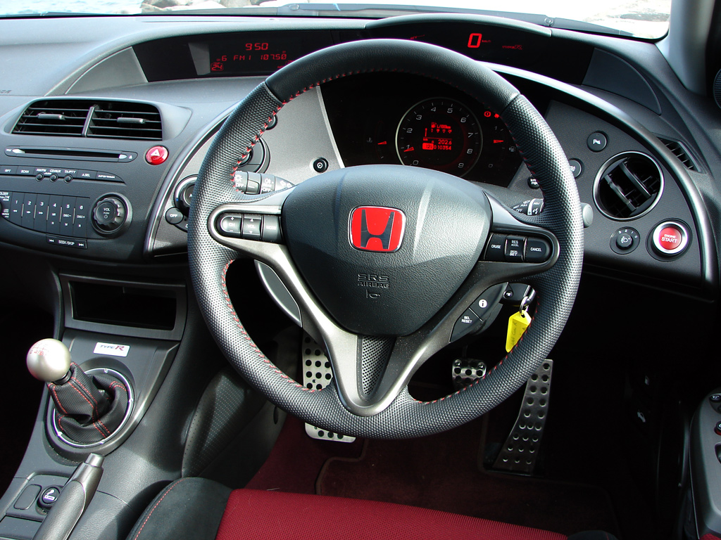
But it's unusual and scares people, like OMG there are so many buttons, this looks like an airplane cockpit.
https://s3.caradvice.com.au/wp-content/uploads/2009/08/Honda...
(if you get the GPS option the screen takes place of the clock/head unit display)
† not a gamified tally like they did with the Insight and CR-Z, but a real-time thing.
†† not a ridiculously small heads-up air fighter thing like Peugeot does that gets unreadable depending on light conditions
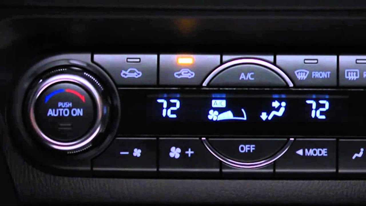
Compare the HVAC control on the base model Mazda3: https://i.ebayimg.com/images/g/xqIAAOSwlv9aU8Hh/s-l1600.jpg
With the HVAC control on the higher trim lines: https://i.ytimg.com/vi/Xdav_EsJ3bQ/maxresdefault.jpg
The older/cheaper interface is WAY easier to control. Changing vent operation or fan speed on the new interface always takes way more button pushes and time until it's in the state I want.
Lower end cars are often more reliable too owing in part to simpler designs. Some of the highest end luxury and status symbol cars have frequent issues and high repair costs.
This makes me crazy. I used to drive a '99 Mazda b2500 (basically a Ford Ranger). I could reach any of the controls without even leaning forward. In a newer f150 that I used to drive for work the reach for the volume knob seems to be about the same distance as the reach to the passenger window crank in my old truck.
That's also why you don't program on a tablet, even with a bt keyboard. Task switching is way to slow, not enough info directly accessible and multi tasking sucks.
But Mazda's cockpit isn't plane cockpit either. Please go for a test drive with new Mazda 3 and you will be surpised how stupid is this decision.
If you want to volume up, change a song, yes, it is easy.
But if you want for example turn on GPS navigation, you need to use this wheel near the gearbox to: - leave a radio interface (you must look at screen and turn the wheel at the same time) - find where is a navi (by turning the wheel and pressing it, still looking at the screen) - choose, again with the wheel, to start typing your destination - and what most: again with wheel (turning it and pressing) type the address simultaneously looking on an onscreen keyboard.
All that while not looking on the road and holding your steering wheel with one hand and another on navigation wheel on central canal.
How come this is safer by tapping on the screen?!
Have you seen photos of a 737 Max cockpit...
https://www.google.com/search?q=737+max+cockpit&tbm=isch
Compare it with a
737-200 cockpit:
Here is an image of what I'm referring to: https://rocketry.files.wordpress.com/2012/08/orion-capsule.j...
I dare you to go tell that to /r/apple :)
Umm, I guess you haven't see the FAA-approved Garmin G3X Touch:
It is interesting that you may in certain countries not operate a cell phone while driving, yet you can operate a car touch screen.
Air plane systems are for example Garmin GPS 430
The reality is that people prefer more features than less, and buttons are not the best way.
What you probably hate are old, unresponsive automotive touch screens.
The future will use more microphones, be faster, use AI to predict what you want to do, etc....
But this seems like a "pop opinion", popular on the internet, but little basis in reality.
First off their system takes an eternity to cold boot. If I’m making a quick run to the store or dropping the kids off at a friends house the system isn’t available for most of the ride. While it’s booting, the radio remembers what it last did but all the controls including volume are locked. So if I was listening to one of the comedy channels on Sirius I have no way to mute it or turn down the volume of the often inappropriate content for a few minutes if my kids get in the car.
Second the system remembers very little of the settings between drives. For example the heated/ vented seats or the auto-hold braking feature have to be set every drive.
I just drove a brand new Ford Fusion rental this week and their system while much clunkier did boot up almost immediately upon starting the car. Of course nothings perfect and while Ford did include hard buttons for most of the HVAC controls you still had to go though the touchscreen menus to find the setting to change the vent control to head and feet.
I do definitely find it annoying that it defaults to playing whatever audio source you last used when you start up your car. Whenever I have a passenger, I have a slight moment of panic as I try to remember what's about to play through the speakers, and whether it's appropriate for them to hear.
I'm probably going to buy a santa fe because hyundai did a great job with infotainment and there is physical buttons everywhere. Plus, the ergonomics are great.
Every car I drove with auto-hold requires you to enable it after each startup of the car. Pretty sure it's a safety thing, as this makes most basic thing (depressing break) behave differently than it did for all automatic cars for the last 50 years.
It's not only the superiority of physical buttons, carmakers seem to be bad at simple, distraction-free UI.
- A single UI task (cancel navigation, switch radio station) takes 4-6 screen presses through some dialogs/menus that have only one option
- the thing responds too slow, there are some superfluous animations and in general there's long delays between presses and feedback on the screen that you touched something.
- Random crashes when not doing anything besides driving
- Random crashes (more frequently) when using android auto or making phone calls
- Updating the software takes 30 minutes, during which no information is shown besides a randomly resetting progress bar.
> There's a reason that our fingertips have some of the densest areas of nerve endings on the body. This is how we experience the world close-up. This is how our tools talk to us. The sense of touch is essential to everything that humans have called "work" for millions of years.
> Now, take out your favorite Magical And Revolutionary Technology Device. Use it for a bit.
> What did you feel? Did it feel glassy? Did it have no connection whatsoever with the task you were performing? I call this technology Pictures Under Glass. Pictures Under Glass sacrifice all the tactile richness of working with our hands, offering instead a hokey visual facade.
> Is that so bad, to dump the tactile for the visual? Try this: close your eyes and tie your shoelaces. No problem at all, right? Now, how well do you think you could tie your shoes if your arm was asleep? Or even if your fingers were numb? When working with our hands, touch does the driving, and vision helps out from the back seat.
> Pictures Under Glass is an interaction paradigm of permanent numbness. It's a Novocaine drip to the wrist. It denies our hands what they do best. And yet, it's the star player in every Vision Of The Future.
http://worrydream.com/ABriefRantOnTheFutureOfInteractionDesi...
(that second-to-last paragraph is surprisingly on the nose with the car metaphor)
Rant is the right way to describe this.
Do you remember the first time you used a map on a smooth multi-touch screen? The joy of panning and zooming around, tapping to learn more about any particular point! I remember that first experience was a total rush and extremely stimulating.
Feeling like the digital map was connected to my fingertip as you pan with that point stuck under your finger — absolute magic.
There are some interfaces which are absolutely superior when provided as picture under multi-touch glass.
Denying a touchscreen entirely is to make huge compromises in the overall experience when configuring something as fully featured as a modern vehicle.
Touchscreens will never replace real keyboards for people who make their living typing but can easily replace a scroll wheel for mindless browsing.
Touchscreens can make sense for things where you need to have a flexible interface and cannot afford your physical interface to look like the cockpit of an airplane.
But for everything that is even a tiny bit critical you usually want to avoid it if possible. This is why even 50k€ cinema cameras like the Arri Alexa swear on knobs and buttons.
The things with buttons, levers and knobs is that they are expensive and very few designers/engineers are good at designing interfaces with them – either because they are not creative enough to get the optimal solution or because they are not pragmatic enough to test their creative solution to the core.
Yamaha DX7, one of the best-selling synths of all time, didn't have any knobs or sliders to edit its sounds. People loved the sounds, but editing them was so hard that few musicians did - that's why you can hear many DX7 stock presets in 80's music.
The 90's were the dark ages of the synth. Even the buttons went away, everything was in a menu now.
The synths thrived as virtual instruments, where adding knobs and sliders was cheap.
Fast forward to 2010's. Arturia, a big virtual synth maker, said: you know what? People love knobs, let's give them knobs. They made Minubrute and Microbute - and it was a smash hit.
Today, there are a plethora of synths out there, and you can program them all with knobs and sliders. For some (like Mini/Microbrute), there is no screen; for others (like Korg Mini/Monologue) it's non-essential, and you do everything with knobs and sliders anyway.
Modern professional gear no only does away with touchscreens, it pretty much does away with screens to a large extent. And where the screens are used, the menu-diving with minimal.
Because when you make things done, you want to interface in your muscle memory. And you don't want to be looking at things - screens in particular - to interact with them.
So if the maker of my $300 can figure this out and put over a dozen knobs on the device to control every single thing it does, I hope that the maker of a $30,000 car can do the same thing as well.
Perfect example: I have a pair of noise-cancelling headphones which let you change volume and switch tracks by swiping on a touch-sensitive earpiece. It's mind-boggling to me that this was chosen over knobs and buttons: first of all it's really easy to accidentally trigger the controls when adjusting the headset. Also, since it's situated in such a way that you can't see it while you're operating it, it's exactly the type of interface which would benefit most from tactile feedback.
Sure Bluetooth is a thing but you dont always drive your own car and every car has their own convoluted way to do Bluetooth.
I wish Android or iPhones had multimedia related buttons somewhere on them (dont miss that lock button / slider thing Apple used to add in so you dont butt skip a song). It is much safer for me to feel out specific buttons while driving than looking down on my phone screen.
Agree that Bluetooth is a nightmare. Every Bluetooth radio wants to dig into my phone and download my contacts (and who knows what else) but all I want to do is play music. If I do this in a rental car I have to remember to figure out how to wipe the radio when I'm returning the car and already rushing to catch a plane, so I don't even bother with Bluetooth any more. It's maddening.
https://photos.smugmug.com/Other/86-Citroen-DX-Prestige/i-Cv...
For what it's worth I've pretty much always known the controls to be over the center console.
And the instruments being there as well has been happening for some time, at least for some vehicle classes e.g. on the C3 picasso anything but the purely driving-related controls is on the center console: https://www.autoexpress.co.uk/citroen/c3-picasso/61746/used-...
1. Using Apple iPhone for navigation. Phone rings. I pick it up using car controls. The navigation screen is now gone and is replaced with the phone screen. [scramble to swipe bottom of phone to get back to nav] 2. Audio routing. The car winds up acting like a Home theater receiver that I have to debug while driving. Why can’t I hear my music? Am I on AM/FM/IPhone USB/iPhone Bluetooth/Wife’s Bluetooth. So many options. 3. Every time I start driving my car, Christmas music starts automatically playing from my iPhone through the car speakers. It’s in my music library and for some reason it auto plays (Why apple?). I always have to do some mid-driving swipeage to get this to stop.
These are horrible patterns. I’d love to spend the rest of my life designing UI for simplifying the driving experience. If anyone wants to hire me, please do.
So please, maybe find a middle ground, as I said - car functionality with hardware knobs, and a touchscreen for stuff like navigation (where you need the sreen anyway), and music control. Otherwise it will get worse - then I can use the hardware button to select my BT input an dhave to fiddle around on my much smaller phone screen. No one can actually want that, if the alternative is to use a condensed version of that interface on a bigger screen...
For complicated things while driving - that you wish you had a touchscreen to accomplish - I wish you wouldn't do them while driving. I say this after more than a decade working responding to road accidents.
However, the Mazda interface has been great for all the Android Auto functions (including Google maps and Spotify) simply using the physical buttons. They clearly went to some effort to make it work well.
And if you prefer, you can use voice controls fairly effectively via Android Auto or Apple carplay.
Please keep your eyes on the road.
None of this bullshit, where buttons are far from each other, moving hands up and down left and right to change temperature, turn air-conditioning on/off. Where driver needs to glance down to steer hand into damn buttons. Where "infotainment" needs to show you anything at all about what you are listening to - as if you dont hear it. Keep information to a minimum, ffs.
Then we got touchscreens instead - now you cant even drive in full darkness and feel some buttons with your hand to adjust. There is not even a Night Mode.
Are car manufacturers really this bad? Yep. Tesla included.
Day: https://i0.wp.com/electrek.co/wp-content/uploads/sites/3/201...
Night: https://cdn-vox--cdn-com.cdn.ampproject.org/i/s/cdn.vox-cdn....
Later I had a bunch of rentals with touchscreen Android Auto, and it was less convenient and less safe than rotary dial Android Auto.
I wish Audi would've kept the rotary dial when they added a touchscreen in their latest infotainment revision.
It's simply not optimised for usability but for attractiveness (both cost and aesthetic wise)
When I asked him why they didn't replace the existing 3 position switch (down/halfway/up) with a 3 position "go down/stay where you were/go up" and just count the revs and remember them, he looked completely blank.
The idea that the people building these UIs are actually interested in actual safe UX is misguided. UX is irrelevant, UI has to be sexy in the showroom.
Neither Apple or Google want the manufacturers to put in knobs and switches, because then they'll have to adapt their partially neutered existing iOS/Android UIs to support things like CANbus etc. Plus the integration costs will go up and nobody got time for that.
In fairness, there's a lot to be said about limited options. The benefit of the 3 position switch is simply that the user doesn't have to think about what the "optimal" position is. Moving the antenna up and down goes from selecting one of 3 numbers, to hitting a button to make a floating point number increase, and then hit another button to stop it on the right position. I personally don't think that's a good UX for the majority of people. (Heck, I'm not even sure what the point of a 3 position antenna is!)
Someone’s relationship with their car is very intimate and personal, in many ways more so then a house.
Much of the discussion I am seeing in this thread is very passionate, which confirms the above observation.
1. They removed the volume knob in favour of a volume slider on the touch screen. Very difficult to use, and even after a couple of years I have not been able to get used to it, and keep reaching for a physical input.
2. There's many UI quirks (bugs and ill conceived design flows) that make menu navigation, managing saved stations, switching from AM to FM, connecting a Bluetooth device etc. extremely difficult. RDS is even disabled by default, which defeats the purpose of having all the extra real estate of the touch screen.
Lots of complaints from users, taking them years to acknowledge it sucks.
Cars go out of style. They last a lot longer than a phone or tablet. Look at any 00's era GM product. The radio/climate buttons are straight out of a Cozy Coupe. It's gross, but in 2001 they were stylin'! Look at the 1992 Subaru Legacy, or the 1990 Ford Tempo, or the 1991 Nissan Sentra. Electric seatbelts, enormous speedometers, oddly shaped steering wheels... They were cool! Now they're eye-catchingly gaudy. Lets not even get into the "digital dash" (yeah, I'm talking to Jethro in the Pontiac).
What if you could have a car with a touchscreen but it only included Android Gingerbread (2.3) and that was it?
Other than that I am always amazed that modern cars have back up cameras and drive-by-wire steering/throttle/brakes but they still have a simple "check engine" light. They don't even print out their own trouble codes let alone tell you "Cylinder 5 misfire!" Such a feature would be trivial and add real value, especially in the truck market. Perhaps when right-to-repair takes over there will be no more incentive to keep the workings of cars magical and mysterious to the layman.
https://www.amazon.com/ANCEL-AD310-Enhanced-Universal-Diagno...
I rent cars fairly often for work and so I see a lot of touchscreens, a lot of bluetooth, whatnot. My car at home has a simple radio, a CD player that rarely gets used, and cruise control. I prefer that to any of this new integrated tech. The only thing about new cars that I really miss is a backup camera.
Same with an oven. Turn the dial to 350 and the oven was on and set to 350. It took a fraction of a second vs a touch screen.
These new interfaces are often a terrible use of "technology" and are actually a step (or more) backward.
But it had its drawbacks. My young children couldn't set the time to heat their oatmeal. "Turn it to 1 minute". They'd twist the knob and say "Is that enough?" Without knowing enough about time they couldn't (yet) figure out to turn right or left to get to the right number.
With a digital one, they'd just poke 1,0,0 and hit start.
Others trying to imitate its screens are shooting themselves into foot. If you are not able to implement continuous delivery, you should stick to hardware toggles. It's that simple.
The problem of screen being screen still stands in Tesla's cars, but much bigger problem is shipping crappy screens.
>you should stick to hardware toggles
There we go, nothing to add now :)
I got used to it pretty quickly and after a week or two I don't really have to look at the screen to do 99% of things I need to do. It seems much safer to me, though it was annoying at first.
Feedback could be visual and in extreme cases audible. Input should be tactile, so buttons rather than surfaces.
And screens should display only a little bit of information, in a font large enough that you don't end up straining your eyes when you switch from the road to the screen and back.
A lot of the things that drive a poor experience with a touch screen are, imho, directly because they have such a poor implementation of a touch screen. Mainly, it's _slow_, _very slow_. A touch screen has to be very fast to seem like it's working, and in a car (in particular), it _must_ feel instant or it will feel like it's broken and cause distraction. I would be very interested to see some sort of apples-to-apples comparision (a good touch experience, vs a good tactile experience), but Mazda's is just not good. It's not even close to the realm of "good enough" to be used as a comparison.
I would say it's more like they never tried to do a touch screen, and then called it bad so they wouldn't have to keep trying.
And... The android auto experience is 10x better than the mazda infotainment system because of access to spotify, podcasets, and _actual_ navigation. I love the loftiness of how mazda talks about what they want to do, but they're so far off of delivering what they say they want to that I don't really know what to think. It's just bad and slow.
I really good tactile experience is probably better than a really good touch experience. But Android Auto is getting close to being a really good touch experience. The Mazda infotainment is not at all close to being a good tactile experience if you want to use say, spotify, or google maps, or use it to actually get to where you want to go.
I miss the days I could reach for a button blindly to adjust my aircon or work the radio.
Having said that - I still like the fact that my Mazda has a touchscreen active while stopped. Entering Nav directions is way faster than with the commander knob.
How many times have you handed your phone to someone to show them and in the process both you and the person receiving accidentally made a multitude of gestures, resulting in your phone freaking out and opening all kinds of random apps/windows..
I love how the new iPhones have the "press" ability on apps to open more options. Personally I wish all interactions required a little bit more force (besides, say, scrolling). When almost half the device is responsive, it makes it all too easy to accidentally perform actions.
Does anyone know where the technology is with this? I remember seeing articles a long time ago about potential for brail via haptics in screens
They are less safe, less convenient to use than physical controls.
The manufacturers know this, but they don't care.
I believe most customers also currently like them because touchscreens are a relatively new technology, and they are a fad.
Based on my experience, Mazda needs a larger display located closer to the driver if they want to make use of touch controls without the side effects they mention. The wheel method is horribly clunky and takes more thinking to get to the control you want to adjust. It's much faster and safer I believe being able to access the control quickly and in a position that doesn't require you to take your eyes far away from the road. You still have to look at the display and process your control movements when using the dial control on the Mazda and it takes longer. Tesla has a better UI by far. If you haven't driven a Model 3 yet, I recommend doing so before commenting against touch screen UX.
Also, the vehicle has a heads-up-display projected on the windshield. The original HUD included a graphical tachometer so you could see the revs which has limited value except it looked cool and gave you some indication on when you were in boost. In a future update Mazda removed the graphical tach in the HUD citing safety as they felt the constant animating tach in the driver's field of view was a distraction. But, the tach remains displayed if you had it turned on before the update.
The voice command functionality is okay, including for the mediocre built-in navigation, once you learn the specific phrases and commands.
Last fall I upgraded to Apple CarPlay and the behaviour is the same. Touch input only works when the vehicle is stopped. There was a rumour that one of the reasons why CarPlay took so long to come to Mazda vehicles was because Mazda wanted integration with it's rotary command nob, back button, and other function buttons around the knob and on the steering wheel. Not sure if it's true, but I will say that navigating CarPlay with the knob is just fine when driving, and the physical back button allows me to navigate to the previous screen regardless of whether the previous screen is a CarPlay screen or one of the Mazda screens, which is really great.
I know some Mazda owners were upset with these limitations, complaining that it prevented the passenger from operating the screen, but that seems like a corner case.
At any rate I still think this is a great idea. Mazda came close with the generation of their infotainment systems before their current ones. You could mostly use the rotary dial and do things if you memorized how many clicks of rotation of the wheel it took and which button to press in the gutter on top of the transmission.
I think the next best thing is a voice UI to control HVAC and entertainment. The one on my 2015 Mazda 6 is pretty bad but this might force them to invest in that which would give them a competitive edge.
Touch screens in vehicles drive me nuts! Requiring the driver to divert their attention from the road makes all tablet-style interfaces a degradation of UX. In all the cars I learned to drive in, I could adjust every thermostat control as well as every audio interface completely by touch, without taking my eyes off the road.
Not to mention the software issues! In one vehicle, you literally could not turn off the radio. Your options were to press the mute button (which would only hold until you restarted your car - at which point you'd get blaring music or static) or to just turn the volume as low as you could.
And every car is now different and unpredictable! My dashboard should be a utility, not a visually stimulating video game where I need to learn every menu and submenu just to fade the audio to the rear.
All I can say is THANK GOD, Mazda. I hope all other manufacturers follow your lead.
At the CHI conference about a decade ago I spoke with some of the lead HCI researchers at Mitsubishi (which has long contributed to human factors research). During Q/A they said the single best thing you could do to improve safety was to NOT buy a car with a touchscreen interface. Lack of tactile feedback is a major problem. We all were quick to point out that they were selling cars with touchscreens. The HCI researchers said yes the company did, but their point still stood.
You want to be able to do things like adjust heat and defrost without looking (just with hands).
It's extraordinary.
Don't get me wrong -- CarPlay/Android Auto are leagues ahead of what individual car makers have to offer. Having a standard system across all car makers is a good idea too. They just need to come up with a more tactile interface.
The touch screen doesn't necessarily have to go, though -- it could simply be disabled when the vehicle is moving.
Volkswagen, for example, have a rotary dial which lets you flip through all the items on the screen to select the one you like. It still requires the driver to glance at the screen, but at least it doesn't require them to touch the precise spot on the screen -- which IMO is more distracting. That said, even the rotary dial is not perfect as it can't be operated by touch only -- w/o taking your eyes off the road -- not unless you know the position of every single icon/control by heart.
If you want to get excited about this type of stuff, I highly recommend this TED talk[1].
[0] https://docs.google.com/document/d/1lTOxHxHFjwJXeCLROAPf6OJD...
[1] https://www.ted.com/talks/david_eagleman_can_we_create_new_s...
I can easily tune through all 150+ stations very easily to find a particular station. I can switch up 20 stations with a single twist, without looking. Also since stations are grouped, I can set a preset for each type of station, then easily tune up or down to listen to other related stations.
My wife's XM is a honda touch screen. The presets work ok, except they are touch screen so you have to look at the screen to change presets. But if you want to manually go to another station, you have to hit 2 touch buttons to get to a tuning screen. Then you have to hit the up/down tuning button each time you want to go up or down a single station. It is pretty much impossible to try to find a station if you don't already know the number because it could be 100's of touches.
Also, when the touch-screens break they tend to be much more expensive to fix. I listened to one person say they were quoted $7k to fix one. They were of a conspiratorial mindset, so they thought it was a planned obsolescence feature to help convince someone to buy a new car instead. I don't know if that's true but the idea of a that type of reliability cost is enough to keep me from returning to the same manufacturer.
I took in my Mazda3 to have the screen replaced. There was an issue with the sensors that mistakenly thought someone was touching the screen. At low speeds, when the toch screen re-activates, it would start navigating on its own; from changing music stations to calling people and changing GPS waypoints. Drivers trying to stop this will be more distracted than they otherwise would be. This happens at stop signs, red lights and slow-moving traffic.
The touchscreen UI when driving is also a very bad design. Touchscreens have no tactile feedback, so require focused visual attention to operate, taking not only the mental focus away from the road environment, but also moving the eyes well away from the road so losing much of the peripheral vision that can 'save' the driver by noticing unexpected motion.
Even as a racer with training on shifting attention between road, traffic, mirrors, surround, & instruments, I've found that any attempt to put a complex phone UI in a car significantly degrades my driving performance. Don't take me wrong, I love having the Android Auto maps up on the screen of my new CX-5.
But, the usability, even using the knob, is a constant distraction, and I far too often find myself squandering far too many microseconds on the UI trying to adjust the map, when I should have switched focus back to the road. It is a genuine hazard, and I've got training to manage it, and still often fail.
The primary, and almost singular goal of any driving or piloting UI must be to reduce the driver's workload. ANY few microseconds squandered on hesitation about the desired operation of the UI or just figuring out it's current state can become deadly.
This is an entirely different goal and threat structure from any ordinary computer or mobile device UI/UX design. Anyone doing it must be fully retrained and reoriented towards these goals, and pursue them relentlessly.
Except for GPS destination input (except if they provide a nice mechanical keyboard ;)) and map zooming. Imho they should allow touchscreen for GPS input and map zooming, and disable the touch for the driver when driving (except when it knows a passenger is sitting next to it and sees the passenger is touching it, should be possible to detect)
Plus it's pretty useless. Other that Bluetooth pairing it serves no real purpose. 99% of the time we control the music player and volume from the remote on the wheel. That's it.
1. It has terrible bluetooth lag. I like to sit in my car at lunch and eat and watch YouTube, Netflix, etc. but I have to disconnect bluetooth because the 2-4 second lag is unbearable. I don't have this problem with my other cars.
2. The keyfob drives me insane. If I get out of the car and leave it running, keyfob in hand, I can't unlock the back doors. I have to open the driver door and do it manually. I also can't lock the car while it's running with the keyfob. I guess Mazda would rather my children have heatstroke while I go in and grab something from the store. I have the keyfob in my hand! And the car knows it.
3. The touchscreen and overall UI is slowwwww. Strangely, the rearview camera boots up and displays superfast, which is the only nice thing I can say about the car's technical features. Switching from radio to bluetooth is an annoyingly long process. The main bootup is excruciatingly long as well. If I'm 5 minutes from home I just don't bother with any sound and mute everything because I'm already on my way and driving by the time it's able to do anything.
4. They charge you to add on Android Auto. Even if I did get this option, you have to get to it thru their already-mentioned slow system, so I don't even know if I'd use it. And you have to plug in the phone. Faster and easier to just put the phone on the magnetic holder and go.
I could go on but this is long enough already. I really like the car otherwise, but I'll be checking my next purchase very carefully when it comes to the technical side.
On-screen selections will involve tactile controls and I find that diable.
Why? CarPlay is a reasonably good UI unlike virtually anything pretty much any car manufacturer can create, Maps, Podcasts/music interface, etc.
Edit: May have found my own answers. ADA guidlines only apply to buses and other vehicles of that type: https://www.access-board.gov/guidelines-and-standards/transp... And most likely, not the operators.
My VW has an amazing UI where the centre console is a small touch screen but it has a bunch of tactile buttons around the edge that also interact with the console. So the only time you need to use the actual console as a touch screen is when entering precise details like an address into the sat nav or phone number to ring. Which, in both scenarios, I am more than happy to do at the start of the journey or pull over to do. Everything else, from the radio to the air con, is controlled via tactile buttons.
More over, any important announcements that come up on the centre console can also be displayed on the dashboard as well. Including sat nav. So it means I don’t even need to look at the centre console to glance at stuff if I don’t want want to.
VW have gotten a lot of bad press in recent years but when it comes to in car UIs, I’ve driven few vehicles that compare equally well.
I'm sure I'm missing something here (or I'm a weird driver), or is it just that without having a multi-function steering wheel touchscreens are more of a hazard than a radio with buttons?
(Ok, reading a few more comments here, it seems that some cars use the touchscreen to also control temperature and other things that are still buttons and dials in our car (the touchscreen is pretty much only media, navigation, phone, and a few other functions I'm forgetting now because I never used them).)
Edit: the car doesn't squawk loudly at me when I hit the lock button when I get home at night, either.
On that note I also want to mention that Maps on Apple carplay has a terrible UI which could potentially be dangerous. To move around the map, one has to use arrow buttons on the touch screen. We can't move the map by just dragging on the map like on a cellphone.
I believe this is an effort to avoid driver distraction. But people, including me, keep trying to move it anyway while driving since its so instinctive, and when the map fails to move it adds additional distraction by having the driver investigate.
One of the primary advantages is that I can usually find the key I want without looking down at the labels.
In a car, I want tactile clickiness in mechanical or electromechanical controls. I even want rocker or throw switches, instead of buttons that light up an LED to indicate their state. And that means if the state changes in software, a solenoid or motor is going to have to flip the physical state too.
Touchscreens, despite having "touch" in the name, are strictly inferior for finger-based inputs. They're more "screen" than "touch".
I have a Mazda and hate their scroll wheel interface, with a touchscreen I can just press the "AM Radio" icon, with a scroll wheel, I need to turn the wheel then keep looking at the screen to see where the cursor is so I can click the right icon so it takes more attention -- both cognitive processing (how many clicks do I need to turn to get down to the button I want), as well as visual (is it on the right one yet?)
Voice recognition is even worse, I often end up having a conversation with the car "Call George" "There is more than one George, which one do you want to call" "George Modaline" "Ok, Calling George Smith - mobile".
Oh wait... they actually didn't!
Mazda's decision is very good: Any UI where you need to detour your attention from driving to changing car status is missing the point of its existence.
I see that the data may not agree with my experience but I look to have touch in every car I buy in the future. From a driver looking to leverage technology, while we get automation working, let's make it easy for the driver to get to the car's features.
It's handy while parked, but I don't think I want to be fiddling much with a touch screen while driving.
On the other hand, I don't see why my passenger can't be operating it while I'm driving.
Still against volume and climate controls not being physical buttons or knobs because having to look at a screen while driving for more than half a second is bad news.
I agree from personal experience that these LCD screens in cars are distracting, and what’s worse, don’t get updates so that in just a few years UIs will feel sluggish and ugly (if not already the day it rolls out of dealership (I’m looking at you Ford)).
My car has buttons for all these operations and it's great. What is bad for is browsing the map when I'm parked; say I'm looking for a car park near my destination, by the time I've zoomed out with a scroll wheel, browsed around and zoomed back in a few times I could've done the same thing on my phone and set off.
At many companies, the people doing that kind of research would be people who no one really listens to. They would do the research. Then PHB-type characters would enter the scene. And if research yields recommendations that would steer the company away from the safety of the herd (of automakers, in that case), then the research would be cancelled and the recommendations ignored.
The knobs are just as distracting as using a touch screen -- you have to look at the screen to see what is being selected, and you have to take a hand off the wheel to use the knob. In many cases it takes several knob movements and button presses to get to something I could have just reached out and touched. How is that any safer?
[0] https://matthaeuskrenn.com/new-car-ui ; and HN discussion: https://news.ycombinator.com/item?id=7261003
Also, to reduce distraction I suggest using Siri with CarPlay. It works like a charm and you don't even need to look to the screen.
I think a touch screen would be OK if it didn't operate while the car was in Drive, so you can set preferences, etc, with a full keyboard. But you can also do this from a companion app or website, so there's really no need to have it at all.
And I'm really glad to see HUDs come to cars. I wonder why it took so long!
I only care about the speed and fuel level. And a big STOP when something is wrong.and style feedback on things Iwill have to change soon.
Then radio and possibly two buttons.
All of this automatically provided when it is me who "logs in".
But I get some weird philosophical view of some designer go though I am interested in the engine rate (I do not even know the name of this rpm big dial), the oil temperature and whatnot.
With Uber or Didi especially, you get picked up in cars that have these touchscreens. I've never seen a driver use them for anything other than radio operation. They use their phones for GPS navigation.
And in the nicer cars (BMWs, Mercs, etc) the touchscreens just destroy the aesthetics of the car's interior. Horrible looking.
Automatic headlights come close, but my hate for those is mostly from drivers that fail to turn them on when the sensors fail or aren't sensitive enough to come on. So many heavy downpours / fog in our area and I see plenty of new cars without their tail lights on and just low beam/running lights.
In a more conservative industry, interaction practices researched and adopted at the beginning of the discipline would be maintained for decades without questioning -cough programming cough-, and profound changes would require a thorough adjustment of the tools used by the industry and the mentality of the practitioners.
IMO this is a wrong move for mazda. Eventually if these cars become smart cars then you will not be interacting with controls as much. Touch an go.
Hopefully I can find something of this sort to replace the 7" screen in my GT86.
Driving should be an exercise in focus with the tools to help me do so, even in the proliferation of options (climate, entertainment, etc).
The 17-inch screen in the Model S is just absurd to me. I dont want it. I dont want screens.
Screen navigation should be banned in the car no matter what type of screen it is.
When driving or piloting, what's the last time you heard the display has several levels of menu/screen to move around. Just display everything, let the eyes choose where to look.
All interior controls were touchscreen and impossible to use while driving. Worthless gimmickry.
Definitely didn’t tempt me to get a newer model. I’ll keep my 2014 with its buttons and dials until auto-designers regain there senses again.
What we need is to put all the controls both within sign and within reach of the driver, that means in and around the steering wheel, just like it was done in sport cars where driver focus is essential.
My current citroen is mostly touch controlled, but I find it requires less attention to operate than the button/dial controls on my old nissan which were horrible.
But I think the real future is voice control.
I get that’s its bad if you’re constantly interacting with it while driving, but... are you?
Good luck with that in 20 years or so...
The issue is that we have to solve high-speed touch screens that behave well in vehicles that sit outside.
I'm not saying that tactile controls in general should be banned, and I'm probably also saying that most car manufacturers _absolutely suck_ at software and will elegantly botch any attempt at integrating a touchscreen.
Maybe Tesla has gone overboard and should add (software-controlled) physical dials for the systems that are used all the time and are never expected to change much, such as A/C, seat heaters, trunk & frunk and so on. But that's a comparatively minor UX modification.
The million dollar question is whether proper self-driving is 5 or 15 years away -- if it's the former, auto companies really don't have as much time to adapt as they think. Some customers might like a touchscreen-less Mazda if they can tack a safe self-driving system onto it, but they will have a hard time competing with companies that understand software and have good integration of intuitive touchscreen interfaces. Once (if?) proper self-driving is here, software suddenly becomes critical, and it's hard to control a complex software system through physical knobs. People will also want better entertainment systems integrated in the car at that point, and a touchscreen makes such modifications simple.
People are used to being able to do sophisticated things that go beyond the sort of controls you can operate by feel. You used to get by if you could adjusting the volume with a knob and pushing one of 5 preset radio stations, and maybe being able to operate most the heater/AC controls without looking. That's not good enough anymore.
Voice seems to be the only real option. Maybe by the time it they work out all the kinks the cars will all be driving themselves.
This is already the case with Mazda's touch-disabled-while-driving screens.
Not sure at all about the net effect on safety.
Meanwhile Tesla... innovative, but not very driver-centric.
Touch screens require you to look at them to use them. Physical knobs and buttons do not. You're supposed to look at the road, not at a touchscreen.
sidenote: I was initially in the "bring the keyboards on smartphones back" camp as well, but given how well it all worked out 10 years later, I foresee the same happening with touchscreens in cars.
The description of the torque "“Doing our research, when a driver would reach towards a touch-screen interface in any vehicle, they would unintentionally apply torque to the steering wheel, and the vehicle would drift out of its lane position,", doesn't make any sense. I doesn't matter whether you reach for a touchscreen, button, or bugle, it would produce the same effect.
Great call by Mazda. Maybe a newer car purchase will make sense again.
I would guess this is a technical failure wrapped in PR messaging.
I know on one of the Tesla models, you even need to use the touch screen to open your glove box which seems odd. Then with all the news stories of police shooting people on routine traffic stops, reach for the center to open your glove box for your insurance card, who knows maybe you are reaching for a gun in the center console. It's just out of the norm since most people glove boxes just open up with an actual handle. Even though their computer always knows if you had insurance or not even before being stopped, just another way for the city to make revenue if you forgot your paper. But maybe I'm listening to the media too much but it wouldn't surprise me if some innocent person was murdered just because they decided to drive something different and slightly more technical while making a slightly wider turn than a cop thought they should of made.
There's a video on YouTube of a guy being stopped in a Tesla because the officer thought the touch screen was a modification instead of being built as part of the car... but after a little back and forth and laughs then realizes it's part of the car and leaves without any further info as a good cop should. while some others might feel bad and still try to find something wrong instead of accepting they were wrong.
Maybe in a popular tech-filled San Francisco cops see Tesla's every day but in small towns in like the midwest, they are rare and fancy. Then some places there isn't an official place to even get serviced, but the same could be said about Lamborghinis. I forget who but I was watching some internet marketer guy from some small town in Maine talk about owning a Lamborghini. Apparently every time you stop somewhere even at a traffic light people want to talk to you and get pictures. Even said people would drive and take photos which made him nervous since that's unsafe but people would chase him to get pictures. A BMW i8 would make a interesting super car since already the large BMW network of service centers at dealerships, but if you are the only one in a small town probably will attract people attention too. So I guess you can feel like a celebrity for a bit.
Then in New Jersey, they have DMV checkpoints during the morning commute looking for missing emissions inspection stickers waving people into a empty parking lot, while the Tesla is 100% electric and exempt but doesn't mean a cop will detain you for 15 minutes giving you a hard time and make you late for work because no one told him. But the same can be said about no front plates, 19 states don't require them (and July 2020 that will be 20 states as Ohio passed a law getting rid of front plates as a effort to save money but delayed it by a year from being in effect so law enforcement can figure out how to deal with no front plates. I'm not sure why they can't just call up the highway patrol from Kentucky, Tennessee or Florida and ask them since they have years of experience with no front plates and already figured it out.) but there's stories of people on road trips being hassled. Someone went on a road trip from Florida to San Francisco and got a parking ticket for no front plate... Might of been a meter maid though instead of a cop though. Well at least it's winnable but so annoying people paid to enforce the law are so uninformed.
I tremble a little bit when I want to play something with my iphone, nervously moving through the screens.
I think a couple of knobs, a few buttons, and a very simple screen, hopefully HUD of some reasonable kind - or even info displayed behind the wheel would be suitable.
I always wonder how many accidents all that technology causes.
A car doesn’t fit any of these.
:no_upscale()/cdn.vox-cdn.com/uploads/chorus_image/image/55955575/9U3A2261__1_.0.jpg)