This is much more reasonable than I assumed. Unlike seemingly most people here I have no problem whatsoever with fan controls or audio controls or whatever on the touchscreen, as long as it is responsive (of course the vast majority of car touchscreens are not, but some are). However, the absence of a physical speed control for the windshield wipers is the single worst design flaw of Teslas. Or at least it was, until they removed the physical turn signal controls. I'm very much in favor of requiring safety critical controls that must be used frequently or urgently to be physical.
https://en.wikipedia.org/wiki/USS_John_S._McCain_and_Alnic_M...
A/C is automatic and I don't need to touch it the vast majority of the time. While driving the most I might want to do is adjust the temperature, and since it's not safety critical I can choose a convenient time. It's at the bottom of the screen so it is easy to do by grabbing behind the bezel and only requires a quick glance to align your thumb. In practice I glance at physical A/C controls when adjusting them too, so I don't see a big difference here.
If you really need to adjust the temperature so often and can't stand the thought of using the touchscreen, you can assign that function to the left scroll wheel.
Yes you can. My last three cars have had a volume knob under the left thumb. My current car has a second volume knob behind the gearstick, and the A/C is the only analog dial along the center console. I can easily adjust both without looking away.
I don't understand how so many people have come across cars with seemingly terrible auto AC systems. Even my old 2000 Honda Accord had a competent auto AC system. I haven't had manual AC on any of my cars in decades. Whenever I rent a car it's always infuriating having to constantly muck with the AC system.
“Hey Google, set the driver’s side heated seat to one”
“Hey Google, turn off the steering wheel heater”
I own a Model S Plaid, and the horn button’s location on the yoke can generally only be reached by the driver’s right hand. Even more dangerous, its position in space changes dramatically any time you are in the middle of a turn. The horn button is not easy to press in an emergency.
Same story with the turn signals.
If you are in the middle of a turn and you have rotated the yoke 180-degrees, your turn signal buttons are now upside-down, and on the other side of the yoke. I have owned my car for a year and a half, and there are still times when I have to look at the yoke mid-turn to figure out which turn signal button is which.
So stupid.
I got used to the turn signals and the wipers because I use them a lot. But I still haven't gotten used to the horn and the lights because these functionalities are used very infrequently, so there is no muscle memory for them at all. I've had this car for over a year now.
The only annoying part is that the left button pad on the wheel is the absolute worst. It's essentially a d-pad with a center press, but it's one single button cover. Which leads to a lot of wrong clicks.
You are legally required to have and use the turn signals. You are legally required to have and use the windshield wipers (because you need to be able to see the road when it's raining). Same is true for the horn and hazard lights - those are safety-critical features, with their use at least partially regulated by law.
While I agree that volume control should be a physical button due to my personal taste, I would not go so far as to mandate it legally to be a physical button, with the reason being that it is not a safety-critical feature. The market can figure this out by itself. But for safety-critical features whose swift and correct use is mandated and regulated by law, I would absolutely mandate them to be provided to the user in a way that supports the swift and uninterrupting use expected from the driver, and that means: physical controls, placed reasonably reachable.
What really kills me is my wife's Civic has no pause button at all, physical or otherwise. And it autoplays media on your phone when you get in. Don't want your phone to play whatever random YouTube video you happened to click on hours ago? Gotta pick up your phone to pause it there. And this doesn't happen right away, oh no, it takes at least a minute into your drive for the Bluetooth to wake up.
Fan controls are important to remove fog on the windows. I should be able to enable it without looking away the road.
Far better to have a dedicated defrost button next to the driver's normal controls that does it all as a single toggle rather than have the driver make multiple adjustments. Which is what I have on both of my cars, one of which people complain about how it's just a giant touchscreen.
> Tesla is probably at greatest risk here, having recently ditched physical stalks that instead move the turn signal functions to haptic buttons on the steering wheel.
The turn signals wasn’t removed, they moved them to the steering wheel as physical buttons. Which ofc isn’t optimal, because you turn it…
Way too often I see people signaling as they turn, not because they are trying to communicate with other road users but because it’s the law. Indicate your intent first and then take the indicated action.
You're supposed to indicate before you turn, to be fair.
I want at the least a physical recirculate/bring air from outside button.
The use case is coming up behind a vintage truck that was made before they even thought of pollution standards on a winding mountain road where you can't overtake and you need to pay attention to the road. And you also need to set the a/c to recirculate before you suffocate.
For audio... with radio dying or dead I guess you can just run Spotify the whole trip. I'd still like volume and mute buttons.
Stupid, arrogant moves nobody asked for pushed down the throats of unsuspecting users. A colleague's model 3 died during rain (apparently its such a solidly built car that a bit more than normal amount of rain can kill it for good, got replaced without questions which indicates this is a well known issue). Newer version didn't have physical turn signals. He was almost crying, an early adopter with a lot of love for the company that evaporated in an instance. Its not every day that car manufacturer actively tries to increase chances of people getting killed and acts like all is fine.
But that doesn't make it wrong to do the research, go through the design process, and come to the conclusion that, in the end, putting blinkers on a stalk is still better than the alternatives proposed. It reeks of change for the sake of being different, rather than an actual innovation.
My biggest issue with the choice is that, on a wheel, indicator buttons are constantly moving. And when the buttons are right next to each other, it makes it significantly easier to indicate the wrong direction. Or have to take your eyes off the road to find the indicator when your wheel isn't straight (suppose you're trying to exit a roundabout)
And then with the lack of dashboard on some teslas, there's the knock on problem of having to look away from the road to see which way you're indicating if you think you've indicated incorrectly, rather than the indicator arrow clearly flashing at the bottom of your field of vision.
Also this: https://youtube.com/shorts/3eKcDOHVZWc?si=-jL4o4Bhu-2y0ibj
Doesn't cover the left multi function button feature after short pressing the wiper button.
(Model 3, 2022, Australia).
Yes, they added this relatively recently. For the first few years I owned the car this was not possible. Also, guess what, it still sucks! More steps than a physical control, fiddly because of the short timeout, and still requires an extra step of looking at the touchscreen because you can't know which way to push the wheel without finding out the current setting. Is it on "Auto" or "Off"? They're at opposite ends of the menu. Acceptable for something less important like setting the A/C temperature; definitively not acceptable for something safety critical like wipers.
Imagine that someone rents a car and is tired + every manufacturer has their own konami code, or secret button to start the wipers. That's how accidents happen.
Granted, that guy that posted it was from Australia so that they probably don't have that sort of downpour problem over there (the same goes for places in the US like California or Texas).
I don't wan't a touchscreen keyboard on my laptop, and the travel is already small enough - i say bring back tactility! The dead cold glass orb has destroyed so much.
Why? What's the difference? You fiddle with these as well while you're driving, and they're also dangerous and distracting.
Normal refresh cycle period for tablets(iPads) is ~5 years.
Normal life of a car is 10 years (2x).
That means that by year 7 or so, multi-touch performance in autos starts to seriously lag consumer tablet market.
Perhaps we need to have a replaceable/swappable infotainment console now
The fog lights are much worse
My only concern with the wipers would be for an emergency, ie the street washers drive by and suddenly I have no visibility, but for those situations I have the button on the left stalk that fires the wipers on demand.
To engage a turn signal, press the corresponding arrow button on the left side of the steering wheel. (The buttons move on the Highland steering wheel)
Turn signals: To turn on the hazard warning flashers, press the button on the drive mode selector located on the overhead center. All turn signals flash. Press again to turn off.
Hazard lights: Overhead console drive mode selector with arrow pointing to hazard warning light button in the middle.
If a severe crash is detected by your vehicle, the hazard warning flashers will automatically turn on and flash quickly to increase visibility. Pressing the hazard warning flashers once will return the lights to their normal cadence. Pressing a second time turns all hazard warning flashers off.
To sound the horn, press and hold the center pad on the steering wheel.
You can access wiper settings by touching the wiper button on the steering wheel
Press the wiper button on the steering wheel to wipe the windshield.
Press and hold the wiper button to spray washer fluid onto the windshield. After releasing the button, the wipers perform two additional wipes then, depending on vehicle and environmental conditions, a third wipe a few seconds later. You can also press and hold the wiper button for a continuous spray of washer fluid—the wipers perform the wipes after you release.
Whenever you press the wiper button on the steering wheel, the touchscreen displays the wiper menu, allowing you to adjust wiper settings. Press the left scroll button on the steering wheel left or right to choose your desired setting.
Off/Auto/Intermittent slow/fast/Continuous slow/fast
It was -27f/-33c this morning when I started my car. At those temperatures ALL touchscreens generally become slow and unresponsive, especially when wearing mittens. I want the defrost/fan/temperature controls on a physical switch. I also don't want a screen that isn't happy unless it is getting a full 12v/14v. Not all car batteries will give that when cold. Frankly, I'd be happy with a series of valves ... anything other than a touchscreen.
Fyi, automatic wipers are a nightmare in winter. It is very easy for them to break if caked in snow. Standard procedure being to start the car first and let it warm up as you remove the snow and ice. So you need them to be on a physical switch to ensure they are off prior to turning the car on.
Real button changes position when you press it. Haptic button is flat surface with vibrating motor inside that buzzes so it "feels" like a click. Like in a smartphone.
The ones I have seen have a lag, so you don't immediately know if your button press was registered or not.
My 2015 Model S has a stalk with a rotary switch for wiper control that includes several automatic and manual modes and speeds.
But I was loaned a Model 3 when my Model S was being repaired and I hated it because most of the stalks had been removed making things like cruise control and the radio much more awkward to use.
Zero-force, zero-feedback, zero-travel controls should be illegal for such functions.
My guess ones that use mechanical dials (i.e. Lexus until ~ year ago) cause more distraction than touchscreen by simply being harder to use and taking more time to solve your problem.
Given how well chatgpt's voice recognition works - why not just put it on all cars!
The only thing that annoys me about Commander Knob + Android Auto is that AA still forces attention breaks as you scroll through big lists (e.g. Spotify playlists) which is really stupid because you're not usually looking at the screen if you know you need to scroll say 75% down. You're just looking occasionally to see how far you've made it. By making the task take longer, it's reducing safety.
The biggest safety issue by far with Mazda+AA is Google's baffling regression in handling voice input for common tasks while driving.
Because saying "roll down the left window" is still a fucking nuisance compared to a click of a button.
I would love to see some data to see how dangerous it is to operate Maps and Media apps on a touch screen while operating a moving vehicle. This is data modern automakers should have access to. I suspect the answer is that it does reduce safety.
It's amazing that accessibility is such an afterthought that having a physical wheel that tabs forward and backward through a UI as the primary means of using it is unfathomable until it's actually implemented.
He tried it, and it's even worse than Siri in terms of reliability. Absolute unmitigated disaster.
I've never had experience with any car voice controls which didn't make me want to drive my car into a divider just to end the pain. Voice controls are so frustrating to use that I'm sure they are more distracting to use than even a touchscreen. I might be able to keep my eyes on the road easier with voice controls, but, my brain is going to be quickly annoyed and focused on trying to suss out why the voice control system is not understanding me, or am I using the wrong phrase, or do I need to put the windows up (impossible for me 6+ months of the year) so the car can hear me better?
It's like trying to pair bluetooth with a non-carplay (or non-android auto -- which I haven't used but heard good things about) with virtually all OEM and many aftermarket receivers. A uniquely frustrating experience which makes me wonder if QA departments at automakers actually exist.
“Hey car, signal left”
“Hey car, reverse”
You’re kidding, right? Even if this worked far better than Siri, it’s too slow.
Google Assistant still regularly misinterprets what I say <.<
Not to mention most voice assistants are fucking awful slow in language. It's like they pick a rural dweller as their speech model instead of a city slicker.
Just give me a button instead, it'll be quicker and less distracting.
"BREAK!"
"BREAAK!!!!"
"OH GOD PLEASE BRAKE!"
crunch
Problems can occur if it the voice system brakes (pun intended). ;)
Imagine mid-sipping a drink and something falls out of a truck… garble garble garble —-crash.
Voice controls in an emergency wouldn’t work unless you require like 500 feet (maybe more) car to car separation. And then you have people with temporary voice conditions (losing voice) and permanent voice conditions (mute/dumb)
Then again, it also boggles my mind how car makers in the US continue to use flashing red lights as the turn signal instead of yellow lights. You can barely see the red light in sunlight and it's harder to tell the red light from brake lights. Furthermore, the same car will have yellow signal lights in the front and side. So yellow signal lights in front and side, red in the back. Just make it all yellow for turn signal!
It is likely that neither safety nor ease of use were part of the automaker's "thought process".
It is much more likely that a first misguided "designer" created the first touch panel control and somehow sold it to "management" as being "futuristic" and/or "ahead of the competition". And once the first car model arrived with one, the rest, like firefox to chrome, felt the need to play the imitation game for fear of being seen as not as "trendy" or "futuristic" as that other guy. I.e., purely the "fashion trend" aspect.
Then, as they proliferated, the reduced BOM costs from removing every other previous mechanical control was reverse justified as the reason for continuing to add them to ever more car models.
There are other reasons of course - planned obsolesence is a big one. Why would they want cars to work after the primary owner is done with it? With software-everything they can lock the car to the first 3 or 4 owners, and then remotely kill it.
It doesn't even have to be actively disabled, just stop providing the replacement head unit as a part because "we don't have that software anymore".
Car manufacturers want to be able to change cars after they are sold. This can be in the positive via OTA updates that fix firmware issues or in the negative by providing "subscription" features that provide a passive income beyond the initial sale. Tesla has been paving a path here with its grandiose claims of "full self-driving" and industrial manufacturers like John Deere have been experimenting with bringing smartphone-style DRM and rent-seeking to motor vehicles. Replacing as many "hardcoded" physical controls with flexible and fungible virtual controls is a logical part of the transition.
Why bother producing five different physical "editions" if you can just produce one and then downgrade it in four different ways by gimping the firmware or disabling controls in the UI? This way you can also upsell the features later or put them in a subscription model.
Technology Connections channel had a video about that a while back:
Flashing yellow = car is pointed towards you
It's the same reason why headlights are white and taillights are not (unless reversing, in which case the tail becomes the head temporarily, and thus white reversing lights.)
Why is it a problem? How is a red blinker actually measurably worse than an amber one?
I have never had any sort of issue interpreting a blinking red taillight as turning? With red, you can more easily tell the direction of travel and the aesthetics of a single color are far nicer. I frankly don’t see the problem.
Commenter a couple levels up says you can’t see red blinkers in the sunlight? I don’t think that’s true on any measurable level, amber is a far closer match in hue to sunlight than red.
Does anyone actually think that though? Or was it considered “good enough” in light of its other benefits like reducing costs, reducing BOM, eliminating part design work, reducing wiring complexity, adding flexibility and customizability, (potentially) increased reliability, making it easier to jam the multitudes of controls and options a modern car has into a more usable and understandable interface, etc.
Don’t get me wrong, when I bought a new car, one of the selling points was the manufacturer was one of the few to still offer physical control and navigation of the touch screens (in fact the touch functionality is completely disabled at any speed faster than 5 mph). But I don’t think “safer and easier to use while driving” has ever been the driver for touch interfaces in cars.
I mainly gripe about losing physical buttons for main functions such as temperature control, radio/music control, lights, windshield wipers, etc.
Also makes it easier to change things later in the design if you do not have a bunch of physical controls to move.
But if any car makers had done any proper UX testing, they'd quickly find out that physical buttons in a car is a non-negotiable.
I'm also starting to see really thin - single narrow LED strip - turn signals that are barely visible next to the much larger headlight nearby.
I walked out and just continued driving the corolla I had (still have it to this day). When I needed a minivan I purchased an older honda odyssey and fixed it up.
This is probably a US government regulation thing. Because those same cars sold elsewhere in the world does have flashing yellow lights as indicators.
I can't say that I've ever had trouble seeing the red turn signals in the sun. Being able to see them in the sun from a few hundred feet away is legally required in most, if not all, states.
Do you have trouble seeing brake lights too?
Are there really cars where the horn is not a physical button/ring on the steering wheel?
IMHO the driving UX peaked in the 1960s, and was largely unchanged into the 2000s, until touch screens started taking over.
Compare:
https://i0.wp.com/www.curbsideclassic.com/wp-content/uploads...
https://images-stag.jazelc.com/uploads/theautopian-m2en/2010...
https://www.motortrend.com/uploads/sites/5/2017/07/Tesla-Mod...
At least the steering wheel and pedals still behave the same.
And specifically the horn button being capacitive co-located with the voice assistance and windscreen wiper buttons.
Which in a safety situation was difficult to locate and press.
https://www.tesla.com/ownersmanual/models/en_us/GUID-DEB259C...
For vehicles manufactured as of approximately January 2024: To sound the horn, press the middle of the steering yoke (or steering wheel). For vehicles manufactured prior to approximately January 2024: To sound the horn, press and hold the horn button on the right side of the steering yoke (or steering wheel).
"press and hold" doesn't seem like it'd be easy to do if all you wanted was a quick toot.
Sometimes even Elon admits he was wrong.
In driver's ed they tell you to not to use your horn when you're annoyed at other drivers - only use it if there's an imminent danger to avoid a crash.
But you better hope it works because if it doesn't, the airbag behind it explodes.
...
I'm not sure Tesla improved the situation, but it definitely seems like the situation has room for improvement.
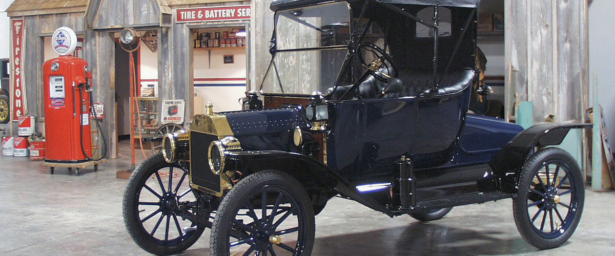
Yes: https://antiquecarmuseumofiowa.org/wp-content/uploads/1913-F...
Well ... "are" is kinda stretching it...
Don't give them ideas...
The French made some really… interesting choices with their cars.
For a while Ford was putting the horn on the turn signal stalk, I hated it:
https://www.reddit.com/r/Justrolledintotheshop/comments/l08q...
For now, companies are experimenting with drive by wire. Don't think I like that concept.
The whole touch cluster on the left of the steering wheel, just below the vent, is a disaster, too. If I want to check the temperature of the air that's blowing into the cabin, I end up accidentally turning off the lights, turning on rear antifog lights, and turning on defroster heating for the windshield. The next minute or so is spent trying to get everything back to normal.
The rule should be that everything in the car needs to be a physically actuated button, and touching those buttons without pressing them should only ever light them up or show help messages, never perform any action.
Compared to ID4, ID3 has another epic cost saving measure: They removed the two switches for the rear windows from the driver door, and replaced it with a toggle switch that decides whether the switches for the front windows really control the front windows, or the rear ones. So in total they saved one physical switch, but made the user experience much worse.
I also skipped the entire ID-family due to that. At least the Enyaq (Skoda's ID4) has a much better setup with physical buttons on the steering wheel, and more physical buttons for the console.
The car i ultimately settled on has worse overall infotainment software but physical controls which can be operated blindely and reliably.
No wonder VW is already in the process of correcting this disastrous, budget driven, decision.
I found a nice Toyota instead with a button for every function, and everything just works.
By Douglas Adams in The Hitchhiker's Guide to the Galaxy
What did not work for me was the re-charging experience on longer trips. I do not want to „subscribe“ to anything just to recharge my car in a reasonable amount of time. But even with a hypercharger it still takes way too long and without the „right“ subscription you feel like they steal your money from you. This is the worst from my POV when it comes to EVs, this is where they felt like inferior technology and business model to me as a consumer. Guess what, even though I was always a fan of EVs and hybrids (even drove three different models of Toyota Prius prior to my ID.4) my next car will be a traditional one (Hyundai Tucson to be precise).
For things like lights or wipers the solutions from the past are quite good I would say.
For things like the Tesla turn signal buttons I would actually prefer to have both buttons and the traditional stalk. Depending on the situation one is superior of the other.
And then your rigid rule would prevent something like having a touch menu for a setup function that you would never have good reason to adjust while driving. Likely making it worse.
It has physical buttons for everything except the radio... much better vehicle.
But in a car when you might interact with controls a couple dozen times per trip? Absolutely clicky.
No amount of interface versatility/flexibility can come close to touching the utility of not having to take your eyes off your subject. NONE.
This drives me INSANE. The other one: some of the Tesla UIs feel like they were made with "minimalism" in mind. For instance the rear defroster vs the windshield defroster. I still, 3 years into my model Y, have no idea which is which, and every time I need to defrost the front windshield it's like a fight against the HVAC system and buttons and touchscreens to make it do anything.
I love my tesla, probably to the point of being annoying, but I **HATE** the ridiculous "minimalist" UI stuff, and I absolutely hate it when they push a UI update which moves things around.
It sounds like an irrational love for the car.
But I am constantly disappointed by just how awful and useless the software is.
Need some directions? Sorry, I can auto-play this music station you haven't used in a week, but if you want those directions you looked up on your way out the best I can do is (maybe) have the address in your recent search history.
Want to resume the music you were streaming from your phone through your media center? Yeah, just give me a few minutes to load up this other UI and...Are you sure you have a music app on your phone? Maybe you just need to add it to the car app? Here, let me bring that up on your phone screen. Hold up. There's some audio coming through the bluetooth, I'll just play that.
Want to see why the "Check Engine" light came on? Oh, well for that you need to buy a $50 dongle with Bluetooth and install an app on your phone.
Most of the time, though, they are implemented simply because it's cheaper. There's no benefit to speak of. In fact, I think the only device for which a touch interface works is a smartphone. I can't think of any others.
Yes, many people find these touch screens annoying, and they’ll tend to buy cars with physical controls. But just like people who prefer physical keyboards on their phones, these consumers are a vocal minority who aren’t big enough to cater to.
If touch screens make cars less safe, then we should see higher liability insurance rates for such cars. So far that doesn’t seem to be the case.
So? If you're switching to reverse then by definition you're stopped (or nearly so) and can afford to take your eyes off the road. The control is no further than most cars' center tunnel-mounted gear levers. Plus it only has the two common drive/reverse settings accessible via the swiping action, rather than all the rarely-used options. (Do you know how many times I've shifted into Neutral or Low by mistake in an unfamiliar car...?)
What exactly is the risk?
I mean, yeah, sure. It'd be cheaper for my tyres to be made of wood. I don't give a toss, a new vehicle costs tens of thousands, what's $50 for a few buttons?
edit: Top tier bean counter replies! Is it contagious?
If you can generate $50 dollars of COGs reduction in a car, that's 250 million per year. Yes, that's basically nothing in terms of their COGs, but that's like 5% increase in net income (if they can channel all of the savings into the net income anyways). Alternatively, if you want to be less cynical, Ford's R&D budget comes from that ~20 billion dollar slice between their revenue, COGs and final net income. 250 million is still a pretty ~1% slice of their R&D budget.
I don't think you've ever worked in manufacturing.
It's not just the cost of the buttons.
A larger cost is the fabrication of the housing for all the buttons: design the housing that goes into the dashboard/console, create a jig/die, continue creating new jigs/dies as the old ones wear out, keep the factory floorspace available even after the car has gone out of production, etc. This has to be done for each car model (yeah, even if you're using blanks).
Another cost that dwarves the cost of buying buttons is the fitment: the fitment robots have to be purchased, programmed and maintained just to put those $50 buttons in. It has to be done for each car model.
And, of course, design changes late in the process cause the manufacturer to spend all that money all over again.
Spread over the lifetime of the car (how long they keep providing parts for it), a minimum of around 5 years, that $50 is negligible compared to the tens of millions of dollars poured into fabricating and fitting of those $50 buttons.
Compared to a touchscreen, all that's done is to ensure that the dashboard design has a housing for the touchscreen. Done, and works for all models from baseline to top-end with no more money needed.
- Tap the fan direction button
- wait 2 seconds for it to load
- tap windscreen and feet. Each selection lags at least 1 second
- tap fan speed
- drag a narrow, laggy slider up/down to the desired position
I hate it. The auto setting doesn’t blow the feet hard enough when it’s wet, to dry your feet. It’s wet about 9 months of the year here.
Another bad UX is to change the drive mode:
- press the physical button
- tap the screen to select the desired mode
- tap a tiny back button (there is no timeout to auto go back to previous screen)
You would think the physical button would toggle through the modes, but no !
Of course, you have to do this the "correct way", which in and of itself requires a bit of experimentation to learn.
> Euro NCAP is not a government regulator, so it has no power to mandate carmakers use physical controls for those functions.
Why isn't this headline clickbait, what am I missing?
edit: the headline used to have the word Regulator in it.
1. If the evaluator is well established it's likely companies would be negatively impacted if they get lower scores even if it just means lower sales rather than an outright ban
2. It seems that while Euro NCAP is not a regulator it is pretty involved with national agencies, so this might be a signal that things are starting to move towards official rules. Of the "self-regulate or you will be regulated" variety
It's really sad that companies no longer care to do any type of UX research, we need it more than ever. There are so few good product left in pretty much all product categories. It seems that with the introduction of the iPhone even Apple has opted to just stop doing any type of research and experimentation into UX.
I almost got hit by a porche 911 gt2 today. That car is completely mechanical - but it was being driven by an aggressive idiot; who gives a crap what the wiper button looks like. The controls haptic feedback must be at least on the 20 thousandth page of important things about a car.
The market doesn’t solve all problems - but if the touch controls are so awful, there are only two answer: either they’re not that awful, or tons of people are idiots and you’re really smart. You know, the fount of all bad legislation.
Since potential buyers of cars can’t themselves test the safety of cars (they have neither the expertise nor the resources) this is pretty much the only way that exists to independently test the safety of cars in markets.
* Radically improve the ability to control the car with the scroll wheels on the steering wheel. I don't mean assigning certain functions to the buttons, I mean having a cursor I could glance at, then put my eyes back on the road while I click right twice, up once, click again and then scroll to change whatever.
* For the love of all that is holy, ANCHOR controls to the top or bottom of the screen where you can brace your hand on the bezel while trying to poke the buttons. Pretty much the opposite of the fan control that is right in the center of the screen.
They added a menu kind of like this in a recent update. Long press the left scroll wheel and then you can control a bunch of things using a menu that's controlled entirely by the wheel, no touchscreen.
I'd much rather have easy full control at my fingertips than have to faff about with scroll wheels or the touch screen.
What the actual fuck? Who thought that replacing such a common function with the least reliable input method possible (capacitive "buttons") was a good idea?
Also, if I get into a rental car or whatever, I don't need to learn basic controls with sane manufacturers, because they're fairly standard. If I get into a rental Tesla, do I need to read the owner's manual first?
Turn signals and vipers including speed should be physical and not a non tactile button.
Love the car otherwise but kinda just want it with a screen that’s 1/3rd the size, CarPlay and speed and such in front of the wheel.
Never used Netflix or any of that stuff. Controlling music via your phone app is easier anyway, since you’re used to that interface.
But at least you still get a driver dash with head up display, proper indicator stalks, real leather seats and quality materials throughout.
I understand that reducing buttons has a cost-saving and reliability benefit, but it's unfathomable that core and frequently used controls are reduced to touch screens while emphatically stating that a driver must not be distracted by the screen while driving. I've lost all trust in car manufacturers that do this, it's not just wrong, it's obviously dangerous.
If you need to look at the screen and your finger for basic functions, that's not different from using mobile phone while driving.
How I feel like that this price is not considered for the end user, at all…
Hear, hear!
and yet, SpaceX thought it was a good idea to make the controls in their space ships mostly touchscreens as well. Utterly insane, IMHO.
I hate to break it to the article writer, but a haptic button on the steering wheel, while absolutely not easy to use, is a physical control.
Absolute majority would like to disagree.
It's like it's an incredible combination of both smart and stupid at the same time. You have to tap, double tap, slide, and press and hold at different places in the UI too.
It can be a digitally displayed graphic on a screen, but please give me a moving needle, not just some numbers that update twice a second.
It almost feels like there is an untapped market for after-market physical controls that can interface with the car that is begging to be tapped. Equally, shudder if somebody patented the ability to add physical controls to augment touch interfaces.
I love the direction of recent Toyotas that have actually made the driver and passenger side temp. controls even larger knobs than before, with rubberized grips. Also generally pleased with BMW’s iDrive knob to control the center screen for more complex menu-based controls.
Maps/Nav is the only thing that should require a touch screen, and the best interface for that is to delegate to the driver’s phone via CarPlay. Yes, having to lean over and use an index finger to interact with a touch screen while moving is unsafe. Hope the US follows suit.
The X5 has nice push buttons on the steering wheel for media control and stuff like cruise and lanekeep functions. Then it also has heating controls, a volume knob, and some shortcut buttons I can control. All the other gubbins is in the touch screen which works fine.
My i4 moved heating controls to the touchscreen too and dropped the shortcut buttons which is annoying. It still has the nice steering wheel buttons though and a volume knob but it's heading the wrong way IMHO.
Mazda in 2019: “And of course with a touchscreen you have to be looking at the screen while you’re touching...so for that reason we were comfortable removing the touch-screen functionality,” And still to this day, Mazda has minimum controls over a touchscreen.
https://www.motorauthority.com/news/1121372_why-mazda-is-pur...
On my wife's Pacifica, the fan speed dial is also a button that can be used to change the vent settings, which is much more safer. Why Mopar didn't include this on my truck is anybodies guess.
Without any doubt, a driver will spend more time and attention trying to operate a touch sensitive interface than a physical knob or button if the car is bouncing or shaking at all due to road surface irregularities.
Not all roads are smooth highways (and some highways are in a horrible state of repair), so managing car systems without physical controls is almost as dangerous as operating a mobile phone.
The new Teslas have button turning signal - caveat emptor.
I don't understand how anyone plowing six digits into a car finds that acceptable. It's a dealbreaker for me.
On top of that there were other "virtualizations" of controls, that just made the car feel like a cheap shitty plastic toy.
Did not one person say- "you know this is a really bad idea?"
'Touch screen' in this context an oxymoron - as it can't be operated solely by touch - you need to be looking at it.
Obviously physical buttons would be the sensible solution here though.
With Tesla 99% of time I just flip temperature slider at bottom corner. For rest - open larger menu for very intuitive extra controls.
Kinda insane how mass media is picking up worst implementations from legacy auto and extrapolate that to a car that has best UX. It's literally 180 degree turn disinformation.
You piss about with the touchscreen to change the temperature and lookup to be blinded by an oncoming 4x4 with low beam led's
Tactile feedback is important.
What's the cost difference between touchscreen vs controls?
If it is about cost savings, why do I see a new plague of animated flashing indicator lights, horrible! And the number of small towns I drove through on my last big road trip that had flashing LEDs dotted all over road signs, crazy. Reminds me of the old flashing web adverts. Just another annoying distraction from driving safely.
I'd like to see some rules like, no change is speed limit within certain distance of previous sign. Because suddenly we have a plague of signs, e.g. every 100m reducing the speed for a roundabout in 10km/h steps! are we allowing drivers on the roads that dont know to slow down in advance of a junction. And the best part, the roundabout has 'go around arrows' flashing in blue (the colour of police lights here) so straight away you assume a major traffic incident ahead, and then probably quickly learn to ignore blue flashing lights...
So physical buttons need to be the start of a bigger push-back against needless technology based on 'because we can'.
* Empathy for others
* The ability to place oneself in an imaginary situation when using something and project what it might be like for you and others using that thing in all kinds of situations
* Evaluate something objectively even when you have sunk costs (say if someone spent a lot of money on a Tesla or something)
* most importantly, the persons judgement. How they view this topic of whether physical controls are important or not shows basic judgement, or lack thereof. That translates over into SO many other areas of life. As an employer, it tells you everything you need to know about whether this person is going to be a good decision maker or someone you have to micro-manage their every decision.
With a few exceptions that they've since corrected, in a Tesla operating most functions comes naturally, it's similar to using an iPhone. Even the lack of gear shifter in the Cybertruck isn't throwing me off (though they did put an additional touch control for it by the rear view mirror).