Edit: Something like the following post would've definitely made the HN front page if it was iMetro or even if it was Google that did it with Android. http://www.riagenic.com/archives/487
That being said, I think there's definitely some truth there for a lot of the other Metro hatred. More and more modern iOS apps have a flat UI style that isn't unlike Metro, but you don't see people giving them shit for it.
Really? Where is this problem? I know the tiles on my phone can all be tapped, without any exception (WP7).
Now everyone is an expert on UI/UX and the overly-reaching and never quite defined "design." Oh well, whatever sells ad impressions I guess.
Heck, at least Metro doesn't fall for the sin of nostalgia based skeuomorphism and other overdone cliches. Not sure how the market will respond to it, but its a decent attempt from Microsoft.
[1]http://daringfireball.net/2003/05/the_problems_with_click-th... [2]http://daringfireball.net/2012/02/mountain_lion
Personally I find the direction of Android Jelly Bean towards a flatter look to be annoying. It makes sense sometimes, but I surely hope it doesn't go overboard, like Metro does.
Paul Thurrott's http://winsupersite.com is hellbanned on HN, you can't submit a link to it, I am guessing due to excessive flagging by HN users with good karma.
And any Jeff Atwood's post on Coding Horror that's positive about Windows 8 gets flagged off the front page just like any other article remotely positive about Microsoft. (Even the announcement of Surface Pro pricing was killed, see [1]).
Coding Horror will probably get hellbanned soon on HN if he keeps up with those kind of posts. That's HN and it's partisan audience at work.
Asking PG about the rampant abuse of flagging on HN elicits no response inspite of getting voted up, maybe he didn't see it because it was flagged too! [1]
Why on earth would that be confusing? When I see a double door next to a normal sized door I don't freak out and try to break down the wall instead.
I get the point being made in the article, but I don't quite buy it. I don't think that people understand they can press app icons on the iPhone because they have raised shadows around them, I think they press them because they are visually eyecatching and surrounded by areas that are not. There are many different visual cues out there, and people adapt to new ones all the time.
They do still fit a consistent grid, though- they're all half or double size another. Android widgets, by comparison, can often be very weird dimensions, and have very different designs that look ugly when combined.
And if I did see a double-door immediately next to a normal sized door, I would wonder why that was set up like that. Is one the emergency exit? Is one the freight-entrance?
Larger tiles are used by apps that need to convey more information - your email app that just shows an unread count probably doesn't need more than the standard 1x1 tile, your newsreader might want a 2x1 to have room for headlines.
I'm not a huge fan of Metro, though I have been actively devving for Win8 for a few weeks. I don't think this is really a problem - all of this stuff is pretty obvious to users.
Wow. Wait until you see your first revolving door.
Because more people or larger objects use the double door. In both cases, it has nothing to do with you as user using the door, so you're wasting brain cycles thinking about it. It's a door. Walk through it.
it takes effort on our part to realize that size differences does not imply functionality difference.
No it doesn't. Size may imply significance difference (which is the "why" you're looking for) but I can't think of many cases where it implies functionality difference. A double door serves the same purpose as a single one.
"Metrosexual is a neologism, derived from metropolitan and heterosexual, coined in 1994 describing a man (especially one living in an urban, post-industrial, capitalist culture) who is especially meticulous about his grooming and appearance" - Source http://en.wikipedia.org/wiki/Metrosexual
"Can I click on all those tiles?" - if you try to touch or click them, you will quickly see a 3D effect that mimics that of a push button (tile scales to 97.5% of its size similar to a pushed button). After that you will quickly learn that you can interact with tiles.
The author is making the point that Metro has zero visual clues, it's not learnable. You don't know which tiles you can interact with until you try and interact with them.
And there are also plenty of things that looked like buttons when I was little, that I thought you could push. But you couldn't. I don't really buy this argument.
http://developer.apple.com/library/ios/#documentation/userex...
Touch UIs can't have these "introspective" affordances because hover is not practical in a touch-based UI.
Even with all these affordances, if a Web UI didn't distinguish a link from other content visually, it would make for a difficult interface to traverse.
The point is we already know these things by intuition, we shouldn't have to learn them.
"Don't make me think" - Steve Krug
Even worse, the icons aren't supposed to have text and users are supposed to know to long press on them to find out what exactly they do. I've never in my life seen a user do that. I emailed a Google Dev Advocate about all this, asking if they actually had statistics and user studies to back up this new direction they are taking the UI, if it actually helped users in the metrics or was just designers trying to make things look pretty without actually helping. No answer.
The big downside to this is that one phone devices you basically will only be able to show 1 action item with an overflow menu since you'll run out of space with just the first action item. The best work around is to make actions very obvious based on the icon used for the action item. You could also consider moving non-obvious UI behaviors into the main content of the page where there is more room for labeling.
Also, this is just about mostly about the buttons and links which can probably be fixed easily in the future. Metro is much much more than that, Metro also removes a lot of unnecessary chrome like lines around menus etc. and reducing visual clutter which are very important on mobile devices where you're looking for actual information in a pinch on-the-go. The codeword for this is "Content over Chrome".
Android(starting with ICS) also is trending a bit towards Metro in things like the weather app, Google Now and the overall designed aesthetic. https://lh4.ggpht.com/p-eZmyce7_T2-_eOwltQxU6glPj6f53kDXvDvN...
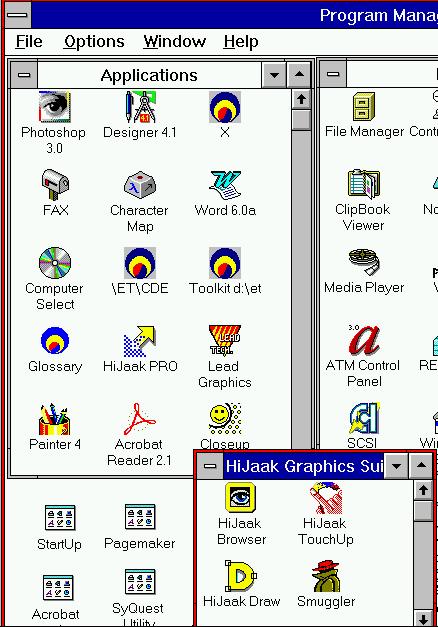
Anyone see the similarities between this[1] from 20 years ago and the iPhone UI + every other mobile OS including Android, Palm, Windows Mobile < 7, Blackberry, Meego, Firefox OS etc.?
[1] http://img.tfd.com/cde/_PROGMAN.GIF
Here's more information if you're interested in the design philosophy behind Metro written by an actual designer who designed Metro like content for his clients' websites.
The principles of Microsoft Metro UI decoded http://www.riagenic.com/archives/487
Going full Metro. http://www.riagenic.com/archives/493
Things you ought to know when designing metro screens http://www.riagenic.com/archives/526
Hopefully all this results in better UIs in the future instead of the tired old jaded WIMP interface and Desktop on mobile yet again with some added touch features and I think Microsoft has taken a good first step here to shake things up.
You can see this mistake in some Android/iOS apps that come with their own custom designs. For instance Twitter on iOS is friendly and all, but after expanding a tweet, to view the full profile of that user, you have to click on that profile's image, while the profile's name is NOT clickable. I always make the effort of going through "what the hell do I click on? every single time I want to view a profile.
So if this still happens in Metro, with the UI giving no visual clues as to what elements can be touched/clicked or not, then your argument is not really valid, being a poor rationalization. In the real world things that can be acted upon either provide audio, visual or tactile clues (or all of them at once).
Also, I agree that the design in Android Jelly Bean tends towards the same kind of flat look. It looks indeed nicer, but it's not as radical. In general, buttons are still buttons, with the exception of things that are designed to be clicked as an after-thought (e.g. the clock widget's primary function is showing the clock, but it opens the dialog for setting an alarm if you touch it, but that's not the only way of setting an alarm, being just a convenient shortcut). There are some annoyances too, like the phone pad for dialing numbers, which just shows some white numbers on a dark background, something that's annoying me greatly.
"authentically digital" -- I am all for it except that most people already have some baggage or notions of how interfaces work (both in real world and digital). It also happens that those in digital world mimic those in the real world (buttons have shadows for ex) or some conventions have stuck that have been randomly chosen initially (links are underlined).
Now maybe it is a noble goal to re-educate the user and I can see that. I remember hating Ubuntu's Unity. Now I like. It has re-educated me. But I also happened to like other aspects of Ubuntu and didn't want to switch to an alternative that why I stuck with it. But it seems a lot of people did and a lot of people will also do that to Windows.
I wasn't sure what I needed to do to get to the "Desktop" mode where it looked like Windows 7, or how to flip back and forth, and which things I could swipe, etc. I felt like it was a big mess because a lot of the UI features that we've come to expect were not there. In contrast, the iPhone and subsequently the iPad were intuitive right off the bat.
To be fair, I'm seeing a lot of this terrible UI experience in other things as well. For example, on Chrome when you are reading a PDF, if you want to save it or zoom, it's not obvious how to do it. You need to miraculously hover over the bottom right corner and then the buttons show themselves, but there are no visual cues indicating that that's what you're supposed to do. It's fancy, but terrible UI.
The same thing occurs on Facebook, where people are just expected to know where to hover in order to show functionality. I don't know where this trend came from, but it's terrible, and I think this article is showing an extension of how we are moving away from all the visual cues and things we've learned about UX in the past 30 years. Sure, it's different but it doesn't mean it's better, especially when it forced people to hunt, peck, and guess for functionality, something that UX is supposed to get rid of.
When I use Windows 8, on the other hand, I spend 99% of my time on the desktop, and the transition to a full screen start menu/screen is pretty jarring. But, honestly, as far as the new UI paradigms go, its not that much of a mess... Try watching a Windows user try to use a OSX for the first time. Or vice versa. Or a mac user trying to use KDE.
I think the real world analogy of the OP is a bit flawed. Babies don't instinctually know how to open a door, that is not something we are genetically programmed for. They learn by watching other people do it, and you learn by trying. There is a low penalty for trying to failing to open a door correctly -- sometimes you push instead of pull -- and that is the point of a good user interface. Does Windows 8 succeed at that? Perhaps, but its not a disaster.
A disaster would be a door that killed you if you tried to open it incorrectly.
Really? I suppose you could have difficulty with it, but the "Desktop" tile is quite clearly visible...
Now within the app one could argue there is a stronger need for affordances, but even there I've yet to encounter a single problem in my use of several Win8 apps.
I find the Win8 interface a lot more intuitive than the OSX interface. But I'm sure others would find the opposite. I suspect a lot depends on your starting point and your predisposition. My four year son figured out most of the Win8 interface in about 5 minutes (literally... at the MS store he was flying through the UI much better than I'd ever seen him with Win7 and a mouse).
That's not saying much though, he just did what all kids do ... tried things out and quickly memorized what worked and it was easy and fun for him to do so because of the touch-screen. He also taught me some shortcuts I had no idea were available, like how to do multitasking by switching between active apps or how to split the on-screen keyword into 2 smaller pieces :-)
In general, kids can learn by trial and error quite efficiently, sometimes in a matter of minutes or seconds and shouldn't be used as a benchmark for how intuitive an interface is, because all that really says about an interface is that it can be learned by trial and error by kinds. Regular WIMP interfaces are indeed not intuitive for kids because the interface is often exposed through hierarchical menus that can't be explored by children who can't read.
That seems like a great benchmark to me. If trial and error gives feedback that allows you to qiuckly learn the UI then that's pretty useful.
At the end of the day a lot of usability is about two things:
1. Consistency 2. Familiarity
If trial and error is effective then consistency is in place. Skeumorphism is about taking familiarity of the real world and applying it to the digital world. And this actually has some use, in particular for UI that users won't interact with much. There's no chance for users to be become familiar with that UI. But for UI that is always there, skeumorphism becomes limiting and can become unusable when you really want to extend beyond what you see in the real world.
Metro says, "The digital world is becoming so prevelant that we should optimize for it, not just the physical world." Is Metro perfect? No. But I think it has the right idea to figure out what works on computers/tablets/phones first. Don't be encumbered by trying to map to physical objects. People will spend so much time with the digital objects that they may spend 10m doing trial and error the first time, but shortly the digital world will be just as familiar as the physical world. Lets not waste the opportunity to introduce the right interactions.
You know how many people here would have had to zoom in?? Are you new to the internet?? /end nerd rage/
Edit: I would also like to point out that HN uses font-size:10pt see: http://ycombinator.com/news.css
On a side note, comparing with door handles is just wrong. We already have a generation who grew up with idea of abstract controls. We have a save button which mostly looks like floppy button. How many 16 year olds know what floppy is?
On a side note, Windows 8 is beta as were: windows vista, winxp pre sp3, win2k, win millennium, win98, win95, win 3.x, and previous. Microsoft had only two versions of Windows that were really usable, stable, and fast: WinNT 4, and Win7.
Though one thing that differentiates them is that the systems we learnt about titles and dates being typically interactable had mouse pointers. I can't quite express why, but it feels less annoying to mouse over something and discover it's interactable (via a change in the mouse cursor) than to stab at text on the screen.
I guess one is a more passive "will this do something if I interact with it" while the other is a more proactive "I'll try to interact with this and see if it works". One results in a yes or no answer, while the other results in a failed action, which seems more frustrating to me.
That all just goes to show that, as you said, it's more complex than simply missing affordances = unusable UI.
We know how to interact with different items because of experience and common signals -- not all door handles are alike, but different interpretations of the 2 major types (knob and lever) are similar enough to visually signal to us their probable use-case (opening a portal in the wall).
Similarly, I could go on about how the "stop, wait, go lights" at the top of windows in OSX are counterintuitive because they are in the same location as their Windows counterpart, but have different functions. It's not intuitive because the same visual signals provide different outcomes.
At the highest level, Metro design feels like a case of design overgeneralization. It tries at once to apply the same look & feel principles in Touch, Desktop, and Web context.
Jack of Many Trades, Master of None.
Of course this can be taken too far. When too many skeumorphic accents are added to a design it can cause it to be rigid and noisy. As the OP mentions, if you go too far from skeumorphism you run contrary to how the human brain works. My favorite user interface designs usually have a very tasteful and well placed set of skeumorphic elements with an overall minimalist design. Tactile, not tacky.
I've been a Microsoft fanboy [1] but just find very little about Windows that I love anymore. I understand they are trying to be visually different from OSX, but I'm not sure this is the right direction. OSX hasn't deviated from 'windows-based' app management and Metro makes its history as Windows almost unrecognizable. As a power user with 2 monitors usually running 2x or 4x in split or quad view, I don't see a UI that will be more adaptable for efficiency and multitasking. iOS handles it very poorly.
[1] DOS > Win 3.1 > 95 > 98/ME > NT > 2000 > Windows XP > .. converted to Apple ..
Take for example the whole crop of metro-style Bootstrap themes and pick an UI interaction element like the buttons, to see an example of a scale of designs between decent micro-skeumorphism and full-flatness. This one http://bootswatch.com/cosmo/#buttons or this one http://talkslab.github.com/metro-bootstrap/basecss.html#butt... sport full-flat microsft style buttons, with no hints of possible interaction, while others like http://inprogress.neuronq.ro/madmin/ show subtle hints of skeumorphism (you can probably google for many other more or less metrofied bootstraps...)
Furthermore, the author talks about affordances and how Metro has none. This is false. Anything that can be touched on the screen reacts to your touch. For example, if you're scrolling down the main menu and your finger happens to press down on a tile, the tile will be "pushed inwards" at the point of contact (even if you haven't released your finger). It's very subtle, but it definitely lets your subconscious know that in the future, if you would want to press that thing, you can. Now it's not an immediate affordance like a door knob, but a touch screen in itself is an affordance for touching, and once you touch then the other affordances reveal themselves.
This sort of thing is why I love HN. Irrespective of the topic, there is always some little gem I find somewhere. I was very sceptical of this claim, so I looked it up. Turns out it is possible:
http://math.ucr.edu/home/baez/physics/Quantum/see_a_photon.h...