At the same time, why does everything need motion? My understanding is that motion should be used if an action subtly changes the UI in a region that's different from where the action was triggered (e.g. toasts)
I think many of these transitions are unnecessary and would feel just as good if they snapped immediately with instantaneous reflow.
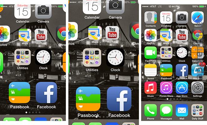
The cursor appears on the left because that’s where the user will actually start writing. I assume that’s where people look, if they know the UI. Having it appear in the middle of the screen and then move over would be unnecessary and distracting.
The stand-in text slides over to the left, to draw the attention of the unfamiliar user.
This is following a more important rule which is "Never make keyboard input timing dependent!" I'm looking at you new Windows start menu and VS Code quick open.
Compare an ordinary pencil (no animations, movement is directly tied to your hand) to a pencil with a pompom on a spring attached to the end. Which is most fun for brief use? Which would you rather write a whole page of text with?
Instant transitions are something I strongly prefer and use in practice. There's no question, I don't want my operating system slowing itself down to a factor (literally) of 1000x, pointlessly fading and jiggling and sliding and bouncing and wiggling. And, as this article points out, animations in operating systems often make a visually illegible mess in the meanwhile.
Animations might be a good idea in theory, but it doesn't seem like anyone has figured out how to do them right.
For a professional tool, animations are anathema. They interfere with muscle memory.
Someone who uses a program continuously can be clicking or typing before a dialog box or button is even in the right position.
My wife drives me MAD with this. She has already clicked the cancel button on a popup before I can even read the first word in the dialog box. This is fine when she is working as the dialog box is just a dumbass notification from some idiot UI designer. This is NOT fine when she has asked me to help debug a problem. I have to force her hand off the mouse so that I can read the damn error message before she clicks it away.
Kinetic scrolling on touchscreens can stay, but only because my finger doesn't have a no-friction scroll wheel.
Would you rather the game have the coolest load screen in the universe or no load screens at all?
Squash and stretch is a whole art style that relies on unrealistic frames.
Other applications are to do things. They should do the thing and get out of the way as fast as possible. Animation-induced delays are fundamentally contradictory with that; they waste the user's time instead of doing the thing.
Reasons:
1) I'm doing that thousands of times per week, I know what's going to happen
2) It's my desktop, there is no one else who might be puzzled by a non standard behavior
3) It's faster.
By the way, it is a GNOME desktop on Debian 13.
Oops, I lied. I was about to click on Reply and I realized that the bottom panel (which on a standard GNOME is at the top) is on autohide with a short transition. Maybe because it's the only transition that I activate with the mouse pointer: I hit the bottom of the screen and while it's traveling the last pixels the bar starts sliding in. It's very fast.
They don't. Most things don't. This kind of nonsense keeps an extra half-dozen people employed, and gives license to a half-dozen other people to smugly proclaim $BRAND's design language is superior to alternatives.
In most of the cases shown, it would probably feel better if the animations weren't there. I clicked the button, show me the thing. Don't do a dance and then show me the thing, just show it!
Often with out it your brain has to rescan the entire page on each refresh.
"Back-in-the-days" you'd click and stuff would instantly happen, and I don't remember anything being more difficult to visually interpret.
On my Kubuntu desktop if I disable all animations (the whole compositor) I don't feel there is an increased cognitive load of rescaning things - but maybe it's my preexisting memory of the UIs and certain baked in UI expectations. Maybe this animated stuff helps people that are computer illiterate? (software made for the lowest common denominator)
The notification area doesn't need animations either, because a GUI is only appropriate for displaying non-urgent notifications. If something really needs urgent attention, you need alarms and flashing lights, not an animated "toast".
The only time I have to "rescan" is if I input a scroll and anticipate a scroll and it doesn't scroll. It has nothing to do with motion. In fact, in that case, I "rescan" even though the page hasn't changed, but because it doesn't match my expectation that it would change.
The only case I can think of where this is true is on scroll, and that barely counts as animation. Anything else is an irritating waste of time.
The absolute worst offence is animating page content on scroll. Great job making me wait on pointless nonsense while scanning your website for the bit I'm looking for. People who do this should be sent to reeducation camps. Both for the animation, and for disregarding 'prefers-reduced-motion'.
https://tonsky.me/blog/every-frame-perfect/toolbar@2x.mp4, for example
I don't think I would have to rescan the entire page to figure out where things were afterwards. Everything's shifted to the right, just like when I open my browser bookmarks.
To hide the user interface congestion exacerbated if not caused by the ubiquitous animation.
Imagine reading a book if the letters just sat motionless. You'd need to be constantly studying the page.
Computer graphics is all about exploiting features of the human visual system. We perceive things differently when they're moving vs. when they're standing still. It's very possible that a "wrong" frame in isolation is the best looking one in a real-time context. We can also pick apart screenshots but these don't capture everything about how the user perceives a display in real-world lighting conditions.
I would draw an analogy to film. A fast tracking shot might look bad on individual frames because of motion blur. A wide-angle shot might make some objects look "wrong" because of optical distortion. But these are still the right choice if they have the intended artistic effect in the theater.
Adding the correct blur to motion makes it appear clearer but seen as a still, it's obviously not clearer. The nuance is correct motion blur appears clearer while guaranteeing it's as clear as the human visual system can perceive moving details at that speed, so no perceptual detail is actually lost. It's a method that objectively improves perception which only works in motion. If frozen, the method breaks. Thus, evaluating motion blurred stills for clarity or interpretability is incorrect.
The rest of the article focuses on details of proper implementation while missing the opportunity to question whether some of these animations should exist at all. IMHO, motion can be a valuable affordance in limited doses but it's reached a point of overuse and, in some cases, outright abuse of the user's visual field and cognitive load. Designers (and their PMs) see it as a badge of 'Refined Modern UX' but it's devolved into a trendy gimmick aping good design without being good design.
It's one thing if the frame halfway through an animation looks a bit "funny", but is still completely logically correct. It is another if the intermediate state of the animation legitimately doesn't make any sense and is just the result of not really caring about what actually goes on during the animation. In that case I'd almost rather just not have the animation at all, or just have a simpler one.
I do like the point the article makes about using ui fidelity as a proxy for software quality, and agree that they pointed out some bad animations. But, I think you hit the nail on the head .. frame by frame coherence isn't the best yardstick for measuring animation "goodness".
I wouldn't mind it, if he had supplied suggested mitigations.
I think every one of those animations are system-supplied ones. Some are likely SwiftUI ones, which heavily abstract you from the iron, and, if other frameworks are supplied, the abstraction goes even farther.
It can be a major engineering effort, to improve a half-second animation.
That said, this is how designers work. I have worked with some of the top designers in the world, and it can be tempting to want to strangle them, as they choose a half-pixel alias as the hill to die on.
But if we try to work with them, it can make an enormous difference in how users react to our software.
Yes, this is a major factor for the regression in overall UI quality and consistency on Apple platforms. SwiftUI aims to make all those fancy animations transitions a single line view modifier rather than 30 lines of manually specified CoreAnimation easing curves and manual animation blocks, but it results in a lot of things just feeling janky, because one-size-fits-all rule and precise polish are fundamentally at odds.
I find AI to feel real nice for pushing delight like this further than I used to have time for as it was never a priority.
For example?
In animation (2d, 3d, stop motion) there are smear frames: https://en.wikipedia.org/wiki/Smear_frame
In this thesis you can find examples from different media, including games: https://theses.fh-hagenberg.at/system/files/pdf/Lendenfeld18...
I'm not aware of any normal software intentionally using nonsensical frames in their UI to aid perceiving motion.
I hacked a Panasonic GH1 to use 24fps in 2014. My newer camera, the GX85 includes this frame rate by default. Movies look more dreamlike in 24fps, due to the magic number of resetting some cycle every 5 seconds (24 frames in 5 seconds is 120 frames). Seinfeld was also filmed in 24fps. Maybe the jokes sounded funnier becaue of that? I don't know, but I enjoy playing games at 20- 30fps more than 60fps for the cinematic effect.
Some of this is also just learned and cultural. 24fps looks like movies because movies are 24fps and you have learned to make that association. In the same way certain color grades and aspect ratios look cinematic, just because that's a reinforced association rather than an inherent fact.
Maybe that’s sometimes true. But, more often, the intermediate states will contribute in a predictable way to the overall look of the animation and if the intermediate states don’t look coherent, then the animation as a whole will be hard to understand.
The examples in the article make this clear. For example, the search box where the initial text animates from the middle while the cursor starts on the left. That disconnects the text from the cursor. There’s no reason for that. It’s just shitty animation work.
The idea that I would defend screen shake is a complete straw man. How do you get from my comment to that conclusion?
I have mine at 0.5x and that feels sufficient, still fast but I can see apps opening and closing etc.
The problem with 0x is that it seems to only affect like 90% of the UI. Certain things still animate, and the cadence feels awful as a result.
At 0.5x the stuff that's mysteriously unaffected by the animation speed setting isn't as jarring.
I would use 0x if it worked properly.
Many transitions in Android are perfectly fine at 0x animation speed. The majority of transitions that suck without animation suck because the pre-/post-transition layout sucks and the transition between the two states doesn't make sense as a result.
It's the same with several of the transitions in TFA. For example, the address bar placeholder text[1] should just be left-aligned all the time. The save dialog[2] should leave all the basic controls in their original location[3] when switching from the basic mode to the advanced mode. That means the "Where:" label should also remain in the advanced mode, and the controls[4] that pop up to replace it should either be moved to the right or below. The search bar should also be moved down.
These are some really basic details and it is my understanding Apple used to not screw them up nearly as badly.
[1]https://tonsky.me/blog/every-frame-perfect/safari@2x.mp4?t=1...
[2]https://tonsky.me/blog/every-frame-perfect/save@1x.mp4?t=178...
[3]https://imgur.com/ZpHLCsv Artist's rendition. Please excuse the minor jank and criminal amount of empty space; I couldn't be arsed to fiddle with the screenshots to get pixel-perfect positioning and shrink the advanced dialog horizontally. Bikeshedding over where exactly the new controls belong is welcomed but irrelevant to the point I'm making.
[4]Is it just me, or are their icons uselessly, impenetrably, unhelpful?
After reading this blog post, I think the rule of thumb should be "If I take a screenshot of your app at any moment (except during animations), it must make sense". I don’t think making sense during an animation should really be a goal, as long as it makes sense before and after.
In an ideal world, it is hard to argue with. Yes, sure it should make sense. But also, please don't spend precious cycles on this unless all the other bugs are fixed, and this animation consistency is truly the most important remaining issue to address.
Maybe I've just spent too many years as a pixel-perfect chasing frontend developer, but things can look very janky if they jump out of place during animations, compared to where they are before/after.
My comment starts with "After reading this blog post"; of course I read it, but it left me totally unconvinced, especially because the author doesn’t bother showing good examples: he criticizes these and then leave you with a random raccoon animation and that’s all. For example, I don’t understand what’s wrong with the Youtube animation; it looks perfectly fine to me.
With MacOS I felt there was a major quality change for visual quality & animations when SwiftUI was used BY Apple for the OS and applications.
I'm not a developer, but it felt there were areas where an icon or window just didn't visually work the way it used to or SHOULD in placement or animation.
The hackish-ness hasn't changed over time: there are so many examples throughout the OS/Applications that I want to say "it was always like that", except it wasn't: Apple set the bar and it was high, the quality was exceptional.
I feel there are a lot of hacks going on with SwiftUI to achieve the same UI placement or animation.
Last quick note I think about often: a lot of analog creation was really hard. It still is. When it comes to digital we've been thinking we'll come back to things later, but never do... we build more bad on top of bad... sadly.
Now it’s 30-ish years later and computers have not recovered the latency increase from compositing, double-buffering, and other attempts to make every frame perfect. If you are showing a frame on the screen that has failed to react to input that already occurred, especially more than about 20ms later, that frame is not perfect. It’s extra imperfect if the user cannot easily do what they’re trying to do while waiting for the computer to catch up with them.
But yes, most of the examples in the article are surely both imperfect in the sense the author meant and pointlessly slow, so there is no dichotomy :-/
- No partially loaded content. - No relayout while content loads.
Holding those as hard rules leads to delay or rejection. Instead, while I agree it's better to have everything up front, gracefully handling cases when we don't is important, and some degree of responsiveness, even with partially loaded content, often makes for a better experience for the user than a delay.
Just be up front about it and find ways to keep continuity of relationship and smoothness. Diffeomorphic mappings are your friend...
Wouldn't be the worst takeaway from the article. You should avoid animation for animation's sake in general. Imagine if we animated letters flying up from your phone's keyboard into the text field as you type them for example.
On a personal level, if thing works - I say, cool, lets focus on something else now.
But I have worked with people who are similar to the author and we will get into the conversation:
    - they: wait, but the bundle size is 2.4Mb, it can be improved a lot
    - me: by how much? and we have 10k users/day and we have cache policy setup
    - they: we can reduce it to 1Mb, imagine saving 10k*1.4Mb every day
    - me: yeah, but its not costing us much, if you focus on making it perfect your salary will cost us 2 years of outbound traffic cost.
    - they: no, but its not perfect
How do I get there? What are the resources I can read and learn from to look at things to make them perfect?
The issue with “premature optimization is bad” is that some see it as a permission to not optimize at all. Hence you eventually end up with a system where everything is bad.
—
Although for some of us being obsessive-compulsive weirdos this is the only way of life: an itch that keeps on physically scratching until resolved.
“Be guided by beauty. I really mean that. Pretty much everything I’ve done has had an aesthetic component, at least to me. Now you might think ‘well, building a company that’s trading bonds, what’s so aesthetic about that?’ But, what’s aesthetic about it is doing it right. Getting the right kind of people, and approaching the problem, and doing it right […] it’s a beautiful thing to do something right.”
Absolutely, but on the other hand businesses operate with lots of broken windows as well, and they are fine with it.
Dilemma I am having is, on one side, business needs my best judgement for today and short term, because this is how most businesses survive, on the other hand, on a personal level I feel like I am stuck making non-perfect decisions, hence I can't even think about perfect world, because I am not training that part of my brain.
In that bandwidth case I'd be annoyed by the waste which kind of pervades software already, and it'd feel great to know at least we countered it a little bit.
That's the barrier to understanding right there! This also makes it easy to make up 2x cost estimates to justify not improving anything
I think this is a weakly presented argument. The article doesn’t actually present stronger alternatives or even why anything shown is negative to the user. It might be negative but otherwise this is the same vacant critique that is levied by pointing at smear frame or transitional points in media to critique it.
The user also has an untenable maxim. Every frame must make sense? I would posit this is impossible, or I’d ask the author how they’d handle window resizing while keeping every frame perfect.
I also think the author themself finds it easier to point out flawed frames (again without actually explaining why they’re issues) than doing as they say. Tap the header links on their blog and see the animations play after the click is complete. Or go see their own UI projects and see how text and objects don’t stay within their containers. Surely someone saying that this is a tenet that should be followed could demonstrate it themselves.
I think this is just a very hollow critique on their end.
A more competently written article would have focused on why anything shown is bad for the end user, and how they might handle it instead. A good critique should actually include some substance and point to more than just the what, but the why and how.
The article is presenting an idea, not a solution. You've failed to see this and have constructed several strawman arguments in order to critique it.
Most importantly the article does not present itself in a definite sense - it is written with care to say "I think", "Next thought:", "Probably", "So yeah.". This article is a person sharing what they are thinking, and unlike many of my thoughts - it is a fairly complete thought which is clearly sparking many other reasonable people to think along similar lines.
The author doesn't present the solution - but there is no reason they should have to. What an odd and unreasonable bar you set.
I also don't find your attacks on the authors site particularly endearing. The taste gap is well known, and punishing someone for their conceptual contribution outstripping their practical skill is quite... distasteful.
A more competently written critique would have been more charitable and in the spirit of this community.
The article establishes an arbitrary standard, provides examples and criticizes them on the basis that they don't meet that arbitrary standard, and then... nothing.
It is easy to criticize something from the outside. Much harder to dig deep, learn the material and understand why it produces the status quo, and then propose workable solutions. That's where the actual value lies.
Can it be possible to make everything during a user interaction perfect looking? What does that mean?
That was part of my original comment that you skimmed past rather than engaging with. So if you truly believe this should be a starting point of a discussion, then why not even bother taking that point to build a discussion point off of?
I’d also argue that this is not presented as just an idea. That is disingenuous. The author clearly writes “I call these situations “The technology has outsmarted the programmer” “
That is more than just a discussion point but a levied criticism at the skill of the people making things. In turn therefore they’ve set the framing of skill as part of the discussion and I don’t think it’s unfair to point out their own lack of ability to execute to their high standard.
But let’s go by your standard of saying that we shouldn’t take the authors own execution or their own words into consideration but only focus on the core idea they present.
Then that still leaves defining what they consider every frame being perfect. What are the bounds of that statement?
For anyone curious, https://www.thisischris.dev/projects/project-6/
If you're curious, you can see it here: https://www.thisischris.dev/projects/project-6/
The improved versions where the elements actually transform into each other, sharing the same visual real estate, is so much better.
The save dialog, albeit a little shakey, is nowhere as chaotic as in your example. The buttons in Notes move between panes in a perfect seamless manner. Albeit the animation occasionally glitches out when you repeatedly focus and deselect the Safari bar, the cursor is perfectly timed with the text, only fading in after the text is done moving to the left. The Preview bug must be something recent too, I can't reproduce this.
I miss it when companies like Apple, Sony, and IBM paid attention to the smallest details. Apple in particular earned its current valuation with the iPhone, an all-touch device that did nothing extraordinary compared to Windows Mobile and Symbian PDAs of the time (and was in fact functionally lagging behind compared, failing to even match the then-contemporary feature phones in some areas) BUT one that you didn't actually want to smash against a wall after a few minutes of use. Now these animations are bringing back exactly the Windows Mobile and Symbian vibes.
Remember how happy Steve used to be with OS X animations? He would replay them on stage multiple times, in slow motion. These though, these would have the people behind them face the fate of the iPhone 4 antenna man.
The move away from skeuomorphism made it acceptable for UI elements to do things that make no sense.
Examples:
1. https://photos5.appleinsider.com/archive/13.06.15-Homescreen...
The status bar is unreadable on in-between frames, whereas in iOS 6 there was no such problem.
2. https://youtu.be/XawiZc8qmWA?si=vqT-JEYf0NDp8I9o&t=461
Play it at 0.25x and notice the app opening animation.
In iOS 6, the status bar is never unreadable for a single frame.
In iOS 7, the status bar is first obstructed by home screen icons animating under it, then obstructed by the dock animating over it, and finally it fades away while a new status bar is drawn on the app that is being opened.
It irks me to no end that iOS handles the status bar this way to this day. In the app switcher, every app card is drawn with a blank area at the top [1] where the status bar would go, when really the status bar should be permanently at the top and the app card should not include space for the status bar (webOS figured it out before iOS 7 [2]).
Snow Leopard was the first to integrate iOS's CoreAnimation framework. Nearly all animations now are based on that. Before, the CPU manually updated the sizes and positions of things, frame by frame, in a loop. This is how you'd program a Game Engine.
After, with CA, state-change property models are sent to a different process entirely which does its own interpolation to animate the UI at a higher thread-priority than any other process in the operating system. This is fantastic if maintaining 60+ FPS at all times, even on an iPhone 1 or 3G with less power than you'd have in today's AirPod chips, was a central requirement. (And it was, the first iPhones dominated their competitors in terms of input latency and framerate)
But programming CoreAnimation is much more complicated and easy to make mistakes in if you want "every frame perfect". Trust me, I made a lot of the animations that shipped in iOS 7 (the Calendar app is full of them, OS level transitions for the core chome elements of iOS). It took nearly a year of meticulousness to get things looking ok. In the years since I left the company, I've noticed these transitions get more and more janky and buggy and full of artifacts. Clearly, whoever replaced me doesn't have the same eye and sense of craft. Oh well.
By having a clear animation which indicates where the window is being moved to, it’s obvious where the window went and thus how to recover it.
So what I don't get is the need to have half-assed animations in a half-assed app. You can add them once everything else is perfect.
It had nothing to do with "if I take a screenshot of your app at any moment, it must make sense." As others here have pointed out - this entire article is very poorly conceived.
> Wayland is talking about the technical side of things (modern GPU stacks are very complex and Wayland is trying to take control back) but it could be applied to UI too.
Old Apple knew not to overdo things.
Instead, we get a zooming in/out raccoon (making fun of the reader, IMO) for recognizing this problem via the OP author.
Maybe it's just a really hard problem to solve across all devices & latencies... Perhaps more time needs spent on "problem solving" vs "problem description".
Pointer should be async with the rest of desktop anyway, unless the system is broken.
I just look at the largest tech companies in the world that with their unlimited finances cannot produce software that isn't glitchy like this.
> This creates a false feeling that something subtly changes when you switch between modes. And you know what? I don’t want my UI to give me false feelings.
The animations in iOS 26 and MacOS Tahoe feel wrong. Almost like an uncanny valley. It makes the UI unpleasant to use.
The result is that the indicator is not really indicating what it's supposed to (since it's out of sync with the view): It's indicating the old view when I'm already in the new one, and then it's indicating something between the old and new views, when clearly I'm not between views at all. So it's completely wrong for the entire animation until it finishes.
In most UIs, it feels like they're animated for the sake of being animated. Very rarely do I say "Ah, I'm glad that was animated, because the transition would be confusing otherwise."
Things like this are part of the reason why operating systems that used to measure in the tens of megabytes now measure in the tens of gigabytes, and require chips 1000x more powerful in order to MAYBE reach the same level of snappiness (although usually not).
While it's been surprisingly easy to animate things, I've spent way too long trying to synchronize the movement of different components, to make sure things don't jump around, etc. Window content snaps to size while the borders animate, the shadow doesn't refresh alongside the borders, that sort of thing. Maybe I'm missing something in terms of how I should set up my code, or maybe it's a hard problem to solve automagically in a framework.
In some cases I basically gave up on slow animations (which make the issues obvious) and rely on fast movement to hide the imperfections - but it creates a less polished feeling as the article points out.
The UI code needs to be structured with animation in mind, with hooks in the right places. And to do that, you need to know what is likely to be animated together.
But what ends up happening is you encapsulated a few of the moving pieces in abstractions (e.g. "toolbar", "sidebar"), but you want to animate stuff within. You end up copy+pasting animation logic inside each (now leaky) abstraction and duct taping it all together. UI abstractions are hard!
(Yes, on apple platforms there are transition blocks which will capture changes to the entire view hierarchy, but then the battle becomes preventing animations on stuff that shouldn't change!)
- An animation that prevents the next thing for enough milliseconds that it causes input loss. Example - the iPhone calculator that wouldn't accept the next digit until the last press was done animating.
- Animation that moves active elements like buttons out of or into the way as you are clicking/tapping, causing an errant click.
- A lack of animation or visible context change that causes you to not realize the screen has changed. This sometimes gets me when I click another section or chapter in some kind of two-pane interface and the other side updates at a random time.
- Animations that take so long that you can't work at the speed of your hand/eye/brain coordination.
- Animations that feel like you're trapped in a liminal space until they're finished, which I think is basically the subject of the article.
Better things:
- Coordinated animations that accentuate updates, especially when you didn't request them. Reordering a leaderboard, adding a new item in the middle of a list from a distant update, etc.
- Animations that cover for slow processes. If we expect a while (but not too long) before a request and a response, an animation can be better than a spinner or nothing at all. It might help prevent the rapid clicking that some users do. I prefer if it doesn't spend a whole second when the response comes back in a tenth of a second.
- Stylistic animations that don't affect how you work. The genie effect and the bouncing app animation of old Mac OS X come to mind. A key feature is that you usually can turn them off.
- Sequoia's Notes had perfect sliding animation.
- Safari's URL bar seemed the same. (Though I think it's more a placement issue, not animation issue. They could just put a placeholder at the end of the bar, not at the center.)
- 'Save as' dialog had a problems with sidebar, but not janky as much as Tahoe's.
- Zooming in preview app worked fine.
It never fails to astound me how some people will fawn over "delightful" transitions. I guess I can understand it in the sense that it is an easy thing to help communicate the perception of high quality to the broader business.
I’d love to see example of “bad” solutions made “good”.
As a result, I feel like solving this problem is easier said than done. I can’t think of a great way to solve many of the problems presented here. (Admittedly, I’m not a UX designer, so the bar is low for me.)
Often the animation itself is the trick. The backend is too slow to deliver data in time, so you start some animation to hide the latency. If you make a screen capture during that time, of course you won't see the data because it is not there yet, that's the trick. Ideally, the back end should keep up, this way, you don't even need an animation, but sometimes, you have to make do with what you have.
Wasting processing cycles making things look pretty yet it almost always results in a worse situation for the user.
It's easy to criticize.
Lazy, lazy development.
"Job done, boss! Ready to ship to... checks notes... 3 billion users!"
"Did you test it?"
"Test? I thought we had a QA department!"
"Nah, we fired all of them a decade ago. You're the QA now."
When iOS first launched, some of the brilliance was in how UI elements transformed into one another—a title in the title bar becoming a "back" button on the left, for instance. There were no intricate morphs, just a simple cross-dissolve between two elements shown briefly at the same time. It read as meaningful without being literal.
The Crop/Adjust example doesn't hold up here, because the two modes don't share a focus. The crop animation is deliberately different: it emphasizes the cropping controls at the edges of the image that you might otherwise miss, prepping you visually for the task and tying the controls into the image workspace. Adjust mode has no direct controls on the image itself, so the transition out should differ. The mismatch is the point, not a flaw.
For most UI, you don't need pixel-perfect morphs between small elements. The real job of animation and behavior is to convey meaning and context. Make your transitions pixel-perfect and most people would never notice the difference.
I get that this is the way of the world, but I still think we'd have been be better off with, you know, real attention paid to classic free/open source ideas (like not breaking backward compatibility.)