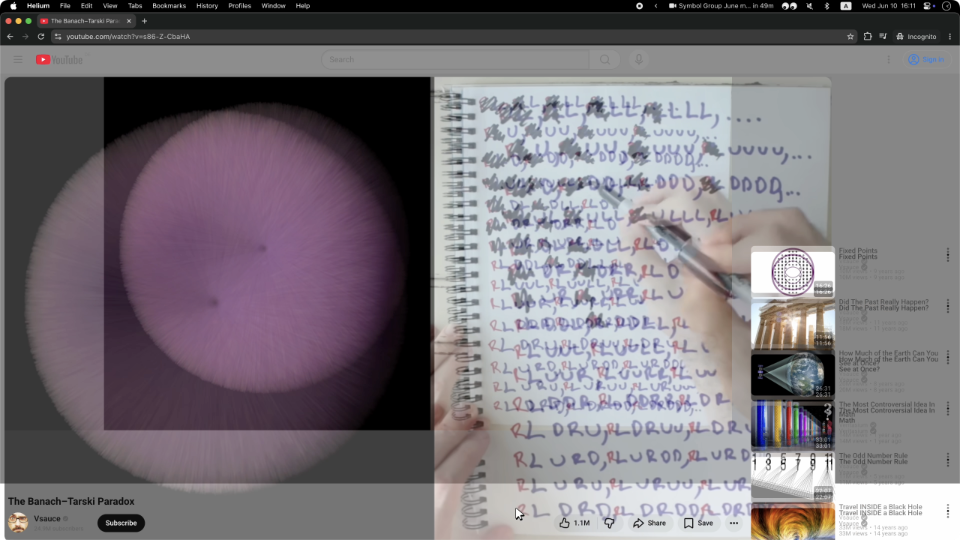
Look at the youtube example - it has two pieces of UI animating from from a start point to an end point, and the paths are such that they momentarily overlap. There's nothing buggy or janky about it in motion; TFA is just saying that if you ignore the motion and take a screenshot mid-transition it looks odd. Same complaint as what GP describes, and silly for the same reasons.
I agree the YouTube example isn't the worst one, but also at the same time, I don't agree with you that there is nothing buggy or janky about it.
https://tonsky.me/blog/every-frame-perfect/youtube@1x.png?t=...
There is no logical reason for there to be two copies of the video rendered at once. The video is literally resizing into position, while all of the UI elements shift around it. Why would there be more than one copy of the thing that is resizing?
I will relent on only one thing: "If I take a screenshot of your app at any moment, it must make sense" is too strong of a statement on its own. The context that it is a screenshot of an animation is important, just like cartoon inbetween frames. However, I think if you're being generous with interpretation you can allow this to be implied.
That said, I think it's fair to hold most practical UIs to a different standard. Prioritizing amusement leads to a lot of strange non-ergonomic places.
GP's point is that those frames aren't broken, but they're intentional and calculated, and so they're not even relevant here.
Impressive and creative yes. Viewable? Not to me.