The A-squad design team left Apple 15 years ago.
The B-squad left 5 years ago.
What remains is a sea of Gen Z designers who weren't yet alive when the foggy glass of Windows Vista seemed like a good idea.
Meanwhile, the talent wars are raging, with every AI company offering 7-figure salaries to the best of Apple's prodigies.
Apple is now the old guard. They're no longer cool, and as a public company, cost controls are too stringent; they can't pay as much. What is Apple to do?
They can give the designers a sense of ownership. It's not a question of how (un)qualified the team is; it's a retention play.
Is the design good? The A and B squads would say no. But this is the best Apple can do these days to keep critical talent engaged.
They'll burn a cycle re-learning fundamental lessons in accessibility, retain talent, and cling to the hope that next year they'll have a midwit Siri than can book a flight with a decent looking UI.
One of the lead designers on Liquid Glass is Chan Karunamuni, who's been at Apple since the early 2010s. If you search for more of the names of the design presenters at this WWDC, you'll find a lot of people with similarly long tenure.
So the theory that it's all Gen Z designers with no experience or talent seems pretty weak.
So I'm sure there's 3 Gen Z folks in a trench coat approving the work of those other Gen Z designers.
All this is just delegating to flavor of the domain "higher powers" instead of trying to grapple with the complexity of reality.
We just have to wait for Gen Alpha to bring back flat design 10 or so years from today.
https://news.ycombinator.com/item?id=44269225
Edit: this appears to be a hot take, so I challenge others to take a step back and consider other protected classes and anti-discrimination laws. They don't call out one race or sex, they say they're all protected and the very act of discriminating is not allowed during hiring. They don't say "you can't discriminate against white people or men but others are fine". That's what the ADEA does.
Look at John Romero, he knocked it out of the park with Doom 1, 2 and some of Quake, but all his projects after have been flops of catastrophic proportions. Look at Jonny Ive's last design mistakes at Apple compared to the early successes that were perfection from all aspects.
Most people can't pull success after success forever, they always bottom out at some point then decline, some sooner than others, especially in a fast changing field like tech. So it's a high chance those senior higher ups at Apple are now dated and out of touch, but still have the high egos and influence from the bygone era. Happens at virtually 100% of the companies.
As a tangent, HR departments are very often affected by this as well. As soon as you have large enough HR, they will start generating ideas about how to waste other teams time. They have to justify their existence by organizing some events, trainings, activities, even if they actively harm the bottom line.
First, there will be those who are devoted to the goals of the organization. Examples are dedicated classroom teachers in an educational bureaucracy, many of the engineers and launch technicians and scientists at NASA, even some agricultural scientists and advisors in the former Soviet Union collective farming administration.
Secondly, there will be those dedicated to the organization itself. Examples are many of the administrators in the education system, many professors of education, many teachers union officials, much of the NASA headquarters staff, etc.
The Iron Law states that in every case the second group will gain and keep control of the organization. It will write the rules, and control promotions within the organization.”
But there is no limit to how much additional security you can bring, so they do bring all of it. Recently had to get new Tomcat distribution deployed via Chef tool, of course our own package of it. Now it runs under 2 unix users, each owns various parts of Tomcat. Main startup config (options.sh) is owned by root, to which we will never ever get access, one has to do all changes in a complex approval and build process via Chef. Servers disconnect you after 2-3 mins of inactivity, if you deal with a small cluster you need literally ie 16 putty sessions open which constantly try to logout. And similar stuff everywhere, in all apps, laptops, network etc.
All this means that previously simple debugging now becomes a small circus and fight with ecosystem. Deliveries take longer, everything takes longer. Nobody relevant dares to speak up (or even understands the situation), to not be branded a fool who doesn't want the most security for the bank.
I would be mad if this would be my company, but I go there to collect paychecks and sponsor actual life for me and my family so can handle this. For now at least.
Alternative approach, also from a financial services world: VMs are created with a DSL on top of qemu/firecracker, containers with Dockerfiles. Cyber are part of an image review group alongside other engineers that validates the base images.
But: no interactive access to any of these VMs at all. There’s hypervisors running on bare metal, but SRE teams have that scripted pretty well to the point a physical server can be added in a day or so. It does mean you’ve to be serious about logging, monitoring and health.
This is one instance where we got it right (I think). We do have some legacy servers we’re trying to get rid of. But we’ve learnt we can run even complex vendor apps this way.
Conway’s Law comes to bite us in other ways though! Like I said, it’s a bear.
The poster above is right in that if you create a design team they will want to justify their existence but it's the controls above and around it that is responsible for keeping them in check.
I remember a time when microsoft came around the corner with flat design on their phones and the iphone all of a sudden looked outdated. They adopted a flat look shortly after. They did that pretty well.
Thirdly and most important: noone does gaussian blurs, macro and micro transitions better than apple and it‘s a key part of their success. They are taking it one step further now. Even if it doesn‘t improve the experience for users it could help distinguish themselves visually. And there is nothing wrong with that.
I think a lot of folks here would say that there is something wrong with degrading the user experience to achieve a win for branding.
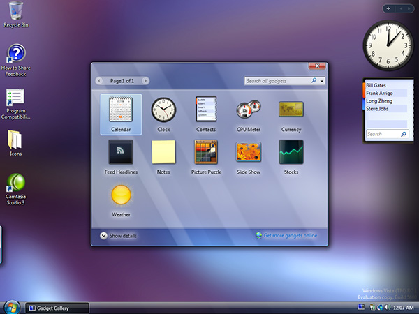
There were parts of Vista that were mostly glass and they still looked fine. The widget picker comes to mind: https://istartedsomething.com/wp-content/uploads/2006/09/gad...
What Apple demonstrated in their first OS demo is not yet finished, and I'm sure they'll add some more frosted glass efects for legibility and such. What they show off in the video looks fine to me, and the explanation that comes with the visuals show that at least from a designer point of view, all of the weird stuff that jumps out in the macOS demo was violating the design principles.
I loved Aero and I bet once Apple adds the diffuse glass to the places it need to for legibility, I'm sure this will look great too.
Apple are much further behind with Siri than they realise.
I think Apple realises it way better than you’re giving them credit for. They simply weren’t able to do anything about it yet, even though they’re clearly trying.
Maybe they just made a bad UI/UX change.
With how badly Apple's VR headset actually sold, I don't think they're going to for a unified AR-first approach just yet. Then again, Apple did think their VR headset was a good idea, so maybe they're just high on their own supply.
Can we stop blaming Gen Z for everything? This happens with every generation.
Is that because a public company or because Tim Cook is a bottom line finance guy?
"they can't pay as much."
Why not? Thought apple had enormous cash reserves.
Does the A-squad include Steve Jobs, who seemed to have been a fan of skeuomorphism:
* https://en.wikipedia.org/wiki/Skeuomorph#Virtual_examples
Does the A-squad include Johnny Ive, who gave us butterfly keyboards and the Touch Bar (where (IIRC) the initial revision of which did not have a separate physical key for ESC)? Though Ive did get rid of skeuomorphism.
By replacing skeuomorphism with minimalism, Ive's anti-skeu was a cure nearly as worse as the disease. They were right to move away from skeuomorphism, but they did so recklessly, giving us a UX where almost all cues for an element being "clickable" were stripped away.
Ive hasn't done a single impressive thing after Jobs' departure. To the extent that Ive did anything noteworthy, it was with Jobs as visionary, product director and tastemaker. Outside of that relationship, his work has been derivative of prior Apple design success, or embarrassingly wrong-footed. Factoring in the lag time of product cycles, it's astonishing how rapidly Apple improved after Ive's departure.
> it's astonishing how rapidly Apple improved after Ive's departure
Is there another Apple? What improvements are you talking about, leave alone astonishing ones?
Perhaps people can argue with me: I claim skeuomorphism jumped the shark with the pseudo reel-to-reel playback UI in ... was it the Podcasts app? Or maybe people think it was Notes with the torn edge along the top margin.
Regardless, skeuomorphism seems to have gone too far at some point. Perhaps became overly cute, overly precious, pretty-pretty.
Skeuomorphism was said to have been the thing in early GUI computers, as metaphor or real objects, that helped early users to those interfaces understand them. Dragging a file icon that looked like a dog-eared piece of paper to a trash can icon on the screen (to delete the file) — the most obvious example.
I suspect by the time the Web came around, users had to become more comfortable with being bombarded with all manner of wild UI paradigms and they learned to more or less cope. Skeuomorphism, like training wheels, were perhaps not really needed as much as they had been a decade earlier.
It has been a downward slope since then after the momentum dissipated after his death.
Turns out, I didn’t like the operating system Apple made. I liked the OS Apple made while being curated and directed by Steve Jobs. His taste matched mine in a lot of important ways.
I have no tastes in common with Alan Dye.
When I read "liquid glass" and saw a thumbnail of it I thought I was going to be impressed. Well, no.
Also that Finder screenshot is hilarious, I'm not even sure it's real.
Like this it’s really just another try in recreating glass which never made sense to be used in UI.
It is beyond me, how this got chosen as a way forward - taking visual design which makes sense in a VR/AR environment, to ruin their rectangular display UI.
It will make implementation way more complex than it is already and worse it will set off an avalanche of badly done imitations creating a mess throughout all touchpoints across companies taking years to clean up again - just as I thought that UI design finally reached an acceptable level of maturity.
Sad, really sad for a company like Apple to throw out precision, clarity and contrast for “effect”.
Sad.
Liquid glass puts UI second (feature cues) in favor of UX (interesting experience), harkening back to skeuomorphism but misprioritizing UI. I appreciated in Jobs's time how skeuomorphism was used to reveal more features, and give new users simple cues.
Now there is this idea that there is a higher percentage of advanced users, but since now there are MORE users (anyone with a screen), and continual change, I think there is still a large percentage of less advanced users "harmed" by prioritizing UX over UI.
What works for augmented UI doesn’t in a desktop, mobile or 10ft experience.
It’s a terrible mistake porting something to an environment where transparency isn’t helping but brings about the opposite effect.
These complicated lenses distorting light from all directions look fancy in a designer portfolio, having them almost everywhere… I’m not sure how it will work out.
In contrast, the original material design was quite intuitive, iirc they based their design on paper sheets, much simpler, and much more common in our day to day life.
I still have some hope it will work out great, if Apple can take the accessibility visibility issues seriously, and developers using it in moderation, it can be great.
Minimal visual cues, analogous (not photo-faithful) to real-world physical objects made GUIs a revolutionary advance in computer use. Both flat design and this new Apple junk (which, let's face it, is a return to hated and nonsensical skeuomorphism) ignore the very concepts that made GUIs so usable.
Apple has prioritized style over usability for decades now. Remember the godawful hockey puck mouse and how stubbornly they clung to it? It shouldn't be a surprise when Apple picks a solution that looks cool but is worse to use; that's who they are.
They are now. A couple of weeks ago I bought an Apple keyboard from the late 80s on EBay (M0116 model). After a quick solder job wiring half an S-Video cable to a ProMicro, it now talks USB, works perfectly and is one of the best feeling keyboards you could hope to use. (One of the later iterations with saner cursor key placement would be better still, though...)
It’s regular “you”s and “me”s there now.
US corporate structure absolutely kills the spirit in the kind of people who could make a difference. And when it doesn’t, it kills the ability of those people to be promoted to a position of influence.
I am not a huge fan of Steve Jobs, but he did understand UI and UX better than just about anyone, and he stuck to his guns.
“I can’t believe this is coming from Apple” is something I said when I saw iPhones with a camera bump. Camera bumps are a fucking abomination.
It gives off a weird 2.5D HUD effect that works well enough in first-person games (which is basically simulating AR), but is just harder to read and kind of unmoored from the main UX on a flat screen.
Joking aside, “design” clearly supplanting ease of use
At the same time remember how much of a struggle it was in the 90s to show transparent layers? Good times
Our visual system is optimized, rather extremely, for understanding 3d scenes under the simple perspective model that our eyes are based on: x' = (x * f) / z
Outside of that 99.999% experience norm, that are brains are so used to, is disconnect and discomfort. If you've ever put on a new pair of glasses, with a different prescription, you'll understand exactly what he's talking about: depth offset and dizziness.
The disconnect is why refraction and lensing is interesting to look at: the model your eyes are used to seeing, for the world behind the thing, is not normal.
When we see 3d movements that don't correlate with what our inner ears, the response is that our body assumes something is wrong, we have ingested a toxin, and a nausea / vomit response is created.
There is something visually jarring about this Liquid Glass UI, and it's possible it's related to movements not correlating with an internal frame of reference.
I guess I'm a weird outlier and that's fine.
Do you have anything to back this up? Seems a lot of your argument is hinging on this point. I’m skeptical that 1. this is true, and 2. Apple wouldn’t have considered it if it were true
Apple's vaunted UI has always been crippled by some stupid decisions and practices. But exhuming the idiotic "transparent" UI fad that died 20 years ago must rank among the worst.
What Apple just rolled out is embarrassing and depressing. You know it's bad when a thread like this is full of well-written, incontrovertible takedowns and nearly devoid of apologist drivel.
My background is a mid tone warm photo, not dark or light, icons got a white foreground that’s very hard to read against their translucent background.
The second thing I noticed, is that when I’m scrolling a webpage, icons now switch color randomly (according to the bg dominant color) and that’s distracting.
The last thing, is that my phone is getting warmer and scrolling has become less fluid, choppy. And that’s on the 16 Pro Max.
What I like the most about this design though, is that it become invisible and let you focus on what you are reading, watching.
Perfect to focus on content, but the user interface has become sometimes unreadable and when you need to interact with it, put the flashlight in a hurry, you are scanning through instead of instantly recognizing stuff. But maybe that’s just new habits to make.
Happens with almost every beta, particularly on first install. The later betas typically improve, and even the current ones often get better if there was some new indexing that had to happen.
I’ve been running since the keynote and my phone was initially warm but has calmed down now.
What I want are UIs built more like E readers or newspapers, with screen updates taken seriously.
The transparency is a mess. I can’t believe how far backwards this is. Trying to visually pick out icons is harder. Icons without transparency have this weird edge enhancement effect going on like a bad photoshop filter.
I seem to be having a bunch of new web issues. Popups aren’t handled as well. And there are weird refresh issues when zooming on web pages.
Some of the work appears so shoddy that I wonder if it was done by code mods or something. The Passwords app on macOS looks bizarrely cluttered and cramped, with all kinds of bad artifacts when you resize the window. I know it's a beta, but it's so bad that I really wonder if a human looked at it for more than a minute before they shipped it out.
I'd probably do that after the first day of using it.
I’d wish that the computation load / battery drain would also be reduced by reducing the transparency. However, I think that the computation will still take place.
I guess the M-series chips are up to the task, but still seems like unnecessary computation I can't turn off :(
But this was a few days ago and I can’t remember exactly which video it was mentioned in.
This has been Alan Dye's modus operandi since he took the helm on software design and the problem is it does not scale to larger devices. On a phone and mostly on an iPad, where you're far more likely to be consuming content anyway, it's not the worst thing to shoot for.
On a Mac it's infuriating. I'm working on anywhere from a 14" to a 27" display, both have a wealth of pixels to work with: why are you hiding controls? You're not making anything simpler, I need those buttons to perform the tasks I'm trying to do. All you've done is make it less intuitive, less discoverable, and added extra clicks.
To be honest it has some problems even on the smaller devices too, mainly in the form of lack of visual affordances. So much functionality you would never discover unless you'd seen someone else do it or triggered it by accident (and even then might not realise what you've done—just yesterday I had to help my mother get out of private browsing in Safari because she'd swiped across to it and didn't know how to get back).
I always found controls in previous versions of iOS to be lacking. I hope the negativity doesn't make them backtrack because this is a _huge_ improvement.
Vista had a black taskbar with some transparency, 7 made it glass.
If you maximised a window on Vista, the maximised window's border became dark (black/with an accent colour tint) and opaque, the taskbar and sidebar went opaque as well. 7 got rid of that.
to understand the motivations, look at the outcomes.
For example the designer in this video says no glass over glass but the control center and the lock screen are glass over glass. It looks cluttered and the legibility is horrible, as predicted by the designers here.
They probably just compiled the old UI with the new liquid glass framework without going through the design considerations that are required by the new system.
By the time of the release, it will look great if Apple doesn't shy away from letting their developers re-work everything.
What I wonder now is, why hadn't that happen already? Don't the internal developers have access to the new design and the people behind it until the last moment? If the designers of Liquid Glass and the designers of the locks screen and the control center have talked, they would have known the principles described in the WWDC video and avoid all that.
I was a student taking an android dev course when the first iteration of material design came out. My classmates and I had the running joke of “this is an amazing design guide, someone should send it to google”.
You’d see even the most specific principles being broken, the left menu in gmail for example interacted with the header exactly the opposite way the guide said it should.
Yes, they iterate through versions and drop things that don't work with their design philosophy (parallax effects on iOS 7) but the first major version they released always seemed well thought out and solid from a design perspective.
I don't get that feeling from this redesign. I'm sure that this Liquid Glass redesign would look and work great next year or the year after that or even by the public launch of iOS 26. They'll fix the issues with readability, control center etc. But the fact that the first version of Liquid Glass doesn't look good is what's problematic.
If anyone wants to refresh their memory: https://youtu.be/6jBK3Dggkwg
Not to mention way more functionality added to the OS that year than this.
However, it is also true that Apple's QA gets bad lately. They let features creep but lose attention to detail so there are more small glitches recently. Along with just bad design, like surely the old Apple would not allow mouse cursor to be "lost" in the notch on the new MBPs. Maybe it's the trend. They become less and less about getting it right and more about getting it out and then reacting when users complain.
Windows Vista had a translucent UI nearly two decades ago, that should be enough time for Apple to figure out if it's a good or bad idea to copy ;)
There's also plenty of computer games which experiment with translucency in their UIs.
If the Apple UI designers would look out of their ivory tower from time to time they could have realized that translucent UIs are an exceptionally stupid idea after the very shortlived "oooooh fancy shaders" novelty effect is over.
I predict that in 2..5 years Apple will go back to regular opaque UI elements with a slight 3D hint to separate items that can be interacted with from non-interactive items.
Windows users might be lucky when Microsoft skips that fashion cycle by saying "been there, done that".
Given Microsoft’s track record, I’d expect worse, not better. Metro might’ve looked good on phones, but the desktop incarnation was pretty ugly (it was basically Windows 1.0 with antialiasing) compared to Aero. It would be completely on brand for them to do something like ditch their current reasonably nice looking Fluent in favor of something hideous and then stubbornly try to make it work without changes for the next decade before finally relenting.
This reminds me for some reason of my preferred answer to the Microsoft interview question "Why are manholes round?" A: Because the average cross-section of a human being is roughly circular.
A dome is:
1. the best shape for taking stress from very heavy trucks putting all their weight on them without the manhole itself gradually bowing, and
2. is best at transferring that stress equally into the manhole wall (cast concrete cylinder) itself. (A square manhole + manhole cover would disperse force unfairly, potentially gradually cracking the manhole walls / requiring stronger walls. A flat circular manhole would disperse force upon the center of the manhole equally onto the manhole walls, allowing for lower-material-cost manhole walls. A domed manhole cover additionally disperses force from most points on the dome equally into the manhole walls — important, as vehicles won't necessarily be driving over the exact center of the manhole!)
...but really, this is the wrong direction to work in. The original reason manhole covers are round, is simply that the walls of a manhole are best made round, for the same reason drink cans and barrels are best made round: a closed cylinder is great at taking compressive force from a lid above; passing it through as soft, equal tensile force through its walls without buckling strain; and then turning that force back into an equal compressive force on the floor / subsurface.
Most manholes are generally small closed cylinders acting as maintenance areas for nearby pipes, with the pipes coming in through the sides of the manhole walls, and the concrete bottom floor of the manhole resting upon compacted earth.
In this situation, any shape for the manhole other than a cylinder — if driven over for years/decades by cars — would gradually pound the uneven force acting upon the manhole's floor into the earth below, unevenly accelerating soil subsidence. Eventually, you've created a sinkhole below the road, right outside the manhole wall on one side.
I’m surprised Apple does not communicate this fact more clearly to people, as many seem to be totally unaware of it (I do remember seeing notifications on macOS about that though)
IT'S A BETA! Seriously. Of course it's slower. Your phone will run hot. Your battery life will drop. And in three months when it's released it will run nicely - just like each of the last 18 years.
Modern Apple presentations are just like being read some marketing materials. It's very disingenuous.
I am generally of the opinion that Jobs was vastly overrated, but one thing I will always give him credit for is that he was a brilliant salesman. One of the greatest the world has ever seen. I believe that the man could quite literally sell someone the shirt off their own back.
Isn't this a common Apple schtick though? Doing something that others have done already, but doing it more comprehensively, executing it better? I'm sure this isn't perfect yet. But watching the video, I certainly felt like a more holistic approach went into this than what Microsoft tried years ago. Time will tell whether the design teams goals will have the reach to actually matter in the wider breadth of Apple's execution of it.
All that is very old-school Apple actually. Way way way more thought put beneath the surface than just meets the eye, when it comes to UI interactions.
I remember the inertial scrolling, rubber banding stuff on iOS. During those early days, people analyzed things like the navigation push and pop animations, and there was a lot more going on there than just "go left, go right"
The same thing applies here, I think - I watched the video expecting to see the exact opposite of what I want in a UI, but came away impressed by how much thought and consideration has been put into it.
If I skinned HN to anything you would still be totally intimate with where things are so long as I didn’t put yellow on light blue or something wild like that.
Hala fricking luah. I think. This sums up--without under bus throwing--what I have loathed about the last 10ish years of "flat design" hell.
I wonder if there will be some issues with what happens when elements are not clearly differentiable from from "controls and navigation" and "everything else"? But just recognizing that flat design is a lossy compression of useful information, has me on board, at least to hope this works well.
That’s precisely what it does, only in grayscale
Oh wait we had that already.
Usability is secondary. The directive from on high was probably about creating a more visually distinctive UI which takes advantage of Apple hardware, thus making it harder to emulate.
Think of the next YouTube review comparing devices. Liquid glass will stand out, regardless of its user experience.
I suspect they are more worried about HarmonyOS phones in China and other markets as Huawei are fierce competition.
“Calculations based on data from the government-affiliated China Academy of Information and Communications Technology showed that April shipments of foreign-branded phones in China rose to 3.52 million units from 3.50 million a year earlier.
Apple has faced increased competition from domestic rivals in China and has resorted to price cuts to stay competitive.
Chinese e-commerce platforms were offering discounts of up to 2,530 yuan ($351) on Apple's latest iPhone 16 models in May.“
https://www.reuters.com/world/china/apples-iphone-sales-capt...
If it would work as well as it does in the beta, you're right it would stand out, but in the negative sense.
Generally i think the Qt controls look fine on Mac. But it never quite seems to get the spacing and layout correct.
They often get slapped on top willy-nilly, and wind up blocking something below - either from view, or from interaction with another tool.
While I recognize Apple's approach here tries to mitigate that complaint... I still appreciate when designers craft a distinct space for my buttons/menus/controls to live, treat those non-content pixels as precious screen real estate, keep them tight, and make clever use of layout within it across different tasks.
Having seen what UI atrocities Material Design has allowed amateur app developers to bring to market, I hope Apple makes these new UI elements difficult to mess up, because unless they're making the UI libraries good by default, apps are going to get messy for a few years.
And boy do I think this looks good. After a few days I can only say that complaining is so wrong. Previous versions of iOS were hard to use. I am finding this cleaner and easier to use. I very much don't want to go back.
Neat eye candy, granted. I'm glad so much emphasis went into legibility, and that accessibility variants are baked in.
But I'd still love a modern device with very basic UI. Palm had it nailed, and I had no beef with the basic shapes of Windows 3.11 or colored squares of the NT/XP eras. Buttons, window edges and other controls you can readily distinguish that simply stay out of your way when you don't need them. No need for every pixel to scream out "look at me" when you trail your finger over it.
And I am all for it. After a few days of this new OS, I really like it. It takes a day to train your eyes, but that happens with literally every version of the operating system. But once you do it is so nice for all of the function to just get out of the way.
Being a sceptic about the latter at first I must say, I wish the technology would finally allow having a "normal" pair of glasses with high resolution, no cable attached, AR overlay screens.
Rumor has it they ran an internal poll on whether their employees would purchase AI glasses which is their first step when developing a new product.
So if that really might be the way forward in mind when developing liquid glass, I think they did a pretty good job. Curious to see how this works in more complex UIs - I'd expect, that it has to play along with a very reduced number of visible UI components in sight.
> have the authority to initiate corrections/fixes
https://web.archive.org/web/20120614042824/http://blogs.msdn...
I think the UI is far more fun and usable than I remember Vista being.
17:03 - what I thought was finally something sensible turned out to be their example of something bad!
Hopefully I'll be able to find the settings to turn this off - if it's not too invisible.
I mean, I get the need to promote things in a favourable light. But Apples language sets off my “bullshit detectors” with every sentence they utter.
It’s no wonder they polarise people like a religious cult.
I have liked MacOS UI upgrades over the years though, I am glad we don't use the brushed metal anymore :)
“I just want the ugliest, highest-contrast menus possible, with everything labeled in large font“
https://omc345.substack.com/p/from-skeuomorphic-to-liquid-gl...
Edit: added a link.
As a user, I want color back on my GD buttons!
Also, I don't trust anyone who would wear those outfits.
The contrast issues are an issue for discovery, but by now, maybe design norms for standard apps mean we've reduced ourselves to controls with only symbols, and sometimes even just color, without text. Meaning, perhaps location, shape, and tactility will be more important than legibility.
However, this probably only works in extreme cases; where the ubiquity of the interface means users already know what to expect. This does not work for innovative designs or new things. Think, the "send" button in chat, email, messaging apps. It's often blue/green and located near the text input. Maybe an oblong jelly bubble near a textbox is clear enough in most cases.
That said, that concept does remind me of eco-friendly toilets in Europe with two buttons for flushing: one is larger than the other, and one uses more water than the other , but I always forget which is which. A large button using more water makes sense, but so does a large button signaling the one you should use most often (i.e. the one that uses less water). There's something I use everyday, something with immediate feedback, something I've tried to learn, but something I haven't gotten quite right.
I find the interactions intuitive, and the rearrangement of the UI (placement of buttons and such) better than prior versions.
I was concerned about readability, but has not been an issue at all.
There are some awkward portions, but seems like something that can be worked out.
The bigger news is draggable, resizable windows in iPadOS 26. That’s quite an upgrade.
Almost everything they describe as advantages (primarily the fluid motion features) can be done without making the controls see-through. Everything else seems to be a straight-up degradation in quality. It all feels totally over-engineered.
Also, if you'll allow me to old-man-yells-at-cloud for a moment:
> The motion of liquids is something we all have an intuitive feel for
Ignoring that they're highlighting literal bubbles at that point in the video (famously not liquid, except at the bottom of the ocean), liquid is also famously hard to simulate well. It's literally the least intuitive form of matter.
> Tinting helps legibility and contrast
I want my controls to be legible always! Tinting should draw my attention or trigger a mental pathway (e.g. "red for dangerous operation"), not be the core thing that makes a component legible against its background.
> Here is a button that is using a solid fill instead of tinting. As you can tell [sic] it is completely opaque and breaks the visual character of Liquid Glass [also sic, there's no liquid glass in the shot yet]. But notice when it starts using the new tinting. All of a sudden it feels more transparent and more grounded in its environment.
No it doesn't! It literally appears more detached from it which is why it looks better and THE WHOLE POINT OF TINTING that you just described. I love the look and feel of this tinting example, but you just made it seem like you got to a good place by total accident.
I really want to believe y'all know what you're doing this time around.
Ironic Apple gets good at hardware and then can't even build a UI or AI.
Maybe there’s an audience for that kind of aesthetic — especially among people who grew up immersed in highly produced digital media — but I’d much rather hear someone’s actual voice, imperfections and all. That rawness is what makes content engaging and authentic. When everything is filtered and synthetic, it’s hard to connect with the speaker or take the message seriously. (Maybe that’s why Apple has had to change spokes models every two minutes since Jobs.)
Honestly, I wish people would stop overproducing everything. I wouldn’t be surprised if this guy was using a green screen too — for no good reason! It just adds to the weird, artificial feeling.
Because it is trying to simulate diffused glass layers apps have a kind of low resolution look to them and certain UX elements just do not work at all with odd spacing and gaps because of different sized rounded corners. Where the UX works is where the implementations are the most minimal.
It will get better before launch, but I worry the concept is a bit half baked.
1. Browser navigation overlapping website viewport in iOS Safari. What is the real height of the viewport?
2. Floating side panel on macOS: necessitates needless extension the app body. Also, the App close button is in the side panel, which is floating IN the app body. This seems like a betrayal of their so called structure philosophy.
I don’t see how this won’t disable a lot of people. It’s cruel.
The section where they talk about how it adapts to different situations so that it still shows the top layer information did not inspire hope. I’m autistic and I have a hard time picking out signal from a noisy background easily. In the demo, it’s as if the icons are constantly dancing (delightfully, no doubt) but the information is lost.
For those that say that Apple always has accessibility settings where you can lessen effects like this, that’s not enough. We’re techies. We know about fiddling with settings. A lot of people won’t know. A lot of people that will be affected by this won’t consider themselves disabled, so they don’t even know the word “accessibility”. It’ll just subtly make every interaction with their technology more difficult and more stressful.
Honestly there have been things where I had to give it some time, and maybe this design will grow on me too. Lord knows Apple puts a lot of resources into this.
But still it looks so Windows Vista...
Like many of us, my initial reaction is to criticize because it feels like they asked ChatGPT to create the script for this demo video with a lot of filler words. It's exhausting parsing all the "connecting to the physical world" phrases just to understand they added refraction between UI elements. I wish someone would just speak these new things to me straightly.
However, I can't pass over that Apple's Design team is top-notch. They absolutely take the little polishes to the highest degree they can. A lot of it doesn't look necessary. We clown on Apple but comparing the iPhone UI to Android, there are just many less visual glitches and jagged edges on iPhone. Apple is known for its polish. A lot of it looks like repeating the visual eye candy of the past that people quickly grew tired of.
To me this looks like they're bridging the gap to running the UI as a full 3-dimensional physics sandbox. They talk about how the new glass surfaces are broken into 4 layers that adapt to each other. I think this is cool how this works mechanically, but I know this will be hardly be legible to most users. I'll have to train myself to get used to it. I do prefer flatter, more minimal designs with less complexity.
I think the future is the UI going from 2d elements to 3d elements. I think scrollbars and buttons and such will be defined as full material objects in 3d space in the future with inherent weight and inertia, etc. I know as an outsider I'm probably naive that this is already so in some ways. Right now most UI elements are 2d materials emulating 3d ones. I do think we've moved up to the point where our less powerful devices like watches and phones can handle running a 3d physics sandbox all the time, and sipping power while they do.
This is the precursor to 3-dimentional physics-based UIs. It's sort of a joke but I do expect ray-traced shadows in the future/soon. Much less static assets, many more materials. MMW~