One thing I've been experimenting with lately is sorting vs. showing. If I'm pulling data from Jira, and an issue is blocked, do I need a separate boolean column to sort or filter, or is it enough to style another column (say, age)? In a table with a hundred or more rows, will an orange, red, or bold red value in a single cell stand out enough for me to recognize something I need to address now?
Looking at the table view of this experiment, the things I like are:
* live updating
* stable sorting for multiple columns
* row highlight on hover
* dimming the trailing zeros
* colors aren't overdone; basically just three pairs of colors
* graph in the 24H Low/High column, kind of like a sparkline
The things that don't land as well with me:
* horizontal scroll bar is almost invisible
* the wide vertical scroll bar with the graph
* how does 24H Low/High actually sort?
* no filtering (although it may not be essential for this data source)
The other thing I notice, comparing this to some of my own reports, is that there isn't much variance in the width of the values. It's harder to manage column widths with text than a bunch of numbers.
The helix I find hard to read and not useful. These types of graphs are better suited for periodic data where the period is much shorter than the span of the dataset.
The cube made me curious, but I couldn't quite see the advantage. Usually using a 3D viz is not as effective as using three 2D equivalent graphs (here would be 3 scatter plots) -- simply because the projection from 3D to 2D distorts things and messes with our innate ability to compare locations (and a bit less so, areas). What was the effect you were after here?
Having a super natural way to peer into the past as much as possible while the more recent data are larger is pure fcking genius. I can't believe why I never thought of this.
The amount of bloat, whitespace, extra spacing, "air" and other such waste - starting with (now Google-dead) "Material Design" has been egregious.-
(One can dream ...)
2. Companies don't want to design two very different UIs and by-in-large users prefer their skills transfer across platforms.
3. Accessibility is easier if the design leaves room for bigger font sizes and doesn't require fine motor control. Watching my dad start to noticeably age I'm realizing that even spacious spacious apps don't go far enough in this regard.
I'm not sure how we get to information dense design without something changing the forces that pushed us that way in the first place.
This is not true. Mobile platforms do help with tapping on small elements. E.g. HN isn't mobile friendly "as is", but I have no issues with tapping any of the links. I've also used Exante mobile trading terminal for some time and had no issues with it either.
I agree that accessibility still is the concern, but watching my grandma struggle with her tablet, it's mostly the fact that buttons aren't buttons and everything jumps around like clowns in circus and cannot stop, instead of being a proper user interface. I bet she'd have similar issues with appliances if their design was just random flat symbols on white surfaces that randomly disappear.
Good for you, maybe your phone screen is huge. I routinely tap on the wrong element when using HN on mobile. Even on desktop I have to set the zoom level to 125%.
That sounds like the control panel for my fridge :)
True. Mobile (and the path from "responsive" to "mobile native" - ergo, pre conditioned by everything you well mention ...)
... has led us to a what I think is today's sorry state of things.-
I thought it was still actively developed. Are you saying this has been killed by Google?
Though I haven't seen Material Design Website in a while.
[0]: https://github.com/material-components/material-web/discussi...
But since Big Sure it means that it got even worse than what It was with the first version of OS X. I remember how crazy it was it setup a mac emulator, set it's resolution to my mac's resolution, full screen mode, and see how much space you could have with classic Mac OS, it's just crazy and everything remains legible.
Suddenly the windows desktop metaphor makes more sense because you can actually have many windows next to each other. OS X has almost always tried to diverge from than, that lead to great things like exposé, spaces and then mission control but it looks like they never considered to reduce elements size.
Indeed.-
At the time - I seem to recall - it really felt like Win8 was trying to "out-Mac" the Mac.-
These screens use a fixed-width font at a single size. It’s a retro 1980 text-mode UI look, and it’s fine if that was the design constraint they wanted.
But you can squeeze a lot more information on screen if you can have a proper hierarchy of typefaces and sizes.
(As a basic example, the “About” box now consumes almost a quarter of the screen on a phone. A change to a smaller proportional font could fit this information in half the space and still remain readable on a phone.)
If you look at the works of an accomplished information designer like Edward Tufte, he often obsesses about getting the typography right. His books use many typographic elements and scales even for the body text, outside of the visualizations.
Is the focus on density around performance, visualization, or something else?
It definitely feels very influenced by it.
My attempts to write similar UIs in React have mostly been failures due to poor performance. I resorted to bypassing React entirely for data tables in order to get acceptable render performance. Even then, I have to minimize the number of DOM elements per row so that the browser rendering itself isn't unacceptably slow.
Hell, you can even throw arbitrary Objects at it and it will just work. You can nest PropertyGrids within PropertyGrids, extend them to collections of objects, build arbitrarily deep nests of controls. All without touching or even caring about the underlying structure of the objects your UI connects to (within limits).
WinForms is my platonic ideal of a UI framework. It's exactly how I would design things.
I collect old newspapers and back then info density was way higher (for an _amazing_ coffee table book, google "nytimes complete front pages"). So much critical info above the fold.
I think high information density === high intelligence. Getting sort priorities right is very valuable and important.
The past few years the web seemed to be going the other way. Good to see people still rowing in the other direction.
Other examples:
I designed my blog to allow one to zoom in/zoom out to see ~20 years of posts at once (https://breckyunits.com/).
I've got some stuff coming out to promote (and make it easier to build) highly information dense cheat sheets (I'm trying to get the name "Leet Sheet" to catch on - https://pldb.io/blog/leetSheets.html)
Just packing loads of stuff on-screen at once, with tiny fonts and tiny margins and all the rest presents a lot of accessibility issues, even for intelligent people.
Google et al are adding padding and white space to make their UIs more accessible for more people. It's not just eye sight we're talking here, but also physical issues with clicking/tapping small targets accurately (e.g. someone with Parkinson's), and also neuro divergent issues where a page full of text or whatever can disorient just by sheer amount of stuff happening on-screen at once (e.g. epilepsy)
You can be very intelligent, but still benefit from well-designed and accessible UIs. Don't assume people who need it are less intelligent.
We’re not in a physical world and FAANG is not bound by money (no, I don’t care about budget allocated to specific teams, I’m sure Android team has Pichai’s credit card), so why are we settling for lowest common denominator instead of creating best UIs for every user type?
The default is high information density. This is how they did it in the old days. It makes a lot more sense to default to high information density with 100% public domain open source content in clean code for perfect accessibility.
Anything with a (c) or license has bad accessibility.
The "Grid" view is absolutely fine for me. The "Table" view is unworkable.
I have a lot of trouble scanning across lines like this, where I will lose which line I am on (when my glance shifts). This, I have realised, is due to the tendency to shift eye dominance slightly across to the right. (My eyes are subtly misaligned so I have some prism correction; a recent change to my prism correction has improved this situation for me.)
This particular presentation has the indicator line in the low/high column placed so that it makes this accidental row shifting (which is always upwards) even worse.
For me, the line graph would be better off either as the background to the cell, or towards the bottom of the cell. And the rows would need zebra-striping, subtly.
The lesson from me, a fast and able reader who is not vision- or cognitively-impaired is: don't assume that you can put stuff across wide lines in tables like this. Provide affordances so people can hold onto the "row" as they scan across. The keyline separators are not enough, and the hover-over background change is not usable on a touch device.
As it is, when I encounter stuff like this, I often have to un-maximise the window and reduce the window height so I can scroll and use the bottom of the window or the title bar of another one to provide a consistent "edge" to see the data on. If I am using my iPad, I have been known to use a piece of paper or card.
1. You mentioned this in passing, but I'll repeat for emphasis: The contrast between a hovered/highlighted table row and ones that are not is too low. I have decent eyes and I also have a hard time seeing it.
2. Table rows (and/or columns) should be striped between two or more high contrast colors for better legibility. White, black, white, black for example. This table is all black through and through.
3. The table borders' contrast is way too low, it's hardly even visible. This combined with the singular row/column color makes legibility even worse.
TL;DR: Table itself is actually fine, the colors are terrible.
On sheer number of interactive elements, my experience (Svelte 4) is that the rendering usually starts to cause problems before the interactivity, i.e. you run into performance problems at the same number of elements regardless of whether they're interactive. As you implemented for the some of these pages, the solution is to go to a canvas.
Svelte can also draw on a canvas. There is Threlte: https://threlte.xyz/
As for performance within Svelte, I don't think it needs something like Jotai as much as React does to prevent unnecessary re-rendering.
That's surprising. I thought Svelte's whole selling point was ultra-targeted and efficient DOM updates as a result of the compilation step and not having vdom. Are simple large tables still a problem within that paradigm? Which of the elements here, eg, could have been rendered via DOM but needs canvas purely for perf?
Hardware starts to mask a lot of these issues, but even a table with 1000 to 10,000 rows will already cause issues. And table layout is very optimized (for this reason, there are plenty of CSS gotchas around tables). So a 10,000 row plain HTML table still is rendered relatively fast, but not practical for an interactive UI.
But for "snappy" UI and more involved CSS + many nested DOM elements, you'll need to start to consider viewport virtualization a lot earlier.
This is independent of JS UI frameworks though.
HTML+CSS rendering is an expensive, blocking operation. CSS even requires multiple passes for rendering nowadays AFAIK. Of course this is optimized to hell by browsers too.
But you still need "viewport virtualization" in markup+CSS, or switch to canvas rendering, which does away with the markup and CSS entirely.
Similar approach (custom virtual processor) is leveraged by Google docs/sheets.
Canvas rendering may be the last resort when nothing worked.
Going by performance (https://krausest.github.io/js-framework-benchmark/), Svelte 4 is essentially vdom, Svelte 5 is ultra-efficient based on the direct-DOM approach pioneered by Solid. Svelte 5 is currently a release candidate, API stable but also not necessarily production ready. https://svelte.dev/blog/svelte-5-release-candidate
Disclaimer: I haven't actually looked at Svelte 4 to see why it is so much slower than Svelte 5
I can't speak to perf differences between 4 and 5 specifcally, but I'm pretty sure Svelte's mission has been "no vdom" from the start. Here's a 2018 article, eg:
Svelte itself is a successor to Ractive.js which already existed in 2013 [2] with similar ideas, but before JS transpilers came into the picture.
[1] https://www.solidjs.com/guides/comparison#svelte
[2] first npm release: https://www.npmjs.com/package/ractive/v/0.2.0
If this is an experiment, what were your conclusions?
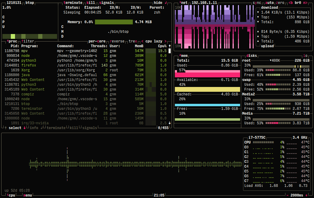
Example: https://terminalroot.com.br/assets/img/cpp/btop.png
Also beautiful and polished as a piece of design, apart from the dataviz.
Above is the evidence that react can handle this sort of thing just fine.
I hacked/converted the page in question to React to show something similar.
Its randomly generating updates to the table and then resorting the table and repeating.
You can grab the source here but I warn you it's hacked together in less than an hour:
I'm biased, but as a frontend dev and sometimes-UI guy, responsive design is one of my favorite parts of the job. It forces me to think creatively (and scientifically, whenever we can actually afford to do testing) on how to present information and create controls for everything from a small iPhone to a giant ultrawide monitor.
I mean, even in the Windows days (as in when most apps were still desktop Windows apps), basic responsiveness was already a thing, since even then you had no guarantee your app was going to be running in fullscreen at 1024*768 only. How your main windows, toolbars, etc. scale to different screen widths & orientations is a fun challenge to solve. Even in gaming, it's fun to see how desktop games (like Terraria) scale their controls down to a phone.
Anyway, for me it usually ends up being about 1.5x the work compared to a single viewport, since most components can still be reused in slightly different arrangements. Menu navigation and information architecture can be tricky though, switching from "broad but shallow" organization to "narrow but deep" hierarchies.
There isn’t really any other choice. It’s reality. But it’s just sometimes quite frustrating.
The layout works remarkably well on mobile regardless, but I wasn't expecting such unintuitive zoom behaviour.
Huh. I expect user-interface surprises on web pages. Interacting with the other user interfaces in my life is much less surprising.
None of them exhibit the wonky behavior of zooming a web page described above.
https://en.wikipedia.org/wiki/Tempest_(video_game)
except it really is a helix and not a cylinder like a Tempest level. Still would be fun to fight bugs in.
I tested for a while, settled on one form, and made an app for that.
It's not the most exciting variant, but it seems to work very well, and the reception in the public beta has been quite positive (one problem is that it's not an app that I would use, personally, so I had to rely a lot on the feedback of others).
Bit humbling, but there you have it.
Case in point: I have a fancy “prize wheel spinner” for UIKit, that I wrote, a few years ago[0]. I started working on a SwiftUI version of it, but stopped.
The reason was, because I kept not using it, in my shipping projects. It’s too “in your face.”
Some of the UI approaches that I tried, in my test app, were “sexy,” but I didn’t use any of them. The one I ended up using, was a bit pedestrian.
DOM Loaded: 134ms
FCP/FP: 163ms
LCP: 218ms
TTI: 1826ms
Seems like there's way more huge phones (especially folding ones) than small ones these days.
I am more incredulous about the comments saying "I am happy Apple takes my freedom away in exchange for security and convenience". Of which there are plenty on certain threads. And clearly not joking.
This is very wrong. Read the announcement and the docs: https://svelte.dev/blog/svelte-5-release-candidate https://svelte-5-preview.vercel.app/docs/introduction
Svelte 5 has change its reactivity model to signals. I anything, it's became similar to SolidJS. All other changes are minor but make Svelte even simpler to use.
Mouse interfaces are fundamentally different, because you have much more pointing precision, so it pays off to show more data on the screen. You don't have to cram your interface with with spaces to make it scan-friendly, you just use heterogeneous elements and colors. Look at Blender and you'll know it can be done.
I'm designing a desktop reference manager (https://getcahier.com), and one of its aims is to provide a UI with high information density. The mobile version will be able to adjust the experience, replacing desktop-only interaction patterns with mobile ones, and the UI elements that are shared will be somewhat bigger, so that users are able to interact them with touch.
Apart from that, it seems that the whole industry is confused regarding UI styles. UI frameworks are either favoring touch interfaces and degrading the experience on desktop, or vice-versa. Even Windows 10 released certain parts of the control panel with desktop look and feel and others with touch-friendly but desktop-antagonistic screens. It's time we realize that both platforms are different and we shouldn't degrade one in favor of the other.
I design, develop and maintain an ERP-style application with lots of tables. The fashions in UI design have made my life much more difficult over the last decade.
The problem is that designers tend to follow fashion trends. And the trend over the last decade has been "lightweight! clean! lots of space!". This is great if you are making a landing page, not so great if you need to display lots of data.
Google made things worse with its terrible UI design, which people accepted as mantra. Yes, there is lots of white. Your screen will mostly display… space. But just try using the Google Ads interface: it doesn't even fit in a normal browser, you need to have an extra-wide window just to see stuff in the tables. Not to mention they keep redesigning it, and every new update is hated by the customers, as well as by Google people (I've been told by Google ads consultants how to switch to the older interface, "which they all use because the new one is worse").
Another problem which compounds the situation for me is that designing tables is not cool. So, UI designers (and self-proclaimed UX experts) will "obsess" over every pixel in iOS-style switches that for some reason have replaced checkboxes, writing blog posts about how things are misaligned, while tables are left as an afterthought. Take a look at all modern UI toolkits: you will find very few with good tables, and likely not a single one with dense tables.
Oh, and on the functionality front: JavaScript libraries like DataTables are great for simple things, but are nowhere near a complete solution for complex apps.
Even Apple has sorely neglected their desktop APIs. Play around with SwiftUI on the Mac for more than a few hours and this will become glaringly apparent.
Nothing humbles you more as a dev than seeing a layman struggle through an interface, getting increasingly frustrated and desperate because she can’t find the button she needs due to complexity and sensory overload due to a million tabs, buttons and text fields.
The worst of it is, you can see that she knows what she wants to do, but can’t translate that into the steps needed to get the computer to “understand” that, effectively making it feel as if it is trying to sabotage her. Something that would have taken 20 minutes with pen & paper suddenly takes 40 minutes digitally. Weren’t computers supposed to make us more efficient?
Considerately, screw your attitude. Eat some humble pie.
I disagree. I’ve been using IntelliJ for a few years now, and the new, simplified interface has made my experience a lot better. IMHO you should limit the cognitive overload but enable power users to increase it. See also Wikipedia, where the main editor is basic but if needed you can switch to the code editor and/or add plugins to make the interface a lot more powerful.
1. Stuff that benefits imparied users benefits others. Subtitles help both. You'll never operate always at peak capacity either.
2. You can design UI to be layered. Easy mode for beginners and more advanced options for advanced users.
3. Software that's easy to use sees bigger audience. Period.
I'm curious why you think it reduces design costs to put less information on the screen? My experience has been the reverse -- the companies that chase trends (including but not limited to low-information-density screens and using mobile-first designs for desktop applications) also tend to spend more money on UI design compared to other companies.
The question is for whom it saves costs? For the developers of UI framework it certainly saves cost to treat the desktop as a second rate platform and to focus just on mobile.
Developers of desktop applications have to pay the price, by working around libraries and frameworks that do not consider them as a first tier clients.
things on screen take effort. less things, less effort
Let's not forget that with the current gigantic size of phones, I can actually easily reach less than 50% of the screen. The top part is completely out of reach.
I've actually stopped using the 'switch between running apps' UI almost entirely now because with that done, it's faster for me to tap to the home screen then on the icon of the app I want to switch to.
Another massive consideration is that a mouse (and a keyboard, if you want to expand from UI to UX) pairs that precision with significantly more available control actions - LMB, RMB, MMB, scrolling, and hovering.
With a mouse, the edges and corners of the screen are the easiest and most reliable areas to interact with; this is the inverse of touchscreen UIs, in which the center of the screen is the most ergonomic area of the screen to use, and edges and corners are practically unusable, leading to large margins in almost every UI targeting them.
With controls like LMB/RMB, you can also have functionality _immediately_ available wherever the pointer is located, which is now quintessential for practically all desktop applications, and which can't be faithfully emulated with touchscreen UIs.
Good notetaking support is something Zotero lacks, so I see the appeal for an alternative that focuses more on it.
If you look at Tailwind UI, which is clearly governed by the principles laid out in Refactoring UI, you can pretty much see the blueprint behind 95% of websites today.
Something I've been banging on about for a while is the following: Programmers and designers keep trying to rebuild instagram in every domain, pretty UIs, regular UIs, "simple" UIs.
This is great when every interaction might be an onboarding, but can be really limiting and stupid in an environment where people are actually paying attention.
A proxy I like to use for the above distinction is whether the users are paid more than the programmers
I have nothing against Svelte, but how much data are you showing on screen, exactly?
Here's an example table with 100,000 cells (100 rows * 1000 columns per row) that seems fine, from a common React UI kit: https://mui.com/x/react-data-grid/virtualization/#column-vir...
It seems fast on my computer normally (M2 Max), slow but usable when the CPU is throttled down 4x, and too slow after that. But that's a lot of cells.
Here's a performance comparison, btw: https://krausest.github.io/js-framework-benchmark/2024/table...
Or filtered down to just Svelte vs some common React libs: https://share.cleanshot.com/LlFXtNx9p6y4kMvqXgc7 (lower numbers are faster; React is generally just a little slower than Svelte, except when it's swapping 2 rows in a big table... then it's 8x slower)
> It seems fast on my computer normally (M2 Max), slow but usable when the CPU is throttled down 4x, and too slow after that. But that's a lot of cells.
No, it is not a lot of cells in a table. It is something a Windows95 era PC had no problem doing in something like Delphi Builder. And you find it acceptable that it slows down, if an M2 Max throttles down? Even a throttled down M2 Max is supposed to be 1000x (obviously an exageration, because I am to lazy to apply Moore's Law more rigorously on a Sunday morning) faster than an Intel 486DX. Where did all the compute power go? Are we really using the right tools for our jobs?
I would recommend you actually try this, because it's not as true as you would like to believe.
I am very much pro-"make things fast" but let's not pretend that old machines didn't randomly hiccup on things all the time as well.
I don't think most tables need to be as peformant as possible, especially when a slow render is still measured in sub-seconds.
That level of performance is totally fine for many use cases. If you have a special need for large datasets, yes, you should pay more attention to how that's optimized.
But for your average bog standard web app, I think any framework will be just fine, performance wise, on any 10 ish year old device. If it's slow, it's more likely because of ads, tracking, large media, poor caching, distance from a CDN, etc. Especially since React these days is typically rendered to HTML during the build anyway and then rehydrated for interactivity later.
React isn't a performance optimization to begin with, but a DX improvement and architecture abstraction lib (vs vanilla or jQuery). It makes some apps much easier to write and maintain across generations of low cost developers. The performance is a small sacrifice, but it's usually not even noticeable.
For performance critical apps, probably you'd just bypass the DOM anyway and draw to canvas instead, and offload all the heavy processing to wasm.
Yeah, compared to the 90s, our computers and modems are much faster and used less efficiently. But there are billions more users and millions more developers of various skill levels now, and that's just a tradeoff we get for mass adoption. It's no longer just a tool for elites, but just another tool in the office, and often times a race to the bottom like anything else in business (in terms of React devs being low cost commodities). A small React team can put together a functional app much quicker and cheaper than with vanilla, at the cost of some usually negligible performance. Probably a good tradeoff for most apps.
If you're talking about web apps in general, compared to desktop or CLI apps, then yeah, I agree that it's a bit of a shame this is what won the desktop platform wars. At least on mobile we have native apps (which often feel much faster than anything web based), so there's that at least.
For a lot of apps React is fast enough but you're definitely starting at a non-negligible performance disadvantage compared to faster frameworks.
A lot of it probably should be a canvas but there's a good amount of interactivity on the chart itself so moving it all over might be expensive.
You obviously can bludgeon that into react but it's at the point where the diffing does seem to be non-trivially expensive and requires a bunch of nursing in the code which is frankly an insane waste of time in 2024.
React is completely fine for big tables, especially if they don't actually change very much.
I will also note that in turn this started out as a d3 project, react was much much faster than d3.
Edit: Completely forgot to mention memory consumption. We have beefy machines so it's not really a critical problem but think of the poor caches!
When we had to do similar things, we found that it was much much much faster to take all that sort of stuff out of the DOM and put it into Canvas. You can still wrap React around it for the UI and controls and data passing and all that, but the actual rendering need not involve the VDOM or even the real DOM at all. With ChartJS we were able to get it to show tens of thousands of individual data points in a time-series scatterplot, each datapoint interactive and real-time, with no noticeable lag. And it was super easy to integrate into our React app. https://www.chartjs.org/
If it's not just charts, here's another canvas-based drawing lib: https://konvajs.org/docs/sandbox/20000_Nodes.html (and its React tie-in: https://konvajs.org/docs/react/Intro.html)
Not trying to discourage you from exploring Svelte if you want to, but it might be less work to just use an existing optimized drawing lib. Regardless of the JS framework used, the DOM is going to be much slower than a Canvas.
We don’t have performance issues with react. I’m not sure I’d really recommend react as such, with the way the ecosystem is leaning more and more into Next, but I doubt that its react itself which is giving you performance issues. I think you should look into how you’re loading and unloading data.
I don't think React is to blame for your performance issues.
Also OP is looking to move an existing React UI to Svelte, why not try Preact first instead of an entire rewrite? Or even Inferno or million.dev? If they did and they're insufficient, I don't even believe the browser's DOM is the right technology for that UI then.
I guess it’s OK if you use something else for CSS such as Tailwind.
Sometimes, they would (e.g. the "users paid more than the programmers" rule of thumb, but also: various technical disciplines, most anything used for professional-grade work). Sometimes, they wouldn't - or perhaps some would and some wouldn't (so perhaps you're looking for a simple base UI with some accelerators [2]).
IMHO the issue is that many products fall into this last camp - where a well-designed simple UI is called for, but also accelerators could greatly help a small but important subset of power users - but we treat the power users as though they don't exist.
[1] https://www.nngroup.com/articles/testing-expert-users/ [2] https://www.nngroup.com/articles/ui-accelerators/
Well, Instagram is basically the only application people use, along with e-mail, YouTube and TikTok. Some people use Spotify, and fortunately no one is trying to copy its design, so I feel like the programmers and designers are onto something.
No, those people are not using email, they are using what Google tells them what email is. A poor imitation of email.
Presented at fact but I’m not sure this is universally correct.
I don’t see why the application that is linked here couldn’t be done in react.
It's when you get to thousands/tens of thousands of data points that things can really slow down without good optimizations, especially if you're modifying the DOM or manipulating SVGs (as opposed to drawing to Canvas, typically).
The data I'm displaying also is quite deep and results in the creation of a lot of DOM elements (i.e. its visual rather than tabular). It noticeably chugs a bit even when the actual changes to be displayed are relatively small.
Dan Abramov's favourite UI is apparently spotify, I think it shows in the things react seems to be designed for.
I dropped the word "literally" from my original comment as I didn't think before I wrote (classic), now I think it's a fair comment.
That's super fascinating. There's an entire industry that runs off these things, on their totally custom UI, showing everything from stock tickers to news headlines to maps? That must be a fun project to work on (except probably the finance users don't like random UI changes, lol).
I have bad news for you, nobody who works with a system more than casually, likes random UI changes. NOBODY. Younger people are often more tolerant to these distractions, because they are often more curious. But when you have used a tool for some longer time, and suddenly it looks or behaves different, that erodes trust. That forces the user to turn of the mental autopilot and to proceed with care. Which A/B tests will report as increased engagement of the users. And there is our vicious cycle.
Note, how a scheduled update with release notes does the opposite. It increases trust, because it tells you what is going to happen and then it happens. (Hopefully)
OTC (things that don't trade on exchanges) markets are a lot closer to ebay or facebook marketplace than many realise, for example, e.g. you ask for a price, possibly haggle a bit, say you want it, behind-the-scenes people scurry off and actually make it happen.
When you first activate your terminal bloomberg send you an email congratulating you on joining "the exclusive club" (this is exaggerated, they want you to feel special, but there's truth to it).
As well as all that bloomberg is technically also still (iirc) one of the largest private computer networks.
> That must be a fun project to work on
Unfortunately possibly quite the opposite for many, although no first-hand experience.
As for the UI: I wish more things were like bloomberg, but bloomberg itself can be slightly hobbled by wanting to lay everything out as a table all the time when a custom chart designed by a creative domain-expert would be almost as useful.
* Why change to something that's "almost as useful" .. that's a downgrade.
* Pretty is often the enemy of Consistent.
On that second point, it doesn't have to be .. but it can take a great deal more effort to have data presentation that's both creative and consistent and dense.
The domain goals here are rapid navigation of dense infomation across tens of thousands of companies, timespans, portfolios, groupings, comparisons, etc. With a good interface the user quickly finds the desired scope and view and automatically eye tracks to the wanted figures.
It's not an interface for pretty board room presentations (although in an organisation that promotes based on merit in the ditches most senior staff would be familiar with a Bloomberg Board) - it's a daily driver for engine room.
I'm not defending this specific interface, just highlighting what is common to many similar domain tools.
> there are a lot of support staff who have bloomberg.
(Svelte is awesome, mind, I compare the two to compliment them both)
https://static.crowdwave.link/index.html
And the source: https://static.crowdwave.link/sveltetest.zip
It's even got a batch update API.
I doubt that naively rewriting the app in Svelte is gonna give you the perf boost you're looking for.
Or a rich text editor containing 200 pages of text.
The point is that Svelte may have trouble processing many off-screen elements, and those would be good tests.
This is a great intro to the topic: https://matthewstrom.com/writing/ui-density/
Regardless, I guess my primary gripe with it is the cognitive overload. A bunch of numbers (stocks? not sure) and names that all look the same, sometimes with different color end digits (why is the zero gray sometimes), in a vast sea of information but no context. What is the most important item at any given time? What do I need to pay attention to? I mostly just glaze over and tune it out because there's way too much going on.
I get that it's an experiment (and ultimately a preference). Just not my thing, I guess.
That's why we like btop and htop, but a normal PC user wouldn't understand anything.
The most similar things I've worked on were dashboards and spreadsheets, but in those cases, we put a lot of thought into information hierarchy and organization, not just flat density.
For example, we'd hide what we could behind traffic status lights ; if all systems were green, you're good, and you'd only need to dig deeper into ones outside the norm that were yellow or red.
Or where the metric itself is important and shouldn't be hidden, we'd still try to highlight changes over time with sparklines or conditional color scales.
Basically just try to guide the report viewer's attention towards the most important things, whether it's "this is broken!" or "whoa, this number changed a lot over the last 24 hours".
Even in a spreadsheet, there'd be sparklines and cell formatting and subtotals and totals and such to highlight the important stuff.
I can't think of a situation where I'd want to see a bunch of peer numbers like this with no hierarchy. I'm not really comparing them against each other, am I, but probably trying to see change over time...?
But anyway, I honestly don't know (and am curious about) how this works in the financial sector. Are traders really just manually looking at all these numbers all the time (and doing what with them, trying to remember what they were some time ago?)?
On one hand, I still hate the MS Office "ribbon" UI to this day and much prefer the denser and more compact Google Docs or even Open Office layout.
On the other hand, Sketchup was hugely popular and very easy to use compared to its peers when it was released, and quickly became the de facto tool for simple free basic 3d modeling, in no small part because of easy and clean it was, I think. But they got bought out and then abandoned, I think? It doesn't have anywhere near the power of the other software anyway.
IDEs are another example. VScode seems a lot cleaner and leaner than old IDEs, and Jetbrains ended up copying them too (a controversial change, of course).
Photoshop is the one that always gets me. Twenty years of using it and I still can't get used to its layout. It's just so many different weird widget types mashed together in a way you don't see in any other software. I much prefer a docked toolbar like in Figma or Paint Shop Pro. I hate that I use it... I feel like a hostage every time I open it.
By the time I got it to something I liked, it severely violated the spirit of the experiment, lol (was too big and sparse, with lots of padding between items – the opposite of what it was trying to show): https://share.cleanshot.com/0xD9bPcWD1CL5wDvlVhB
And I still don't know how these numbers are used. I wouldn't be able to keep track of even 3-4 numbers at once, much less the dozens here.