Anyway, here's a pet project of mine, I made it as a glued on for another pet project of mine, but it developed a life of it's own now and can soar skyward toward success, fame, and glory.
But it is actually pretty easy to switch to Chicago in the library -- apart from the clone you mention, there is also a 'plain' TTF version of the original Chicago floating around...
t. satisfied Nu Sans shareware buyer http://www.scootergraphics.com/nusans/ :)
https://www.oreilly.com/api/v2/epubs/0201700042/files/020170...
or similar.
You can also get the "real" TrueType Chicago font (designed by Bigelow & Holmes) via a System 7.6.1 download, then convert the TTF to OTF with FontForge's command line tool. https://www.macintoshrepository.org/1682-mac-os-7-6-x
fontforge -script -c 'Open($1); Generate($2);' input_font.ttf output_font.otfLike, when you have a dialog box, you have a certain number of pixels on the left, right, top, and bottom. The buttons are a certain number of pixels apart. If you look at old software from the very early days of the Mac, you’ll see that it’s kind of the wild west of user interfaces—either the HIG wasn’t out yet, or people weren’t reading it.
The HIG also has a bunch of good practices for thins like how to name buttons and menu items. Buttons should ideally be single words, and should be verbs. Menu items get a “…” ellipsis if there’s a dialog box that appears before you perform the action. The book shows how common interfaces look in non-English languages, like Arabic, Hebrew, and Japanese.
IIRC, if you were using DITL resources for layout (standard practice for dialog boxes), ResEdit would help you out by snapping controls to these spacings. If you were doing programmatic layouts, though, you were on your own.
https://safereddit.com/r/MacOS/comments/me2r7j/macintosh_hum...
I couldn't disagree more regarding 'layouting' engines. I absolutely detest pixel-perfect English-only UIs that basically look like a mess the moment anything (including font DPI) changes. You CANNOT imagine how much pain the work of the translator is and it just doesn't matter because it will look horrible anyway, specially the more "smarts" the original English form designer applied.
I want to enlarge the fonts, reduce the size of the useless icons, and set black backgrounds, and no amount of "creativity" from the original designer is going to convince me to lose that flexibility. I'll also translate to my native tongue thank you very much.
Flat buttons and no usability testing is another story, of course.
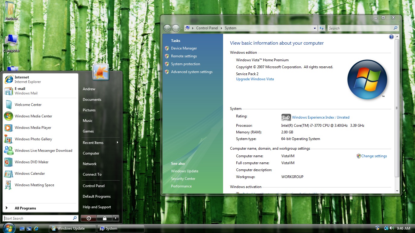
Here’s a screenshot of the Windows Vista start menu in English: https://cdn.arstechnica.net/wp-content/uploads/2015/07/Scree...
As you can see, it’s a nicely crafted layout, with the power buttons at the bottom taking up all the available space, and the thin separator lines below "E-mail", below "Games", and above "All Programs" are taking up the entire widths of the boxes they’re in (minus reasonable margins).
Here’s the Polish version: https://ia902303.us.archive.org/24/items/WinVistaSP2AIOPLMay...
The awful translation made both columns of the menu much wider, making the separators look too short, and adding blank space next to the power buttons.
Just for comparison, nowadays a shitton of desktop software doesn't look all too bad with just changing a gettext()-style list of strings, and not even touching the dialog definitions. You may argue that this is because the dialogs nowadays just look equally bad in all languages, but I'd disagree and anyway it definitely is an order of magnitude in "manageability".
Would it be that hard to build nice, clean and powerful UI libraries as alternatives to Electron?
I find it quite horrifying in many ways to see how much resources are used for so very little in terms of user benefits. Not just 'UI' per se, but just general functionality.
And the 'reasons' are always the same too, 'it is more maintainable' (read: it is not, in 2 weeks time the new version of your stack will break your 'code'.), 'it is easier to read for a newcomer' (read: no, not at all, it is just this week's fancypants trend), 'it is more secure' (read: just because we don't actually KNOW what it's doing, and rely on hopefully someone else for it) etc etc.
My only nitpick is that MUI is already the name of an Amiga GUI toolkit. A widget lib named libmui is not what I’d think it was.
When it was released in 1993, it was very modern. Object-oriented, scalable layout, simple to program, themeable and very customiseable. I wouldn't be surprised if the developers of Qt, Gtk and SwiftUI would reveal that they would have taken inspiration from it.
https://lists.gnome.org/archives/gnome-themes-list/1998-Febr...
But this is good.
I mean: anything that brings back some sanity. Clear unambiguous controls. Menus instead of gear icons, hamburger menus and fly droppings.
Great work!
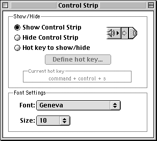
If it could be done, ResEdit could be used :-)
So it actually is technically superior to most (all?) "modern toolkits. Nice:)