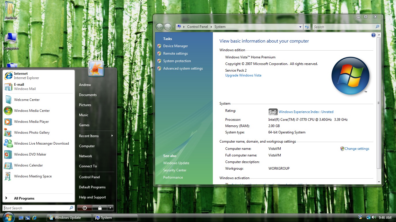
Here’s a screenshot of the Windows Vista start menu in English: https://cdn.arstechnica.net/wp-content/uploads/2015/07/Scree...
As you can see, it’s a nicely crafted layout, with the power buttons at the bottom taking up all the available space, and the thin separator lines below "E-mail", below "Games", and above "All Programs" are taking up the entire widths of the boxes they’re in (minus reasonable margins).
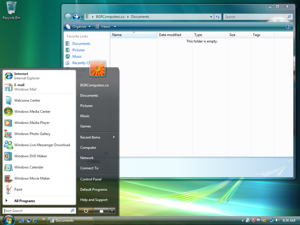
Here’s the Polish version: https://ia902303.us.archive.org/24/items/WinVistaSP2AIOPLMay...
The awful translation made both columns of the menu much wider, making the separators look too short, and adding blank space next to the power buttons.