Now you might be questioning why I dislike cherrywood. The answer doesn't actually matter though, I dislike it. Most importantly, I am not the only one.
I like vinyl, because I spent a few weeks of my life (probably at most a few hours total actual wall clock hours on it) replacing flooring in a couple of rooms through a few houses. The beginning, and the rest of my answer here though, also does not matter. It only matters that I like it and will pay money for it over wood. I am also, not the only one.
Gray is used for many reasons in new builds, its a neutral color, and because many builders build a house/apartment, THEN sell to customers. Very few customers buy a plot of land, contract an architect, make customizations, and then build the building. It comes with the realization that people will substitute out the things they want on their own, not requiring someone else figure out everything they like and being creative all on their behalf for $0.
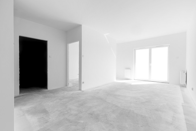
Interesting. Here in Poland when you buy an apartment from developer, you generally get it unfinished, like this: https://www.domoweklimaty.pl/app/uploads/2018/10/co-dokladni...
It's up to you to find contractors to finish it the way you want it - maybe together with interior architect if you want one.
So this excludes all colors for everything. Black, white, gray everything.
I buy electronics equipment, computers, furniture, clothes, and cars with the mindset I will be the last owner of them, and they will have no resale value.
“I bought this, and I will assume it’s instantly worthless”
It keeps me from buying the same thing twice and causes me to save up for the thing I really want, and keep it for as long as possible. It also lets me be picky about my preferences and really scope out exactly what I want on a relaxed timeframe.
Perhaps it’s a side effect of growing up with hand me downs, and knowing anything our family owned was one step to junk, but it does keep spending in check now that I am doing okay in my career.
Maximizing the resale value of a home involves making it appeal to the largest number of people. Adding character risks lowering demand by appealing to niche markets. So you end up with lots of white and grey.
You see similar things all over the place. Want to maximize your career? Better suppress your individuality in favor of copying how successful people speak, act, and dress.
If you've ever heard the term "TikTok Beat" that's a similar phenomenon where the most popular music on TikTok gets copied like a meme by wannabe famous music producers.
It's a process that ends up with bland results as variety is reduced over time. It's also dehumanizing as humanity is slowly stripped away due to inefficiency.
I have asked around and I am not the only male in my acquaintances that experiences this.
https://www.thespruce.com/greige-best-neutral-color-ever-797...
You have builder grey, builder white, builder off white, and builder beige.
They also help reduce the noise caused by walking around, so your neighbors don't complain.
Now we mock everything grey as "Millennial grey."
It costs money and time. I work with people in shirts that are only befitting for elementary school kids.
You can have the niceties, just have to pay for them.
But I think this is about where the market is going. People (with the money for homes) don’t care, so that’s how they’re catered to.
And getting my car, the only options were grey and white. :(
I hate the greypocalypse that has happened. So depressing.
Before the late 1970s, NYC was illuminated at night by pinkish-white incandescent bulbs.
When the yellow monstrosities were rolled out people almost rioted. Their harsh orange glow invaded bedrooms creeping between gaps in curtains and assaulting the eyes, destroyed the soft and warm ambiance that had set the night scene for generations, and muted all colors into a monochromatic hellscape.
After just 30 seconds on TimesMachine I found an article from 1982 about the transition and how some residents were hesitant and one jurisdiction rejected the change out of hand. It took a long time for NYC to gain its orange glow and people didn't like it. https://timesmachine.nytimes.com/timesmachine/1982/09/12/137...
Lol here's another article from the 40s: "Sodium light is not suitable for city streets, Commissioner Goodman said, because it gives a person a sallow appearance not liked by women."
https://timesmachine.nytimes.com/timesmachine/1940/05/26/iss...
People of my age view them as a nuisance born out of the austerity of the 1970s, a temporary suboptimal fix that persisted due to inertia. A reminder of the rot and desperation of the that era.
Now this dude is nostalgic for them?
No, they really were better for sleep.
With the orange-ish sodium lights, I could go to sleep with their light still coming through the bedroom window. The amber glow was reminiscent of the glow of fire.
The harsh blue light now tells my brain it's daytime. I had to buy blackout curtains to be able to fall asleep.
It's the same principle as using the amber-hued Night Mode on your phone in the evening.
I never experienced the pinkish-white, but the transition from orange to blue has been horrible for sleep. Nighttime lighting around homes should be amber, not blue. (Contrast with highways where you do want people to stay awake, so blue makes sense.)
It is literally true that human mind is suggestible to an unimaginable degree.
Try the "LEE Filters 206R: Converts 6500K Daylight Sources to 4600K"
I remember some kind of study around yellow light being ideal for roads actually. The human eye is more sensitive in the green/yellow part of the spectrum, the lights are more efficient and cut through fog better.
> The harsh blue light now tells my brain it's daytime. I had to buy blackout curtains to be able to fall asleep.
When I moved in with my fiancee (at the time my girlfriend), I noticed after a couple months that I had a bit of trouble sleeping due to her often falling asleep later than me and being on her laptop for a bit. Since blackout curtains don't help with that, I bought a sleep mask for a few dollars from Amazon (basically a piece of nylon fabric and a strap, nothing specialized), and it's not an exaggeration to say that it's been life-changing. As a child, I'd often struggle to fall asleep due to literally any amount of light in my bedroom, and when I was in elementary school it got bad enough that it would take me several hours of lying in bed to finally fall asleep, and I ended up getting prescribed insomnia medication that I continued taking for a couple of decades. It turned out that with the sleep mask, I was able to taper off the prescription sleeping medication within a year or so, and I'm even able to get up earlier without being quite as groggy due to my quality of sleep increasing so much.
If anyone else has similar issues with lighting interfering with their sleep, especially if it's from things within their building rather than outside, I'd highly recommend investing a few bucks to try this out. Obviously my sample size is only one, but given how drastic the effect was and how low-cost it is to try out, it would almost feel irresponsible for me not to suggest this to people.
> Now this dude is nostalgic for them?
An easily-unrealized benefit until people were forced to use them, they didn't ruin our low-light vision, at least not nearly as much as the new ones. You could easily see into unlit areas, or go from an unlit area to a lit one without your vision having to adjust.
That's pretty much it. SF is full of a similar kind.
Many more people admire Taj Mahal or Ancient Greek/Roman buildings than, say, brutalist architecture. Heck, even Art Deco, while distinctly modern, seems to be likeable.
I am fairly conservative myself, but I like some new Czech buildings, such as the Masaryčka project by Zaha Hadid. It has a soaring soul that is hard to describe, but nevertheless you can feel the positive vibe of the structure when you walk underneath it.
https://www.masarycka.com/cs/o-projektu/
On the other hand, Le Corbusier architecture (mostly older than me, so I should have been used to it) looks like deliberate insult to anything human: look at this concrete prison I made for you and weep and gnash your teeth because there is no escape from its rotting ugliness, you worm.
I live in Boston and there was a similar freakout about the gas lamps in Beacon Hill being replaced by LEDs. Not a single person I talked to about it knew that the gas lamps were only added to the neighborhood in the late 70s to make it look more quaint and historic.
The other thing, about the "McCentury Modern" architecture, has been proven time and again over the last decade. Flat shapes without detail with random splashes of colour cause anxiety because the human mind needs visual definition and coherency. There are ongoing studies about whether or not modern architecture causes depression because so many people have noticed. At least in the past the cheapest stuff used bricks for facades, but developers think even those are too expensive now. That and the proliferation of grey is entirely about money, because it's easier to sell the lowest common denominator without a hint of individuality. This is especially true when it comes to market instability, because when tenant turnover is in the range of months grabbing the cheapest thing and throwing together the least personable environment to rope in anybody at all will keep you from having a vacancy of longer than a few weeks.
The films thing is just... Nobody actually looks at physical examples anymore, so they have no idea how things should look. With practical effects you were manipulating and testing what already existed instead of trying to recreate it as an approximation. There's a surrealist level of detail in almost anything created via CG, only worsened by the lighting needing to be flattened to cover up the unfinished work done because of an impossible schedule and masked with digital colour correcting. Real waves don't have that much foam, real diamond weave cloth doesn't have that specular profile, real explosions don't have such low luminosity and so many particles, so on and so forth.
A lot of people realize things are very wrong with the world, they just don't have the expertise or the vocabulary to explain it. So they point at things they know other people will innately understand as examples. Don't say they hate change because of that limitation.
I stopped reading there. I'll take LEDs over ugly orange any day (or mercury-arc, as well). When my town converted, they picked neutral-white lights for the side streets and ones with a very slight yellow tint for the major streets. Either of these is far better as far as I'm concerned.
Even the old mercury-arc lights weren't that great - either sickly greenish or a color-corrected version that was blue-white. The 175W mercury-arc streetlight on my corner was replace by a 40W LED, with better lighting to boot.
Low-pressure sodium is even worse - an absolute monochromatic yellow. If you forgot where you parked your red car, good luck finding it. Been there, done that.
Now, people get nostalgic for them. People are weird.
> Now this dude is nostalgic for them?
You could just as readily be talking about a cassette tape.
Next, let's talk about how I miss CRTs...
I think there's a tendency to romanticize this kind of thing, a la an early Tom Waits song. I've lived in Portland for a little under 5 years. I feel like it has been moving in the "ugly" direction the author describes for a while, and it started before I moved here. People that have been here much longer describe how it used to be much more "gritty" and dangerous. They say it with sort of a twinkle in their eye, almost as if they miss it. Part of me would have loved to see how it was, but the other part of me knows what's its like to be in the wrong part of town. At least you have the wherewithal to see why a move to LED lights was probably a smart move. Just because it's new and different doesn't make it bad.
Apple devices and stores look clean and elegant to me.
Tesla vehicles feel and look simple and beautiful to me.
If given a choice, I'd rather live in new buildings with bright, light-filled interiors than in old buildings with darker, mustier interiors.
I could provide more examples of things I don't think are ugly. The main point is this:
Beauty is in the eye of the beholder.
As you say, beauty is in the eye of the beholder—but, seriously, the Cybertruck as a thing of beauty? (This is from someone who actually liked the boxy car designs of old.)
I for sure find the cybertruck prettier than 99% of cars on the roads anyway. The SUVs are especially ugly imo.
Is it different? Yes. But ugly? Not in my view.
Have you seen it in person?
Tesla vehicles look fairly bland, dry and devoid of emotion to me.
There are things that objectively make something more beautiful. Symmetry for example. Not all beauty is in the eye of the beholder.
Most major older cities established a central core in an age where people had taste.
I could not finish it.
Although on the art front I'm looking forward to learning what storms lie in wait for the first publicly notable pro-Trump statue in the US. It'll be a real cultural discovery.
We can all see quite clearly this block long apartment building isn’t actually 5 buildings. Yet, now we have to suffer five hideous facades.
Just around the corner is a 75+ yro brick building (to the right of this street view) [2] with a detailed facade fashioned to have a small personal scale and plays with ornament to align with other older buildings on this street. (And this is some firm’s same solution/plan that you can find in at least one development miles away. [3])
The building to the left of the street view is a monstrosity, and here is another around the corner [4]
I’ve heard many long-time residents complain bitterly about the experience of walking our downtown, so I hope this new building will move the needle in the right direction for folks.
For the speed the new building went up and the challenge to develop in such a central area on a large plot, I think the result is positive (though, I’m sure I could not afford to rent there).
[1]: https://maps.app.goo.gl/XKzYWUhiV5WTUBXv7?g_st=ic
[2]: https://maps.app.goo.gl/fGY9DYCvH6xZdNbz5?g_st=ic
Still, to this point:
> Such bad lighting — and such large portions! We exit the movie theater to a bright realization: our films are exactly as overlit as our reality. As our environment has become blander, it has also become more legible — too legible. That’s a shame, because many products of the new ugliness could benefit from a little chiaroscuroed ambiguity
Cool that I learned a new word. Having just watched "Badlands" last night from 1973, I definitely agree modern cinema has become way too "graded".
Not every article is or should be targeted at convincing the resistant reader, and visual examples can be a distraction or simplification of a broader idea.
It is valid for an article to simply connect ideas together, in a way the reader may not be aware of. A reader may have their own examples to think about, which are much more powerful.
When the majority of people and businesses live hand to mouth, those that don’t have to constantly maximise exponential returns to their owners. Who has money to burn on “valueless” beauty
Even if the cost of beauty is the same, and there is an actual value, as beauty is in the eye of the beholder, you are increasing maximum potential value but you are reducing the minimum (you turn off some buyers who don’t like the look). Throw in the concept changing over time (pale green bathrooms used to be a big think in the U.K. in the 80s) and people go for neutral and boring.
No one is afraid anymore so the ‘filter’ that selected ‘confirmed urbanites’ was lifted. The city reflects its new demographics. The OP and myself and the rest of urbanite that got a ‘buzz’ just walking in the city now mostly decamp to Brooklyn.
Speaking of Brooklyn, I must register my public approval of gentrification of Williamsburg. I actually lived in Williamsburg when the only (only) sign of civilization was a bagel shop next to the L. But let’s take Domino Park. That’s not ugly, is it?
So, two items: Money, and Taste. Now we people of ‘taste’ were priced out of Manhattan. And now you have what you have.
Let’s blame Giulliani for this. I never liked the man /g
It's not beauty, exactly. It's norms.
Some places have fairly strong norms. If you own a plot of land (perhaps with an old building) in such a place and go to an architect ask for a proposal to renovate/rebuild/whatever, the architect will tell you clearly what you'll be permitted to build and what not.
In such a place, your new building will look rather like its neighbours. Unless you want to try to fight the building commission, maybe you think the voters disagree with the commission and you can force the elected officials to overrule the commission.
In other places you have a lot more flexibility, and in that case you have the option to build beautifully, and you also also a lot of less beautiful options.
You may think the second question is the key: Do people who hire architects and builders choose to build beautifully or not? I think the first one is the most important factor. The second matters seldom, because even when the choice is there, the choice is usually for such a small area that you can see five or ten independent buildings, and the overall effect will lack beauty even if one or two buildings are beautiful.
Fortunately the modernist minimal grayscale look is universally beloved, so no-one is turned off by that.
Build something pink and now you only have 1 person liking it and 2 strongly disliking it, demand now equals supply so price doesn’t rise.
Is it worth the risk?
There’s a reason rented properties are co feed in magnolia, not just because it’s cheaper to get the same paint in bulk, but because if turns off the fewest people, and those it does don’t have any choice anyway as everywhere is magnolia.
However, in the modern world with set of regulations plus complexities with urban places, and cost of build is not viable to have such so great ornaments around.
For instance: one of most recognised and awarded architects had a lot of criticism[1] due to a new set requirements for urban life.
[1] - https://foreignpolicy.com/slideshow/the-dark-side-of-oscar-n...
https://intersectionist.medium.com/american-power-structures...
https://www.newstatesman.com/politics/2018/11/how-classical-...
Probably by some insane woke ultra-leftists. Romans had white marbles. Romans also had black emperors, from Africa (yes, really).
You have to have a serious sick mind to believe "white" means "white supremacy" and that anything "black" means oppression towards black people.
I think a talk should be had about the Ottoman entire, when non-white people ruled a great part of the world, including Europe and had, shocker...
Wait for it...
White people as slaves.
Wow. What do the woke have to say about that? How comes we're not asking for retribution, today, to turkish people for the white people their ancestors used to have as slaves?
One of my brother married a japanese woman and another brother had a kid with an african woman. So my kid's two cousins are half-asian and half-african. We speak several languages at home. We've lived in four countries. And I despise this cancer on earth that are woke leftists.
Anyway here's a great photo of it I found on Google:
https://lh3.googleusercontent.com/p/AF1QipMKvYH4OHFU5o4gZlSZ...
(Actually I'd rather visit Kyiv but I've heard that now's not a good time.)
Regiojet.com has daily trains from Krakow to Kyiv, with guaranteed connection at UA border. It takes about 14 hours and 50 euro. Or dozens buses every day, but you will have to wait for several hours at border (train skips queue).
* Colors other than gray don't look nice in CAD and aren't the default.
* It's super easy to just stack a bunch of rectangles (looking at you, architects...)
* You can chamfer and fillet but that's the end of what most people do. More complex shapes are hard to due due to the clunky spline tools. Hence elaborate ornaments are left out.
If your building is made from rectangles, lines, and few curves, you can use off the shelf panels to build it. Order them from a factory, have a truck deliver them, stick them together with cement and bolts.
On the other hand, even if you do pay someone for the extra time to create beautiful, unique, complex designs in a CAD program (which is not that hard), actually making those parts is extremely expensive so they will get rejected by most architectural and construction firms.
Perhaps as we come into the era of 3d printing, more complex structures will come back into vogue again. It will be kind of ironic if 99% of all futuristic cities depicted in scifi, all clean lines, spires, and cylinders turns out to be wrong and the skyscraper of the future looks more like the Sagrada Familia, but built in six months instead of three centuries.
(Although personally I'm hoping the future looks like forested garden cities.)
in the era of blueprints, where you had to draw literally everything from scratch every time, human pride would necessitate taking the time to add flourishes or small details to every page, just to keep the talent who is producing them from losing their minds
look at old bibles, full of small details that are ultimately useless for the message being conveyed, but still announce the presence of a poor soul doomed to reproduce these glyphs for eternity
nowadays... you can just open an old drawing, hit copy-paste, and be down by the pub at 11am.... not a bad deal for the drawer, but for the people looking up on the sidewalk...
They lied on the publication date.
https://web.archive.org/web/20221206160651/https://www.nplus...
Never attribute to malice that which is adequately explained by stupidity.
The title should have had an additional exclamation point.
I don’t think the recent trend in abandoning aesthetics is accidental.
Typically because they face a huge population move from the countryside to the city areas, and thus have to build as fast as can be and on a budget, which leads to what you can see there.
You can observe a similar pattern in many countries, e.g. here[0] in France, in the Lyon suburbs.
[0] https://france3-regions.francetvinfo.fr/image/boW0onRHUjdzzl...
This has nothing to do with abandonment of aesthetics though, as Brutalism is a very explicit aesthetic and architectural movement. We did indeed abandon aesthetics but the product of this is the non-offensive, utilitarian, convenient Starbucks store, the Ikea furniture and so on, not Brutalism.
If you want to find ugly, you can. If you want to find vibrant bright colours, you certainly can, too. At least in the UK, in both London and Manchester, where I have lived, you can find the best and the worst of many kinds of styles. Where I visited in Belfast, also. Also in Indonesia, from Bali to Jakarta, there's so much different kinds of styles you can experience. Sure, the "average vibe" is also kind of persistent, but I think the average vibe has been quite bland in many places for a while.
This includes art, architecture and the vibe as well as interior decor.
Edit: adjusted to distinguish between "general" and "average"
> sure, the "general vibe" is also kind of persistent, but I think the general vibe has been quite bland in many places for a while.
But, ironically, my comment of "you can find what you look for" is applicable for your observation too ;)
Besides, it's okay to agree with some points and disagree with some points.
(Of course, if art is a reflection of present-day it’s not necessarily predicting a stable future in the context of global warming/water wars etc. I wonder if more graffiti will show up on these themes over time.)
(Most people lived through the fall of the Roman Empire and didn't even notice it.)
The cyberpunk we are living has no such aesthetic filters. An adventure is something terrible that happens to someone else.
Compare the colorful panel surfacing to the description "Our new neighbor is a classic 5-over-1: retail on the ground floor, topped with several stories of apartments one wouldn’t want to be able to afford... We spent the summer certain that the caution tape–yellow panels on The Josh’s south side were insulation, to be eventually supplanted by an actual facade. Alas, in its finished form The Josh really is yellow, and also burgundy, gray, and brown."
The coy phrasing about "apartments one wouldn’t want to be able to afford" is a disguised reference to the fact that the apartments are reserved only for low-income residents; the author would not want to live in Brooklyn on the poverty-level income required to be eligible for the housing development.
The pictured sculpture the author dislikes is "Waiting" by the artist KAWS (Brian Donnelly). [2]
[1] https://gluckplus.com/project/van-sinderen-plaza-affordable-... [2] https://www.architecturaldigest.com/story/kaws-waiting-brook...
My educated guess is that the building in question is somewhere in Williamsburg, Greenpoint, or maybe Bushwick.
But what strikes me in some “ugly” cities is how accepted it is to let things be objectively ugly, for example in some cities you can see how a building wedged between two beautiful buildings has been torn down but the effort to build a new one seems on hold. As if owning the building/land gave the right to leave a scar for any amount of time. In cities where this doesn’t happen I imagine you simply don’t get a permit to leave an ugly hole. Build it or face a stiff fine, perhaps forcing you to sell to someone who would build. Seems like the only reasonable way of keeping it tidy. A lot of UK inner city areas look like this for example.
https://www.currentaffairs.org/2017/10/why-you-hate-contempo...
The two don't necessarily disagree, but I think the one I linked is better written. Plus, something about having all the block quotes be from tweets always makes me feel like the author isn't doing enough research or reading widely enough to be authoritative.
We live in undeniably depressed times. Where people don't stop and smell the flowers or pet the dog. They don't see the bald eagle flying over.
You are surrounded by utter wonderful beauty and you can't see it.
Sunsets/Sunrises/Landscapes have gone nowhere.
Music is literally at all time peak for beauty because it's understood far better than ever.
Special FX has reached a point where they are simulating younger/dead people like Leia in Rogue one?
Acts of kindness and charity are now made easier then ever. I'm checking out at some big box store and you're offered a 99% charity to donate to... Yes, please, every time.
Guess I can't have a positive message?
Its politicians have orgies and organize festivals to run naked on the street once a year in the name of “pride”. Art is not art anymore, they’re producing “artists” who put candles in their ass and walk like dogs for “art”. Same as poets or singers. So much nakedness, nothing deep or beautiful. There’s no more good art, novels or movies coming out of Western culture. Careful people even take steps to protect their children from it.
China tore down most of its beautiful temples (the contrast between mainland and Taiwan is striking), totally obliterated any moral compass among its people, its politicians are just comically corrupt (when it’s politically convenient to prosecute one of them they need trucks to unload the literal ton of cash in their homes), etc. Their movies are now mostly pointless propaganda with zero appeal outside China.
And the examples you list are incredibly niche. There’s still plenty of good art if you care to look. There’s always been weird niche art and trashy popular art, all throughout the history of civilisation.
What country do you look to as a good example?
As an Ontarian who recently took a road trip through Quebec (where a faith in culture still presides), it seemed like there was more “giving a shit” about all institutions and it came through in quality across the board.
Take a look at this from over a decade ago: https://www.vice.com/en/article/5gynqq/what-v11n11
Part of the article laments how the shape of cars have turned into "cough drops" and "globular tears". Clever but I can also write a edgy article about how idiots in the past designed cars as if they were hideous boxes and the concept of a curve was too advanced for their square minds to comprehend.
I decided it had to be the expansion of a public (state) school, because I’ve read on the press about these containers being used in cases of shock-doctrine implementation.
Compared to foreign universities, Public education and public buildings in general used to be ugly, uninspiring, from the cradle (horrible huge hospitals) to the grave (horrible huge condominia-like wall with niches for a coffin).
We are transcending these thresholds to go full ugliness for the poor, in the name of economic efficiency
And a great YT channel explaining these points too: https://youtu.be/C9pg2j2oGy0?si=83HrNdnZ6PdwGfrf
Basically the author is self-aware that others’ preferences and economic conditions have led to a built environment that’s incompatible with their tastes, and that they don’t actually have the right to dictate what others choose to build and buy. So they decide to snobbily denigrate them because… (makes them feel better? some kind of psychological need to establish superiority?)
Tastes change. There has been a pretty continual oscillation within architecture between more minimalist and austere styling and ornately decorated styling. Feels pretty pointless to get caught up in argument that boils down to red being a better color than blue
I see color generally as the least significant feature of design. There are situation where color becomes important to communicate ideas. These moments I see as design details. I don't see them generally as intrinsic to design.
Mosts of the factors I see discussed in this thread are more related to mass manufacturing and trying to guess what people want.
Everything is ugly becuase few people take personal responsibility in making the world better.
The hundred-million dollar shopping centre was done up last year and it removed most of the internal landmarks and created a series of flat hallways. There is nothing to rest your eyes upon, nothing to look at.
It's one flat, dated shop after another. Usually based on some dead subculture from 10yrs ago and recent ladies' fashion trends.
The apartments went up as part of the build and that are flat cubes, copy pasted with doors and windows cut into a wall behind a front patio of flat wooden slats. Minecraft aesthetic for ferrari prices.
It is physically irritating to look for a pattern or a boundary line or a landmark and find nothing to anchor yourself. Everything is textureless and shapeless. I avoid the place.
The concept of an aspirational home is dead in my books. The traditional homes may raise the blood pressure a touch too much and seem complex.. The contemporary builds are ugly and irritating.
A sense of balance, proportion, beauty and differentiated shapes, physically calms me. It has to be updated traditional. Neo classical or french colonial or some such new variation on an outdated style.
Who is this "we" they keep referring to...are they Siamese twins?
Creating something so ugly that it induces a negative emotion is probably easier than creating something so beautiful that it induces a positive emotion.
That would also explain modern UI design.
The “problem” is, everyone has a different preference.
Let’s say I like mid-century modern, and spend $75,000 extra on building (tastefully) in that style.
Now it’s 10 years later and I want to sell the house. A potential buyer likes everything except the mid-century modern. Their favorite style is neoclassical.
To them, mid-century modern styling has a value of zero or even -$25,000. So if I didn’t build in that style, they might have been willing to pay 75k-100k more.
The paradox here is that a divergence in preferences, due to cultural atomization and the internet, has led to lower returns on investment in beauty (and atrophying of craftsmanship and the ability to build beautifully to begin with).
If you ask me, a tasteful aesthetic monoculture is a good thing, and can result in timeless beauty which will be appreciated long after that monoculture evolves/ends. Sameness is not inherently bad! See: Florence, Venice, Andalucia, 1800’s Paris, etc…
One of these things is not like the others
They have a certain junk food allure, but their tone isn't really something we should strive to feel in our lives.
From The Original Complete List Of The 45 Declared Goals.