By the way, does anyone know of a good alternative to http://neverssl.com ? I had been using this for years, but now it supports SSL for some unfathomable reason.
"neverssl.com now supports ssl, as some browsers and sites automatically use https even when you don't type that in. You get a browser-cacheable page that still helps you get online by forcing a request that ... never uses ssl." -- https://twitter.com/NeverSSL/status/1456310362551164928
They're trying to solve the "how do log into this captive portal" problem, and they needed to make this change to handle that typing "neverssl.com" now often evaluates to "https://neverssl.com".
This is the url that apple devices ping to get the login box up for things like hotel wifi. There's a mozilla one also which is http://detectportal.firefox.com/canonical.html [1] , but that returns a redirect which may or may not work for your use case.
Edit: I'm running Chrome OS 113 beta. Maybe they changed something recently, to automatically use HTTPS unless prohibited by the server? This also happens in Guest mode with no extensions.
http://http.rip/ was shared (here?) recently.
Bloody hell. Thanks GP, enabled it.
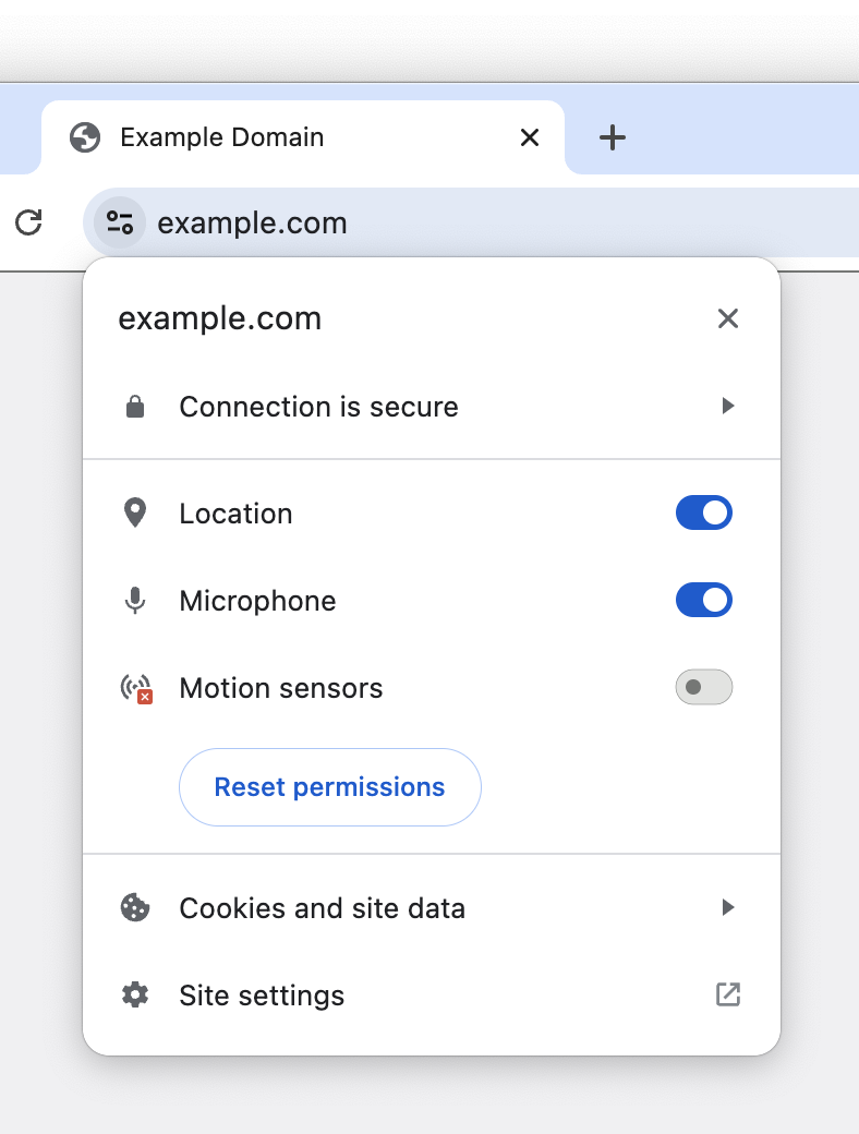
But the replacement icon looks really strange to me. They're calling it a "tune icon," but I've never seen a tune icon like this, with just two circles and two lines. Looks weird. I'm surprised that it fared well in the experiment.
I would prefer it if they'd use a gear icon, which is normally used for settings like this. You can see a gear icon at the bottom of the tune menu for "Site settings," which makes it all the weirder that they're using a tune icon in the URL bar and a gear icon in the menu for site settings.
A gear icon would work as well, but the intent was immediately obvious to me.
Also, I think using not-well-known icons is actually underrated (see my comment here: https://news.ycombinator.com/item?id=35793362)
I forget whether it's cool or not this week.
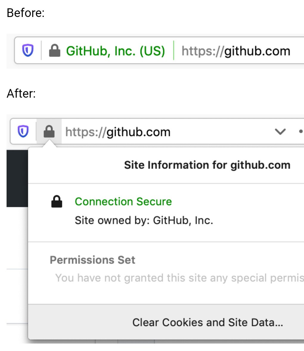
Here’s how they used to appear: https://pbs.twimg.com/media/EBxdA7EWsAIQtc0.jpg
While I buy the reasoning that consumers simply ignore them, EV indicators would be really useful in a corporate setting to mitigate phishing attempts against employees. It’s much easier to train employees to “look for your company’s name in the green bar” before they sign into a site, than to understand how domains work and why login.yourcompany.com is OK but login-yourcompany.com isn’t.
Does anyone know if it’s possible to restore EV indicators in Chrome via MDM software or similar? Does anyone work at a company that does this?
Our company puts a big red banner on the top of all emails that come from an external source or don't have DMARC/SPF/DKIM/other security protections. Literally nobody ever checks the banner. It has no effect on phishing click rates. People do not read, or think. They just look for wherever it is expected for them to click something/fill something out, or just click random things to see what something might be.
The only thing that has marginally improved click rates is when we either gamify it, or put all external mails in an external mail folder marked NOT SAFE.
"This product causes cancer" is ineffective when the warning is plastered on everything. Same goes for warning in computer systems.
I believe that kind of "negative awareness", the awareness that need you to keep checking if something has disappeared constantly doesn't work well in practice. You naturally develop blindness to that element, and therefore to its absence too.
So what are you proposing is of questionable value.
His original research site appears to no longer be online (https://stripe.ian.sh/), but you can read more about it in these articles:
https://www.bleepingcomputer.com/news/security/extended-vali...
https://arstechnica.com/information-technology/2017/12/nope-...
This doesn't seem like a good idea at all.
You can make an extremely valid similar argument regarding C++ tutorials written in 1995, but the end-response is the same: "Update your sources, learn the new thing, and most importantly don't assume anything computer-related that is more than 5 years out of date is relevant, especially for something Internet-related."
I am sticking to Firefox but as changes go, this wouldn't be a terrible one for non-Chrome browsers to converge upon. I don't think it's a good idea to hide the option away entirely though; a lack of available information and options for a user on a platform can often lead to the platform itself deciding it needs to become the arbiter of information, but I assume the iOS limitation is Apple's usual user-hostile behaviour.
"But it has a LOCK on it ..." It was impossible to get them to understand that SSL only protected one part of the movement of data. All they got was LOCK.
So, yes, I agree that the lock offers a kind of false sense of security to people who will latch onto that symbol even as the people providing the hosting tell them otherwise.
Indeed. In two different directions, even. First, a server can send a certificate with a large number of domain names in a field called "Subject Alternate Name" (SAN). If a server host a small number of static names, that's an easy solution.
Second, the client can use a TLS extension called "Server Name Indication" (SNI) to tell the server what name it's attempting to connect to. This is more recent than the SAN approach, and allows a single host to work for truly ridiculous sets of different names, even changing them dynamically.
I remember using an early (90s?) browser that explicitly said "Secured Connection" in the status bar with an icon that featured a depiction of a network cable. I don't remember the details, but I think that may have been in the early days of SSL.
I downloaded Chrome Canary to take a look at this "general design refresh" and... sigh.
The new browser UI is now 10 pixels taller than the old one.
I realize 10 pixels isn't a lot. But it's also not noting—it's half the height of the top bar on Hacker News. And this is after Google already made their UI much taller in their last refresh. If you make the UI take up more and more space with each redesign, it adds up.
Yes, I have a bigger monitor today than I once did. But I bought that monitor so I'd have more space for actual content, not the browser UI.
Remember how Google chose the name "Google Chrome" because it was designed to have a minimal UI that gets out of your way and lets you focus on page content?
> We think the tune icon [...] is more obviously clickable.
Yeah, because they made two changes and made it look like a button by modifying the surrounding area as well as changing the icon itself. The lock icon would also be more obviously clickable if it had the same changes in its surrounding area. How ridiculous of a comparison to make while changing two things.
What in the actual fuck.
The rest of the "refresh" actually seems not unacceptably bad.
Some 'designers' just blatantly waste advanced technology and screen real estate. Like I finally built a PC that can open right-click menus in an instant wihout having to watch the spinner, and then windows 11 decided that having (unskippable!) transitions to open menus is a good idea. I went out of my way to make sure I have the lowest-latency mouse and monitor, and websites use these custom css scrollbars that have nearly 2 frames of more latency that the system one, also dragging windows in and out of Stage Manager make your mouse have massive latency for a while.
I am at least happy with macOS though, at least the line-height is not going wild. Seems Apple have some of their soul left, though they may be lost soon. Even just being a novice macOS user I can immediately tell whether any animation is done pre or post 2020.
32-bit color? Naw, we're going two tone: Black and white.
8k screen resolution? Naw, we can't waste precious screen real estate on such frivolous things like borders and shading.
240Hz screens? Naw, we can't waste precious processor cycles and power on frivolous animations.
As for fonts, I get the impression that designers behind it are all in their 20s, maybe even fresh out of their late 10s. One's eyesight is usually still top notch in that age range, I know mine was; and I too dabbled in font sizes for ants because they looked cooler.
But I'm in my 30s now, and I can't stand tiny fonts anymore. My eyes aren't what they used to be, and designers by either their ignorance or naivety can't seem to respect the fact that people fucking age. I don't entirely blame them, I was that ignorant and naive bastard too once upon a time; I've grown wiser with age.
Newer/younger designers really ought to be shown how their seniors use their designs, it'll be an eye opening (pun intended) learning moment for the ones who were just naive. The ignorant ones probably can't be helped, but who knows.
http should simply be RED https should not be indicated at all
A curated list, preferably by the gov. should indicate which SSL certificates are allowed to be green.
Government oversight of TLS certs? No way this could possibly go wrong
Everyone everywhere knows red, yellow, and green now, and how to navigate around colorblindness (both red and green lights are tinted to be distinguishable).
Tuning is associated with musical notes (originally) and then with cars (optimizing performance) and engines more generally.
It's a weird metaphor to use for an icon that's usually been called "settings".
Because settings are not tuning, because engine/car tuning isn't about choosing your preferred settings, it's about small adjustments to maximize performance.
(The visual icon makes sense since it shows the popup to toggle settings for the site.)
1) Business contexts. A local network maybe shouldn't be trusted, there, for security purposes. "OK, but they should set that with policies" which, yes, sure, but defaults do matter, so... I dunno, I can see why they'd prefer the safer default.
2) Lying DNS servers on a local-but-actually-public network (think: coffee shop wifi) directing you to a local address to bypass SSL protection while it proxies Amazon or your bank website or whatever, and steals your credentials.
3) IPv6 is supposed to render these distinctions rather moot (although, LOL, and also that's precisely one thing some folks don't like about it, but that's another topic)
It's a pet peeve of mine, as you may have noticed. I have a lot of little random devices on my home network and many of them have no way (or no simple way, at least) of protecting with a real SSL certificate. Sometimes I'll go through the trouble of using nginx as a reverse proxy to hide the insecurity, but that isn't always easy to get working either.
Turns out there are lots of localized, privacy-preserving cues you can observe to determine whether a user may be at some level of risk, that doesn't involve a centralized blocklist or a boolean answer; and users really appreciated the "heads up".
I think a control panel like this is a good step forward after ubiquitous HTTPS. I also think user agents can do more to protect and warn users in ways that are less easily spoofed by malicious sites. Looking forward to seeing future developments!
Firefox gets a padlock with a red slash through it, Chrome gets that warning icon with "Not secure", and Safari just says "Not secure".
PS: I'm not writing this out of spite, btw. It just came to my mind when I saw the title and I was surprised I was right
[0] https://blogger.googleusercontent.com/img/b/R29vZ2xl/AVvXsEg...
https://blogger.googleusercontent.com/img/b/R29vZ2xl/AVvXsEh...
Even today, a page served over HTTP just gets an unobtrusive bit of text saying "Not secure", but if a page is served over HTTPS with a cert that expired yesterday you will get a very scary full-page warning that entirely blocks you from accessing the underlying page.
It seems totally backwards to me.
From a security perspective, a door without a lock has no expectation of protecting anything. But a door that should lock but doesn’t, or is supposed to be locked but has the key left in the latch is not providing the security expected, and should be given pause when anticipating security from the lock. This is what the browser is trying to translate with its UI.
Put a third way: to the average user, a website behind an SSL-stripping MITM proxy is going to look more trustworthy than a website that forgot to renew their cert.
> Despite our best efforts, our research in 2021 showed that only 11% of study participants correctly understood the precise meaning of the lock icon.
It doesn't seem to me that this is the right thing to be measuring. What matters more is: how many people critically misunderstand what the lock icon means, leading to the potential for trusting sites which shouldn't otherwise be trusted. The study itself goes on to better answer this, though its absent from the article: only 23-44% of respondents referred to the padlock at all when asked to evaluate the trustworthiness of a website. Its safe to say that some subset of that group would be shared with the group who critically & negatively misunderstand what the padlock represents, but its also safe to say that the entirety of the 11% "we know what the padlock means" group is also in the center of this venn diagram.
In other words: not more, and likely less, than a third of users were being misled by the padlock to the point of compromise. That's still a lot of people and its worth improving, but its a far cry from the 89% the blog post advertises.
When combined with the notion that the padlock's absence could cause harm; a different kind of harm, moving from "yeah this site is trustworthy I'll enter my credit card" when it isn't, to "no way this site is trustworthy I'm out of here" when it is trustworthy for some in that 23-44% group; I'm not sure this is a positive change.
I get that the world of HTTPS is evolving, and its very broadly default-on instead of default-off nowadays, but it seems to me that this is something of an expedient and ineffectual solution to something much harder: education. The article says "Despite our best efforts, our research in 2021 showed that only 11% of study participants correctly understood the precise meaning of the lock icon", but I'm at a loss for what exactly Google means by "despite our best efforts". I don't intend to be mean or combative with this observation. Education is really difficult; but when viewed through a more critical lens this article and the associated change really smells like "We failed to correctly educate our users about internet security, so we're changing an icon to absolve ourselves of the responsibility of the previous icon's inferred meaning."
This used to mean a lot when certificates were harder and more expensive - the rationale was fly-by-night bad actors wouldn't bother. This is most definitely not the case now.
Realistically as well, it's mostly to guard against man-in-the-middle interception - as we all know once it hits the server handling the SSL termination, all security bets are off.
FWIW Chrome does (and I assume will continue) saying "Not secure" where the padlock used to be, for HTTP sites. So there is at least that as a warning.
I like this update, I think this is an excellent UX change
I get what they were going for with this design, but it's impossible to describe this over the phone. I guess they want you to use Chrome Remote Desktop if you ever need to support someone remotely.
In The Lounge IRC client, we've also opted to this approach years ago, where secure connections show no icon, and insecure connections show an insecure icon.