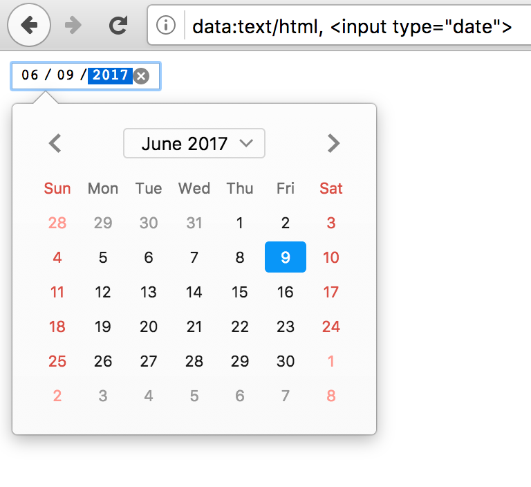
It's not just limited to Safari. Any and every date picker that doesn't allow text input of the date is ridiculous, those of you that design these things that call yourselves designers should find a new career path, I recommend selling cologne out of your trunk at a gas station, and if you're involved in this blatant and hostile devolution of interface I hate your guts. This particular one is my number one hated trend in UX, by a high margin. It is the most absurd set of design decisions I have ever seen, I can't see how it would not be malicious, it shows disdain for your users and you should be ashamed of yourselves. Fix this one and then we can talk about the others.
When I retire from full-time work, I almost feel like I should make it my mission to front up to these organisations and "pretend" I'm their typical user or customer that they are not serving very well at all, and put a rocket up them demanding why with all their technical and designer resources they should have at their disposal why they can't provide a useful and satisfying user experience.
been working on the web for ~20 years now. the amount of debugging, switching devices, just general hacks i need to do in order to interact with certain websites is a bit crazy:
- open my desktop browser
- open a specific browser
- disable all extensions
- open a new private tab
- inspect element with the dev tools
- js breakpoints and fixing minified js code on the fly
- removing or adding css
- allow location/camera/etc permissions
all so that i can press a button on a website :))
i’ve always worked in small teams. and we always tested on all the browsers, on all the devices. manually and automatically. and this is every time we deployed.
how some of these broken websites get to see the light of day is just unreal.
If anyone else has such a thing, I would encourage you to share.
The fact that this isn't natural standard practice speaks volumes to the current state of """UI design""".
I feel like designers do this minimally, or can get away with more functionality breakage or poor UX because they can make things look slick.
1. There should be a textbox allowing me to type a human-readable date/time (e.g. "monday 5pm" or "july 7, 2015").
2. The textbox should be selected and ready to type into as soon as the datepicker is opened
3. There should be a short list of previously-typed dates because often, for a given date in the UI, the same date is used multiple times in quick succession
4. There should be a typical month view with days of the week visible, in case I'm on mobile
5. The current date should be highlighted on the month view.
6. I should be able to pick the month and the year in at most two taps each (i.e. dropdown for each), no matter how far back in time I need to go.
Shameless plug: we recently implemented an exceptional date picker on momentcrm.com because of how frustrated we were with the default browser experience.
I like the idea of inputs being able to make sense of as wide of a variety or formats as possible.
For number inputs I’d like to build into Rails something that can handle basic math expressions. For example, a person can enter “120 / 2” in an input and get 60. This is useful for expense apps where you need to expense half of something.
If folks are interested, I can open source these bits. I’d like to expand them as much as possible to handle an even wider variety of inputs.
If you think date pickers are bad, you'll love time pickers, e.g. https://vuetifyjs.com/en/components/time-pickers/
The absolute worst are date pickers that grey out unbookable dates to look like past dates and default to one week from now, leading me to believe, if I'm not careful, that Im booking a ticket for today.
Seemingly no website that lets you book things has sensible date UX.
1: dates close to the current date, such as flight dates, meetings, delivery dates. 2: birth dates and similar (wedding date, start of employment), often a long time ago.
For “near future” dates, date pickers are somewhat handy because you can see the day of the week, and glance the number of days compared to other dates.
For date of birth, date pickers are useless. You don’t need to pick anything, you will just know it by heart in most cases and you can type it fast enough.
Programmers like date pickers, because you can’t choose nonexistent dates, you can’t confuse day/month number, and you can’t enter ambiguous 2 digit years. And they like consistency, so the same design is used for all use cases.
Please realize that consistency != usability.
The issue is that with mobile something has to pop up. So browsers need to make the decision between an onscreen keyboard or the built in pickers (this holds for color pickers as well)
If web developers don't want any of this, they could always just use `type="text"` instead of `type="date"`, but this leads to other accessibility issues and means you have to write a ton more code for proper validation
A simple "date (DD/MM/YYYY)" or similar format above a text field is a blessing these days, but I'll take anything over a date picker. A good date picker would let the year drop down somewhere, show calendar view, and allow text input of the date. That's the minimum requirements, a month drop down would be nice too. Sometimes I run into date pickers that have some unintuitive way to page years, one click at a time of course, and while I dislike that, at least I can move back by a year, it doesnt ruin my day. Imagine someone deciding that to input the exact time of something you'd select a drop down containing Unix timestamps, one option for each second, that's probably the only thing I can think of that would be more frustrating and senseless than the current state of affairs, and even then perhaps not because at least it's a dropdown you can scroll on. Literally a scrolling dropdown of all dates back to 01/01/1900 would be a superior UX to the current common date picker design.
Back in the day we had buttons in inputs, so a user could either click on white to enter the text or click on a button to see a picker/something. Same goes for type-or-choose comboboxes, search-or-choose object picker fields, type-or-calculate numeric fields and so on.
In addition to that, specifically for date fields in inhouse systems I’ve often added a popup button with most obvious starters. E.g. some reports assume days around today and some are mostly month-oriented, so a popup contains “today (<date>)”, “yesterday”, “start/end of week/month/quarter”, some combination of these. And also “+/- <unit>” buttons to quickly adjust a period in case they changed their mind. Users were happy. Good luck choosing a previous quarter and narrowing into it with these modern ui abominations.
It’s not a mobile issue, it’s an issue with stupid decisions around “stupid” users who still don’t get it, as all our occasional tests on eldery show. These ui patterns are designed for someone who never existed irl.
And what’s worse, these uis are not forced to use by those very designers. We could see a great improvement if they were forced to sensibly pick 50 random dates and other fields before collecting their paycheck.
There should be a text box I can just type "January 1 2022" or "2022-1-1" or "4/20/69" into, and it just figures it out (with a disambiguation dialog and 'save as default' popped if I feed it something ambiguous).
Imo, the site to plainly and explicitly require an exact type of date formatting. It’s very easy to validate and they can even help with formatting.
This doesn't address the real problem, though, which is IMHO that a calendar-like presentation doesn't lend itself easily to numeric date input/selection, especially, if it's about a date outside the current month. (E.g., a 3-column list view, which could be operated both by mouse/touch and keyboard input, may serve the purpose a bit better. Safari mobile could even style them rolodex-like… Which is, BTW, how it used to work on Safari mobile, before they switched to the unified style.)
Further reading
[1]: https://github.com/minimaxir/hacker-news-undocumented/issues...
Please don't do it again.
p.s. A comment beginning with "I hate these stupid parrots claiming Safari is the new IE" obviously broke the HN guidelines and therefore did not belong at the top of the thread. The moderation here was correct; your comment and laster destructive edit were out of line.
Don’t do that and tell me I’ve deprived people of context. You've already taken away from otherwise valid discussion about development with an industry and why this sentiment has proliferated by pushing my post to the bottom.
I could have also simply replaced the sentence with, "I don't like it when people repeat that Safari is the new IE," but HN doesn't have a recorded policy of restoring posts from downweighing.
If this is the only offending sentence, it seems like pretty shallow moderation to me.
“Edit out swipes” is a part of HN guidelines. I removed the post because clearly moderation found it fulminating, I agree it was, and now you seem to think you own my words.
If you have a problem with edits after silent moderation and believe this to be abuse, which contradicts current guidelines, just update the guidelines to include such a statement.
Safari does not have the monopoly status, Chrome has that, but safari does have the IE 11 like constant fighting when you have to support it.
Also Safari has monopoly status for everyone using an iPhone. The people on iPhone simply can't pick another browser, because Apple won't let them.
Yes, and is also very IE like in that it's not evergreen, various iOS devices stuck on specific revisions that Apple has left in various states of broken.
i have an iphone with safari, firefox, firefox focus and chrome, ...
It's that Safari is the only browser allowed on iOS. Which means that we are stuck with the subset of the standards that Safari has chosen to implement.
So Safari has outsized influence over which standards are actually feasible to build an application around.
One example: I've lost count of how long I've been waiting to build web apps that can send (user requested) push notifications.
Which, considering the alternative is Google having complete control over the web, I'm quite thankful for. It doesn't line up with how I'd like things to be in either case but it's much better for there to be some sort of check against Google. Google is far too aggressive about implementing new tech in the browser for very obvious reasons.
Totally broken indexedDB implementation. Random rendering issues, especially if you happen to ever use z-index. Hacks needed to get the most basic events to trigger. Idiotic scrolling behaviour. Choppy animations that didn't adhere to basic CSS standards (even the ones that weren't added by Google).
Honestly, it was a mess, and sometimes felt like a deliberate ploy to stop web apps from becoming viable. Things are better now. Just waiting for them to finally add web push notifications.
Just because it doesn't exactly match up to the same scenario of IE6 doesn't takeaway from the point that you can develop for everything else easily, then must deal with Safari's failures specifically.
I’m not one to defend google, but in the matter of a datepicker… it’s 2023 for crying out loud! A datepicker standard should have been solved and implemented about 20 years ago.
Admittedly it’s non-trivial dealing with dates across regions, time zones, DST, etc, but c’mon, it’s been clearly solvable for decades.
> https://github.com/minimaxir/hacker-news-undocumented/issues...
Can you elaborate on this? How does this happen, and is it a permanent de-buff?
However, OP complaining about usability and the providing three text fields with the MM and DD being placeholders is terrible. Normally placeholder-only labels are a bad idea, but this is especially true when the month and day fields have different order depending on the region. The moment you've got [1] [4] [1980], you no longer know which is month and which is day.
And do they swap these placeholders and entered values if you change the country from US to an EU country?
The lack of progress in the tech world in making consistent user interface standards is disappointing. We should not be still struggling with these topics (and as users we should not be suffering). Tax time, trying to fetch reports from banks/exchanges is one of the worst recurring experiences...
I don't think this is so much a problem of UI not being consistent as us just not providing resources to help elderly navigate the web better.
Also, they could've just... set a default date of like Jan 1, 1960 and saved 90% of their users a headache
<input type="date" value="1960-01-01" />
FF: https://blog.nightly.mozilla.org/files/2017/06/input_date_ca...
comparison: https://wd.imgix.net/image/vvhSqZboQoZZN9wBvoXq72wzGAf1/uh0U...
I'm not sure how that really helps? Moving multiple years is still going to be a huge pain, so you're only really saving people who have a birthdate in or very close to that same year.
They look nothing alike though.
Are you trying all three on iOS? On iOS Apple only allows a single rendering engine (WebKit), so Apple dictates what the <input type="date" /> entry dialog looks like, and there's nothing other "browsers" on the platform can do to fix it (since they're just shells built on top of WebKit).
It does not seem that most websites use the built-in date pickers. I've seen dozens of different date pickers all while using Firefox. This is the key problem.
At least if everyone used the browser native date picker, it would be consistent within that browser. Then we could debate about which browser had the better one (and maybe standardize).
The solution is to use words instead of numbers for Month. I dont care which part of the world you are from and how the date settings differs. Months are only show up as Jan, Feb, March Etc and not 01, 02 , 03.
And always show 4 digit for years as YYYY.
Not everyone uses the Julian calendar, or even 4-digit years. Here in Japan, this is year 4 of the Reiwa era, so you need a year picker that lets you choose the correct era (Reiwa, Showa, etc.) and then the year of that era, and of course the number of permissible years per era differs greatly. (The era reflects an emperor's term, so when we get a new emperor, we start a new era.) Then, just because this system is such a PITA and anything international doesn't use it (but everything government-related does), we need a converter that lets you convert between the Japanese standard and the Julian calendar.
Except for the vast majority of the world that doesn't use the English language.
https://dontplaywithculi.netlify.app/readlater
(it doesn't do anything, just a UI experiment)
Yet that's not how browser controls work - browser controls for all major browsers always use the client's date formatting settings when displaying dates (once popped up it's usually obvious which is which). And that just makes them pretty much unusable; it means outside of the US you will have dates in text using 1 format, whereas browser controls use a different one. That's... completely unusable. How all three of the major browser manufacturers managed to agree on this particularly hostile design is beyond me.
I suppose that the ordering of dates is independent of locale.
The locale rules for the date format are simple: the DOM value property of the field is a string in YYYY-MM-DD format, independent of locale.
The date display format and what the text input accepts depend on browser locale.
Conversion happens automatically and the text input is shown in a way that indicates locale on desktop, least I remember (e.g. dots for European format, slashes for US). If a user enters "1.5.2011" in a browser with German locale, HTMLInputElement.value would be the string "2011-05-01" (invisible to the user).
I honestly can't think of any better choices, the only thing missing is some attribute to eplicitly control display locale. Which is probably by design, as it would be abused to override system/browser locale and create confusion.
I once replaced a Vue date picker library in a web app with native date inputs for UX reasons (e.g. typable dates, reliable visibility of the picker when fields are near window borders, mobile UI...) and users were reportedly happy with that.
Admittedly, it was mainly a desktop app.
So, long story short: the only problem I see here is the mobile modal date picker UX. And thankfully, it can be improved in the future because it's part of the OS and not controlled by the website.
What is odd about it other than being different and not being immediately lexically sortable in file names?
Edit: It's an honest question. People and context help determine what you're wanting out of a date, so I am curious what is viewed odd about the U.S. format aside from it being not what your country uses or what the ISO standard is,
The one true date format is YYYY-MM-DD
I have no doubt that 9/10s of people reading HN would be able to figure this out if not more. But what is the figure like out in the normal/non-IT world? I miss when Microsoft had their accessibility research lab that tested stuff like this scientifically and released tons of great papers. We need more of that, I'd love for Apple to invest in stuff like that.
The problem is whether they're getting calls because the UI is objectively worse, or because there's an upstream selection issue: there are comments on the gist showing the UIs on other browsers are not fundamentally different, the biggest difference is that Firefox desktop makes it much clearer that the month/year is an active control, and the three desktop variants clearly allow textual input.
They also indicate that their population is:
> As such, most of our customers are in their 60s or older.
So sounds to me the issue is not that Safari is worse than the rest (although it's no better either), but elderly generally get (or get offered) iPads for pretty obvious reasons, and so there's a huge selection bias.
It's all rather minimalist - and if a user catches it, that's fine, but if they don't, there aren't any fallbacks or additional hints as to what to do. Additionally, the icon seems fairly small from the screenshot - though on an actual device that may not be an issue. It may be too small to function as a good UX element.
It's a really terrible UI - why would the month and year both pop up at the same time? They should come up independently.
If you hide it on a different screen I need to react to it when it appears.
Not to mention that you now need a "Next" button and a "Back" button in case I made a mistake (or just want to double-check what I inputted)
It does not, that interpretation does not make any sense.
Although I do agree that the old skeymorphic iteration of the control which made it clear those are wheels and the bar is an index was infinitely clearer: https://www.andyibanez.com/img/date_picker_pre_7.png
Here, too, Safari is the cause of 2/3rds of the lines of exceptional UI code now that Edge switched to a compatible render engine. Or blocks features altogether. All major browsers settled on doing things a certain way and then you remember that you always need to check Safari and of course they want it another way, so you get to re-do the work and duplicate your code with a comment "//because safari wants x to be done this way". I had less trouble with MSIE6 back in the day, though I can't rule out that I did less fancy things back then.
These things are not like "oops we render it differently by chance", it's conscious choices like not supporting SVG or being able to read file names in JavaScript (can't have javascript-based upload progress bars or local file encryption if you want to keep the filename; need to encrypt on the server and have the server report progress back via another channel).
Not “compatible”. The same render engine.
Edge is essentially just Chrome with a slap of Microsoft paint.
That’s nice for uniformity, but having all browsers use the same engine is not good for the health of the open web. We do not want Google as a single point of failure any more than Microsoft.
If Firefox had the marketshare of Safari and was mandatory to support because they were a major platform’s browser devs would be cursing their name too but with a different set of things that aren’t exactly like Chrome.
It really does feel like devs are literally developing against Chrome with not even so much a thought at cross-browser compat or a glance at caniuse and then taking their finished site and then working backwards from there on other browsers cursing the compatibility issues when they could have avoided it entirely had they started with a cross-platform subset of browser features. Just the same as how cross-platform native development works.
Hell someone did all the hard work for you https://github.com/amilajack/eslint-plugin-compat
Then multiply by all the npm packages blindly imported that were developed with the same methodology and I see where the rage comes from.
Safari (mobile), however, will be broken. Firefox on Android often breaks for more complicated stuff, but works better in my experience.
Uh, it kind of is? At least, I use Firefox exclusively and thus also support it when developing things.
The browser I have trouble with sometimes is a webview skin on mobile (whose engine is blink or whatever it's called nowadays), there some sites block the http user agent string for some reason or it's missing some advanced this or that and I have to switch to mobile firefox which is a lot slower.
> Can any browser that is not a reskin of Chrome with feature and bug-for-bug parity actually satisfy web developers at this point?
Uh, yes? Firefox? I don't understand your question.
What is the definition of “compatible” here?
The point of “one specification, multiple implementations” is to explicitly leave the door open for slightly deviant implementations.
There's the occasional situation where Chromium doesn't support something or Firefox doesn't support something, but it feels like Safari has double the rate of both combined.
But the UI is not superfluous for many use cases. Often, you want to see the whole calendar for context -- eg, to see the associated day of week.
Not on iOS (at least assuming you don’t have a hardware keyboard). The software keyboard does not appear and there’s no option to bring it up.
I wrote code on the back-end to also parsing. So just type 11 for the 11th of this month, or 11/11 for 11 Nov this year. Or 11 Nov. Or next Tuesday. Or tomorrow of yesterday etc.
It also only treats the screen format as a suggestion. Like it wants dd/mm/yyyy, you can type in 1945/12/6 and it'll figure it out. (it uses the suggested format to resolve ambiguities)
Computers are good at this, and should do more if it. Don't get me started on Web sites that reject my credit card number because I type in hyphens or spaces. With specific messages like
"enter the number as 16 digits, without spaces". WTF????
I have gripes with Safari, but date pickers isn't one of the things only Safari struggles with.
An image search for 'android date picker' brings up at least three different designs: https://i.stack.imgur.com/3DW4n.png https://i.stack.imgur.com/LLRmB.png https://i.stack.imgur.com/kJqln.png
It seems like the first screenshot is `type="time"` and the second and third are `type="date"`. But I don't know if those are native components or the browsers defaults. Would be useful information
https://developer.mozilla.org/en-US/docs/Web/HTML/Element/in...
But yeah that's a good point. I'm on Firefox on Mac and it looks pretty much exactly the same. I don't really get why other browsers wouldn't be causing the same issues
From the screenshots it seems like they're talking about users on a mobile device. iPhones only allow you to use WebKit, but I'd be curious to see what Android's date picker looks like
I feel like they could've just saved themselves the headache by setting the default value to 1950 or something
Video: https://imgur.com/a/W196T5f
iOS keeps the input on screen, so you can see the value in context. Android covers it up, and shows the value in a different format in the header.
iOS shows the Month+Year inside the calendar, with a blue arrow beside it to indicate interactivity. It’s not a strong affordance, but it’s something.
On Android, nothing gives any such affordance.
Blindly tapping the month+year in the calendar does nothing.
Blindly tapping the day or month on the header does nothing.
The year looks similar to the day and month, only smaller, and slightly darker grey. But if you tap it, you can scroll through the years.
There’s no way to scroll through months – the only option is to tap through them one at a time.
They didn’t just have a few bugs in their browser implementation or were slow to implement new features.
Basic, crucial CSS features were broken. Microsoft didn’t add any new features to the browser about a decade, basically holding the entire web back to the standards of circa year 2001 until it was finally safe to drop support for it almost a decade later.
And furthermore, Microsoft weren’t pushing users to upgrade to the latest version, so we had to support older versions of IE long after their replacements were released.
I understand wishing that Safari would be better, but luckily the Safari team is much more on the ball than the IE team ever was.
It's not my experience as a web developer. It's 'a lot' at best. And not only in js, but also in css or literal anywhere you might interact to.
It always requires a few workaround when I finished the page in other browser. Firefox or Chrome, in the other end. If your page works on one of them, it will pretty much just work on the other.
Safari is probably 50% of my bug ticket, almost equals to every others sums together.
Write a page for safari really reminds me the age IE is still a thing.
I'd be very curious to hear some common issues you have to deal with
I think Safari isn't broken in the ways IE was, because IE always had comptetitors running along it and pushing the enveloppe where Microsoft was pulling the brakes. Firefox and later Chrome were handicaped in adoption, yet had little to no limitations on the features they wanted to add.
In comparison no other browser can run with the same privileges as Safari on the phone, while the iPhone is a dominant platform. So there just isn't the same space to innovate in a profitable way. The only company who can afford pushing the envelope is Google, and at this point their only real competitor is Firefox, that they basically pay to keep alive. They also have little incentve to really push the web as it doesn't impact their bottom line (native app ads also go in their pockets afterall)
I have submitted 10s of webkit bugs and most of them will never get fixed.
New bugs randomly appear in every OS update.
5 year old cheap android device can handle complex webpages really well, but my 1500 eur brand new iPhone runs out of memory. iOS Safari is really buggy.
I work with online maps.
I can't see why there isn't an standard semantic web standard for this. We shoukd standardise how common fields should be named and their datatypes set once and for all. Example: set on a field for month AND a field for day. No more MM/DD vs DD/MM issues. One-click and it's unambiguously filled by the browser. Seriously, what's preventing this from happening?
What’s preventing this from happening? Nothing, clearly, devs just don’t implement it because they don’t know about it, and they don’t know about it because they’re busy learning about or implementing something else. How would you universally communicate to everybody that this is now a thing? How long will it take you to fix 90% of the forms out there that were set-and-forget five years ago?
Besides, for most it’s easier to use oauth with google or whatever and automatically get the name and birthdate from there (of course, often enough, they have the non completed form anyway…)
After recent story about github ban: https://news.ycombinator.com/item?id=33917962 anything that asks for more that email is a instant 'close tab and never return' for me. And even before, there is no way I am allowing any site to access may date of birth (despite it being fake one anyway)
And going back to "autocomplete" - it looks that browsers "know better" than developers: https://stackoverflow.com/questions/12374442/chrome-ignores-...
This implementation literally forces you to use the arrows...
This technique also fixes the issue where a Safari Mobile date picker defaults to todays date, for example when using > to move through existing dates that are empty (clicking Done unobviously picks today - often not what you want). Terrible UI for fields like birth date or employment end date. Although depends a bit on whether a blank date makes sense.
Oh, and be really careful of type=number on Safari - it silently fails. inputmode=xxx can help, but it has weird differences between devices last time I looked (versions, Android, iPad etcetera). My mum repeatedly failed to enter a dollar value into a type=number, because she was entering a thousand’s comma (the UI showed $ and , everywhere for numbers so it is a sensible mistake to make; although Safari will display the entered number in the input field the .value==0 —— arrrgh silent failures are hideous).
I hate Mobile Safari - buggy, impossible to get bugs fixed, relatively poor standards support e.g. still need -webkit- prefix for some standardised CSS from a decade ago. Oh, and you end up with people using obsolete phones stuck on old Mobile Safari versions. Android updates Chrome even if it doesn’t update the OS (although Android also has the problem, it is less of a problem).
Just set a default date and it won't default to today.
I am not suggesting my solution is perfect, but I am saying I have successfully used it (although I admit is was a few years ago now, and I first used it was when iOS and Android type=date support was unpredictably broken so type=date must not be exclusively be used). I think it was about iOS10 before the bugs in the UI to clear dates were fixed? Another situation for me was New Zealander’s confused by MM/DD/YYYY native formats when using browsers configured for US date localisation.
Until April 2021, Safari on Mac didn’t even support the date control, and Safari (on Mobile or Desktop) still doesn’t support the min or max value attributes. And time entry is a complete nightmare. I always try to make sure data entry controls work well for everybody, even console devices.
There are always corner cases that somewhat depend on your particular users, so compromises are necessary.
Background: I have programmed HTML entry controls (combo, date, time, number, etcetera) for actual man-years of my own life. That is because I started before jQuery existed, supporting IE5.5, and the available DHTML controls were mad broken for usability. I have had to understand the compromises between different solutions on different browsers, and try to find the most elegant solution, given that data entry on browsers is an extremely gnarly problem space.
That's exactly what's happening here though, Safari shows the platform's widget.
> Just set a default date and it won't default to today.
That's not really helpful either, DOBs have wide ranges of dates so the need to switch year, possibly decade (as this is for the elderly) will always come up).
Tbh I think setting a default value might actually have been a better solution. It's not perfect, but hacking together your own alternative could lead to a number of issues for folks relying on screen readers and other input devices. The `type="date"` gives a lot of semantic meaning that `type="number"` lacks.
If you're gonna ditch it, I'd say at least use an existing external library that's been battle tested for accessibility.
Date pickers are terrible if not near the current date. Ones for long-term data sets where you set the start and end date are a huge pain. Like getting inflation data starting in 1960, or coronavirus data starting in 2019.
https://wd.imgix.net/image/vvhSqZboQoZZN9wBvoXq72wzGAf1/uh0U...
From left to right: Chrome desktop, Chrome mobile, Safari desktop, Safari mobile, and Firefox desktop
I think at minimum they could've chosen 1980 or something as a default. 0% of their users were born today so not setting a default makes no sense
We're actually expecting users to follow through on that?
So, typing in Y/M/D is better in most cases for DOB than drop downs, unless maybe it's dropdowns for [YYY][Y], then [MM] and [DD]? Or how about start with "How old are you" and then get me most of the way there on the picker? :-)
DD/MM/YYYY is the way
purely safari's fault, makes sense otherwise to have this on the browser side.
Next challenge: A sensible input for a date range with optional time of day. Have not seen a good one yet I think, especially when you try to correct your made input.
I have no trouble figuring out how to pick by year because the rest of iOS follows a standard UX.
It seems more important to me to support the native accessibility of the phone than use an external UI vendor.
I am a huge advocate of family members and elders to purchase devices they are comfortable operating. This is why my grandparents primarily use their desktop computer for any important things, and their iPhones for messaging/video chat.
Does anything they say read like it’s been backed up by peer review studies?
This is semi relevant to me, I do have high blood pressure at 49 that’s well control with what amounts to a standard diuretic (Hydrochlorothiazide).
My pet grievance is the range input, which is now filled by an accent color from the left (start) up to the selected value. Meaning, if you provide your users a range from -200 to +200 to select a value from, and a user selects a value of 2, this represents a selection of 202 units, which is apparently the real meaning of the number 2. (As is, Safari is the only major browser not participating in this nonsense.)
90% of the annoyance could've been dealt with if they had just chosen a default date value of, say, Jan 1960 or so.
That tells me you didn't once use your site the way many of your users do. That's completely on you.
MS deliberately added non-standard crap to get everyone off the rails when not using IE. That's why websites often showed "Best viewed in 1024x768 and 16M colors using Internet Explorer".
And that is a remark I see more often every day. And it's Chrome being recommended.
Remember why MS switched from EdgeHTML to Blink? Because Google would hamstring EdgeHTML at every corner on their services. Not completely break it, but make Gmail or Youtube a tad slower than in Chrome.
"Don't be evil" my ass.
I'm not exactly condoning, nor condemning, that behavior, but there's a little part of me that wants to say to Microsoft: "not so funny now, is it?"
The proposed solution of using number inputs is also not great, since they have a host of accessibility issues [0] You want a regular text input with inputmode="numeric" and a pattern attr. This will give the correct numeric keyboard on mobile, and work just as well in desktop, without any of the associated issues.
I've built several date pickers, I know how hard they can be to get right. But they shouldn't bbw blindly used for any date value, they should be a deliberate choice
[0] https://technology.blog.gov.uk/2020/02/24/why-the-gov-uk-des...
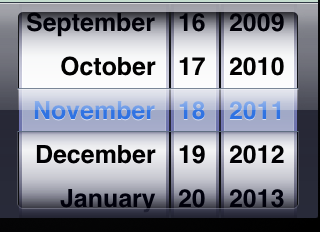
Interestingly the old iOS datepicker was actually pretty good for DOBs: the old picker just gave you three scrollwheels with the year, month, and day (possibly in your locale order), scrolling through the years was a very quick thing: just flick the years wheel and off it goes. A touch finnicky to adjust, and maybe not great for close picks because of the lack of context.
The issue here is the "new" (iOS14) calendar-based pickers, which give you, well, a calendar, and hides the quick month/year direct selection behind a dropdown (and as the essay notes without a day wheel, so now you have to open the year/month selector, jump to the right one, confirm that, then select the actual right day on the calendar view).
Especially given the flat design language as it's really not obvious the month/year and their arrow is an active dropdown.
That’s all fine, except it does this validation on every change, rather than when the user has finished entering data. So if today is 27th Dec, and I wanted to enter 1 Jan 2000, I have to first change the year and only then is it save to change the day and month fields!
What’s worse is the year appears last/right hand side, so as we work from left to right the first thing the UI has you pick is the day, not the year. I simply cannot understand how these issues weren’t addressed before release.
1. Have an "evening event" from 16:00-23:00
2. The start time changes (or most likely was previously a generous placeholder)
3. Update the start time to 19:00. Thunderbird automatically adjusts the end time to preserve the length. Now it is 02:00 the next day.
4. Adjust the date back, however after the first click it closes the datetime picker and throws an error.
5. Try again, select the future date to get past the date picker into the time picker, then select the correct time.
6. Open the datetime picker again, select the correct date and the same time.
This is a particularly egregious example because the datetime picker is combined and aborts half-way through after you select only a date.
So why use a date picker for this and not go with 3 number inputs which would be a lot easier to enter your birthdate in.
However, they also mention that many of their users are on iPads. On iPad there is no numeric only keyboard so it's not the best experience. Not terrible, but it's annoying that iPhone has a numeric keyboard but on iPad it's just a full keyboard, even when you request numeric only. We ran into this same issue and ended up just creating our own keyboard to make input simpler.
It looks simple and basic, but <select> works very well on all devices.
new Date('12-27-2022'); works in Chrome but returns an invalid date in Safari & FireFox.
new Date('12/27/2022'); works for all browsers.
But beyond that, don't use `new Date(string)`: the only spec-defined format is a restricted ISO 8601[0], though the horror show that is RFC 2822 datetimes is conventionally supported by everybody because it's the standard stringification (Date#toString).
Everything else is implementation-defined, and likely heuristic.
Without user experience testing "I'm convinced" says more about the person saying it than the reality of what users in the broad will find easier and what will reduce friction.
Using the date input field should always adhere to the UX of the browser OS.
If I'm on Android and I spend my whole life learning the UX of Android's date picker, wouldn't you want the web's date picker to follow the same UX?
This is less a problem the website should solve and more of a problem that end-users need to learn.
If my grandma doesn't know how to use a feature on her phone you bet she is contacting a family member first. Maybe we should encourage our family to use tools that they are proficient in...
I'm an iOS user majority of the time and it is very intuitive to tap the text with the > symbol. Like others state, Android's UX can be just as confusing.
I'd say you're following UX best practices and are supporting the native accessibility features of the phone so :shrug:... close and move on
> This is less a problem the website should solve and more of a problem that end-users need to learn.
It's crazy Apple hasn't fixed this.
I know there's good faith work around WebKit, etc., by smart and genuine people. But it was easy to wonder (especially with the anger that comes from being existentially threatened) whether some element at Apple wanted to make Web apps work badly, to keep the proprietary App Store party going.
(I did pull it off successfully, but only with much heroics.)
It is nice to see a calendar when picking a date for an Airbnb booking.
Picking a date for a future event is an entirely different use case than choosing a date in the past. The former is more of an exploratory activity; you are interested in things like the day of the week, proximity to holidays, availabilities, and all kinds of information, whereas a visual depiction of a calendar conveys valuable information, information that is entirely superfluous when picking a date in the past.
But registering dates is slow and cumbersome, more so if those dates are removed a few years ago, like DOBs and other similar kinds of dates.
Also, anything past the current month is a chore; manual input is usually faster and less error-prone.
- Pattern: https://design-system.service.gov.uk/patterns/dates/
- Research: https://designnotes.blog.gov.uk/2013/12/05/asking-for-a-date...
Date input can be DD, month in textform drop-down, YYYY and you won't have any problems anymore.
I don't understand why it is so hard for devs, PO,... to understand this :)
Also, ISO-8601 not being universally adopted is a shame.
The benefits of doing this are:
- Standard elements that work everywhere
- Easy to refresh the available options after a date change
- Mimics the "rolodex" behaviour to quickly find any date/time
The libs I used are arbitrary, won't be hard to rewrite using only built-in Javascript, or any library / framework
Spinbox is great if you need to increment like 5 items up or down. Not 30+ and CERTAINLY not starting at goddamn 1900 and making me scroll down nearly 100 entries.
People who do this need to go to jail. Forever.
Please don't force users of mobile devices to type in a date.
Honestly, this aspect of Safari's UI (the default form input widgets for complex values) is severely under-worked and in desperate need of an overhaul.
Honestly , 3 select boxes are so easy to understand even if they are somewhat clutter
It needs to stop being a blockbuster feature that lets companies/products like Fantastical that bait and switched their paid users limit their competition. If Apple can spend the amount of time on things like LiveText and their creepy NeuralHash program, they can take 5 seconds to implement easy date entry.
The fact that a lot of people prefer to avoid using jquery (for no particualr reason) and all its widgets and instead try to re-invent the wheel (in a much inferior way) blows my mind.
I feel like the data is flawed. This is (supposedly) 1/3 of tech issues raised by customer support — how many of which are total?