Firefox’s Redesigned Preferences Feel More like the Web
That expresses exactly what's wrong --- the native UI controls are predictable and accessible and styled with the rest of the OS, and as the cascade of dialogs above it (I'm not sure how that's even possible --- getting to "Offline Data" From "Exceptions - Saved Passwords"?) shows, you can actually see that you're controlling the browser and not merely a page inside it (related article: https://news.ycombinator.com/item?id=30697329).
Another important change is the introduction of a skeleton screen to make the start feel fast
I've never heard that term before, but whenever I see things like that, I'm reminded of fancy progress bars and such --- the real problem is that you need one in the first place, and instead of fixing the underlying problem of why it's taking so long, you try to hide it...
This is such a weird thing to me. Did anyone ever want this? Were users asking for this? Did user studies show that this was somehow desirable or preferable? Did they do a study of Chrome users and find that they were more likely to stick with Firefox if they made this change? Does it significantly reduce code maintenance burden somehow?
It seems like the kind of thing where users only "want" it because it's familiar, and it's only familiar because it's already been forced on them everywhere. Basically it's circular reasoning. It's like the meme of hiding a button and then claiming that users never use that feature, so you can justify removing it.
In this day and age, noone cares what actual users want. Instead, corporations tell users what they "want".
How do you design and implement an interface that feels native across platforms?
First there is the easy approach: The common denominator elements. Essentially what you get when creating a Java Application. The UI will probably look kind of native, but also outdated. Think Windows 89-Style Settings. You're also limited in how you can present options because you have so few form elements to play with.
The other approach to native is to use modern UI elements. For one thing these are not easy to get. While on macOS Cocoa bindings are at least available, on Windows it is pretty much impossible to get anything but the Windows-89 style form elements. Even if all the bindings were available, which also has to take various Linux Desktop Environments into account, then you had to design for and maintain multiple versions of the same settings menu.
So I hope this explains why non-native controls are a sensible approach. You create your own design system that is (mostly) consistent across platforms. Designers only have to design one surface, they can create new patterns if necessary and engineers only have to maintain one implementation. Of course they have to be accessible and they are. I say "mostly consistent" by the way, because Firefox still respects some UI conventions from operating systems. For example it uses system fonts, system font-scales, and changes naming conventions and button orders appropriately.
This reduces work but of course it still is work to update and maintain that surface. about:preferences in Firefox has quite become quite messy over the years and is neither loved by designers nor engineers, but it's time and resource intensive to update it.
Is it really more efficient to maintain a design framework chasing latest web trends instead of having separate native interfaces?
"What about users that want to customize things?"
Give them an alternate path. The browser loads slightly slower (the same as now), and they still get their ability to customize. The rest of us can use the default, faster path.
Bias towards fashion trends is one of the biggest problems in the software industry.
> Another important change is the introduction of a skeleton screen to make the start feel fast
Yeah. Sometimes you do have to make users wait— e.g. parsing a huge cache to put in a dialog or making shaky network calls— and most designers mental model for addressing that frustration is the slow elevator problem†. Skeletons seemed like a good way to address it. We don't parse screens instantly: we first interpret structure/visual hierarchy so we know where to scan for titles, ordinals, controls, or whatever else we need. Skeletons theoretically let us do that while content loads. More recent research doesn't corroborate claims of silver-bullet efficacy:
https://www.researchgate.net/publication/326858669_The_effec...
† The related anecdote goes something like this: Tenants of an NYC office tower complained of slow elevator service during peak use. The property manager consulted with experts to evaluate the algorithmic efficiency and mechanical components, but it resulted in little improvement. The property manager then turned the exterior elevator doors int mirrors. Most riders were sufficiently emotionally engaged by a life-sized version of themselves long enough to make the wait seem much shorter.
I thereby will claim that cross-platform UI toolkits (which includes "the web") actually affords me--as a user--tremendous value, and I am always pretty happy when I see a product start to figure out their house brand. I do appreciate the other side of this, and I even have sometimes argued it myself to engineering teams I work with as--if nothing else--using the local style is certainly better than being bad at style, and I frankly would rather avoid having to work with a designer. But is it really so shocking to appreciate mine? I always feel like people jus let casually dismiss the idea that users might actually prefer software to look the same everywhere, and yet I feel like it is only particularly snobby tech people (which does include me: I hate poorly done UI) that seem to want the fully unified toolkit, and I think the success of bespoke UI in games really demonstrates this.
1) Create Window 2) Create UI (based on native controls for OS) 3) Load drop downs, top level down. 4) If you design your application this way, you won't have to build a skeleton. Mozilla is not using native UI/UX components to build their UI, so they have to go through several extra steps. I'm sure they do this in the name of customizability, but that, IMO, should be optional.
Wow, I think you've identified the probable cause of something I've felt was "wrong" about Firefox for a long time but couldn't pin down. Firefox just "feels" bad on a Mac even in comparison to Chrome, not to mention Safari.
The new web-based pop-ups can take a long while to render if a heavy page is being loaded. So if I try to quit Firefox, the "are you sure you want to quit" popup renders empty until the current page is done.
Sure, this happens only on high resource usage, but the previous implementation di not suffer from this.
What an absolute abomination that was. An insane waste of space and a violently assaulting visual distraction. Especially when you're trying to open a document that the current one is referring to, hiding what you're trying to see with useless space.
"Windows is called Windows, not Window."
Thankfully however I don't care too much because I can still completely hide the tab-bar with my userChrome.css, and use "Tab Center Reborn" to have my tabs on the side instead.
Thanks for the extension suggestion I may give it a try.
I think I read somewhere that the reason was that user studies showed that people did not understand that the tabs could be dragged around, moved to other windows, and generally were "detachable". Floating buttons should make that more obvious.
I'd be interested in research on whether they achieved that goal.
No wonder they peaked user share early on and have rapidly hemorrhaged since then.
Ummm yes? Funny, I just wrote another comment complaining how hitting refresh on a major airline's flight status page is liable to give one of those terrible "something went wrong" messages (apparently the search results are liable to expire, but until they do, refreshing will actually update the info, so it is useful to periodically press to see if the flight got delayed).
Combining stop and refresh is also dangerous since that's a race condition. Suppose the page is taking forever, I decide I've had enough of that and want to press stop. But in the second it takes me to actually click on it, the page decided to finally load! Now my click, instead of stopping the annoying spinner animation, clears out the information that FINALLY arrived and brought the annoying spinner back.
(I actually think there is a pretty good case to just remove the stop button though, it isn't vital and just hitting back or close does the same thing anyway. But combining it with the refresh button is about the worst possible thing you could do to either button. It takes one useful button and one meh button and combines them into one awful button.)
Speaking of clicks, that's actually the last straw that made me abandon firefox entirely: in version 75, they broke clicking on the url bar. Instead of doing the sane thing - putting the cursor where I clicked - it instead selects all. Before, double click would select all, meaning if you wanted that, it was still easily available. Now double click instead selects... a word. So they completely removed the very useful single click functionality and turned double click into a completely useless behavior. Absolutely unbearable.
I could tolerate or undo most the other UI changes they did, but this click thing couldn't be user style'd away, couldn't be configured away. They just shoved this massive breakage down. So I uninstalled it .
> takes space even when you're not loading
I'd rather have a predictable UI of marginal utility that doesn't change out from under me than a UI that randomly changes from bad to worse in its own time. At least you can get used to consistency, even if it is consistently mediocre.
> What makes v1 "the best ever"?
Don't put things in quotes that weren't actually said. I actually said "v1 was not great but ok, and it got overall worse".
There's actually specific changes I think were good, coupled with other changes that were bad.
As someone who's been using it since the phoenix/firebird days, I disagree strongly. There have been hiccups along the way (particularly the tabs appearance in proton), but in general the UI has gotten significantly better with each redesign. Looking back at the v1-3 UI all I can see is how much vertical screen real estate is wasted on things I would very rarely click.
v1 was a perfect baseline. Then you could reconfigure to your hearts content, or reskin with a few clicks.
That being said, I never did that. I like v1, and the only thing I would change about it is to take out the tabs and move them to the side.
Its UX "history" made it plummet from the top browser at one point to a forgotten has-been. These tweaks were not successes or celebrations, they were the death by a thousand cuts.
My guess is the rise and marketing of Chrome and its offspring had more to do with Firefox's decline than anything Mozilla has done.
I still think there is plenty of room for a privacy respecting browser in the market, but Mozilla hasn't even been trying to fill that niche in years and still claiming to do so just makes them look like untrustworthy liar.
It made the browser compete with itself, and pushed people into alternatives. After all, if you're going to learn a new UI, why not try another browser altogether?
Google added things like WebUSB, Bluetooth, all kinds of web app APIs Mozilla rejected because of tracking risk, etc.
Mozzila killed their coolest features like FlyWeb.
They just haven't kept up with Chrome, and their vision is way too "privacy at all costs" rather than allowing users to decide. They don't seem to share in the modern idea of web apps having full native parity.
What an awful idea that is.
Those are literally the last things keeping me with Firefox.
There’s another state that may be related to uBlock Origin (or other extensions) immediately afterwards, too: You can click bookmarks etc. but nothing loads (only after a significant delay). Again, awesome UX.
I guess I’m slowly becoming conservative because I’ve come to hate change. Most of the time, it doesn’t improve anything. And then, with increasing odds, changes actually make things worse. Not just limited to Firefox, of course. Also Windows, macOS, iOS, Android, whatever. Hell, even cars are getting worse every year.
Some people in the browser space haven't lost their minds and track things like how often the layout of a page changes during loading, how often it wiggles around, etc - which penalizes skeletons and other bad tricks, as it should. But this particular sensibility hasn't caught on elsewhere.
Not everyone runs good hardware, in fact the majority doesn't. When you click to open something and it doesn't load immediately many people will click again and again which leads to opening 2+ windows and also adding to the loading time of the first one.
When 70%+ of the users are not skilled in tech using laptops on battery saving mode this happens a lot.
Nowadays, the innovation has plateaued and computing became an ad delivery mechanism and a way for employees of bloated corporations to justify their salaries "fixing" things that didn't need to be fixed.
Precisely. Much better. I know something is happening. And if done well, I can interact with the shell, like use the search box, while the content is still loading.
I also already know something is happening. That’s what the busy cursor is for.
I’m sometimes tempted to try to start a Firefox fork that returns its UI to a “smaller part of a larger desktop” look and feel, but then I remember how impossible it would be to maintain that over time. Wish Gecko was still embeddable so one could just write a new UI and not have to keep patches maintained.
The one thing I will say in its favor is that Firefox still maintains a decent amount of customizability, at least for the seriously dedicated. I still have a separate search bar, a menu bar, and have removed the "hamburger" menu button entirely. For me, the UI has changed very little over the years, but the pile of hacks in my usercss file has grown over time...
It's still "consistent", just on a different dimension (app-wise instead of OS-wise).
I know HN favors the former, but I don't mind the latter too much. Especially when products are able to strike a nice balance like Outlook on Windows & Mac.
Up until around Photon, I considered every UI update an improvement. Photon itself was a bit of a mixed bag, but mostly contained improvements. That marked the turning point for me; Photon is where I actively started disliking the more prominent features. Unlike Photon, Proton was just a huge step back, with no real improvements to compensate.
Trying to get details about a TLS certificate, something only power users do and even then is done very rarely, is now a full page ordeal, with a small column down the middle of the page for content. Apparently the popup was too clumsy or something? I seriously don't understand why any UI designer ever cared. Everything is now bring dumbed down, information that doesn't satisfy the top 80% just gets completely removed and the space saved is dedicated to padding and margins making the entire UI more bloated.
Then there were dumb plans to make Firefox interesting (I think? What else were they doing?) like the idea of "colourways" being available for a limited time only, which was simply preposterous. Earlier they took over Pocket, a service everyone has now seen the icon for and barely anyone ever uses. When it comes to decisions about the browser, everyone who dares reduce telemetry gets ignored . Mozilla brands itself as a privacy aware company, but when you try to use that privacy it turns its back on you.
I suppose I should be thankful Mozilla isn't trying to ruin Firefox in desktop as much as it's trying to push users to abandon Firefox on mobile. My tab bar has gone through three changes I don't really give a damn about, collections have come and gone, and I've given up on ever using the addon API again. The text encoding settings and menu seems to have inexplicably disappeared, leading to some very annoying broken web pages that can't be fixed anymore.
You can't even enter an IPv6 address on Android. The browser engine can browse to IPv6 addresses just fine, the URL bar just doesn't accept them. The regex to determine if an input is a URL or not doesn't test for IPv6 and the single attempt by someone else to fix it was apparently too complex and therefore removed later. That person abandoned their efforts and the whole process doesn't exactly make me want to contribute either.
In my frustration I've actually considered (and quickly dismissed) the idea of writing a tool to spam Mozilla with telemetry to get the features that I use more hits. Telemetry warfare, of sorts.
The funny thing is, extensions are completely functional on mobile. All you have to do is:
1. Create a collection at addons.mozilla.org containing exactly the addons you want 2. Install firefox for android, developer edition 3. Sign in to sync 4. go to "about firefox" and tap the logo 5 times 5. select "custom Add-on collection"
Yeah agree about the 'colorways' thing. I've read through their blog post a few times, and I still cannot understand why it was necessary or whether it accomplished its goals. https://blog.mozilla.org/en/products/firefox/introducing-new...
Nothing about this—the feature, and especially how they publicized it—made sense to me at first. Themes? OK, old feature, nothing to get excited about and I didn't even know they'd removed it in the first place, but sure. Limited time? Uh, what? Big announcement and interrupt my browsing session with a big ad? For a feature that wouldn't have been novel 25 years ago? None of it made sense.
... until they did the Disney tie-in colorway, at which point it all made sense. The original push must have been to generate "engagement" stats to show to potential advertisers, using a media push and user experience similar to what one would see for a paid advertising colorway.
As for the 'curvy' tabs, I can't say I was a fan of it, even in Chrome, it feels like a waste of space and draws attention to it. The straight tabs, even the 'button' tab is a lot better in being out of the way.
Could you give an example of it being a struggle?
Without the icon, you have to consciously read the lines in the menu to make sure you are clicking on the right one.
You still read the text with the printer icon, but it's a faster index-match when the icon is present.
i value productivity above all else, so over the years, I've found that a familiar interface that i have muscle memory for is the most important aspect of browser ui/ux, imo
Could you please share your userChrome.css file or does it contain any sensitive data?
I get the feeling that many people have, that FF is following suit with chrome in terms of UX (and other things), rather than innovating[1]. There is some truth to that, but I do feel like FF tries out some nice things in their UI.
I'm currently running on FF on MacOS, and I find it incredibly hard to come up with any legitimate criticism of the UI, but it does help many apps that MacOS forces a top menu.
Yes, there are little things, like tabs are now buttons, and container tabs should be easier to use without first reading a guide.
[1] And maybe many vocal HN'ers objection is directed at the mere fact that innovation is attempted.
Damn do I hate Proton.
Of all the names they could've used, they chose one that's one Levenshtein distance from the previous. Looking forward to the next redesign dubbed Protan.
I customized my firefox so all the "bars" are in the window-title.
...which just shows that there's no one-size-fits-all, and that being able to customise the UI is a very important feature.
My personal biggest pet peeve: I hate, Hate, HATE that they changed the default behavior of clicks into the address or search bar, from simply "put the cursor here" to "select all". Oh my goodness, do I hate this, even after all these months. It breaks a fundamental behavior of text fields since, I don't know, the beginning of time?
Even today, I don't know how many times I keep inadvertenly deleting the contents of my search bar when all I want to do is add another term at the end. My brain is probably just too old to learn something new, I guess.
Also annoying: with the new add-on system, you cannot even write a plugin to restore the previous sane behavior.
My solution: touch to select all, touch again to reveal sliders, drag the (only visible) left slider to the right to reveal some unselected text, touch the unselected area to get a cursor, touch+hold to drag cursor to end of URL, edit URL, profit! I've seen easier puzzles in puzzle games!
Soon, we'll be stuck dealing with whatever UI Mozilla feels like implementing for the current week. Thanks for your efforts for now at least.
Ironically, it's now present in all other major browsers. Safari went above and beyond to make it a headline feature.
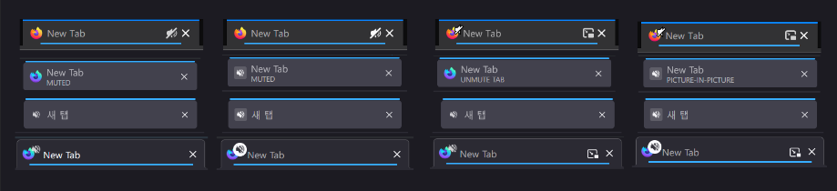
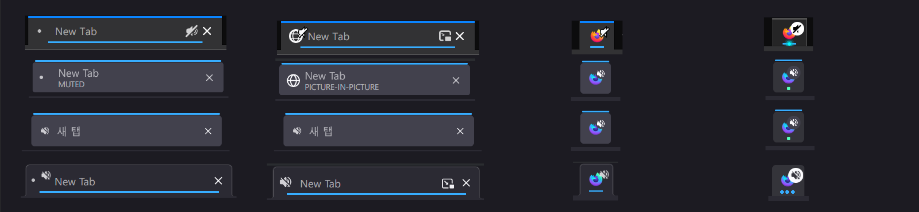
https://user-images.githubusercontent.com/25581533/160292608... https://user-images.githubusercontent.com/25581533/160292618...
Each language has different behavior and does not display information properly.
1. Early (v1 ~ v3)
v1~v3 are classic UI that we remember when we were in the early 2000s.
Features
- Clear as the icons do only one thing
- Unique color for each icon
Limits
- Not fused with OS UI
- UI height
- Contrary to the modern interface philosophy as there is no abstraction
- Inconsistent icon size and texture
2. Classic (v4, 2016.10)
Thus, v4.0 was released after a large-scale UI reconstruction project was launched!!
It is the longest-lived UI and loved by many people.
Commonly called a Classic theme.
Features
- Orange app button at the top left like the symbol
- Calmer tone
- Win7 Aero Glass support
- Stop / Reload / Go with one button
- Tab moved to the top
Limits
- Unfamiliar interface with large-scale changes
3. Australis (v29, 2014.04)
Australis, which had a lot of likes and dislikes compared to Proton UI.
It was a change that put a lot of effort into simplicity.
Features
- Curved Tab
- Drag & Drop customizing UI
- Change settings UI pop-up to contents(tab) format
- Animation
Limits
- Panel UI that looks like a tablet
- Remove status bar
4. Photon (v57, 2017)
Photon was a generally well-received update to the UI that was used until June of this year(2021), when Proton appeared.
Features
- Components: List based panel and page actions, library menu
- Animation: Add animation to actions of buttons, tabs, panels, etc.
- Visual redesign: tabs, icons, density, etc.
- Performance: improved initialization, synchronization reflow, etc.
Limits
- It looks a bit complicated
- Only light weight themes are allowed.
5. Proton (v89, 2021.06)
This is the moment I started working on themes.
Features
- Neatly organized menu
- Icon that are pretty enough to remind of the edge
- Some of animations that I like & skeleton screens
- Stylish color scheme
- Moderate rounding
- Meticulous implementation
Limits
- Excessively wide padding
- Remove icons from menu
- Feels like a button rather than a tab with a connected look
- Confusion of tab indicators
- Remove page action menu in address bar
- Delete bookmarks / library animations and illustrations
- The icon size of the new tab contents
- Changed the search bar of the new tab to be performed on the URL bar.
Missed still! On large screens I prefer a permanent status bar with useful info persisting, than a URL flashing over the page. Chrome did it first, then Firefox copied like a mirror. The status bar was oddly banished to UI hell, not even a config switch lifeline. Replaced with google's flickering lower left overlay.
The actual implementation is exemplified to read the Firefox source code.
- https://searchfox.org/mozilla-central/search?q=reload-to-sto...
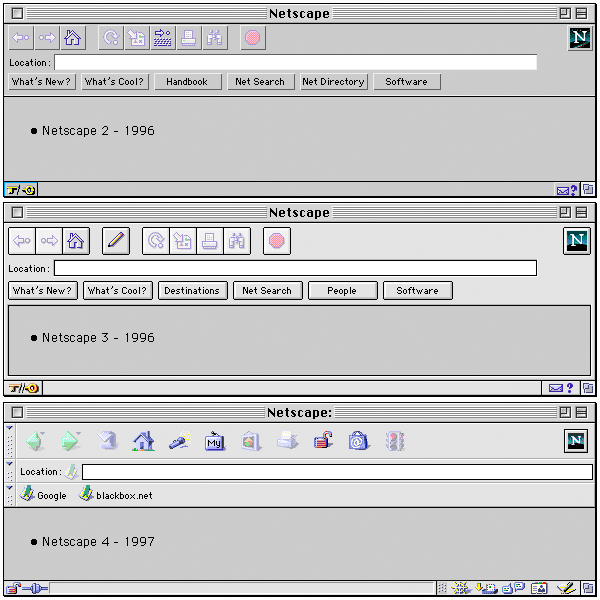
https://www.masswerk.at/nowgobang/images/netscape-navigator-...
Edit: The "Classic" themes of early Firefox and SeaMonkey were still very much reminiscent of Netscape 4, but the toolbar and the location bar merged. (In the early days Firefox and Netscape 6/7 still coexisted in parallel, packaging the same engine, and the "Classic" theme represented the Netscape legacy UI.)
I look at the URL for the hostname, look at tabs to find the one I want and sometimes click on it (more often I use ctrl + pagedown/pageup), click on a certain extension GUI regularly because it lacks a keyboard UI, and that's about all but the edge cases. Everything else is done on the keyboard and sometimes the mouse scrollwheel (when presssing the spacebar doesn't work).
My guess is that browser GUI design has limited impact here; website GUI is a far bigger factor for me.
Changes which the user did not ask for and did not want are NON-CONSENSUAL.
Non-consensual changes foisted on the user are par for the course in proprietary software, but they should absolutely not be a thing in FOSS.
If the developer can repeatedly force non-consensual changes on users without any recourse, that means the project is not healthy and needs to be forked.
If it cannot be forked, then the idea of it being a FOSS project can be safely interred and a tombstone placed above it.
(Still using Firefox 3.x on occasion and ensuring my sites work with it.)
Modern interface philosophy means that if you don't use something every day you have no fucking idea what it does anymore. For example, every time I use the desktop Gmail interface I have to wait for tool tips just to figure out which inscrutable icon does what.
v4 was a ripoff of Opera's design at the time.
Australis was a Chrome UI clone.
The Photon design is my second favorite after v3.
I really hope Proton gets dropped. Worst one they've done since Australis.
However, the scrollbars since v98 are a big issue, they no longer follow the system UI (I'm using KDE Plasma on Fedora) and sometimes they take the same color as the web page background, making them invisible. Unfortunately there doesn't seem to be an alternative other than the n-th Chromium-based browser.
I’ve never been able to leave hubdreds of tabs open in Firefox for any length of time. Eventually it will consume so much RAM or crash. Any Chrome based browser seems to handle hundreds of tabs open for days at a time without any problems.
On other hand Chrome didn't change, they kept a simple, effective and clean UI/UX from the beginning
Firefox followed Gnome's design philosophy mess, hence why users left the ship