Also saying "The war on terror" is kind of misleading since troop levels have varied greatly. To give one example the initial Afghan offensive only involved about 1,300 ground troops. As of 2003 that number was still only at 10,000 (http://www.cbsnews.com/stories/2009/12/01/ap/government/main...)
That's around the same number we had in Somalia (5,300), the '89 Panama invasion (30,000) and several other conflicts. So the fact that the chart starts to level off as of 2001 while these other conflicts don't seem to have made an impact undermines the implied point
http://en.wikipedia.org/wiki/Recession_of_1953
There was also a recession brought on by the oil price spikes of the First Gulf War:
http://en.wikipedia.org/wiki/Early_1990s_recession
The trend still holds up, it just wasn't worth mentioning in those cases. I'm more interested in why we got the Great Depression in a period of relative peace.
Speculation. There were very few regulations on the stock market, which led to massive growth across the board. As a result, average people invested their savings in the stock market, because they were all but guaranteed double-digit ROIs. Problem is, stock prices were based on the inflationary pressure of increased investment, not the actual revenues of the companies themselves. When the bubble burst, it hurt everyone. People were worried that their savings would be lost, so they rushed to the banks to withdraw all their money, but the banks didn't have enough to cover their balances, so they shut down. Now, savings weren't insured back then, so when the banks closed their clients lost everything.
As a result of the Great Depression, the government instituted sane financial regulations. Of course, in protecting against busts, they capped growth, so big money types hated them. Thus, neoliberals in the Reagan, Bush (I), Clinton, and Bush (II) administrations systematically removed the regulations that had been put in place to stop serious recessions from happening. There was tremendous growth, then...
This latest recession was entirely foreseeable, and in fact, my friend's grandfather called it. He said in about 2005 that the last time he had seen growth like that, and people generally acting so irresponsibly with their money was right before the Great Depression. In fact, he even called the housing market as the bubble that would pop. I promptly ignored him of course, because he was just some senile old man. Just goes to show, people will only be responsible so long as the pain of their previous irresponsibility is fresh in their minds. When it starts to fade, they get greedy and stupid again.
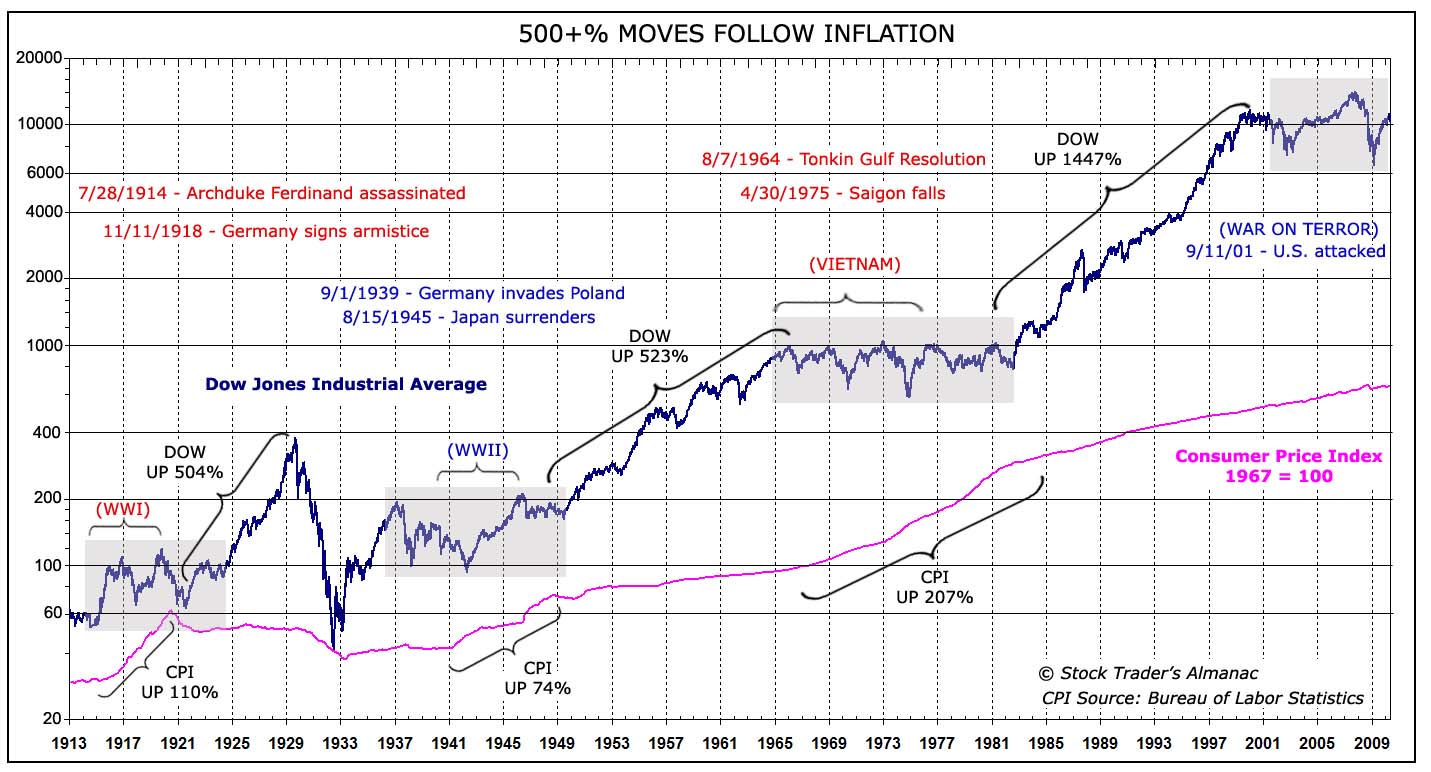
Note he still doesn't mention 1929-1933, which seems like a big omission, although it doesn't directly contradict the assertion.
http://costofwar.com/en/ http://historical.whatitcosts.com/facts-korean-war.htm
Sometimes we forget that 100 years of data is nothing compared to human history and does not signify anything about the future.
So unless you're buying index funds that track the DJIA, the chart loses it use. Because when we look at this, we see that the stock market always goes up with time. But what we are looking at is the fact that the 30 largest/most successful companies in the USA keep pace with inflation. Which is hardly a shock.
Note that I'm not arguing some of the authors points, I'm just encouraging an open mind when viewing graphics like this - you've got to know what you're looking for.
So you're correct in that bad performance by a firm in the DJIA will affect the index, however, really bad performance by a company will not be completely reflected in the index, only the first part of their decline. And that will be somewhat mitigated by the inclusion of their replacement, which is usually a growing company.
And if you need proof that linear graphs of money are misleading then compare:
http://en.wikipedia.org/wiki/File:Components_of_US_Money_sup... http://en.wikipedia.org/wiki/File:Components_of_US_Money_sup...
Wouldn't the length of a war be difficult to estimate at the outset, and hence be priced in to stock market growth over time? In my economics class they taught us that war is bad for the (real) economy because the country is relatively more invested in the engines of destruction than production, and thus productivity growth in things that make life better is lower. The conclusions of this chart stand to intuitive reason based on that teaching, but I'm by no means an expert.
But to be fair, Korea was dwarfed by WWII and Vietnam in cost and public awareness. For example, did you know that we're currently technically still at war with North Korea? There's only a cease-fire, no treaty. We still even have troops over there...
That's how we explained it when I studied economics, at least IIRC.
Edit: just noticed the website name. "The Christian Science Monitor". I feel slightly cheated.
(For the avoidance of doubt: No, I am not a Christian Scientist.)
I'm more apathetic to this surprise. Everything looks like linear growth when plotted on a long enough time line, in log log with a fat marker.
That the war on terror will last for decades to come, escalating conflicts in other locations, say Pakistan or somewhere in the gulf (again)
World wide war without end.. The assertion that the war in Afghanistan is winding down, doesn't strike me as accurate.
In addition the period after the second world war, was marked by a US economic dominance, as Europe was in ruins and the soviet block stifled economic development in almost half the globe for several decades including the Vietnam period until glasnost started to get a footing (in that curious uptick around 1988 perhaps), right till the fall of the Berlin wall.
Things are different now. slightly.
.svg)