Discussion of the ship's scuttling procedure, and the odd 'destruction keyboard' layout in particular I found totally fascinating. I was actually quite surprised at the level of detail the set designers went to with this movie.
If you are not a typography fan - do yourself a favour and push through the initial part of the article and wait for the bits where the author zooms in on particular screenshots to explore tiny details like the ship/company logo on cat dishes and beer cans etc.
Also I guess it depends on what kind of programming... frontend devs probably care more about it than embedded devs.
When I write an article saying I'm doing something better in code I need to demonstrate it empirically.
Maybe that's not a reasonable way to read a design article though.
Airport signage is another pretty good example. I always look for the little man/woman symbols with an arrow pointing to the restrooms. I've missed signs that actually say "Restrooms ->" because there's so much visual clutter in airports. And i'm usually tired and a bit stressed out about making my connection.
Perhaps it is pseudoscience. In this context, I'd be willing to agree it's all just learned conventions. I'd argue, studying those conventions, and exploiting them is more than nothing though.
You should never remember a good sign. it's noticed, used and forgotten. You will always remember a bad sign.
https://youtu.be/TX1rxPBTyEY?t=1m
It has been recycled over and over again, particularly in trailers. It's like the Wilhelm Scream... once you start looking you'll start noticing it (and its homages) constantly.
https://youtu.be/dZ0dH5qv1mA?t=1m23s
https://youtu.be/-bBay_1dKK8?t=59s
https://youtu.be/jdl6eAIx2K4?t=1m35s
Edit: Here's the interview. https://youtu.be/U8bv0QDLI7M?t=481
    James Horner thought he’d have six weeks to write
    the musical score. Instead, he had three weeks,
    and had to write some parts overnight. The movie
    was behind schedule, not even finished being
    filmed (let alone edited) when Horner arrived in
    England. What’s more, the recording studio he’d
    been provided with was outmoded, not equipped to
    handle the synthesizers he wanted to use. Horner
    called the experience a “nightmare,” and ended up
    writing the climactic musical cue overnight.
    Coming away with the impression that a James
    Cameron film was too stressful and rushed, he
    figured he’d never work with the director again.
    And he didn’t ... until Cameron approached him for
    Titanic. (That rushed Aliens score earned Horner
    an Oscar nomination, by the way.)
To me, this completely clarifies his conflict with Ridley Scott. The director doesn't care at all about #2. And yes, Scott is right: no one is as close to the film as the director and editor. It's not their job to pad the composer's portfolio, although ironically it seems the composers are rewarded for this "tight coupling" that they strive to avoid.
p.s., I never saw Alien, but I liked the OP and I am a Jerry Goldsmith fan from the Star Trek scores, which I used to love listening to on CD. It seems he was happier with those collaborations because he was allowed to express the "romantic" view that he had of human space exploration.
It pretty much encourages you to explore it's decomissioned (and of course Alien infested) Sevastopol station, which is lovingly built to mirror the original movie aestetic and it's full of terminals and other lore pieces :)
I would love to see new entries there.
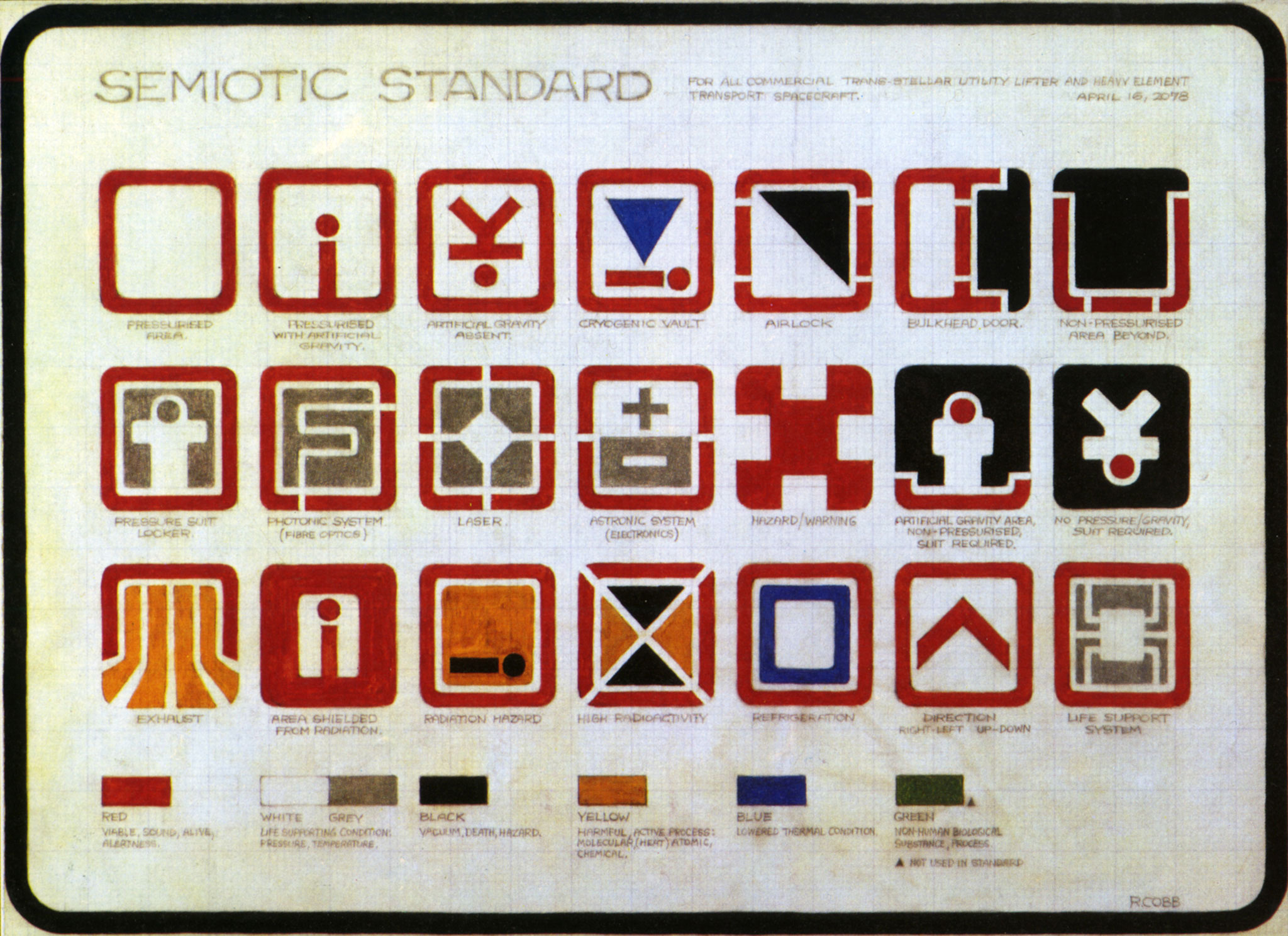
Enjoyed the carefully thought out icon design:
https://typesetinthefuture.files.wordpress.com/2016/06/alien...
Cryogenic vault -- the blue triangle pointing down to a stick figure. Photonic system -- has the letter F shaped by what looks like fiber optic channels. Radiation hazard is great too -- a stick figure dead on the ground, with the sickly bright orange color filling the top of the square.
Then not all details could be consistent of course. And the whole self-destuct French vs English instruction bit was funny.
Then the completely off the wall stuff-- 70s psychadelics creeped into the keyboard design, that was fascinating. What else would you put on a self-destruct computer console than "SHAKTI EXCESS", "PADME" and reference to a phychadelic trip?
Some of the symbolism they use for computer operations are fascinating
> This is most unusual, if only for being a serif (rather than sans-serif) on-screen computer font in a sci-fi movie.
"Ensure" and "insure" are both valid words/spellings for this. The use of "insure" is far less common, for this meaning, though. Both include "to make (something) sure, certain, or safe" in their definitions: