What will the new Uber car sticker look like from afar? A circuit board? A community college parking lot pass? There's no way it will be as obvious and instantly recognizable as a big U sticker. In fact I can't even imagine Uber drivers will swap their decals out, ever, so it'll create a rift in the overall brand (drivers with U stickers, website/app with the new brand) and increase overall confusion with passengers.
http://mashable.com/2015/12/03/uber-spot-light-color-code/
The problem with just having a logo is in many places there are lots of very similar Ubers (oh hey my Prius is here!).
When you're trying to create a logo or brand, the first step in the process is to determine the "values" that are associated with a brand.
These values force a company to ask what are we selling?
Is a Corvette dealer selling you fuming gasoline, smudged glass, and cold steel? No, they're selling the open road. Sun on your arms, with the wind sweeping through your hair. The dealer isn't just selling an engine, some wheels, and a few chairs.
What they're selling, what they're really selling, is freedom.
Now look at the most recent U-logo for both Apple and Android:
http://defiantly.net/wp-content/uploads/2015/12/uber-logo.pn...
What does it communicate?
First, it conveys identity. It shows me a high-contrast single symbol (U) that strongly identifies the brand. A customer can see that symbol a handful of times and come to instantly make a very strong connection to the company.
Second, this logo immediately conveys the brand's values. Somehow I can tell that this is a premium product, probably in the "aspirational luxury" category: a treat for the middle class, a luxury for the haute middle class, and a necessity for the upper class.
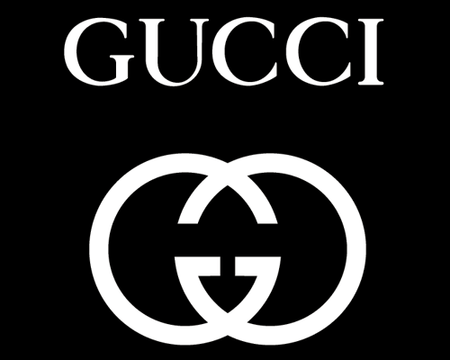
Why does the brain automatically know this? Because the logo draws on a language of visual metaphors that are embedded in our culture, and thus our advertising. See all the following logos:
Gucci:
https://2.bp.blogspot.com/-F6tpNhNYBdo/Usa7AjaHphI/AAAAAAAAC...
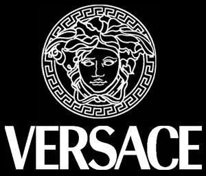
Versace:
https://s3.amazonaws.com/rapgenius/1322717097_versace_logo.j...
Uber:
http://defiantly.net/wp-content/uploads/2015/12/uber-logo.pn...
High contrast black and white is a symbol for accessible luxury. The U renders it nearly universally recognizable. I understand the desire to tweak the branding, given the more market-diverse offerings, but throwing out what is quite close to a perfect brand for this nonsense reeks of corporate mismanagement.
Sorry Uber. I'm glad I turned you guys down.
I'd post a link but it was originally hosted on blip.tv and no longer exists online.
It's by-far the most influental talk about marketing I've come across covering the 'New Coke' branding kerfuffle as well as a lot of other great examples (ex Southern Bell's rebrand to AT&T).
The message, a brand is essentially an immutable const identifier in the minds of the users. Once people establish a firm perception about a brand, it sticks for life. Diluting a well established brand by turning it into an 'umbrella brand' does nothing but erode its value and confuse the users. Once the damage is done, it can't be undone.
Meanwhile that was totally just a horribly placed ad for the site ...
"Uber", "uBar", yeah sure, why not? run the ad.
--EDIT-- For clarity: http://imgur.com/sZN6g2i ...still looks like a 'U'
That said, designers often over-worry about logos initially. If you put enough marketing power behind it and the company is still on a growth curve, the logo will eventually become associated with the brand and it wont matter whether it was obviously a 'U', a Chinese coin or a ghost ;)
EDIT: The question now is, is uber on such a growth curve that they can still get away with this. My gut says 'no,' but only time will tell.
Apple's logo? Looks like an apple.
Exxon's logo? Says Exxon.
Google's logo? Says Google.
Shell's logo? Is a shell.
Chevron's logo? Has a chevron in it.
The first time I saw Uber's new logo, I said "wow, I have no idea what this is," which is absolutely the opposite thing you want a customer to think. You might say "oh, but it says Uber right underneath the icon on my phone." Which is accurate, but many customers wouldn't recognize the logo on the car without additional text, which COMPLETELY misses the point of having a logo in the first place.
It's the title of a blog piece. There are no rules that it's required to be hyper-descriptive. Nobody is being deceptive. Did you really think the article related to some sort of nuclear meltdown and Uber?
A freaking logo redesign does not qualify. Less so when it's brand new and nobody even has the logical basis to make an educated guess as to what its impacts might be.
So yes, clickbait. The headline wrote a check the article couldn't cash.
But after living with the rebrand for a few weeks? It sucks, and it made me realize how all the things I used to like about Uber are disappearing.
The simplicity was one of the best parts of Uber: you picked your service level, then ordered a pickup. That was it! These days, they've added a lot more friction to the process, and instituted carpooling rules. Never mind that surge pricing is almost always in effect -- I guess they're having a hard time retaining drivers?
Ultimately, all Uber has long-term is a brand: their business model will be commoditized the day autonomous cars are integrated into a fleet management system. And they fucked up that brand: they went from a recognizable brand identified with the letter "U" to an unrecognizable glyph that looks more like a video game than a ride hailing app.
So while the "U" meant "Uber" I always interpreted it a little bit differently.
No clue what the backwards C means.
It is the vaguest marketing device since “Visa. Love every day.”
It's one of the worst things they could have done at a time when they need a strong brand the most.
What in the sands of silicom valley were they thinking? http://cdn.igeeksblog.com/wp-content/uploads/How-to-Fix-Apps...
Touch icon layouts aren't designed to encourage you to read the text below before selecting an app. If the big "U" isn't there but the big "lyft" still is, they've probably just lost a ride.
Black monolith icon -- I like it.
When Uber updated, I wondered what is that Chinese bank app doing on my Android.
Personally I think the logo is awful. And the statement
> but creating an icon that was based on an English character didn’t make sense for a global brand
Is the company not called Uber in all languages? Is Uber not the name of the company that starts with the letter U?
> The bit makes for a great favicon, and reminds us of the great work of early modernist painters. Left, Kazimir Malevich, Black Square, 1915. Right, Uber Favicon, 2016.
> Of all the brands based on squares, Uber's is the most exciting.
These might even be interpreted as parody ("here is a great work of art by Uber, which is comparable in insight and execution to this work by a lesser known artist.")
> English is the lingua franca of the world
I love reading, and hearing, these words. Heh.
Ok, I took it too far. I'll go have a lager now.
I had no idea what I should choose and I was in no mood to track down what to the designers and implementors meant by the various choices in the matrix.
(Took the subway to something close, got out, got in a cab and got there for $20 total)
I wish there had been a more scripted experience: where are you going? What's your timeframe? Do you have luggage or need to impress someone? Do you mind acting as a carpool dummy? Do you want conversation or quiet?
Then pick from your array of checkboxes for me.
This time it seems that, because of Kalanick's micromanagement of the Uber logo design, Uber's Head of Design has left the company[2].
A non-technical co-founder shouldn't write code, right? So I don't understand why a non-designer co-founder should design a logo.
[1] http://www.inc.com/cody-steve/yahoo-logo-redesign-marissa-ma... [2] http://www.fastcodesign.com/3056457/fast-feed/ubers-head-of-...
While not normally as bad as that example, executive input is acceptable at some companies, typically from those people we've all seen whose confidence clearly outweighs their ability (though to be fair some people give great commentary too). In areas like brand its very difficult to 'prove' bad suggestions right or wrong as measuring impact/result is difficult given so many variables, and for what you can measure you'd have to run the alternate to truly know results, which is unrealistic. The other one I see is sales management get promoted to run marketing as many operations/finance leadership dont realise how different the skillsets are, assuming 'selling is selling'.
For this, life is a bit easier in the performance marketing channels vs brand type channels. I've found the best solution is, rather than fight the political fight to keep them out, simply build what they want (assuming digital campaigns) and A/B test their campaign version. Afterwards be sure to present the results at a suitably high/wide level. Its win/win as if they contribute good work the company benefits from their insight which is great. And if they are the manager sticking their untalented nose in repeatedly, after several presentations (all done in a genuinely friendly manner) the bad internal press tends to keep them quiet, at least for a while.
And to be fair, some marketing people are not the best themselves and probably deserve micro-management...
What part of that implies that he left because of the redesign ?.
However please consider that:
1. he made the announcement just a few hours after the logo was presented to the public
2. according to numerous reports in the press, Kalanick closely managed the redesign.
For these reasons I believe that my claim is not completely unfounded.
Flagged this submission for gratuitous negativity and for being a hit piece on Uber and some of Uber's employees, disguised as design critique.
but i agree with the author, this fiasco and even more so, the yahoo! logo redesign my mayer are just colossal crap theater. i actually don't know what's worse, doing it over a weekend and crowing about it or taking 18 months and then crowing about it.
Maybe I just read some of the sarcastic parts too literally.
> "Obviously designers have no right to comment unless they were in the room with the Uber designers during the design process"
I think we can all agree, that when it comes to the quality of a logo or visual identity, the end customer is always right. If people paying for Uber services can't recognize Uber, or get negative associations with their visual identity, no design process can make up for it.
The logo went from
http://cdn.makeuseof.com/wp-content/uploads/2012/08/lastpass...
to
https://lh3.googleusercontent.com/VUywxm7hR04d-hXnhenjtLcwHG...
Considering things like that the three dots simply look like any number of other menu icons, especially on android where you can have three of those ellipsis type of icons in one view sometimes; I'm not sure that was all that smart of an idea. In case you didn't notice/realize it like I didn't, that's a cursor at the end of what are supposed to be three hidden characters. It's just an odd choice in my opinion.
That was immediately obvious to me. I'm neither a designer, nor have I ever actually used their product. I think it's an excellent logo because it is instantly evocative of how you use their product.
Would have been better if he took a more objective look at Uber's redesign instead of taking the time to bash the CEO or the designers.
Even if you can get past how pretentious the whole concept of the design is, it all falls down anyway once you realize that they're just making shit up.
Only two possibilities:
--A hundred Uber employees thought of this, and didn't say anything about it because they were scared of the CEO.
--A hundred Uber employees thought of this, someone said something, and the CEO heard the words but did not even process them.
The problem is not the brand, that's just a symptom of a far worse problem.
"One can be sure that Uber's Design Director, Shalin Amin".
Compare to http://webcache.googleusercontent.com/search?q=cache:http://...
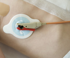
1. see pic on the right here: http://www.epilepsygroup.com/notes6-35-63/new_patient.php
EDIT: I was told by my friend who is a nurse that the more accurate example would be "telemetry leads" - http://www.wireless-technology-advisor.com/images/cardiac-te...
Hence my slightly comical experience of sitting in an ambulance during a transfer from my local accident and emergency department to a specialist cardiac hospital, topless, having my electrodes replaced, then going through the same procedure after the ten-minute drive to the destination!
If someone could disrupt that, that would be great, thanks.
They destroyed their brand in one fell swoop their new logo is entirely new. The good news for Uber is though that they are so essential and ubiquitous there's no danger of this impacting their business.
Unfortunately Uber's timing is such that it'll probably have to be season 4.
I see ads for Uber on Grindr all the time. What's that about not associating the brand with sex?
It worked for Steve Jobs at Apple.
Not sure this is going to topple the company. I think this is a case of, "I do this for a living so it's super duper important". The branding redesign probably isn't as important as this author claims.
In no universe did I imagine an atom or a bit there. Why does the bit have a tail that makes an atom a backwards C?
Pixel art on city landscapes would have conveyed their point better, and would have looked better.
And I say this as a long-time Uber fan.
Is there a difference between "head of design" and "design director"? They seem to have been at the company at the same time - correct? Just can't understand what the difference between these two positions would be...?
Maybe that's indicative of the new 'data platform' development team they're actively recruiting for.
In the past year, I have had several drivers bring up, of their own volition, their dissatisfaction with the fact that tipping Uber drivers is uncommon. It is quite clearly stated in Uber's app and website that there is "no need to tip". I'm not a cheapskate, but I don't carry cash most of the time, and their veiled reminders/requests made me uncomfortable.
It probably sounds strange, but the ridiculous logo change on top of the changing driver culture have made me remove Uber from my transportation-method choices.
Fickle creature I am.
Funnily enough, I used Uber three days ago and didn't notice any chance at all. But after I read the article I checked the Uber logo on my iPhone, and there it was, the new logo staring at me.
Does the writer not get that the "Puppy Bowl" was on at the time? Animal Planet's special show is very popular alternative to the "Let's not compete with Super Bowl" lull on TV.