1. I assume "the ability to content" means voting/commenting? ;)
2. The advantage of those colored bars is that they are very easy to visually parse, while also requiring very little indentation. In fact, it would take 40 levels of comment nesting before half the screen width of a regular size (non-phablet) device is used up. However, I see your point, and will probably add an alternate comment threading style later on.
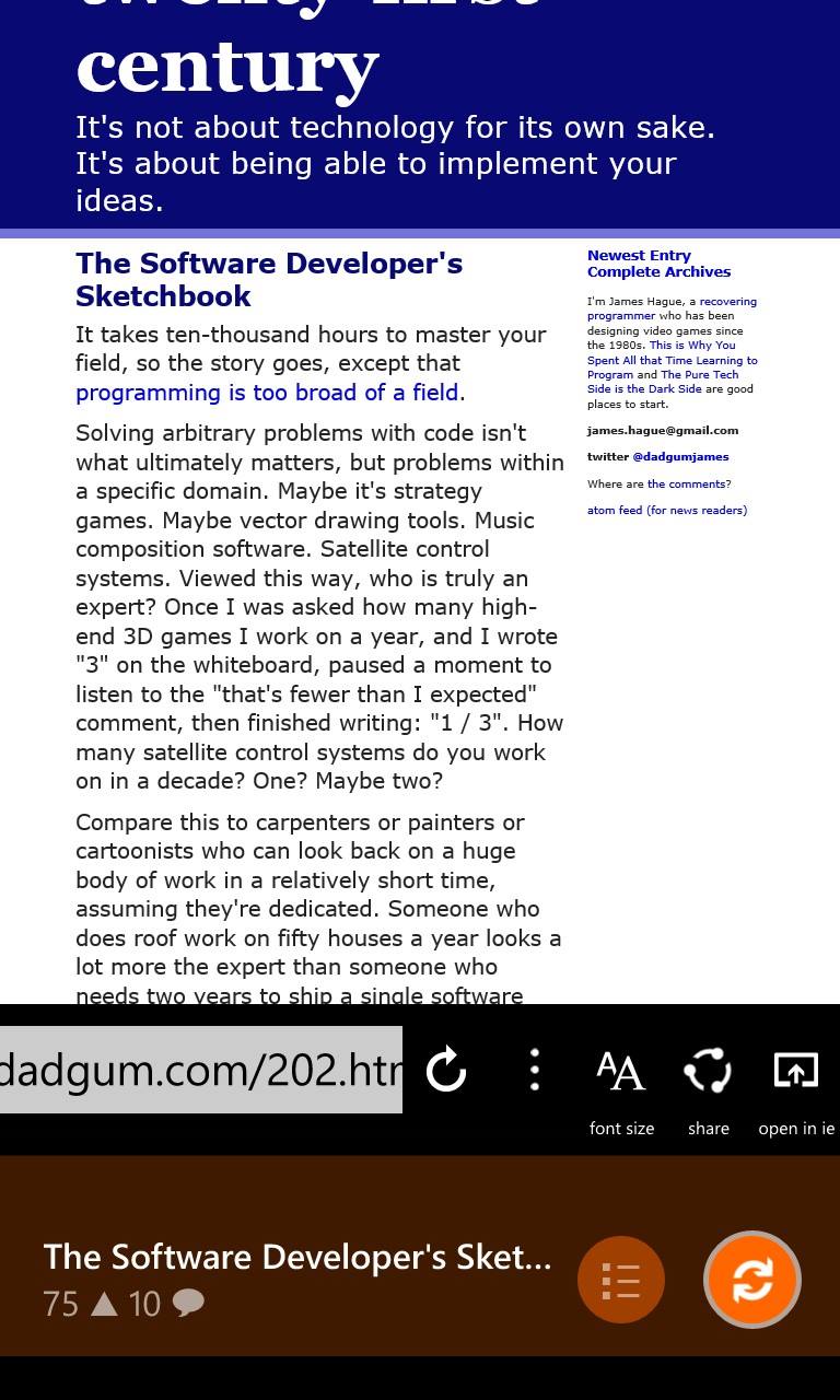
3. The address bar for the browser is actually very similar to the standard WP browser, which also doesn't have the usual icon labels. Back, forward, refresh, stop, more, and share should be self-explanatory, so I guess you were having issues with the mobilize and open-in-IE icons? I might change those out for the reading mode icon that IE uses [1], and the IE icon, respectively, which should hopefully make them more obvious. The reason I did not use them in the first place is because I have not been able to find vector/font versions of those icons. Also, I agree with you on the WP app bar, it's really well designed, however since it's an OS component it can't really be customized which is why I'm not using it.
4. The rotation angle is already bound to the horizontal scroll offset. As for the rotation direction, I tried both ways and this one felt better to me. I'm not sure why scrolling the bar in one direction should cause the rotation to feel wrong to you though, maybe try scrolling the bar by dragging instead of using the button and see if it still feels weird?
5. That's a very good point that I never thought of. Fixed, and should be available along with some other minor design changes next week.
BTW, would you be interested in beta testing a Reddit client I'm currently working on? Your feedback has been the best I've gotten so far, much appreciated :)
[1] http://blogs.msdn.com/b/ie/archive/2014/03/04/introducing-re...