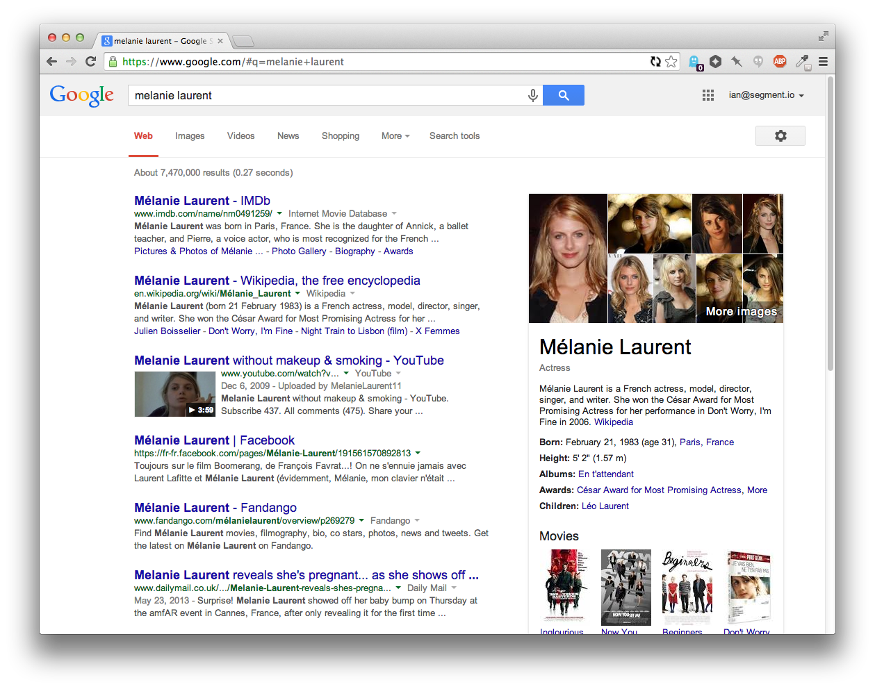
The other day, I was searching for a Django core developer's contact. I knew his exact name was Baptiste Mispelon so I searched that directly.
On Google [1] after his Twitter and Github accounts, the first picture is correct, and I did not have to do anything else, the contact infos are there, his picture is there, great.
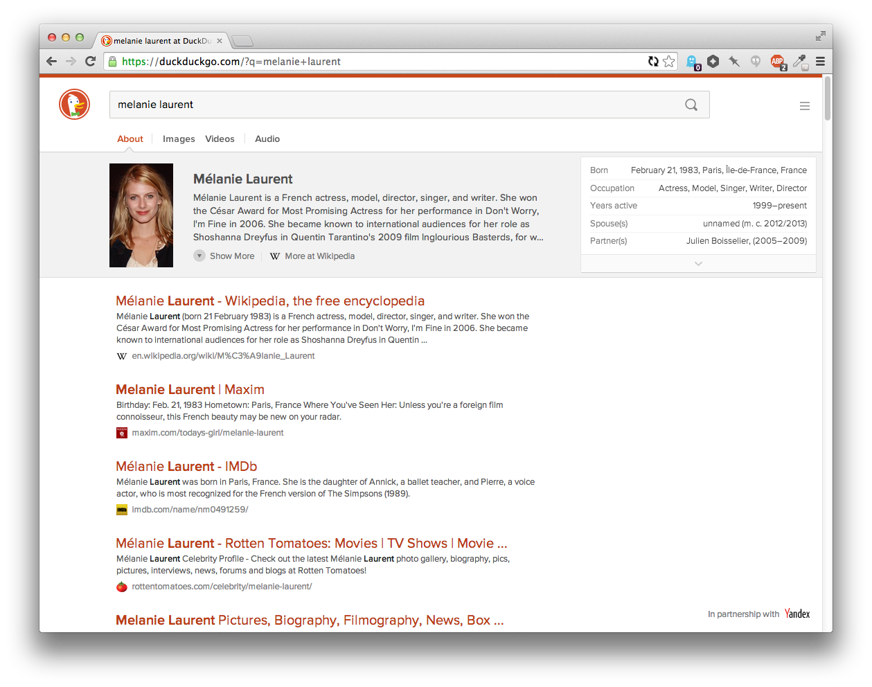
On DuckDuckGo [2] the picture is not even close, and the first couple of results are not as useful as on Google [1].
I think it is a mistake to concentrate on clean design on a search engine until the searching algorithm is not that good. AFAIK Google's page ranking algorithm is well known, when I were in university I even heard stories that a student (going on the same class as me) reproduced the algorithms only on his own!
TL;DR: I want to search relevant information with a search engine, not to look some nice webpage.
Dude they're working on it. Modern search isn't as easy as having a college student implement a crawler with the pagerank algorithm, don't belittle the team like that.
(1) Ad for Christianity
(2) GitHub Profile
(3) Twitter Profile
When I search the same thing on DuckDuckGo, the first three results are:
(1) Twitter Profile
(2) LinkedIn Profile
(3) GitHub Profile
I definitely think that the first couple of results on DuckDuckGo are as useful as those produced by Google, if not more so.
This specifically relies on keeping information about you that DDG won't.
The team focusing on the design is, I'm sure, not the same team focusing on the search algorithm. I don't see any reason why the design team should stop improvements because of the search algorithm.
Everything position seems relevant, and first 6 are good sources of personal contact info.
Not bad.
The contrast is way too low, it prefers vertical over horizontal (I, like any people, have a widescreen monitor. Displaying 3 search results by default is a little absurd), a couple other issues.
It feels like a mobile interface.
Oh, and there's no way to revert to the old version. The options merely change the color scheme, as far as I can tell.
My 'puter is a mac with retina screen - so maybe it's a monitor thing? Are there any "progressive desaturation" or "color calibration detection" tricks available to web devs in these situations?
It's customizable, so it's not the part of the redesign that I have the most issues with, but still.
While the new features are welcome, the new presentation is not, at least for me. Now I can't even describe the old format, or create a clone front-end, or ANYTHING because there was no formal cutover date given to users.
http://cdn.fansided.com/wp-content/blogs.dir/317/files/2014/...
And I agree. Random mandatory switchovers to new interfaces are a good way to make me stop using a product.
The only thing that stands out to me as less useful than the equivalent Google search at this point is the hiearchy of the results. Google uses a link-like blue color for the titles of each result, which seems like a leftover from a past age of the web, but is actually useful for scan-ability because the text of the headers stands out.
Compare the current DuckDuckGo... https://i.cloudup.com/vrwZgUkOty.png
...to Google... https://i.cloudup.com/eFCFEE5TYG.png
...to an adjusted version of DuckDuckGo... https://i.cloudup.com/jluIYZWtzz.png
Having an extra color for the headings lets you scan the page much more easily, which lets you get to the result you wanted faster. The downside is that since their brand color is red, it feels "best" to have the highlight color red. But then that has some negative emotional connotations. Tried green as well, but it didn't stand on it's own enough since there's so little green on the page.
Anyways, I've switched to DDG as my default and will try it out for a while again. I also love those favicons that show up next to the domain names.
Btw, you can make it your default today by playing with the ddg address parameters:
https://duckduckgo.com/?k9=%23b02900&q=melanie%20laurent
This solution is preferable to changing colors in the settings screen if you regularly delete your cookies (and with it the custom colors) - just change your browser search engine shortcut.
More info: https://duckduckgo.com/params
As the page says, "The benefit of [Cloud Save] over using the URL parameters bookmarklet is that when you change settings, they will automatically be saved in the cloud."
Generally the primary feature is that DDG does _less_ than Google, insofar as tracking you around the internet.
UPDATE: DDG allows setting custom colors, great! Check out https://duckduckgo.com/settings (Color).
A bunch of ideas/complains:
- It's awesome that you're showing me a nice map when I search for places/address, but let's be honest, I'll probably need to load it into an online map (OSM, MapQuest, Google Maps) to get directions. So a "open in map" button would be great (yes, I can copy/paste the address and !bang it, but it's not exactly a great experience)
- Sometimes I just want to search for images or videos. Yes, I can search "Images X" or "Videos X", but it's not nice. Also you get the minimized image/video box. I'd add two bangs, !i and !v (those right now alias to Google Images and Youtube, which have !gi and !yt anyway) to search for images/video and that will auto-open the images box.
- Auto-suggestions are neat, but please add an option to remove the "select-on-hover" behavior. It's really annoying to casually move the mouse and select something else.
That's mostly it, otherwise I'm really, really happy with DDG. Thanks, and I wonder what the future will reserve!
It does seems to work with streets too (taken from the first results of restaurants, https://duckduckgo.com/?q=Corso+Giuseppe+Garibaldi+68%2C+Mil...) but only big ones, It couldn't find my home.
Edit: tried a few more and some of them work. It seems like intersections may never work and some addresses don't work.
Other suggestions for DDG:
Speaking of !bang!, did you consider making the tabs !images, !video, etc.? That might help more people discover that really cool feature that I didn't know existed until folks here mentioned it (and is why I switched to DDG as my primary search engine). Similarly, the "try these other search engines" section at the end could have !g, etc. in parentheses.
I'd also suggest keeping the X in the search bar visible all the time, at least if the page is wider than some minimum width.
I like the few orange lines at the top of the page as the only header to make it easier to identify the page. I just noticed the up arrow off to the right when scrolled down, which is helpful too.
I really like that you just show the site rather than the full url until I mouse over that result.
The one thing I miss is the longer text list of meanings; only being able to scroll three at a time isn't fun if I'm looking for number 11, but before it was easy to pick out #11 even if I had to click once to expand the results.
Edit: I just noticed the result site favicons, which is nice too. I don't remember if that was there before, but I hadn't explicitly noticed it. I use the FaviconizeTab extention on Firefox so I appreciate wider use of favicons :).
For example, a local bar here where I live is called Old Hickory Whiskey Bar. If I search for "Old Hickory <City>", I get a bunch of pictures of houses, but if I search for "Old Hickory Whiskey Bar <City>", I get a map result.
Thank you to everyone who provided feedback to us during our public beta period! Please keep the feedback coming so we can quickly iterate. We really do listen to it all.
Related: I've spent more than a few minutes on sites unwrapping carouseled content to just display stacked on the page. It's fucking annoying.
But, I clicked all the way through before reading the comments here because I found it a compelling way to tell their story.
edit: actually, I happily clicked through this: https://duckduckgo.com/about The "what's new" carousel did feel a little tedious.
(Edit: How odd; a reload caused the page to be displayed differently, with the images below the text and icons.)
People get through websites with scrollwheels. Forcing people to use non-standard scrolling (left right) AND forcing them to do with click handles... I wonder if they're keeping data on how many people see the main preview and quit out versus how many actually see the other 5+ slides...
So, yeah, the "what's new" page is real clunky, but I haven't, so far, been offended by the changes to their actual design. I haven't used it much since the changeover, but DDG is my primary search engine, so I'll probably have opinions on it soon.
.page-whatsnew .site-wrapper--static, .page-whatsnew .content-wrap, .blk--whatsnew { height: auto; }
DDG is my search of choice and the pain induced yesterday is not enough to swap back to google but still, not happy at all :(
We also added themes (in the side menu) to address some of the feedback on contrast. Classic theme reverts to the color scheme of the old site. And you can fine tune the individual colors further in Settings.
Maybe this is fixed with the redesign?
I do really like having the images and videos readily available; I just don't feel like the current presentation strikes the right balance between the text search results and "hey, you might want these images or videos", unlike the extremely valuable instant-answer boxes, which when present are almost always what I want.
It's improved fairly steadily in that time (as measured by how often I end up falling back to appending "!g" to my search), but this is the single biggest improvement I can remember in my time as a user.
Aside from the auto-complete (which is nice), it feels significantly faster, and it's also easier to parse visually.
I'm really excited about seeing DuckDuckGo evolve, and it seems more and more people are as well: https://duckduckgo.com/traffic.html
DuckDuckGo seems to be getting better, while Google is getting worse in some areas. The results that I get from Google is still impressive, but more and more it seems that they are making wrong assumptions about my wishes.
https://i.imgur.com/SsicEFJ.png
The fonts come from here:
* https://duckduckgo.com/font/ProximaNova-Sbold-webfont.woff
https://wiki.archlinux.org/index.php/Font_Configuration#Auto...
> The Autohinter attempts to do automatic hinting and disregards any existing hinting information. Originally it was the default because TrueType2 fonts were patent-protected but now that these patents have expired there's very little reason to use it. It does work better with fonts that have broken or no hinting information but it will be strongly sub-optimal for fonts with good hinting information. Generally common fonts are of the later kind so autohinter will not be useful.
Anyway, I don't think it's related to the shifted letter "i".
By the way, how does fontconfig translate to the Web fonts? Is there any way to affect them through it on the individual basis and not with global configuration?
UPDATE: Just found this: https://necoro.wordpress.com/2013/04/29/matching-web-fonts-w...
Here is my final result for adding to $HOME/.config/fontconfig/fonts.conf
    <!-- Fixing DuckDuckGo font -->
    <match target="font">
      <test name="family">
        <string>@font-face:DDG_ProximaNova</string>
      </test>
      <edit mode="assign" name="autohint">
        <bool>true</bool>
      </edit>
      <edit mode="assign" name="lcdfilter">
        <const>lcddefault</const>
      </edit>
</match>Has Yandex ever had any privacy concerns? How did this partnership come about?
Why is DDG leveraging Yandex?
There's still the issue of individual queries revealing something that the user doesn't wish revealed. It would be interesting to see how exactly DDG uses these other search engines as sources (and if they are able to make demands with regard to logging), but it's worth noting that DDG logs search queries itself (just not associated with a person), so that may not be possible to ask for.
In general, solely using an icon instead of text (or a combination of the two) is poor from a usability standpoint. Within a mobile context, I can understand the general push towards more compact treatments, but an icon with three lines does not intrinsically have any definitive meaning. While the icon may be aesthetically pleasing, I always felt there were some more effective alternatives.
There's been some recent discussion and data generated related to this icon (1,2), some of which can obviously be debated, but I think it's safe to say it's not as ubiquitous as you may think.
Overall, I don't think the hidden drawer pattern (and the associated menu icon) are appropriate for the site when it's being used on a desktop. But, it's OK given the contents of it and understandable when the site seems to have been designed mobile first and responsive. I do think more time should be given to the final 'desktop' state for a lot of responsive designs these days, though.
[1] http://jxnblk.tumblr.com/post/82486816704/an-update-on-the-h... [2] http://exisweb.net/menu-eats-hamburger
[edit] I have bug reported this. They have a very good feedback system on their website.
Regardless, he shouldn't have to change his shortcut because a website (a search engine, no less) hijacks his keys. That's bad UX.
So to conclude this: Not relying on the search engine to guess your intention based on personalization takes some time to get used to, but for me it definitely payed off.
Specifically: the DDG results don't rank the arguably top-rated open source offic suite (LibreOffice) at the top of the results page, instead showing an order suspiciously similar to that of Bing. Google (both logged in and out) puts LibreOffice at the top of results, as does StartPage.
Some argue a bias against free software by DDG. I apply Hanlon's razor, but this is one example where improving results would be a bonus.
Screencaps of results:
I've got my search history disabled (when logged in), and ran the second search in a logged-out session, to see if the results differed (that they don't is ... curious).
StartPage, however, claims to proxy its results anonymously, which makes the similarity with my Google search results ... interesting.
That said, for DDG not to return the leading open source office suite as its top result (similar to Bing's response) strikes me as a less-than-optimal situation.
SERP is the new Tarot.
I miss some of the simplicity of the old DDG but after adjusting the only thing i find missing is the StackOverflow integration. It may totally be there, i just haven't had the right query yet...
Usually I had to add "github", "npm" or some other word that would narrow it down for DDG, while Google just knew what I wanted and/or already visited.
Maybe it's the lack of personalized search results or Google is just smarter. Either way non-personalization is a double-edged sword.
For example, all the <domain>.<something>stats.com sites that try to get traffic when people search for various brands, or this strange one: http://www.loginto.org/<domain>-login (apparently it tries to steal login credentials, or I don't see the point).
clearwebstats.com pandastats.net cubestat.com allwebsitestats.com
(all in the top 10 results for one particular domain)
I tried that myself several times, and never quite managed to do it. It only stuck when I forced myself to do it for an extended period, at which point I finally started being able to reliably differentiate between "good results" and "results that feel like Google". I found it disturbing to realize how much I had conflated those.
  Smarter Answers

  Answers to your questions from the best sources,
  developed by our open source community.
I agree that there should be a link on duckduckhack (or, if there is, it needs to be more prominent and I couldn't find it too).
It works well with "orange" as in the example, but searching for "Apple" directly shows result for the company without displaying the "Meanings" panel. We can't see the fruits' search results using that term, which is quite disappointing.
It gets more puzzling when you search for "Apples" and are displayed with the meaning tab
try: https://duckduckgo.com/?q=orange vs https://duckduckgo.com/?q=apple
Edit: apart from that this redesign is very pleasant :)
What saddens me though is that we (as in "the users") still don't have a strong guarantee on the respect of our privacy. We still have to trust the DDG team. I know there is no easy technology to do it, but still, the whole thing is only marginally better than using Google.
Can you tell me, the end user, what are other benefits of using DDG aside _privacy_ (given I am using chrome/incognito by default)?
[0] https://duckduckgo.com/html [1] https://duckduckgo.com/lite
One of my favorite things about DDG is that I do not have to worry about "search bubbles." I don't have to worry that DDG is profiling me and de-prioritizing results it doesn't "think" I would want to see. I know Google thinks search bubbles are a feature but I think they're a bug. I don't want some algorithm trying to reinforce cognitive biases for me so I don't experience the shock of a dissenting opinion. I've observed a few times that DDG seems to do a better job finding really obscure things, and I've wondered if this might somehow be related to profiling algorithms or lack thereof.
I also find the level of data mining Google (and Facebook) engage in to be creepy, invasive, and to hold a high potential for abuse. I'm certainly open to alternatives whose business model does not revolve around that kind of intrusive personal profiling. I'm aware that DDG does have an ad-and-analytics business model, but they seem to be taking the high road with it.
Prediction: "privacy is dead" will in the future be regarded as an idea that greatly harmed several multi-billion-dollar companies. I think it's firmly in the realm of utter crackpot nonsense, and anyone who thinks this is either hopelessly naive or delusional about the political, social, and economic realities of the world. A full-blown user revolt is underway.
https://duckduckgo.com/?q=weather+palo+alto+in+centigrade
It came up with some interesting results. The images opened automatically for me (not sure why) and were a little off the mark. Ideally there would be a link to switch between Celsius and Fahrenheit, with maybe even a cookie to save your preference, although I don't know if that's very anti-DDG (does DDG store cookies for anything?). Yahoo "solves" this by having you go to weather.yahoo.ca to default to metric. At any rate, given that 95.5% of the world's population uses metric, it'd be a nice feature.
Also, setting the Header option to Off is the same as On With Scrolling. This is on ff29.
Other than that, I think I'm finally switching over to ddg.
* Someone looking to search immediately may be confused/frustrated as the text entry field is currently not visible until the slideshow ends.
* Consider relocating the "press" button away from bottom right; I almost missed it and only saw it because I'd been on the page for a few minutes, finished the slideshow and was looking for more.
* Also, when I saw that button, I thought it meant "press this to see something cool", so I was disappointed when it only took me to the company press page.
* I really like the background colour scheme on the front page but you might consider switching it off as it doesn't carry over to other pages. I.e I found the visual discontinuity a bit jarring when the search and press pages didn't reflect it; that's when I realized that the biggest message I got unconsciously was that my default DDG pages would now be in this colour (with ability to change it). I see now that the pages depicted on "inner" screen were the usual white, but I honestly didn't see/process that against the bolder background.
I noticed the change, and it didn't annoy me much (any change is a bit discombobulating), which is actually high praise. I haven't stumbled into any "woah, that's cool!" features yet (though I'm noticing a few things and nodding appreciatively).
Just checked the "what's new" and I'm pretty much liking.
I'd still love to see time-bounded search provided. That's one of the very few uses that will draw me back to Google for general Web search (Google's special collections: books, scholar, news, etc., may bring me in more often).
I've been using DDG off and on for a couple of years and solidly since last June. It's definitely working for me.
I can't seem to trigger it now. So I guess it's an improvement.
Also searching for say chicago, IL does not show the maps tab. We need to search for Chicago IL for that. Not sure why the comma is throwing them off.
I use search engines for a niche blog, and I have a need to keyword search certain specific terms which are not common words. I have consistently tested all the available search engines (there aren't many). And I have always arrived at the same conclusion: there is no better search engine out there then what Google maintains.
I am no blind Google lover, but when it comes to practicality of effective and useful products, you have to have the best, in order to make your case.
Luckily, there is a "classic" mode. Please Gabriel, make classic mode the default mode again.
I'm loving it – excellent work!
And thank you so much for not including the large(-ish) position:fixed header/banner that we saw in the preview last week. Vertical screen estate is so precious on today's widescreen netbooks.
Big improvement imo.
I also hate the way results have no apparent division between them, not even a prominent title; it makes them all blur together when I am scanning the page.
A question. Where do ddg guys get this massive taste for color red?
Thank you.
Hopefully the market share will be more evenly distributed among SEs. Let's do our part