I would posit that an "ultimate" visualization tool would allow me to exploratorily map aspects of my data to various aesthetic properties of the plot, such as size, color, shape, and transparency. I'd also expect to be able to get something reasonably close to publication quality straight out of the software without a whole bunch of tweaks.
I was hoping that this post would show me something about visualization workflow or extensions they'd written to ease some of the old pain points. As it is, they lead with a statement that is pretty laughable if we compare to ggplot2 or Tableau.
Also, I'd argue that Tableau doesn't require any particular expertise beyond what is required for Excel. Though Tableau isn't my preferred tool, I've seen great results come from total novices. It has the side benefit of sneakily training people to "think beyond the canned" and to develop novel visualizations that may better get to the heart of the relationships present in the data.
I get it that ggplot2 requires some minimal coding ability, however I've also seen good (i.e. superior to stock excel) results come out of never-before-coded grad students in an only nominally quantitative discipline. Certainly the business people who power our economy and command great sums of wealth are capable of such modest feats?
Otherwise, great and clear ideas.
I liked your post a lot, anyway.
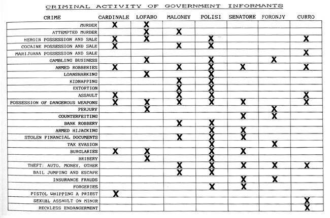
I was hoping the OP would focus on the beauty of the table as a visualization, something I wish was used more often despite its simplicity.
Tufte's small multiples is a kind of table, and a very effective one. This was one of my favorite examples he uses in his books, and helped to get Gotti acquitted:
http://www.thejuryexpert.com/wp-content/uploads/gotti.jpg
Here's a modern take by the NYTimes:
http://www.nytimes.com/interactive/2012/08/24/sports/top-fin...
The problem with charts is twofold:
a) They are very very easily turned into ideological tools.
b) They are very very easily turned into 'kitsch' pastiches made by uninformed people trying to make beautiful-looking summaries.
Look at the charts here (population density http://en.wikipedia.org/wiki/Population_density): is it good or bad to have a population density of >500? Is it even good or bad to have it at 41-500? What would you have thought if the colors were reversed? Compare with this one (deforestation http://www.cryonie.com/en/world/images/map-deforestation.jpg): is it good or bad to have forests?
I really look forward the day somebody tackles the issue of sharing/updating spreadsheets across many users that speak different languages, are in different countries, etc.