I've already heard from one family member about changed, an aunt, not going to be fun doing family tech support.
only thing I can think of is they get more money with more pageviews
At first reading the user complaints, I just thought "Bah, they would get used to it" (without actually visiting the page first). And then I visited https://my.yahoo.com, I totally agree with those complaints. as a fellow designer, some points I've noticed:
#Poor selection of font sizes
#Poor selection of colors (especially for background)
#Poor application of borders (remember, in design, borders portray complexity (in this case, unwanted).
#Inconsistent design themes (Search button has borders and gradients and shadows, the rest do not)
http://img809.imageshack.us/img809/9383/hhew.png
It seems to me that the design they had in mind was something iOS7-ish (which is actually good due to the minimal information it shows the user at any point) , but ultimately they ended up with something else more complex, confusing and awful.
Either way I wish Yahoo good luck and wouldn't dare to judge an entire company based on this design alone.
I think it comes down to 2 things:
A) there's an AOL-esque aspect to Yahoo. I genuinely believe that they don't want to be innovative, because they have such a white-shoe and casual-user demographic trapped in their walled garden. Yahoo doesn't want or need to re-invent ghe wheel.
Ii) Yahoo, as s company, is such a bloated entity. A fresh, interesting, original design concept would have so many layers to penetrate. Hence, the diluted mediocre crap.
Still suffering from the changes to Google Apps. Now responding to an email in Gmail requires 3 clicks to open it in a pop out full page view.
The sad part is it isn't easy to shift out once your team is on Apps.
Can you point to a page that is well designed in your opinion. That would help me as a non-designer to appreciate your points.
Well, in all honesty, design is something of personal preference. But, the 'right design' is the one that strikes a chord with the majority of your users, making them 'feel at home'.
There are a lot of examples I'd like to cite, but, the best example you can use for reference is most of Apple's web design philosophy (P.S - I'm NOT an Apple 'fanboy' though I like their designs). Another one would be Stripe. They have some pretty consistent designs!
As a bonus - Every designer has his/her own version of 'good design rules'. These are just mine :)
-Don't use complexity where it's not needed. Borders and gradients add complexity. (good example: iOS 7)
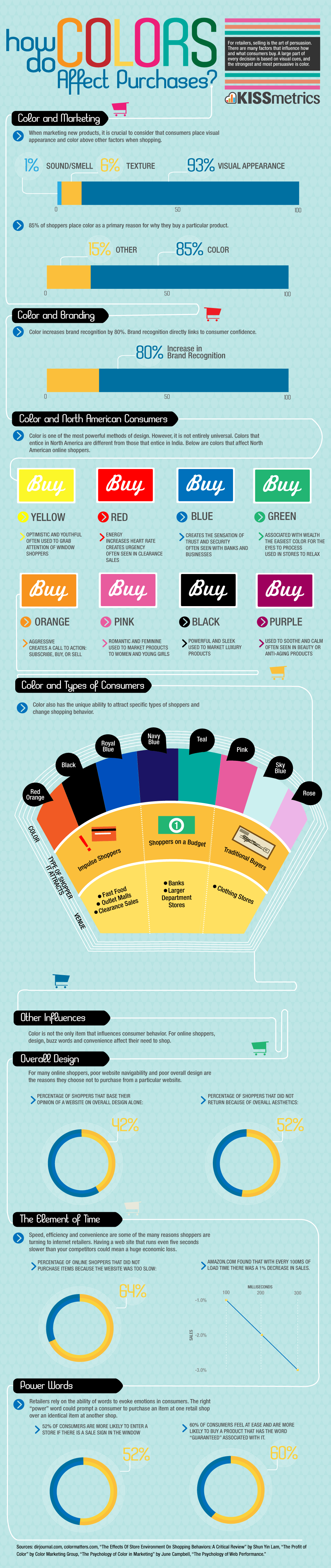
-Generally, try to use contrasting colors for action buttons (Purchase/Sign up/Subscribe). There is some psychological study associated with the color choice too.
Link: http://blog.kissmetrics.com/wp-content/uploads/2010/08/color...
-Once you use a color for a particular type of button (Action, or example) maintain it throughout the site - So your users will know which buttons are important and have side effects (like, costing them money) and which ones don't.
-Contrast is everything. If you use a dark headline, then use a light background. And vice versa. Also, a small black box of 100px x 100px provides more contrast than a mild grey box of 200px x 200px. Contrast is not something that is proportional with colors. Always experiment!
- Sometimes, you get drowned in your own designs that you wouldn't be able to tell them if they are actually good looking or you only feel that way because you bought it/designed it yourself.
-In such situations, close all tabs, watch a movie or perhaps even go for a small cycling session and come back and re-check. You'd be surprised how many flaws you will be able to discover, then :)
I'm only telling you all this since you specifically mentioned you are a non-designer. I hope this helps :)
How far do you carry that opt out? Three versions down the line do you end up having to select one out of four versions? Who is going to maintain that?
The poster of the complaint didn't really want to go back to the old My Yahoo. What they want is a new My Yahoo that
* use smaller fonts ("Font way too big and no way to adjust.")
* preserve the user-configured layouts ("Apps are rearranged all over the place, and some old ones are no longer available.")
* provide the useful quick previews for new items ("Hovering over news items no longer gives brief synopses.")
* etc.
Any discussion about "new vs old" is not going to be constructive. Users should learn to report "what" they want, not just filing generic complains. But treating users as intelligent people that can be taught things may go against the current trend of treating users (especially when customers) as spoiled kids.
If I were to deploy such an interface change I would provide a complaints box with these instructions: "0) complain only about one things, you can file as many complaint as you want. 1) Please summarize what you do not like. 2) Please suggest a better alternative. NOTE: generic complains like 'it sucks' will be ignored."
Resistance to change is a major factor in the adoption of new technology and without some kind of change management, reactance will occur.
iGoogle is being transitioned out for a Google now homepage. It's a much better implementation than a smattering of stale info boxes/links.
MyYahoo has been my default RSS reader before there was a google (yes I'm ancient) and it was a real gem. I have 10 tabs in the damn thing and the idea of those not being easy to transfer is a really great reason to find something else.
I guess my real lesson is NEVER trust a third party with the data you love. And I don't care if it's Google or Facebook I'm telling you now as you become an older nerd that those services will go the way of GeoCities one day.
1) like all the subjects of this link, I can't go take a look & decide - they're forcing me into it.
2) I use Yahoo as a simple new aggregator, with a few small, collapsible boxes for weather, a few sports scores, a couple links. I don't need to see images of the sun that take 15% of my screen to tell me tomorrow will be sunny
I think the comment "This is MY Yahoo, not YOUR Yahoo" hit it right on target. Add to the fact that their new email system is an unusable disaster, it is sadly time after 15(?) years to dump them
I've posted this before, but for all the money they have, give me a decently paid position and I'll at least make sure things actually WORK