"Hey there. It looks like you're on a mobile device. Just a quick warning: This project will download a lot of data from the interwebs (no really!), and even then it probably won't look that great.
Your best bet is to bookmark this page, go home, check it out on your desktop, and see it in its full glory."
I am at home, on the couch, with an ipad. That is my favorite computing device at home, I hardly touch my desktop these days... Times are changing... Why would I want to use a truck at home?
That is the most pretentious load of bullshit I've heard in a long time. The creators took the liberty to warn you that they might eat into your data plan that you may be capped on and you call them out? Not to mention the rendering on this site would bring your little ipad to it's knees. This attitude has got to go.
Assumptions they made: * you are not at home, (I am sitting on the couch) * you have a desktop at home (I have an aging five year old iMac, which I won't be upgrading any time soon) * a tablet is a mobile device (no, it's mostly used at home, not on the road)
This is a data visualization company's proof of concept, using voronoi tesselation rendered via SVG.
My iPad 5 doesn't do justice to this, since it can't render fast enough. It's very choppy.
Could they make a stripped-down version that works on iPads? No doubt. But that defeats the purpose of their exercise.
Of course, my problem is not that I'm on a mobile device at home. It is that I'm on my "truck" at home, but connected via my phone's 3G connection, which is capped at 1.5GiB a month... However the website is not aware of that. It's like opening a page where HD youtube videos start to stream without my knowledge. Pity there's no way to warn me about lots of data (except that I tend to read HN comments before visiting the page :)
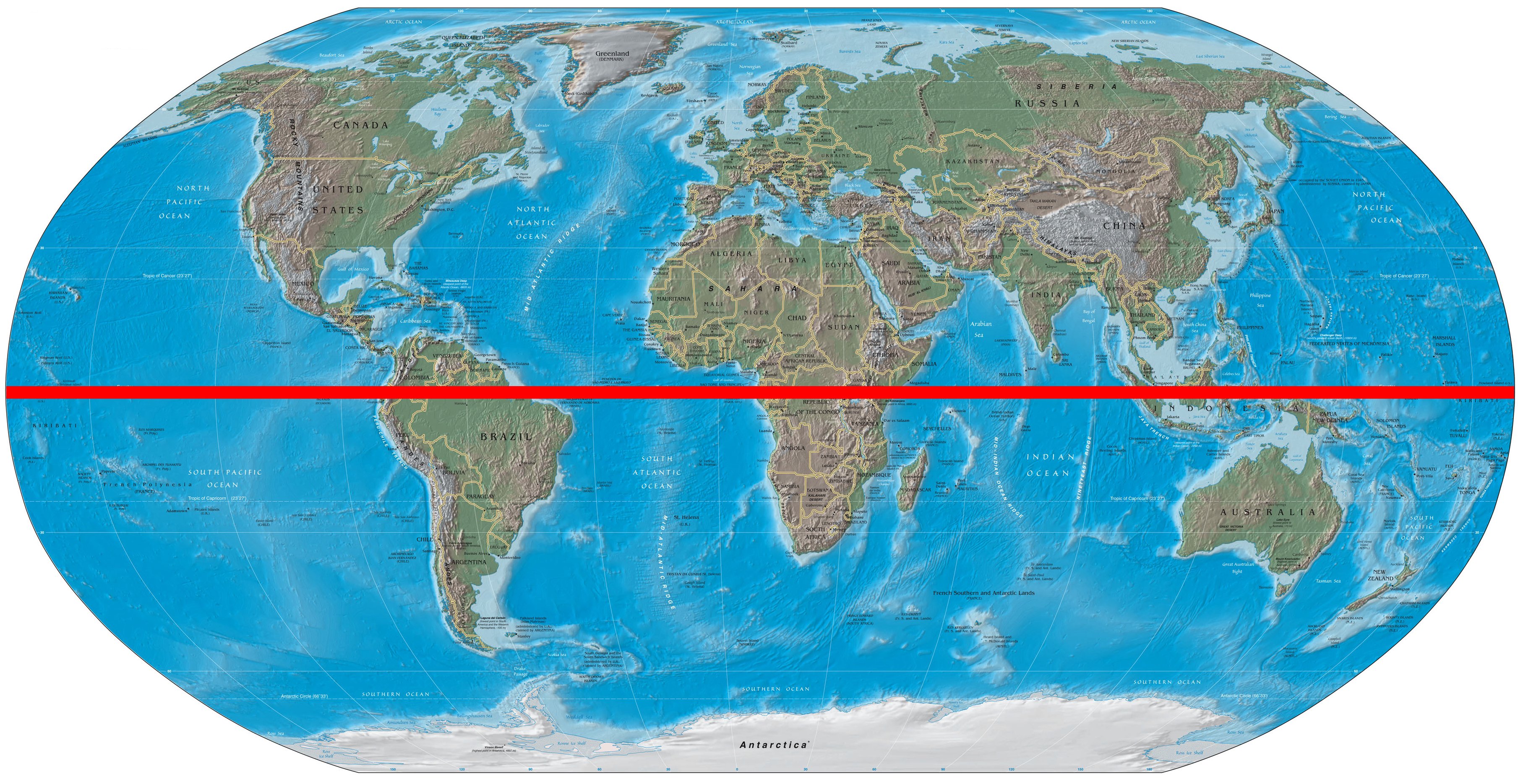
[1] http://upload.wikimedia.org/wikipedia/commons/f/f8/World_map...
It would be nice to have a "play" button that automatically goes 1 year back every second or something like that.
I don't know if they could be SMOOTH, because of the use of tesselations, but at least it could do it for me. :)
I assumed it was much smoother over the century.
Ok, we're all boned. Impressive visualisation - what did you use - can you do a post on how you built it?
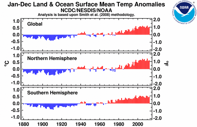
I'd like to incorporate this bar chart, because I saw some tweets claiming that this project is evidence that global warming is not real. That annoys me.
http://www.ncdc.noaa.gov/sotc/service/global/glob/201301-201...
And yes, we will write a post on what we learned in making it!
[0]http://www.ncdc.noaa.gov/sotc/service/global/lo-hem/201201-2...
Winters are more exciting imo - but there is no way to copy a URI for a specific time :(.
Since we're talking about temperatures on Earth, it's statistically more appropriate to use a range which covers just the minimum and maximum (conceivable) temperatures on Earth.
Also, I see you're using data from ground monitoring systems. You're probably seeing the result of residual heat being let off from surrounding industrialization over time.
Yes, it's essentially Backbone & d3 (with topojson for data). And it's a better intro to "real life Backbone" than todos, so if you're interested, take a look.