In reality, the greatest defect of the sRGB color space, which is still too frequently the default color space, is that it is not able to reproduce many saturated orange/red/purple colors, which are very frequently encountered around us, e.g. in flowers, fruits and clothes.
The missing orange-red-purple corner appears small in the diagram in comparison with the missing blue-green corner, but in reality humans perceive much more different colors in the orange/red/purple corner, so the relation between those areas would be opposite in a uniform color space.
The Display P3 color space is much better than sRGB for reproducing orange/red/purple colors and now it is available even in many cheap monitors. However many monitors that can reproduce Display P3 come configured by default to use just sRGB. Such monitors should always be reconfigured to use Display P3.
Monitors that can reproduce an even greater part of the Rec. 2020 color space are obviously better than those that can do only Display P3, but such monitors with a higher color gamut are usually more expensive. The full Rec. 2020 color space can be reproduced only with laser projectors, because it uses monochromatic primary colors.
Software that does color processing should convert all input pixel formats into BT.2020 linear FP16 color components, do whatever processing is desired and convert from linear FP16 to whatever pixel format is sent directly to the monitor through DisplayPort/HDMI, as the last step.
I have not looked on the market to see how widespread are different kinds of monitor specifications nowadays.
I am using relatively cheap monitors, but not the cheapest, e.g. some common types of Dell monitors. There are more than ten years since my minimal requirements for a monitor have been 4k resolution, 10-bit color components and Display P3 color gamut and 60 Hz at 4k and 10-bit.
So I believe that, especially after a decade, it is easy to satisfy these minimal requirements or better, except that not everybody checks the monitor specifications when they buy one.
10 bits per channel is the common target for higher color depth. The formats with 16 bits per channel are generally for image storage and allowing more bits for downstream transforms to avoid quantization. I don’t even know if there are video cards that would output 16 bits per channel, let alone panels for it.
As a cinema enthusiast, I say 24 fps ought to be enough for anyone.
Separately, sorry to nitpick, but while wide gamut colors with only eight bits of data have lower resolution than sRGB, that doesn’t make them an inferior option. You might not be able to specify the exact shade but a) your effective accuracy is still greater and b) you trade that for greater range.
Just as an example, assume you have buckets of granularity 1 (sRGB) and 0.5 granularity (wide gamut). With only eight bits you can precisely select any individual bucket of granularity 1, whereas with only eight bits you sometimes miss the intended wide gamut 0.5 precision bucket and hit its neighbor instead (as if you had a granularity of 1 in this specific worst case). That doesn’t make it worse; you just aren’t taking full advantage. On top of that, your range with granularity one is, say, 200 to 800 while your “range” with the wide bucket is 0 to 1000 (just as an example).
There’s a reason photos or graphics saved as eight-bit png or jpeg still manage to look ten times better in a wide gamut profile than in sRGB (on a better-than-sRGB display).
The problem is that you almost never are showing a single solid color and in the real world it matters much more how wrong your colors are compared to the ones displayed next to than it does how wrong they are compared to some far away reference. Banding is VERY noticeable and would be even more so if camera sensors didn't have noise.
Unfortunately, there isn't really a way for a consumer to know short of buying a spectrometer like my Sekonic C-800 Spectromaster.
For illustration, I have uploaded a few readings here, mostly flashlights, not LED bulbs: https://majid.info/images/reddit/spectro/
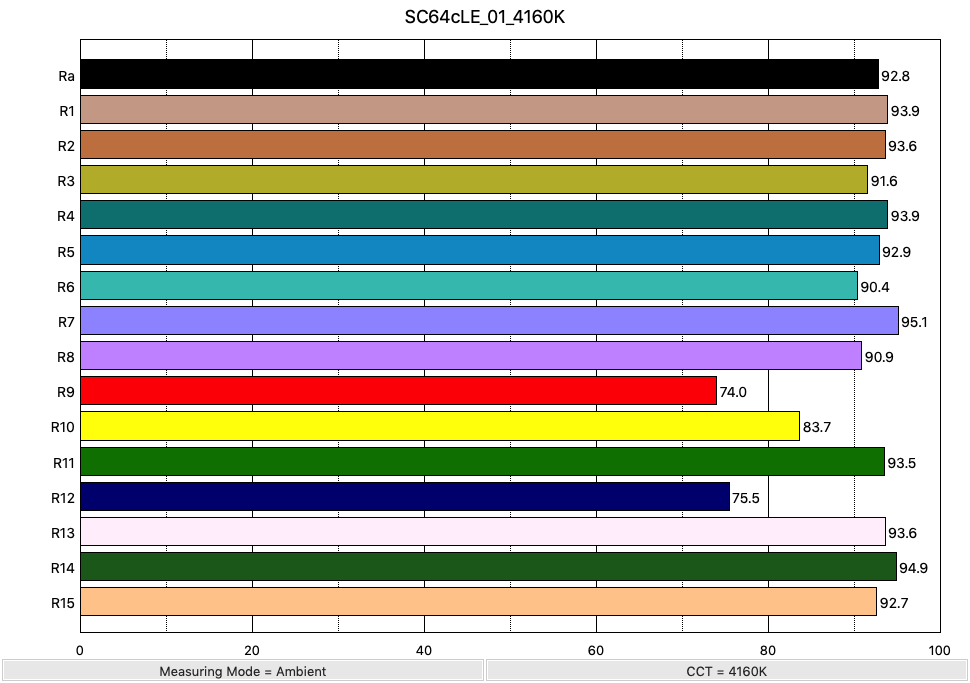
If you look at the Zebralight SC64c LE, for instance, it has an excellent Ra of 92, but only 75 for R9:
https://majid.info/images/reddit/spectro/ZL_SC64cLE/SC64cLE_...
If I understand correctly fig. 3 in [1] should be perceptually uniform. The bluegreens missing from sRGB, but present in BT.2020 comprise a sizeable chunk comparable to redyellows.
[1] https://www.researchgate.net/publication/345252499_Evaluatin...
It is true that both the red and green primary colors of sRGB are bad (because they correspond with obsolete CRT phosphors that have not been used for decades), but in practice the defects of the green primary color are much less important, because the objects with saturated green colors are more rarely encountered.
Like I have said, objects with saturated orange/red/purple colors are very frequently encountered, even in most homes, e.g. flowers, fruits, clothes, blood.
Photographs or movies showing such objects that have been recorded using a wider color gamut look extremely differently on an sRGB monitor vs. a monitor supporting Display P3 or an even wider color gamut.
Only very rarely I have seen examples with obvious differences between monitors when showing green objects, e.g. some documentaries with certain vividly colored animals, like some insects, birds, frogs or lizards.
According to the article you get purified greens from transmittance through foliage, ie backlight in eg a maple forest. This makes me suspect that it may be more important than just exotic animals, and maybe we are more sensitive to ”greens” than we think? For instance, a lot of my photography of trees/forests tend to feel much more ”green brown mess” and loses structure when going from reality to screen. (Another explanation is that my photos are bad, but I like that one less)
This sounds plausible. I think that in general for content that you record yourself, where you would record whatever is interesting, e.g. the more unusual things, especially outdoors, it is more likely for all the parts of the color space to be important.
My point was that for the content most frequently watched on a monitor, like commercial movies, it is much more likely that the main effect of using the obsolete sRGB color space is to see a lot of objects whose color is in the orange/red/purple area and which appear to have washed-out colors.
In almost any commercial movie, if I switch at almost any point between a Rec. 709 copy on an sRGB monitor and a Rec. 2020 copy on a Display P3 monitor I immediately notice some reddish objects that have become more vivid, looking like in real life, while on sRGB they look abnormally dull.
Until a dozen of years ago, I had used for many years sRGB monitors and I was content with them, but immediately after I used for the first time a Display P3 monitor I could no longer enjoy sRGB photographs or movies, because now their limitations had become obvious.
All of the non-commercial triple laser projectors I'm aware of are single-chip DLP, so they suffer rainbow artifacts and have poor black levels. They're also liable to laser speckle[^1] if you're not careful on your screen selection.
The JVC (LCoS), Sony (LcoS) and Epson (LCD) laser projectors all use a single blue LED laser and phosphor wheel to make white light, then use prisms and filters to split it to RGB and can only get 87-98% of DCI P3. They have better blacks and no rainbow artifacts, but the color reproduction is not as complete.
Which is to say, it's still a compromise in projector land, unless you've got $400K for a https://www.christiedigital.com/products/projectors/all-proj...
JPEG is a different thing, first it does RGB -> YCbCr conversion, then it splits the image into blocks. Wikipedia article shows a good diagram of the 64 possible DCT blocks. Each image block becomes a linear combination of the DCT blocks. You did that for the Luma channel, then you do the same thing for the Chroma channels. It's even common to reduce the resolution of the chroma channels (chroma subsampling).
Then JPEG means that you are deleting information that is less popular after you've made your blocks. Often throwing out more information in the chroma channels than the luma channel. You're left with ringing (high frequency noise to fill the block), and blocking (differences between edges of adjacent blocks). Better compression codecs have ways of mitigating blocking and ringing.
Do you know if this is why looking through a true green-blocking (pure magenta or purple) filter (e.g. Wratten 32, 33, or 34A) is such a different experience than a digital photo taken using the same filter?
Looking through those filters is extremely surreal for me, but I've not been able to capture anything like it with any camera.
SCNR