I agree, that would be ideal, mentioned that above (so used sparingly + colors is what I would love to see). The linked example I saw in the article is what I had in mind and agree with it being the best way to go.
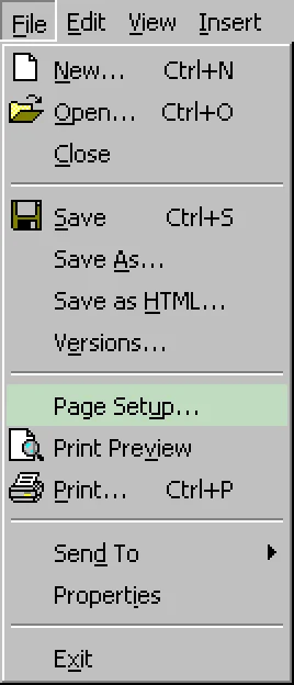
Though even the visual clutter of everything having icons I find faster to scan with my eyes on the first "visit", as those usually suggest the functionality I might be looking for at least. Even if not perfectly distinct, I find iconography faster to parse and guide me towards what I seek. I don't even particularly mind reused ones, as those usually mark a "section" of their own.
However I understand that some people would probably take no icons at all rather than every option having one... or whatever Apple decided to do in a given menu, considering Tahoe's inconsistency all over the place).