When I see this: http://www.istartedsomething.com/wp-content/uploads/2011/09/... I have no idea what is and is not a button. I suppose it's all a button. But there are zero affordances in this UI.
This is now finding its way to Microsoft's websites. On outlook, I can't quickly find the buttons to do key tasks: http://cdn-static.zdnet.com/i/story/70/00/001893/eb-new-outl...
I think the reaction to excessive skeuomorphism is well founded, but removing all affordances isn't the proper way to move forward either.
Everything on that Outlook screen seems to be clickable, with the possible exception of the logo (upper left) and copyright notice (bottom left).
It reminds me of the `acme`[0] editor a bit; not nearly as flexible, of course, because it is executing pre-programmed commands, not arbitrary shell commands.
I bring `acme` up for two reasons: (a) it gives you an interesting perspective on "text as actions" and (b) look at that menu system... no buttons, no distinguishing marker, the menu is just text! The buttons are just text!
The editor itself is fairly nice to work in; a big departure, yes. Intuitive? Kind of; it only becomes intuitive once you understand "mouse-chording", after that the UI makes plenty of sense, even when it's almost entirely "flat."
--
So, if you assume everything is clickable by default (which is true, give or take a few very specific targets that have no obvious action anyways), why then does the user need skeuomorphic hints?
If 90% of the non-whitespace results in a "button press", that fact should become obvious fairly quickly, even to the uninitiated.
If you cut out all the cruft and only leave the functionality, the functionality will inherently "float" to the surface. And that seems to be the case in Microsoft's latest bout of UX.
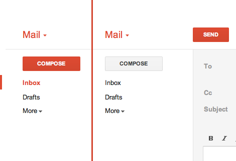
In Gmail, there's a big ass red button that does exactly what you think it will do. (http://25.media.tumblr.com/tumblr_lyrwjaXatd1qea4hso1_500.pn...) I bet I could use Gmail for the first time in Arabic if I had to. I'm not sure I could use Outlook.com.
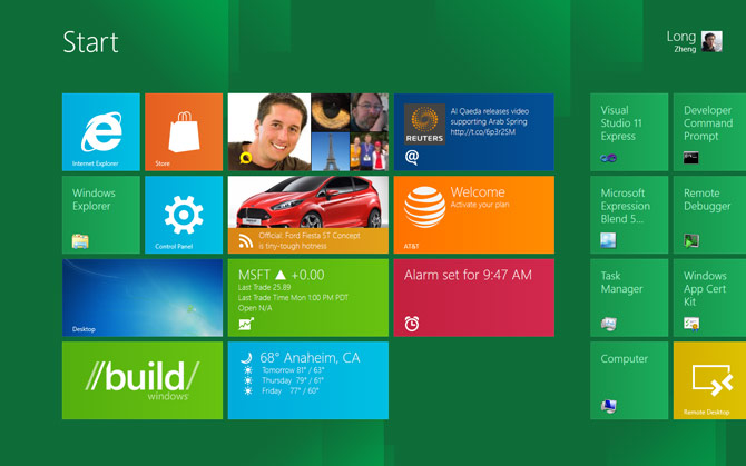
(Everything in that screenshot is a button. That's how Metro works)
As someone started with a 286 EGA graphics PC from the eighties, boy are we spoiled...
Usability is so much more about how it work, not just how it look.
All design systems will have some learning curve. A learning curve where you have to understand that everything a button is pretty close to being easy to learn.
So in my mind, the problem you seem to think there is is a pseudo problem. I.e. it's not actually a problem.
The Map is not the territory.
Granted, the visual clues from bevels, drop shadows and whatnot had the bonus of instant familiarity to people not accustomed to GUIs. Nevertheless this might have been a sort of a crutch and nowadays people even if they expect the computer to emulate their home appliances, the appliances themselves have less and less buttons and levers and more and more touchscreens or at least touch-buttons.
Think about it: Microsoft is a big proponent of a design language, and helped the trend to take off.
But normal people need their hand held as to what a button is. Subtle drop shadows and gradients are the best way to instantly get someone to understand that yes, this element does something. Something important is lost in flatland.
On a side note, the vault and picture frame image on the main homepage for layervault.com is the height of skeumorphism and realistic design. Beautiful, but also kinda ironic.
I disagree. Go to http://google.com. How many of the items in the bar at the top have gradients? Is there any confusion about whether they're clickable? Now go to Google+. Is there any confusion about whether the icons on the left are clickable, despite being flat (and even grayed out)? I'm looking at Chrome right now and none of the buttons in the toolbar look 3D. All of these examples do have a rollover effect, but even without that, the design informs you what's clickable. And mind you, these are all examples from a company that is not embracing flat design as its major aesthetic.
Users have plenty of experience with clickable items that don't look like buttons. There are a ton of ways to convey that something is clickable without trying to make it look like a physical button.
> On a side note, the vault and picture frame image on the main homepage for layervault.com is the height of skeumorphism and realistic design. Beautiful, but also kinda ironic.
Agreed. It seems quite out of place to me.
The spinning background is also really rough. It's completely gratuitous and actually makes me queasy.
If I had to advocate for just one aesthetic (which is silly on its face), I suppose restrained skeuomorphism would be the one.
As for the image on our homepage — that's our app icon. Pretty funny that it's quite realistic (done by the talented folks at SoftFacade). We didn't think it was a huge contradiction, since it serves as more of a pretty picture than an interface.
That said, we probably will end up throwing it out when redesign our rather outdated external site :)
"According to various reports, when someone suggested to include a touch-typing tutorial in this intro as well, since many people did not know how to use a keyboard, steve Jobs simply said not to bother as those people would die out eventually."
* http://orangejuiceliberationfront.com/theyll-die-out-eventua...
When the interface is to facilitate a straight-forward task, one could make the argument for a more embellished interface.
I adore flat design in a aesthetic way, but saying flat design is the answer to or even plays a part in UX decisions making just sounds silly. Is there really a point in advocating an aesthetic? It is subjective in every way. Though if the purpose is to make a style trendy, the article perhaps does make a great deal of sense. Flat design and skeuomorphism are both styles, whereas applying affordance IS a means to an end.
In a few years, designers will start to get tired of looking at and creating flat designs day in and day out. They'll add little flourishes and write blog posts proclaiming "The Era of Living Design", where designs have all the spark and texture of real living things.
I mean, it's absolutely great that these folks are so excited, so passionate about design. But I don't think it has to be so cosmically meaningful for it to be exciting.
And this is not to say that Layer Vault is poorly designed. It's just that it can be a good design without every non-flat design being bad or dishonest.
Trends are not indicators of best practice, and they cannot be applied to just any site at random and work as effectively as they did on another. I love LayerVault and think Allan Grinshtein is a great designer, but this post was a little too much for me.
In a sense, this is creating a language to talk about UX in the same way we talk about architecture. No doubt it's a bit grandiose, but it works.
Yes, only those were major art movements, this "flat" thing is this month's design fad...
It's not about flat design being right or wrong, it's more about whether it's appropriate for the job/task and audience/market.
There are good movies with special effects and good movies without special effects -- it's just a one element of the entire experience and by no means the most important.
Skeuomorphism is an easy target because it is dishonest by definition. Things that appear "cutting edge" or "high quality" today will, in a few years, seem dated, clunky, and pointless.
By contrast, pick up a copy of Die Neue Typography and see how well not just Tschichold's designs, but his ideas, hold up today. Skeuomorphism is a symbol of the Old UI. What we need is the New UI.
http://byamt.wordpress.com/2009/03/03/dieter-rams/
> By contrast, pick up a copy of Die Neue Typography and see how well not just Tschichold's designs, but his ideas, hold up today.
Dieter Ram's designs also hold up. Honesty is at the center of it all. This is also the reason why people still quote Confucius. Honesty is simply living and experiencing in the purest way possible.
I think your own example illustrates it: a film without special effects is just a film.
Buttons can have depth without gradients. Check the ones on http://www.facebook.com. A flat background color, a subtle 1px light on top, a subtle 1px shadow on the bottom, and a darker border all around.
Depth is not only achieved through "3D" gradients and shadows. It is achieved in flat design through size, color, spacing. It's hierarchy by balance.
It's like a well-balanced music mix: if it sounds good on average level, it'll even sound better on loud level. Flat design is balance before the lighting tweaks.
This is exactly how Windows 3.1 was drawing its UI. :) (not that there is anything wrong with that)
Facebook lighting is directly overhead; Windows 3.1 was off to the left a bit :)
It is as if there were a natural law which ordained that to achieve this end, to refine the curve of a piece of furniture, or a ship's keel, or the fuselage of an airplane, until gradually it partakes of the elementary purity of the curve of a human breast or shoulder, there must be the experimentation of several generations of craftsmen. In anything at all, perfection is finally attained not when there is no longer anything to add, but when there is no longer anything to take away, when a body has been stripped down to its nakedness.»
-- Antoine St. Exupery, Wind Sand and Stars.
That would be Leonard Nimoy - best known for his role as Spock in the original Star Trek.
For examples look no further than Apple's iOS (borderline kitsch) and Microsoft's Metro (reduced affordance). I think one UI that gets this balance done very well is Facebook.
The big damage comes from 3rd party apps that don't get skeumorphism right.
I find it funny that the author refers to this as "flatland," when one of the most prominent uses of that word was probably by Edward Tufte when he was exploring how data visualizations allow an escape from flatland. The same lesson applies here. Skeumorphism isn't necessarily the solution, but overly flat designs aren't either.... flatness is what you want to escape from.
I can still say that Tufte was probably the most prominent to use it in a design sense (but I'm probably wrong about that as well..)
What I love most about flat design is that it forces you to simplify, since you aren't giving the user as much visual information. The flat aesthetic magnifies any clutter, because objects and shapes don't communicate their "possession" as much, so having too many pieces on the page at once doesn't work. Remove a line here or a drop shadow there. Make your text more succinct. It's awesome. It might even be a good challenge for startups, just because it forces you to focus your product more.
A huge bonus for me to flat design is that I'm not constrained by my earlier true-to-life decisions like gradients and drop shadows. Before I started using a flat aesthetic, I'd often run into situations where I couldn't place a button or a plane right where I wanted it, because it would contradict the other dimensionality that my gradients and drop shadows were creating. I'm glad to be rid of those constraints now (or almost).
Though, I'm always scared that we'll a/b test a gradient-filled button on our call to action and it'll crazily out-perform our flat one.
---
It might depend on who the interface is for. But it also depends on what the interface is for. LayerVault is a perfect example of an interface that needs to recede when a user is viewing their own work. You don't want your flashy buttons competing for their attention. Similarly, with Segment.io, I don't want all of our UI to be competing with the data we show in graphs.
That button can still be really good. It can be like reading pages of Hemingway longing for all the adjectives. When they show up, they're such a treat. The girl in the red dress in Schindler's list is another great example. It blows the flat aesthetic, but gives mountains of importance.
These guys are confused, they're lying to themselves.
Honesty in the context of industrial design takes into account the materials, manufacturing and physical form.
And in graphic design, respecting the limitations of print.
Pixels are intangible. The 'honest' that's respected within industrial/graphic design, fields that have influenced this new 'flat' digital style do not translate due to the fact that pixels are intangible. The ideals that defined the modernism movement were based on the tangible.
What if a "non-flat" design improved communication/interaction? E.g. I touch this button therefore using 3D to communicate such interaction would make sense.
The designers that promote these ideals are confused.
Honesty for me in this context comes down to the HTML/CSS/JS crafted to create these visual and interaction elements.
Wordplay aside, I completely agree with you. I think throwing in that an interface or scheme is "honest" is just another way to make one feel good about their decisions.
"honest" is the new "clean"
It'll also help blank slates like me adopt this "flat design" faster.
And this site gives me a bit of a headache, too.
Just skimming it, it's a bit too dark and a bit of a strain to read; part of that may be the office lighting though.
The funny thing is: it's _very close_ to my terminal color scheme, just lacking a lighter shade of the background [which would differentiate content from the background], and a "brownish-orange" for highlights/accents [links and things].
The text in my terminal is also slightly "whiter" and a much bolder font-face.
So perhaps some of these suggestions would help make the site more readable in general, though I've never tested my terminal style with a color-blind audience so YMMV. :)
It sounds like that MacBook isn't the only thing that's unhinged...
Visiting LayerVault's website, there's no immediately apparent way to contact the company other than signing up or contacting support; the Support link can be found in the footer navigation. When going to the Support page, I see a partial phone number (but pixelated because only premium customers get to call, haha!) there is an actual email for support, but I don't want support.
Usually the About page will have some contact information, so let's check that out. I see Twitter handles for the two founders, and a picture of NYC.
Why do you guys invite people to email you, then make that process as difficult as possible?
An upcoming (da da DA) Minefold release will convert the entire site to "Flat Design". One thing that goes hand in hand with "flat design" is clear simple writing. I've spent the better part of the last month brainstorming names and finding clear, simple ways of explaining what we do.
It's modern and clean and flat but doesn't take it as far as windows 8 where everything is text, a rectangle or an icon.
Granted marketing content has different usability requirements than functional software. But I'd argue that dizzying your prospective customers with swirling animations is counterproductive and not an example of "lean design".
We experimented on a website a while back with making stylish "flat" buttons vs bog standard grey embossed buttons. Turns out the grey buttons made site navigation way easier, people who were given these buttons spent more time on the site on average.
Also for a company that talks about good design, I actually couldn't look at their home page for long because the rotating image at the top started to genuinely make me feel slightly sick.
Also, is this page (https://layervault.com/payments?plancode=freelancer&sign...) an example of this flat design? For some reason, I don't find it as beautiful as the rest of the website (Such as https://layervault.com/about).
To me this trend comes really naturally when you're trying to expose the function of something, rather than make something appear to function in 'space' or with certain 'materials'
I like the idea of digital brutalism - celebrating the materials, if you will - but the damn thing still has to be easy to use. It'll always be a moving target and that's good.