This, of course, is the point of the article. It was so predictable that it made me wonder: who is telling me that top is good and lower is bad? The articles themselves.
> And high is better than low, because if you have your head down, the blood goes to your brain, because feet stink and hair doesn’t stink as much, because it’s better to climb a tree and pick fruit than end up underground, food for worms, and because you rarely hurt yourself hitting something above—you really have to be in an attic—while you often hurt yourself falling. That’s why up is angelic and down devilish.
You could also argue that because of gravity and potential energy, up is usually the result of purposive action and effort, while down is often the result of accident or neglect ("you often hurt yourself falling"). That potential energy (and wide-open space) can also be used for maneuvering, so if two people or other creatures are fighting, one who is higher is generally at an advantage compared to one who is lower or lying on the ground. The lower party has less energy available to direct toward the opponent, and usually less room to move, being more constrained by the presence of the ground.
Tell that to a BJJ fighter.
The book: https://archive.org/details/lakoff-george-metaphors-we-live-...
Norvig's review discussing the book in the context of AI: https://norvig.com/mwlb.html
Do you have people to look up to, or do you spend more time looking down on others?
Are you on top of the world, or working your way up from the bottom?
Etc, etc. It's suffused throughout our language, and not just this one language, either.
I also love that Singapore is both 'developing' on this list and int the Small Island Developing States list, despite it easily being in the top 10 of most developed countries in the world.
For one, starting at the top and ending at the bottom is natural progress of things because of gravity.
I’m not sure if that means anything, but down-to-up seems very unnatural (of coure I can’t ignore my cultural biases). Is there any writing systems like that?
Aren’t most of the people and land and things in the North part? A casual Google [0] suggests 88% of the humans, for example?
I don’t understand the “good” and “bad” thing, but it does make sense to me that you scan something “earlier” or “later” in casting your eye across a mass of stuff.
If we read from top to bottom… doesn't it make sense to put the part where the stuff is earlier in order than the part with mainly oceans?
It makes slightly more sense to me to argue about which continental masses should go on the left or the right of the map, e.g. [1]. Although compositionally, if you put the Eurasian continent on the left side (“first” for left-to-right readers), doesn’t the massive Pacific exaggerate the impression of a discontinuity or a vast gap between geographical clusters of humans?
[0] https://brilliantmaps.com/human-hemisphere/#:~:text=88%25%20...
[1] https://www.mapresources.com/products/world-digital-vector-r...
The author has an inferiority complex.
Up-and-coming.
Top-of-the-line.
I could go on, but I don't want to get you down.
We generally read top down because of this. We generally want the bulk of information at the same level as our eyes. It's why tv's aren't on the ground.
I feel like many are overthinking this.
1: https://journals.sagepub.com/doi/abs/10.1177/194855061140104...
Absolutely terrible study. Full paper is here: https://www.researchgate.net/publication/258189192_Spatial_M...
Your map should be bottom-heavy for stability.
We should put Asia at the top, Europe bottom left, Africa bottom right.
Its all arbitrary, and we can all make up random minor pro/cons all we like but it don’t change that.
As most people age, that gets less true. The optimum placement ends up being around an arms length away, so being away from the edge could help.
But if you're showing the whole world, typically the details aren't that important, so it's mostly arbitrary.
No, the preference is conventional.
I should note, though, that Chinese maps were traditionally south-up. There's no reason to expect what hemisphere people are from to control that decision.
(Not only did the Chinese come from the northern hemisphere - they had an official orthodoxy holding that the north of China, where they originated, was morally superior to the south!
Nevertheless, they drew their maps with south at the top and referred to compasses as "south-pointing needles".)
How come this culture war mindset infuses everything we do online now?
Nowhere does this map or its description even imply you are a bad person.
It's pure ... projection
I had an HR training session that was intended to help folks see things from other perspectives, but by other perspectives they meant a sort of generic minority perspective ... and a lot of finger wagging.
Nobody enjoyed it. It was all unnecessarily adversarial and represented the shallowest cliches. Nobody thought any of the cliches applied to them about any background because they were so absurd. It was of no use except to make everyone kinda hate HR for wasting their time.
I recall an Obama speech where he noted how telling someone that they have advantages over someone else is not an effective route to influence people. For all you know they think they've had a really hard life ... and maybe they have, you really don't know.
It's the same as logical fallacies: you're not a bad person for falling prey to them, but they ARE something you should be aware of if you're trying to make logical arguments.
I can't see anything in either implying people are bad for seeing world maps as "upside down" when the Southern Hemisphere is at the top. The article does say that looking at it that way "encourages us to think more deeply about such conventions" - I don't think it's saying people are morally bad/prejudiced/etc (or anything) for accepting those conventions.
I don't want to acuse but it seems to me like you're assuming a response from an imagined liberal-woke-type-persona(tm) that doesn't exist?
If you come up with a majority of people telling you "down" is "better associated" with "good", I'll live stream myself on Twitch eating the pair of socks I'm currently wearing.
Also, how typical HN to take something that's absolutely obvious and deny it, just so you can escape the terrible idea that you might be subject to unconscious bias.
[0] page 907: https://onlinelibrary.wiley.com/doi/epdf/10.1002/andp.190532...
It gets unconfusing if you realize it just means White.
North is not up. That would make left west. When standing in front of a building, with map in hand, and asking people to go start going to the street in the south, then left, I mean left in direction of travel, which is east.
Not left in direction of map conventions, which for people who cannot read a compass is probably west.
Nope. You're confusing up and front.
Made me think of how much more accurate the end to end process of putting up that map has to be vs. maps oriented by "north is up".
Just imagine the map needs to be moved by 10m and rotated around for some last minute restructuring of the park before finalizing the project.
Anyway, it was fun to read these maps and think about how many assumptions we carry around that are shaped by objects around us we use daily.
At some point I switched to the more common setting (I assume) of having the map rotate.
If there is no perspective, then at the very least, the car is about halfway between the middle of the screen and the bottom of it. I care far more about what's in front of me than what's behind me.
What I really hate is that the nav in my Tesla will typically show a perspective view while navigating, but as I approach a turn, it changes to a top-down view and zooms in, often to the point where the actual turn is no longer even on the screen, so I don't know where I'm actually supposed to go anymore.
It just needs to me moved not rotated if it's horizontal though, those are not so uncommon either as physical/tactile minature models or maps on podestals, tables or on the floor even in europe.
Einnorden used to be quite a thing with paper maps in the field.
The term Orientation even goes back further referencing to the era of T and O maps in occidental Europe where east was up and where the sun rises and also of significance to Christianity https://en.wikipedia.org/wiki/T_and_O_map
Then again nobody seems to notice the Manhattan grid is actually not north up.
China is an incredibly rich, highly developed industrial economy with a history that goes back thousands of years with massive cultural influence. They are firmly in the northern hemisphere. They have high speed electric trains and their cities look like something out of Blade Runner. I live in a comparatively underdeveloped, de-industrialised Australia, way to the South where we get classified as part of the North because white people invaded 200 years ago? If we are ex-colonial doesn't that put us in the South?
As much as I love New Zealand its very clear visiting that they suffer massive under investment compared even to Australia though at least they have an orbital launch capacity but then so does India which is in the South. Is it because we speak a European language. Why is Argentina, the country with nuclear technology that build our research/medical reactor in the South when we don't have that technology?
It is completely arbitrary, political and divisive. It portrays countries like Australia and NZ as being in conflict with our neighbor when we have had really good relations with our neighbors. It puts China in with countries they have territorial disputes with. It puts Russia in with Ukraine. I don't get it.
If it was so offensive, both India and China would not be at loggerheads trying to posture themselves as a leader of the Global South.
Simple fact of the matter is that progress in modern world requires networked systems. Europeans and Euro-descendants were able to achieve this networking through racial bonhomie and colonialism. Non-western countries do not have that available to them, so they have to invent new narratives to facilitate that networking.
The fact that India may have orbital launch and Australia doesn't is the reason to reject Developing/Developed dichotomy and move to a different one, Global North/South seems to be the one gaining traction.
Getting offended over the existence of the idea of Global South just because it doesn't hew closely to some arbitrary parameter is similar to saying that G7 is natural but BRICS is dangerous. It's just a statement of rote comfort. If Australia is not a northern country by direction, it's not a western country by direction either; I doubt any Australians are in a hurry to classify themselves as an Eastern society and not a Western one.
There is nothing "arbitrary" about the classification, and it was created by aid groups originally based upon socioeconomic factors, later adopted by the UN and others as the term third-world went out of favour after the Cold War ended. It got the North/South bifurcation purely because most of the one set were Northern countries, and most of the other set were Southern countries, and most people don't have a defensiveness about the words North or South and aren't offended by it.
As an aside, acting as if the colonial countries aren't empirically successful because you want to push some umbrage is just super weird. Australia and New Zealand are both highly developed rich countries, regardless of whatever your rural area's infrastructure is like.
Countries in the Global South desperately want to be classified in that grouping because it means development funds and benefits that aren't available to Global North countries. China has rapidly risen over the past couple of decades and it's getting hard to still call it a developing country (and its foreign aid intake has been rapidly tapering off as it industrializes), though to be fair, it still has a GDP per capita 1/4 Australia or New Zealand. Similarly Russia is mighty close to losing Global North standing.
And for that matter South Korea and Japan are a part of the Global North. I guess they didn't get your memo that it's only for the white countries or some such social justice prattle.
And once I get to your final paragraph I'm firmly convinced you were just trolling, or at least I honestly hope you were. Delineating the world by socioeconomic conditions doesn't denote allies or enemies, and this bizarre take is nonsensical and has zero relevance to anything but some contrived taking of offense. The mere notion that it is "arbitrary" is so fantastically ridiculous that you have to be having a laugh.
But it's not worse than what we were using before, and it's not completely arbitrary either. It's frequently useful to group countries in this way, people seem to really want to do it regardless, there's going to be names for this idea.
It was going to be north or south, thanks to the widespread existence of the magnetic compass at the time, and the printing press was invented by people in the north.
Printing press and maps really started following the sailors and navigators knowledge and needs, where previously it was often religious or political (east at top facing jerusalem or 'oriented')
I believe you should be able to get it shipped wherever. https://www.mapcenter.com/store/p/upside-down-world-by-rober...
https://upload.wikimedia.org/wikipedia/commons/5/53/Dymaxion...
".snoitnevnoc fo yticilpmis eht dnihneb noitnetni neddih a eb ot dnuob si erehT"
I'd be interested to see if handedness in those countries is different.
So?
Anyway, handedness bias is a humanity thing.
You're not interested to see if they don't care about majority, are you? But let's be honest: it's just other cultures to me. I don't even think WE often care about majority either.
Russia looks small flipped on its head and I can't quite figure out why.
Yes. This is a consequence of the fact that the "land in the north" is, on average, further north (of the Equator) than the "land in the south" is south (of the Equator).
The southernmost point on the South American mainland, per Wikipedia, is Cape Froward, Chile, at about 54°S. For perspective, some cities between 53°N and 54°N include Edmonton, Alberta, Canada; Hamburg, Germany; and Dublin, Ireland. Similarly, the capital of New Zealand is about in line with the capital of Albania, and the capital of South Africa is about in line with the capital of Qatar.
I think that GP is accustomed to Mercator maps and is thus more surprised by it.
(I'm not really sure why this is a thing. My elementary school classrooms in the late 80s showed a variety of projections, and globes.)
Japanese addresses that name the blocks, not the streets: https://sive.rs/jadr
West African music that uses the "1" as the end of the phrase instead of the start: https://sive.rs/fela
“Whatever you can rightly say about India, the opposite is also true”, Joan Robinson
https://www.ted.com/talks/derek_sivers_weird_or_just_differe...
And BTW, in the old towns of Sweden and Finland blocks do have names!
Before compasses all indicated North, "the North" was associated with cold and evil, the south was associated with warmth and prosperity, and the East was considered neutral when establishing bearings.
Even more literally "of the rising" ("occidental" meaning "of the falling"). The sun is of course implied here, but the Latin verbs orior and occido more generally indicate rising and falling motions of anyone and anything.
In Europe. And probably even only far from the Mediterranean.
Effective scene, too -- I've thought a bit differently about maps and some other things ever since, things that might not have ever occurred to me before. It's not a bad idea to expose people to different map projections / configurations to shake up their view of the world.
1. The sun (and moon and planets and many stars) rises in the east.
2. The east represents what is to come. This manifests in natural (day / night cycles) and cultural (timezones / dateline) aspects.
3. Orienting a map to such an easy to locate (day or night) direction requires no compass or other technology.
4. Orienting a map with such an impactful direction at the top creates a strong literal connection to the territory it represents, rather than to a part-abstracted direction that must be identified and agreed.
Also the North Star being a thing is quite influential.
Also, where the sun rises and sets varies enormously over the year. Using the sun to determine north (e.g. shadow-stick method) is more reliable.
Even more fun fact: once you’ve seen this, you cannot unsee it. It’s a duck.
The fact of the matter is that any data visualization brings with it some advantages and drawbacks. This can be projection, orientation or centering related. Acknowledging these drawbacks can be useful, and so is trying out alternative representations of the data every so often.
One thing I think can be acknowledged is that the poor job traditional maps do of representing Africa has affected policy towards countries in the continent for the worse. For instance misguided infrastructure projects.
Example: https://ebay.us/m/tN1UfJ
It's long been practice for maps to be centered on the country/continent they're produced in. American world maps centered on the Americas, British world maps centered on Greenwich, Chinese world maps centered on East Asia.
These days we've mostly standardized on the more "neutral" choice of having the edges in the middle of the Pacific because that minimizes the land getting split up, but there are also Asian maps that split in the middle of the Atlantic, since Greenland's population is low.
A similar change of perspective "trick" is knowing that when we look up at the stars, it's not really "up", it can be "down", too. Imagine being suspended head down, feet stuck to the ground looking at the space below, with billions of light years worth of almost nothing out there. A bit terrifying, I suppose, so maybe don't think too much about it :-)
I searched, and Ptolemy was a Greek who lived in Egypt, not an ethnic Egyptian.
They're reading our freaking brains!
So the conventional association between Upward and Northward is very much grounded in physical reality (for dwellers in the northern hemisphere).
As evidence, see GPS navigation, which shows "forward" at the top.
It is a novel (I would say amazing) map projection that manages to retain proportional landmass size by using an "ioso-area-mapping" technique. It maps the sphere to a tetrahedron and then slices and unfolds that tetrahedron into a 2d plane.
The method places all of the continents into the map (proportionally!), while also being able to tessellate (so you can move the "viewfinder" to focus on different map subsections without changing the overall map). It's easier to see than describe. The "4" link is an example of modifying the "view" of the tessellated surface to create maps that focus on particular regions.
The downside is that "north" and "south" are rather arbitrary points on the map, instead of being at the top/bottom.
It is still by far my favorite 2D map projection!
For a list of alternative projections
And also this one for a whole deep dive in the topic https://en.wikipedia.org/wiki/Map_projection
People have gotten very creative about the topic .. also.. the UN actually uses a north-centered view of the world to compromise on this.. it’s really cool
https://upload.wikimedia.org/wikipedia/commons/thumb/2/2f/Sm...
Why are the tabs and URL on my browser on top while the OS bar is on the bottom? It looks like it would work if we flipped it over, in fact, on mobile, it would work better, and it is an option you can set!
Another one: US style power outlets, the one with the ground plug. We always tend to make it look like a little face, with the ground plug at the bottom. Now what if you flip it... it is actually better (i.e. safer)!
And clocks. Why is 12 on top? And why do locks have the pins on top in some parts of the world and on the bottom elsewhere? And numeric keypads, why is "1" on top or on the bottom depending on the situation?. Why do trapezoidal connectors (ex: HDMI) have the long side on top?
Turning things upside down is not just for maps, sometimes if may even help give some bit of insight.
https://www.reddit.com/r/mildlyinfuriating/comments/cadent/t...
:)
European and American maps place the Atlantic in the middle, because it minimises the distortions to those regions and makes them more visible. Asian maps put the Pacific in the middle for the same reason.
Reading the article, I am reminded of the medieval maps that put Jerusalem in the center, with Asia at the top and the Mediterranean flowing down from it. A spiritual map.
Perhaps what the article is describing is also a spiritual map in its own way.
Nope, just convention from the places that held cultural hegemony when our current map-making conventions were established.
Most languages read left to right, top the bottom, so it would make since the relatively important stuff to you be at the top.
[1] http://mediterraneesansfrontieres.org/babel4.html [2] https://amroali.com/2020/12/what-a-sideway-map-of-the-medite...
Would be interesting to see a world map designed with latitude vertically instead. If the top were the Pacific, your eyes would first appraise East Asia. If the top were the Atlantic, North America.
https://hemamaps.com/products/upside-down-world-in-envelope-...
If that happens, do we stick with putting North at the top and all maps look like this, or do we stick with keeping the maps the same way up and putting South at the top?
It's still surprising how much that has colored my mental orientation in Berkeley even 15 years later. I now consciously know to correct for it, but still think of campus "oriented" in that direction. For years I had to really think about it to remember that up-hill was not, in fact, North.
[1]: https://www.berkeley.edu/wp-content/uploads/2025/06/campus-m...
[1]: https://www.berkeley.edu/wp-content/uploads/2025/06/campus-m...
https://external-content.duckduckgo.com/iu/?u=https%3A%2F%2F...
Panel 1: But Libertad¹, you’re hanging it upside down.
Panel 2: Upside down in relation to what? Earth is in space, and space has neither up nor down.
Panel 3: Saying the northern hemisphere is up is a psychological trick from those at the top, so that those who believe we are below continue to believe we are at the bottom. And the worst part is that if we keep believing we’re below, we’ll continue to be. But starting today, that’s over!
Panel 4, top: Where were you, Mafalda?
Panel 4, bottom: I don’t know, but something just came to an end.
¹ It’s her name: https://mafalda.fandom.com/es/wiki/Libertad
Out of convention we call it the “North Pole” because on a compass the north magnet is point toward its attract magnetic south.
The earth is a sphere and we could just as well pick any pode/anti-pode we want when drawing.
It would be a deliberately weird design choice to make a globe (which is almost always viewed from above) with the northern hemisphere n bottom.
But, the fact that Africa and South America are pointy on their southern sides makes these kind of maps look awkward and bad IMO. It is like adjusting a paragraph so that the extra white space is in the first, instead of the last, line. Or putting the shortest line of a multi line function definition at the top, instead of the bottom.
We’ve all seen ragged-right and ragged-left typesetting, but never ragged-top.
If you do an image search for, say, "world atlas," you'll see all the maps have cut the Pacific in half, so the West Pacific is at the right edge and the East Pacific is at the left edge of the map.
Now, if you search for, say, "세계전도", then you'll see that most maps have cut the Atlantic in half, because otherwise kids (for whom those atlases are intended) would see their own hometown shoved all the way to the end of the map.
That said, it is pretty silly. And asserting it is meaningful philosophically reeks of agenda pushing.
It is also just going to be an outdated concern faster than makes sense. Most kids are growing up used to computer maps in navigation devices, and those, by far, default to "up" being "straight ahead." Because they can.
Is it a sign of strength to require me to use your map, or is it a sign of strength if you adapt to mine, regardless of how many irrational or rational reasons I may give for my preference or not? Why, if somebody expresses discomfort or calls something oppressive or wrong, do you need to “set things right“ instead of just respecting their discomfort? What is the cost to you? This is meant as actual questions for exploration.
Remember that even Darwin meant by “survival of the fittest“ the one who is able to adapt, rather than the one who is sticking to some “principles“ and engaging in unnecessary fights. Unnecessary, in the objective sense of survival.
Regulations dictated that north should be at the page top, but exceptions were made so that the relevant land mass would efficiently fit on standard paper sizes. For example, you could fit a lot more detail onto a printed map of Japan with the paper as Portrait, rather than Landscape. So the practical aspects of the printed paper age have long been a side factor in map orientation.
And there was no doubt that the exceptions, where maps had north other-than-up, proved mentally more difficult for everybody to deal with. People not used to working with maps would struggle because it didn't align with other maps, and people used to working with maps would struggle because our minds were locked into the convention that came from 95% working with north-up maps!
Given the context in our movement compared to the milky way, maybe it's better to have East/West for top/bottom, with the poles on each edge of the map ;) [1]
Or better yet, let's make the top of the map Galactic North, instead of Celestial North :P
[0]https://www.youtube.com/watch?v=0jHsq36_NTU
[1]https://www.physicsforums.com/threads/orientation-of-the-ear...
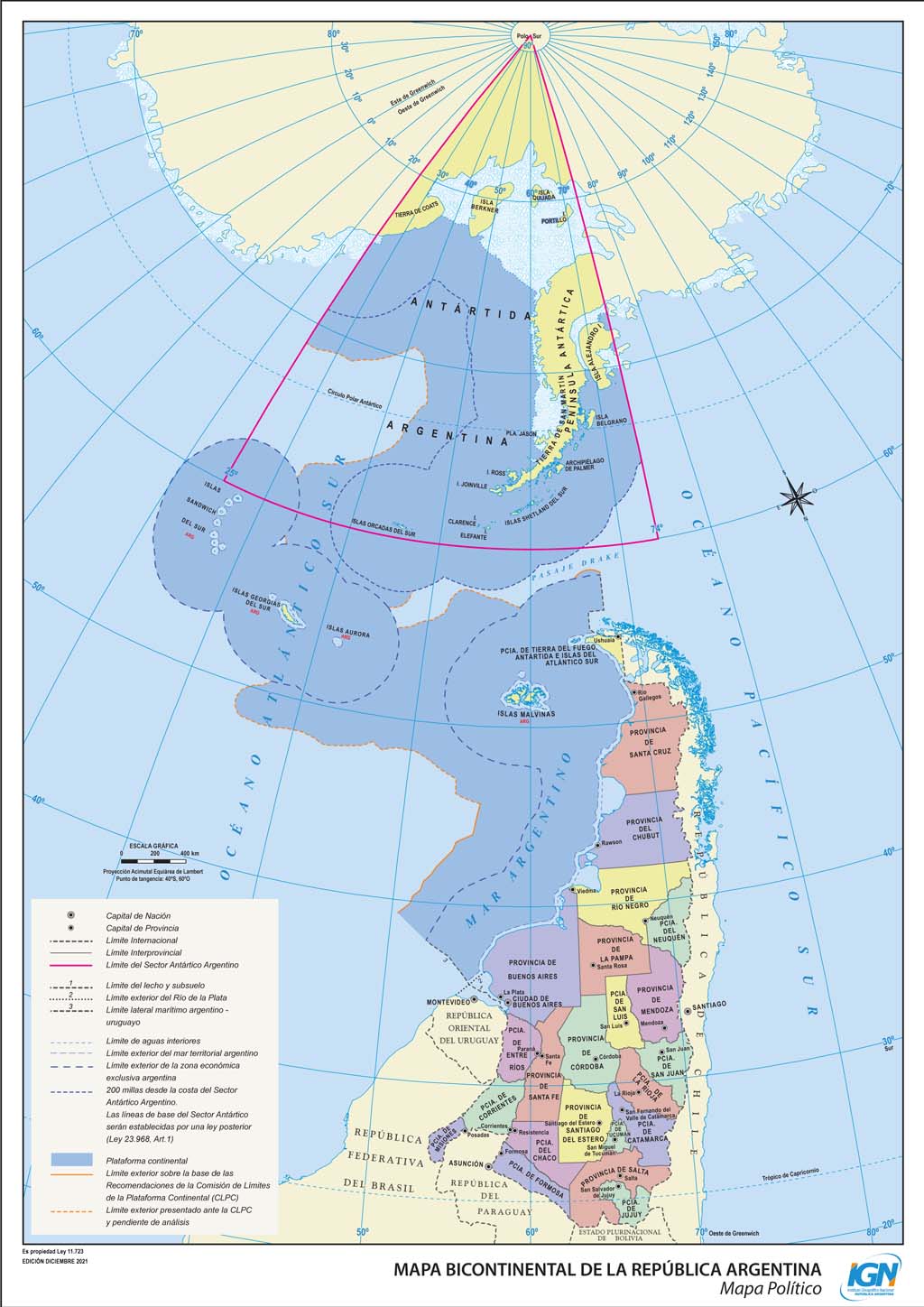
Thing is, in China, any map that doesn't show Taiwan as being part of China is illegal. This map doesn't show that.
Things didn't go as smooth as she expected.
˙ɹǝɥʇᴉǝ uʍop ǝpᴉsdn ʇou sᴉ ʇxǝʇ sᴉɥʇ 'ɔᴉʇuɐpǝd ƃuᴉǝq ǝɹ,ǝʍ ɟᴉ 'ɹO
https://gist.github.com/HenkPoley/8fa7a4a8e25f106585584463c1...
Sadly mostly north oriented.
Did some more vibe coding: https://gist.github.com/HenkPoley/0a0eac0e81c53145dec8c19568...
Actually no, we could say this one is the closest we might build from the most usual one. Now, not everyone might be equally at ease with this but this is it, how much can we stretch from the most frequent view before we feel some difficulties to find familiar repairs. Here it's not even using an alternative projection.
What is even more interesting, is the map put sideways. I suppose this is slightly "more wrong" as the rotation of the earth can't be easily mapped here https://strategiccoffee.chriscfox.com/2020/09/What-if-your-m...
The portolan chart from 1439 is already north-up.
https://en.wikipedia.org/wiki/Portolan_chart#/media/File:Gab...
https://www.reddit.com/r/newzealand/comments/o3u6uo/ive_had_...
https://www.gmexconsulting.com/cms/the-world-from-a-brazilia...
Click on New Zealand and you get a nearly perfect "East is up" map.
South up as a default I think is a little boring once you’ve seen it but thinking wider orienting a map to how it would best display whay you’re mapping (rather than defaulting North/South) is a must in my mind.
"Why not?"
"Because it's freaking me out"
The moralizing is indeed tedious, when something is indeed "wrong".
Right now the sun goes from right to left which is the opposite of how we read most languages.
/sarcasm
Justify your perception.
I wonder how many times I missed similar things just because the perspective was different than I'm used to.
Because most people live there.
Because the people who drew modern maps lived there.
Take your pick.
Yea, sure. That's why we all try to vacation in a "tropical paradise", which tend to be in the middle of the map.
People are dumb, really dumb even, but even a two year old is going to realize vertical map position doesn't equate to "good".
Antarctica bug spanning the whole windshield
and people fuss about orientation?
They're looking at nothing but guts!
"Psychologically, we tend to view things nearer the top as ‘good’ and those lower as ‘bad'."
Isn't that the salient point? Just a simple, yet fascinating thing.
In school, everyone learns that north is not up, and south is not down. Only us dumb grown-ups use that. ALL. THE. TIME. ALL. OF. THEM.