Anyway, this reminded me of that. Making these pictures in anything but the tools of the time wouldn't just change them, they'd be totally different artworks. The medium is part of the artwork itself.
For example, Bach's music was shaped by the fact that the harpsichord had no sustain. The piano changed that, but "upscaling" Bach's work to take advantage of this new technology would destroy them. You use the new technology to play them as they were written for the old. The beauty comes through despite the change.
Gaming embraces most of its historical aesthetics while say movies do not. There aren’t serious attempts to replicate the aesthetic of 50’s tv (which are tied in heavily with the culture of the time) similarly, jn the eighties and I imagine prior, I’ve been watching Miami vice and you can tell lots of the rooms are cheap sets with pretty minimal props. This is on the one hand definetly not full formed, but on the other hand I’ve grown to appreciate that aesthetic, And again other art forms like painting and video games seem to appreciate all eras of aesthetics in their modern versions in a Way tv and movies don’t. (Maybe just due to expense?)
Was this the artist’s vision, or were they simply making the best of the tools they had?
Academic Western poetry shed the metre and the rhyme in an attempt to be free from limitations and more fully express things. Can you quote something impressive? OTOH rap, arguably the modern genre of folk poetry, holds very firmly to the limiting metre and rhyme, and somehow stays quite popular. If rappers did not need rhyme as a tool of artistic expression, they probably would abandon it, instead of becoming sophisticated at it.
Same with pixel art, and other forms of pushing your medium to the limits, and beyond.
I'd be inclined to agree about some older Zelda games though, namely Wind Waker. I replayed it on GCN recently, and can attest that HD Wii U version really didn't add anything to the aesthetics.
And even the new ones that have gone back to that style have the same 'look'(obviously because they're trying to be like those old games) but the graphical fidelity doesn't seem to change much beyond more pixels.
I tried Claude and it mentioned the term might actually be „Aesthetic sufficiency“, but I couldn‘t find an essay with Homeworld on it.
To me they look horribly pixelated and at least some would improve aesthetically a lot for me with a higher resolution.
(A pixel-art specific upscaling filter would mitigate that issue, of course.)
That being said, although there are also some extremely good examples in here (in my subjective opinion), I absolutely think there is a nostalgia element at play. I worked on these machines in the 80s and feel that nostalgia myself.
Some games, like Borderlands or Wind Waker, use aggressive cell shading. They age like wine, because the game has a distinct art style that gives it character.
(From page HTML source) <!-- ******** HELLO OLD COMPUTER USERS ******** --> <!-- This site is designed to be viewable at 640x480 resolution or higher in any color mode in Netscape/IE 3 or any better browser, so if you're using an LC III or something, you're welcome. In fact, I really hope you are using such a machine, because limiting the site to this level of simplicity wouldn't be worth it unless someone is. Please let me know if you are using an old computer to visit the site so I know it is worth it to someone to maintain this compatibility. I do apologize for the one javascript error that you may get on each page load, but I don't expect it to cause any crashes. The major exception to all of this is Netscape 4. That thing sucks. -->
Does anyone even remember why Netscape 4 was bad?
Netscape 4 is a broad set of releases over several years. It also wasn't necessarily "bad". It was just largely not mindblowingly better than Netscape 3 (for normal users) while using more CPU and RAM.
I also imagine in this context it's incomplete CSS support is problematic. Netscape 3 will ignore properly commented out CSS (mostly) while 4 will try to interpret what it can and choke on the rest. It's box model doesn't conform to where the CSS spec landed so even if you can give it CSS it can handle, your page is broken in every other browser.
At the end, there was something like acceptable variation in page view for different browsers.
DHTML in Netscape 4 was also completely incompatible with DHTML in IE 4. In IE you had the DOM, which is an inconvenient and inherently very inefficient interface that you could coerce into doing anything you wanted. In Netscape 4 you had layers. Our team (KnowNow) was working on an AJAX and Comet toolkit at the time (02000). In order to not write separate versions of our Comet applications for the two browsers, we stuck to the least common denominator, which was basically framesets and document.write.
https://en.wikipedia.org/wiki/Netscape_Navigator#:~:text=Thi...
But I also don't think 3 was much better.
You can try Screenitron to imitate something like this.
That's how I fell in love with Monkey Island and Flashback
http://www.effectgames.com/demos/canvascycle/ (hit "Show Options")
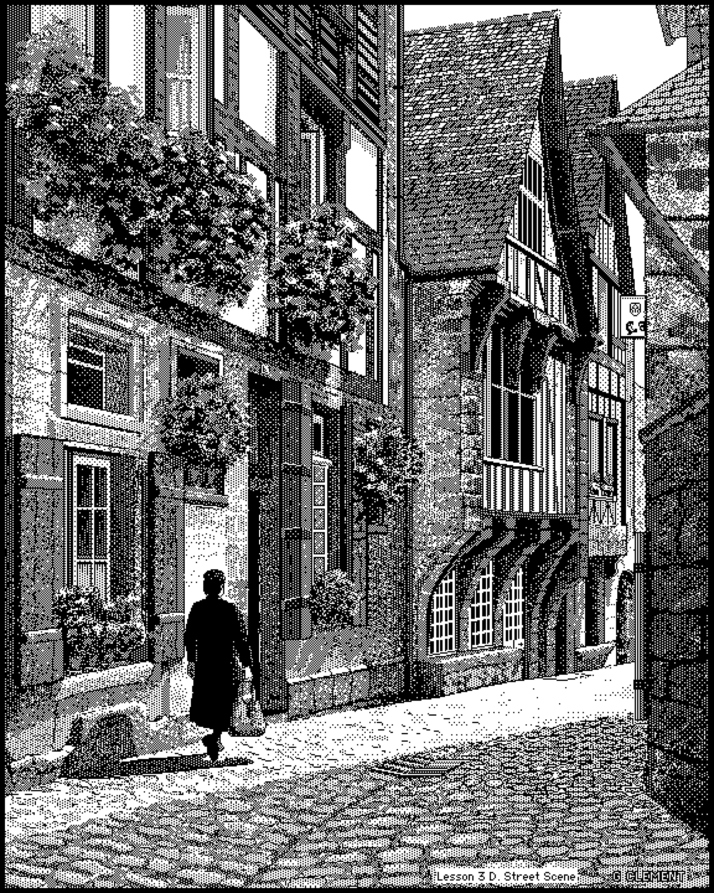
How do you even do that? Zoomed out it looks like a nearly photorealistic street scene, zoomed in I just see seemingly meaningless patterns of black and white. Magic. Unbelievable.
Dithering, for one. The parent also suggests pointillism, which was also a popular modern art technique for making detailed portraits using small, low-detail components.
But no, it's just how that sort of black & white shading looks when you scroll past it - amazing effect!
What’s wild is that would be true for every single human work up to about the mid-1800s. Art - and architecture - would be made to be seen either in sunlight, with its attendant shadows and shifts throughout the day, or by firelight, which flickers and shifts on its own.
Obviously a large part of it is likely due to the fact that a lot of the creators grew up with the NES or SNES and just like that aesthetic, but I think you get a lot of "implied detail" when using pixel art, which is great when you're working on a limited budget.
This isn't to knock it, to be clear. I love good pixel art.
https://en.wikipedia.org/wiki/View_of_the_World_from_9th_Ave...
Software outfit founded by a French guy, as hinted by the drawing with Paris visible ...
(Those "view from ..." were plentiful at the time)
Don't know this guy's technique, but the idea that people were drawing such elaborate pictures on tiny screens - with mice! not even tablets - boggles me. Every pixel a deliberate act.
For example, I was making animations with EasyToon, and I only had a mouse, while the really good animators were using graphics tablets.
Clearly, if I bought a tablet, my own animation skills would drastically improve!
I guess I still kinda believe that, when I look at how fancy some of the newer computers are. If only I had one of those, my creativity would be unlimited!
The funny thing is that my fallacy sorta came true: my friend was showing me some insane stuff he rendered on his 5080 with a custom Stable Diffusion...
Preview is great to some extent and does a lot of useful things for me but it's designed to modify existing images, and I'm still missing a software to draw a square, circle, some text etc.
Thank you, will try! I'm kinda missing this ms paint feel on some specific situations
Take the first one, "acius.png", at 84,326 bytes. If you losslessly scale back to the original size (1/4th) and convert to 1-bit NetPBM, it's 51,851 bytes, without compression. I thought that was remarkable.
At the end of the article they mention digging in to the Amiga scene. If you want to feel old, Deluxe Paint turns 40 this year. My mates had Amigas (I had an Amstrad) and the computing world just felt full of wonder and promise. It was a magical time of creation.
As an aside: Do your best to capture at least something in a way that will be preserved.
When I was a kid, I owned a monochrome display that could only display at CGA resolutions “640x400” 1-bit (and 320x200). Many games and art and didn’t support that showed up garbled.
Then I got hold of Deluxe Paint that would load pictures in color and dither them with an algo called Floyd Steinberg. And the pictures that I saw on my friends VGA monitors suddenly looked beautiful on my monochrome screen.
See examples https://surma.dev/things/ditherpunk/
Games like Monkey Island were also ditherered for monochrome displays and they looked great.
We like it today because of the nostalgia/retro factor.
To contrast, a lot of content from clip-art collections at the time looked awful then and didn't age well at all.
https://oaksnow.com/retrodither/
There’s also a chapter in my new book explaining how to write the same program in Python including Atkinson dithering, the MacPaint file format and MacBinary. You can get the code for free and do the conversions yourself without Retro Dither here:
https://github.com/davecom/ComputerScienceFromScratch
The book is here:
https://www.cultofmac.com/news/pinot-w-ichwandardi-flatiron-...
The constraints of the original Mac and MacPaint have resulted in an art form specific to the time and place.
https://macintoshgarden.org/apps/macgrid
Incidentially /r/VintagePixelArt often has discussions about this sort of thing.
I can think of a few reasons why this may be the case, but I’m looking forward to chewing on it for a bit
Also, "a door somewhere" reminds me of old album covers. For whatever reason I'm thinking of Lou Reed's "take no prisoners".
What a nostalgia trip. Reminds me of sitting in the computer lab in the library in my elementary school in 1990. Some days, I'd give anything to go back.
Instead it was gatekept for grifters in order to separate gullible teenagers from their allowance.
So maybe for some values of "great." Maybe.