sRGB is the familiar color space you all know and love, it's what your display uses, and it's what has those RGB numbers between 0 and 255. But it's not a linear color space.
First think of values as being between 0 and 1 instead of 0 and 255. To change sRGB to Linear, do X^2.2 (close to squaring the value). To change Linear back to sRGB, do X^(1/2.2) (close to a square root).
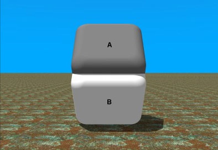
In Linear RGB, a value of 0.5 is halfway between black and white. You can put a stripe or checkerboard pattern next to the color value, and it will appear to be the same brightness. But in sRGB, a value of 0.5 is much darker. Linear RGB of 0.5 is roughly equivalent to sRGB of 0.73.
The actual method of conversion involves a complicated curve that isn't continuous, using X^2.2 is still an approximation.
HSL has the angle discontinuity which is really annoying to deal with and sometimes even impossible to work around.
CIELAB should be fine in theory, but it's not what people actually use on their screens, so I've had some problems with it in practice.
CIECAM02 CIECAM16 seem to be new iterations. Maybe those are good now?
Basically, anyone that paints knows that the more colours are mixed, the more they tend to brown. Yet because of that misunderstanding in the 1960s in Caltech, in CS more colors = white.
Crazy stuff. A great example of technical debt in systems design where we have all this jazz like sRGB, HSL, HSV, etc, trying to reset that basic mistake in physics from 60 years ago.
When you mix paints your are subtracting from white. The primary colors are 45degrees around the color wheel, namely cyan, magenta, yellow. From those you can make alm other colors by subtracting various amounts of the above three colors from white.
Btw do you know what color model matches your eyes the most? It’s additive color mixing. Your eyes literally start by seeing black and as your eyes let in light the cones and rods that are focused around detecting red, green and blue are triggered in various amounts and you see color that way. You don't see color the same way color is formed from mixing paints. You don’t see cyan, magenta, yellow at all. You see in RGB.
So your painting example is really flawed. Subtractive color models are inly useful for paints.
There are two models of combination:
- subtractive, which applies to paint, since the more you mix in the more frequencies are absorbed
- additive, which applies to light, as mixing an extra light adds the frequencies in it
So additive, where more colour tends to white, is correct.
Isn't continuous? Really? That seems surprising to me; tell me more.
more specifically it's defined piecewise and the standard then rounds some constants in the definition, which results in a slight discontinuity around the transition from one piece to the other.
https://en.wikipedia.org/wiki/SRGB#Deriving_the_transfer_fun...
I'm no fan of schools forcing STEM students to study boring electives but this is a prime example of why that might be useful.
The entire premise of the post is wrong - average pixel value has nothing to do with how orange the oranges look - it's all about perception.
Here's an example where the same exact color (pixel value) can be perceived as either light or dark depending on the context: http://brainden.com/images/identical-colors-big.jpg
That's what the bag adds - context - but the author hasn't made this connection.
To me it showed curiosity and ingenuity, sure they might not have studied a certain subject but it is a totally valid approach to an unknown problem. It might actually get people who have similar "silly questions" to run a similar set of experiment and perhaps stumble upon something novel.
You comment showed less human-ness than OP, ironically.
Maybe a reminder that computer science != programming.
But so does its colour.
So observing how a red mesh affects that colour is absolutely worth investigating.
It's all too easy to come across as supercilious and I'm afraid you crossed the line, no doubt inadvertently.
It's my understanding that oranges for transport to colder countries are picked unripe and ripened in the holds of cargo ships. This ripening process is great at making the skin more orange, and OK at improving the flavour, but nowhere near as good for that as ripening on the tree.
So if I saw green patches on my supermarket oranges, far from the tropics, I'd be conditioned to expect them to be really good. They wouldn't be, of course.
[0] Satsumas? Clementines? I don't want to get into a debate about what taxonomically is an orange, but these were citrus fruit that turn orange in colour when ripe.
That said, in the US, oranges destined for markets de-greened for aesthetic purposes since customers won't generally buy them otherwise.
Not true for all cultivars. For example, the emerald orange rind always looks like a lime.
Limes will actually turn yellow when ripe. We just pick them early.
For example, what they call a lime in a lot of countries (for example Calamansi) would be called a tiny orange in North America (we don't have that fruit here). What we call a lime they wouldn't recognize, but if they saw/tasted it they might think it's a green lemon or something.
Calamansi limes are grown in California and usually called Calamondin limes. They're typically anywhere from orange to yellow/green when grown here.
> What we call a lime they wouldn't recognize, but if they saw/tasted it they might think it's a green lemon or something.
What country doesn't have what we call a lime? The Key lime, like the Calamansi is is native to the Philippines and available everywhere the Calamansi is. Persian limes are exported nearly everywhere.
Lots of languages don't differentiate between lemons and limes though.
As far as I know in the Philippines they don't have a common word to describe a Persian lime, and I never saw one in a store there.
The unbagged oranges are more appealing.
We know that other people will not be truthful, misleading even.
We subconsciously know that the bag is orange to manipulate us.
Could it look better because you know it's truthful?
Also that picture (both versions) are the brownish oranges i have ever seen in my life.
Fun fact: "dekopon" means basically "outie" (as in protruding navel, not Severance).
Oranges, avocados, Brussels sprouts, and more I am forgetting. I’m receive basically the same “oh it’s the same thing!”.
They are just excited to see you, too.
Did you do exercise any specific control over the phone’s camera?
I wonder if the ring light might use the sort of general-market LEDs that underperform specifically at illuminating saturated reds and oranges in this range… see for example
https://www.canada.ca/en/conservation-institute/services/con...
and
https://indiecinemaacademy.com/are-leds-ruining-your-project...
Another comment mentioned it, but I wonder if the overall effect would be more visible with yellower baseline oranges (or, as you mention, pale lemons and limes). Really interesting about the LEDs underperforming as well!
The average pixel doesn't look correct because human vision does not interepret shadowed colors as different colors. We first guess at the shadows, and then do some kind of inverse mapping from the shaded color space to the illuminated one before we "perceive a color". This is why the black,blue/white,gold dress illusion exists.
Maybe tomatoes are in boxes that make them look more red? Who knows. I am looking forward to the next super market visit.
If it's marketing, all of it. Movies as well.
It is also a consumer advice about not comparing an orange inside a bag (of any color) with one outside of one as we have a hard time truly comparing them.
Some examples.
Red netting on oranges makes it hard to see imperfections on the skin. Green netting does the same for avocados. Costco sells corn in trays that are cling wrapped with a wrap that is unmistakably designed to hide the ends of the corn (the easiest way to discern if corn has gone bad). Other fruits, and veggies like melons, onions, and potatoes have similar netting with colors that seem to be carefully chosen to maximize visual clutter.
Why aren't all the nets the same color?
Costco sometimes sells pears in plastic trays with multiple creases that cause reflections that make it very difficult to see what the pears inside look like.
Or... maybe you have be both discerning and naive in regards to it for the illusion to work.
They are SUMOs which belong to the Dekopon crop type.
It looks like the averaging was done in default sRGB color space, with:
magick "$f" -resize 1x1 txt:-
Downscaling should instead be done in a linear colorspace. Human vision is non-linear, but the filtering required for downscaling is equivalent to blurring, which is linear because it's done optically not within the retina or brain. Using ImageMagick:
magick "$f" -colorspace RGB -resize 1x1 -colorspace sRGB txt:-
Additionally, JPEG supports chroma subsampling, which is usually enabled by default. I don't know what sips does, but with these small files you might as well use PNG and avoid the risk of losing color information this way.
This should produce results closer to human perception.
If you look at the pic below where it shows the oranges in the store, they’re much oranger.
For a post about color accuracy, it seems odd the comparison pics seem to have some color imbalance to them.
There's already so much food waste due to safe but blemished produce though!