One of my theories was that professors expected rushed papers to have poor or missing formatting, but my rushed papers wouldn't. The formatting was therefore sending a signal to the professor saying "He didn't write this in the morning, so give him the benefit of the doubt." I never considered that the typeface that I was using could have been involved.
Other students had very clear handwriting, while others had very crisp and confident handwriting. I'm sure there are numerous subtle cues in handwriting that give it the air of professionalism or confidence.
Handwriting differences could easily account for a few points on an exam, which might translate into a few crucial percentage points.
Soon we'll just have to force everyone to type their answers in a standard format and then the graders can view the results in the editor of their choice.
Does handwriting say anything more about a person than that they spent a thousand hours or so in their early schooling repeating symbols on paper?
I'm not sure why people like the Computer Modern typeface so much. I think it looks terrible. :\
Clearly that's subjective, and you might hate it no matter the output device. :)
Also, with XeTex/XeLaTeX, you can use opentype typefaces and it still typesets them far better than a word processor.
The bar charts used to illustrate that article are terrible. They present raw counts for each font, but each font was not presented to the same number of people---they varied from 7,477 (CM) to 7,699 (Helvetica), which is a pretty big swing given the other numbers they're displaying. In fact, when you run the percentages, CM has a higher percentage of agreement than Baskerville (62.6% to 62.4%)!
When we turn to the "weighted" scores, which don't follow any clear statistical methodology that I'm aware of, the bar chart is again presented with counts rather than proportions, and this time with an egregiously misleading scale that makes it seem like CS gets half the score of gravitas-y fonts like CM and Baskerville, when in fact its score is only about 5% lower.
Finally we get to the "p-value for each font". That's... not how p-values work. The author admits that his next statement is "grossly oversimplified", but there's a difference between simplification and nonsense. He says that "the p-value for Baskerville is 0.0068." What does that mean? What test was being performed there? Can we have a little hint as to what the null and alternative hypotheses were?
I'm on a Vista system at the moment, and it does have a Baskerville Old Face variant, but "Gold has an atomic number of 79" does not look like the text shown in the article.
One thing that seemed odd to me was that Comic Sans has a negative association that is heavily biased by cultural factors rather than any real, intrinsic human determinant. I would suspect that all the typefaces are going to be more heavily influenced by social norms than anything else. But that's just a hunch.
On your #1, you could do a comparison of (% Agree) for one font versus another. For #2, the weights on the scale don't matter, you can just compare the means between the groups.
You can see the resume and source code here if anyone is interested: [1]http://www.jedberg.net/hire_jeremy_edberg.html
Of course, this hasn't helped me at all because I haven't updated my resume in a year and a half. This might not seem too bad, but I was actually in the middle of freshman year last time I touched it :P.
I like the look of consistency.
I wouldn't make a hire/no-hire decision based on something as insignificant as that, but in the context of you holding it out as a example of a well-formatted resume, it kind of grabbed my attention right away and wouldn't let go.
It is a great resume, though, and I might steal a few of your layout ideas for mine, next time I update it, if you don't mind.
And what about the type of parchment one uses? There are stationery conventions for that sort of jazz: http://www.nationalstationeryshow.com/
I quickly went over to a different (Windows) machine to try it out because I couldn't believe my eyes. That one was given Georgia, so I mistakenly assumed that Errol Morris was such a type hipster that he included Computer Modern in his type stack if it was installed locally. It was pretty funny to see this today.
One thing I will say, is that the Computer Modern webfont they used is a disaster. It had tons of aliasing issues. I wonder how they sourced it since natively it isn't in a normal font format. (Knuth!) That certainly would skew the results.
http://canopus.iacp.dvo.ru/~panov/cm-unicode/
Then I messed around a bunch with the advanced options on the Font Squirrel @font-face generator:
http://www.fontsquirrel.com/fontface/generator
I don't remember the exact settings I used, but it needed a decent amount of tweaking to end up looking acceptable.
The base64 encoding doesn't contribute to anything other than website performance. It saves an additional request in modern browsers. The other linked fonts are for IE/Older browsers.
METAFONT predates TrueType by more than a decade.
Also, did they control for desktops vs smartphones vs tablets? It's reasonable to hypothsize the device's screen (and zoom level on mobiles) affects typeface rendering and its perception.
All in all, intersesting and worthy of more work, but I want more to believe the result more.
They could have used @font-face and distributed the fonts with the page, but to be safer, they could have just created 6 different images, and distributed the passages as a png's.
I have no idea whether this was the approach - but if they do it in the future, this is certainly something to think about. Simply swapping the order of the font-family css line isn't going to cut it.
I look forward to this being researched more - Who thinks Google/Facebook have done this A/B test already? Maybe they could release the results!
Bingo. These CSS[0] and JS[1] are in the quiz.
[0] http://dl.dropbox.com/u/2891540/Fonts/fonts.css [1] http://graphics8.nytimes.com/packages/js/multimedia/bundles/...
You make a good point about the possibility that people did not actually see the passage in the intended font.
I've thought for years Georgia was a great choice on a resume/paper.
a) You want to stand out
b) You also don't want to appear too "starchy"
Here's a little more about what I'm talking about: http://www.kadavy.net/blog/posts/design-for-hackers-why-you-...
[0] http://had.co.nz/ggplot2/geom_bar.html [1] http://www.b-eye-network.com/view/index.php?cid=2468&fc=...
Looks like he's tested a size change and letting users pick their own font, and neither helped.
a lot of sites at MIT, CMU have that mark... the more prestigious, the uglier.
of course it has to be a certain style of ugly.
For Weighted Agreement, it looks like Comic Sans had a way lower agreement rate (it looks like 60% lower) but Comic Sans had only a 4.5% lower agreement rate than Baskerville, including their weighting system.
For Weighted Disagreement, Georgia had only a 7.7% increase in disagreement than Baskerville whereas the chart makes it look more than double.
Still interesting, but not nearly as substantial as they make it out to be. Is there a term for this type of manipulation of charts (whether intentional or not)?
EDIT: Indeed, the term for this is "Truncated graph" http://en.wikipedia.org/wiki/Misleading_graph#Truncated_grap...
And as a bonus (thanks wikipedia!), according to Edward Tufte's "Lie Factor"[0] (where 1 is considered accurate), the Weighted Agreement chart has a lie factor of ~15 and the Weighted Disagreement chart has a lie factor of ~17.
[0]: http://thedoublethink.com/2009/08/tufte%E2%80%99s-principles...
No amount of 'pushing' and 'pulling' at data can compensate for a poorly designed experiment. Georgia can't be used as both the control and a measure of how effective Georgia is—clearly fonts that stood out from the rest of the page would have a different effect than the one that looks exactly like the rest of the page. To give any of this credence, the sample should have stood alone, or the typeface of the surrounding page should have been randomized as well. What we're looking at here is "Are there certain typefaces that compel a belief that the sentences they are written in are true when contrasted with Georgia?".
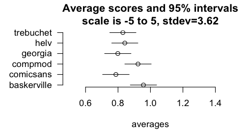
This is a nice example that you can get statistical significance for small effects, if your sample is big enough. Their p-values are explained very badly, so I did my own analysis by transcribing their data from those plots. Let's take their weighting scheme for granted. I agree with some other commenters that the sums and counts are misleading, and instead took average scores per font, and computed confidence intervals for those means. The means are indeed a little different, and for some pairs, statistically significantly so.
http://brenocon.com/Screen%20shot%202012-08-10%20at%202.03.0...
But does it matter much? Take the pair with the largest gap, Baskerville vs. Comic Sans, of 0.95 versus 0.79: a difference is 0.16. This is out of a 10-point scale (ranging -5 to +5).
In fact, the standard deviation for the entire dataset is 3.6 -- so just 0.05 standard deviations worth of difference.
Or here's another way to think about it. If a person does Comic Sans example, versus could have done Baskerville example, how often would they have score higher? (This ignores the weightings, it's a purely ordinal comparison. I think this is related to the Wilcoxon-Mann-Whitney test statistic or something, I forget.) So with independence assumptions (if they had proper randomization, hopefully this solves), just independently sample from the distributions many times and compare pairs of simulated outcomes. 22% of the time it's a tie, 40.3% of the time Baskerville scores higher, and 37.8% of the time Comic Sans scores higher. I guess then it sounds like the difference is better than nothing.
Not sure what's a good and fair way to think about the substantive size of the effect. I wanted to take the quantile positions of the means, but realized you can't exactly do that with ordinal data like this (zillions of values share the same quantile value).
I probably missed something, so here's the transcribed data and R/Python code probably with errors: https://gist.github.com/3311340
Now that I'm thinking about it more, averaging the agreement scores seems weird. Maybe it's clearer to use the simple binary agree/disagree outcome.
There's two axis - engagement and authority. Baskerville is not engaging, but it looks authoritative. So you tend to agree, even if you don't know what it says (like a boring professor or politician). Comic Sans is like a boring person in a clown suit - you can't follow what it's saying, and you tend to disagree just because it looks a little stupid.
The more respectabel Sans are engaging, but not authoritative; Times is both engaging and authoritative.
If you read something in Baskerville, you agree because it looks so boring that you can't be bothered reading it. Georgia, on the other hand, encourages both strong agreement and strong disagreement - people take it seriously, but actually pay attention. No-one takes Comic Sans seriously, because it's hard to read and looks stupid.
Now I'm going to petition Randall Munroe to gather more data (thinking of the color survey).
I certainly agree that Comic sans nudges me towards disbelief (and I'd never read a full article written in this horrible font :-)), while Georgia seems more 'professional' and believable.
Baskerville in my mind is instantly associated with all the books I read - most of those on scientific topics had this or a very similar font. Don't know whether it affects my judgement of what's written compared to any other normal fonts.
Typewriter-style fonts do make texts seem older and therefore, more believable (since they've been around for so long, there must be some truth to them - the standard logical reasoning).
I wonder... Do the names of programming languages have an effect on how seriously people want to read what's written in them? If given 3 names (e.g. Python, Ruby, Groovy), do people subconciously rank their seriousness???
Edit: incidentally, she works at CERN on the ATLAS experiment too.