The subpixel layout of OLED screens is different than the the traditional layout, so text ends up looking pretty bad. Patching ClearType would be the first step to fixing this issue. I'm surprised that none of the display manufacturers have tried twisting Microsoft's arm to fix this issue. At the present moment OLED screens are the superior display technology, but cannot be used for productivity because of this issue.
Patching ClearType is unfortunately not as straightforward as it should have been. In an ideal world, you just change the sampling kernel your rasterizer uses to match the subpixel layout (with perceptual corrections) and you’re done. In our world, it takes hackery of Lovecraftian levels of horrifying to display crisp text using a vector font on a monitor with a resolution so pitiful a typographer from centuries ago would have been embarrassed to touch it. Unfortunately, that ( < 100 dpi when 300 dpi is considered barely acceptable for a print magazine) is the only thing that was available on personal computers for decades. And if you try avoid hacks, you get more or less Adobe Reader’s famously “blurry” text.
One of the parts of that hackery is distorting outlines via hinting. That distortion is conventionally hand-tuned by font designers on the kind of display they envision their users having, so in a homogeneous landscape it ends up tied to the specifics of both ClearType’s subpixel grid (that has been fixed since 2001) and Microsoft’s rasterizer (which is even older). Your sampling kernel is now part of your compatibility promise.
The Raster Tragedy website[1] goes into much more detail with much more authority than I ever could lay claim to, except it primarily views the aforementioned hackery as a heroic technical achievement whereas I am more concerned with how it has propagated the misery of 96 dpi and sustained inadequate displays for so long we’re still struggling to be rid of said displays and still dealing with the sequelae of said misery.
I find this fascinating, because I recall school textbooks having visible dots, but I'm yet to experience what people refer to as "oh my god I'm seeing the pixel!".
It further doesn't help that when seated at a typical distance (30° hfov) from a ~23" 16:9 FHD display (96 ppi), you get a match (60 ppd) for the visual acuity you're measured for when an optometrist tells you that you have a 20/20 eyesight.
It's been of course demonstrated that eyesight better than 20/20 is most certainly real, that the density of the cones in one's eye also indicates a much finer top resolution, etc., but characterizing 96 ppi as so utterly inadequate will never not strike me as quite the overstatement.
Can you explain why that is? Is it a bed Microsoft made or something more intrinsic to font rendering generally?
Well, Apple found a solution that works with web and print - and the font( file)s are the same. What's the secret stopping Microsoft from going the Apple route, other than maybe backwards compatibility?
Have you looked at the desktop monitor market recently? There are still a lot of models that are not substantially higher PPI than what was normal 20 years ago. PCPartPicker currently shows 1333 monitors in-stock across the stores it tracks. Of those, only 216 have a vertical resolution of at least 2160 pixels (the height of a 4k display). Zero of those 4k monitors are smaller than 27", so none of them are getting close to 200 PPI.
On the low-PPI side of things, there are 255 models with a resolution of 2560x1440 and a diagonal size of at least 27". One standard size and resolution combination that was common over a decade ago still outnumbers the entirety of the high-PPI market segment.
If you look at the Steam Hardware Survey results, their statistics indicate an even worse situation, with over half of gaming users still stuck at 1920x1080.
If subpixel antialiasing made sense during the first decade after LCDs replaced CRT, then it still matters today.
From what I can gather, 4k at 32", which is the typical size you get 4k panels at, is just 30% more pixel-dense.
I have strong doubts just 30% more density will somehow magically make grayscale AA acceptable.
If you know any good 27" 4k mixed-use (ie >= 144Hz, HDR) monitors I'm all ears.
Also, this isn't true? The blur busters founder (Mark Rejhon) has worked a lot on this exact issue and already has defined shaders and approaches to arbitrary subpixel geometry text shaders in the PowerToys repos (no thanks to Microsoft).
His approach is based on the Freestyle HarmonyLCD subpixel rendering approach which has supported non-striped layouts for over 6 years.
We're currently blocked by Microsoft, who continue to ignore everyone on this issue despite Mark's best efforts. Core Windows shaders need to be modified and he can't really proceed without cooperation, without injecting a security risk for anyone who uses his solution.
[1] Samsung SyncMaster 173P (released 2004, bought IIRC 2006)
I believe there are rasterization algorithms that can sample the ideal infinite-resolution picture according to any sampling kernel (i.e. shape or distribution of light) you desire. They may not be cheap, but then computer graphics is to a great extent the discipline of finding acceptable levels of cheating in situations like this. So this is definitely solvable. Incompatibility with manual hinting tuned to one specific sampling grid and rasterization algorithm is the greater problem.
> OLED screens are the superior display technology
With all the hassle to apparently keep my OLED from burning in [^2], I'd disagree. Apples Displays acheive the same contrast levels with backlight dimming. The only cost is a slight halo around tiny bright spots. It's only really noticeable when your white cursor is on a pitch-black screen.
[^1]: https://www.elevenforum.com/t/use-cleartype-text-tuner-to-im...
[^2]: The edges of the picture are cut off because of pixel orbiting. I have to take a 5-min break every 4 hours for pixel refresh. I have to hide the menubar and other permanently visible UI-elements.
I have a 27" 1440p 3rd gen QD-OLED panel and while I can make out some fringing if I pay real close attention to black-on-white text, it's not noticeable in general usage. The 4k panels have such a high DPI that I can't see the fringing at all without a magnifying glass.
Until the lighting condition move away from "99% perfect" and then it falls way below QLED.
And what would be the others? The hopelessly huge number of screenshots for example will forever have the regular smoothing baked in.
https://developer.chrome.com/static/blog/better-text-renderi...
Note: I'm not affiliated to Chromium in any way.
I don't have Windows right now, so I haven't tested if the change's closer to Firefox - but Firefox always had some heavy antialiasing on Windows, which I wasn't a fan of.
4 years of user research?
3 years to respect the user's ClearType Tuner values?
Being a regression from pre-Chromium Edge, this should have been a release blocker on Chromium-based Edge. Instead, text looked bad for 4 years.
Text didn't look bad. It just didn't look identical to the rest of the OS.
It's not obvious why that should be a blocker at all, rather than a low-priority inconsistency.
And for people who switch between devices all day long but use the same browser, you could even argue that it's more important for text rendering to be consistent in a browser across devices, rather than consistent within a device. I don't personally think that, but I can see why there might discussion over whether this is even an issue at all, much less a blocking one.
Edge getting this wrong is embarrassing for Microsoft, but is not at all surprising when you take into account how notoriously fractious Microsoft is and how unlikely it is that anyone in Microsoft could enforce a cohesive vision for UI standards to the extent of being able to make this a release blocker for Edge.
Reporting text rendering bugs is frustratingly difficult!
It seems unlikely someone is going to block a release because an expected thing happened.
Displaying ads is the key job of a web browser, and they are mostly video these days.
Linux is a goofy with this too, but still looks better than Windows. macOS handles it best on high-DPI displays, but because subpixel anti-aliasing is no longer used, fonts can be a little blurry on low-DPI displays.
On the other hand, back in Mac OS X Leopard, the OS lets you adjust the level of font smoothing. I preferred the strongest level of smoothing. Many designers hate that because it is akin to faux bold. I didn't like that Apple removed it in Snow Leopard. These days it hardly matters though.
Asking for user feedback feels kinda pointless in that context, does your average user know what some random font should look like? Better would be to ask type designers for feedback on rendering their own typefaces
It's just pure grayscale antialiasing of the underlying letterform, with the correct gamma used by the monitor. Or subpixel rendering if you want, as long as it matches your screen's actual LCD layout.
The issue is that that's not necessarily what's most readable. So various forms of hinting and darkening can be introduced to improve readability, and all of that is of course entirely subjective.
Resampling comes with some aliasing/information loss. Font rendering is about picking which losses you're willing to take.
And you can't just "ask designers" because the trade-offs are different based on resolution and pixel layout. And they change as you scale the font up and down. ("Font hinting" tries to fix issues with that scaling. It's got its own downsides)
And because it's fun, there's also a perception component, where different people can just look at the same font and process it differently.
Font rendering is the art of making compromises that offend the least amount of people. A good starting point on the subject: "Text rendering hates you" - https://faultlore.com/blah/text-hates-you/
(I could swear there was also a great post by Raph Levien, but I can't find it)
Left is Firefox with GDI, right is Chrome: https://i.redd.it/0fk50cgcexie1.png
The pref name is 'gfx.font_rendering.cleartype_params.force_gdi_classic_for_families'. I believe it may have just enabled a GDI compatibility mode for DirectWrite, but I'm not sure if that uses the GDI rasterizer under the hood or not.
Also this is not important. What's important is that DirectWrite does not render this font correctly, if you compare it with LibreOffice or Word.
But they didn't fix it in Skia, so most Skia based projects still have shitty font rendering on Windows.
Here is the meta issue tracker:
This is why wet behind the ears tech boys can't be trusted any more. They really think that the hardest part of software, the thing that slows us down, is writing code. Really!?
Kid, I'll offer you some free advice. Writing the code is the least difficult part. Deciding what and how to write (and what not to bother with) is a critical step that has nothing to do with writing code. Designing the architecture, ensuring it's correct, leaving something well written and maintainable for the next grunt, documenting code so it's easy to understand and to review, ensuring your code supports all the desired use cases and interactions with users and other code/apps/etc, iterating on it until it's polished, and then actually maintaining it and fixing bugs that are inevitably going to be there if the code is sufficiently expansive. Those are just a few of the things that aren't "grinding code" as you want to make software.
Read a programming book for Pete's sake, and stop assuming you can just fake it till you make it because you are part of what's destroying software for the world and it's got to stop.
One has to only look at the... storied (to say the least) history of Microsoft's first-party 2D graphics/text APIs to see it took a lot of iteration to get to this point; and it leaves me wondering when the next inflection on the learning curve will be released...
Meanwhile, GDI will somehow still live-on.
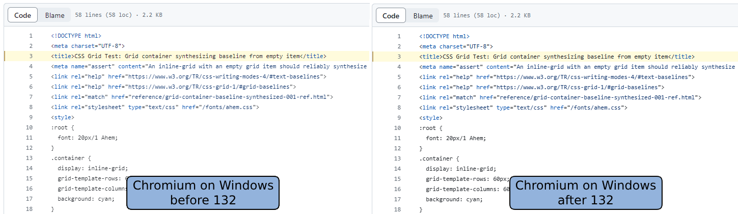
> Text looked washed out on Chrome on Windows pre-132.
> The team took this feedback seriously and did some investigation.
Wait, does "the team" have no eyes/visual tests of their own? How can you seriously make a claim about them taking it seriously when they failed to notice this degradation in the first place? Or, for that matter, that it took so long to fix
> It was evident that the text contrast value needed to increase, but data was needed to determine how much to adjust it.
No, you adjust first until it's not "evident" anymore and then waste years on consumer research
However, most users don't run the ClearType Tuner. This announcement is basically that we are now using values that match the default ClearType contrast and gamma. There's no extra complexity or separate defaults. This behavior shipped later because it has a much larger impact on the user base.
This wasn't happening automatically because Chromium doesn't user DirectWrite for text rasterization, so they were missing default Windows behaviors like the ClearType Tuner integration and Windows default values.
As a web designer, you must accept that the browser is fundamentally not yours to control. It is an agent acting on behalf of the user, not on behalf of you.
You can instantly notice it when you try to read comments on youtube (w/ dark theme)
Would the same teams at Google be interested in implementing better line breaking? The Japanese text in the screenshot in the article breaks words in half. There's a library that does it already; it just needs adding to Chromium: https://github.com/google/budoux/
So they decided that not deliberately lowering contrast will fix the contrast problem. So this basically stems from that annoying designer trend of grey text on grey backgrounds that was in turn based on the false assumption that our displays have infinite contrast.