My mom (and my dad) belong to the group that - even after a decade of daily computer use - frequently fail to recognize distinct interface elements. They seem to have no general concept of the look / purpose of a link, a window, a modal box etc. Colors and chrome are meaningless to them, but text that says 'click here' is the best of UX there can be.
I've noticed that many web publications that cater to non-savvy users tend to stick with the 'click here'-pattern.
As a matter of fact I spoke to your parents the other day. They asked me if there was a space between the first and second word of my domain name. They also didn't understand that you can't just send an email to domainname you need an address at domainname. They didn't know what a browser bar was they just type my domain name in google and go from there.
In all seriousness you raise an excellent point.
It would be interesting if there was some data and metrics to backup the web saavyness of various audience types and how a particular link style impacts those groups. What works with one group might be a detriment in another group.
What's interesting is the the OP's parents have been using computers for a decade. They're not beginners per se, but they seem (I'm guessing) to have internalized some UI artifacts from the Web of 10 years ago.
If this is the case then the problem is not helping people who are beginners, but helping people who have possibly stopped reconsidering the UI they are actually seeing and who instead are locked into habits they built up earlier.
She would call me saying her email "looks all different" for "no reason"
The only thing I don't entirely agree with is:
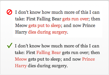
1) Wrong: "first Falling Bear gets run over" 2) Right: "first Falling Bear gets run over"
I think they're just different. In the first case, I expect a link to to a photo of Falling Bear as he's getting run over. In the second case, I expect a link to a page on Falling Bear, that may have nothing to do with when he was run over.
But I think the distinction is important to make.
Guaranteed confusion every time.
From Aristotle to OOP, there's a long history of over-reliance on nouns to describe the world around us. Unfortunately a full and nuanced description requires an explanation of both object and action.
Anecdotally, I did a website recently for a carpet cleaner. Standard wordpress job with his services and things. At the top of the home page, he wanted a link to a form for redeeming living social coupons, which, not wanting to say "Click Here for", I just made as "Reedem Living Social Coupon".
It turned out after a couple weeks that many of his users were not clicking "Reedem Living Social Coupon", but clicking the "Contact Us" link. As a quick fix, I renamed the link to "Click Here to Redeem Living Social Coupon" and bolded the text. He mentioned a week later that this had a noticeable improvement in people clicking the correct form.
People who use the web for scheduling carpet cleanings are not always the same as the twitter crowd. You need to remember who your audience is, not what all your programmer friends prefer.
(And for some closure, I ended up adding a "coupon code" optional entry on the generic contact form for people who still clicked the wrong one anyway.)
I still wouldn't use "click here" in normal writing (e.g., a blog post); I think it's unnecessary and a bit gauche. But I'm happy to do it on landing pages and other places where I really do want people to click there.
Landing pages, big call-to-actions, etc. are a different beast entirely. Especially because it's not always obvious what's a graphic or a link, what's a headline or a link. "Click here" makes it obvious, which is necessary when dealing with anything is not "standard" page content.
Yes, you can print an A3 sized sign to remind visitors to flush the toilet, bolding, italicizing and underlining the text to get their attention. Or you can make a clever doodle or an icon, and make it fit into the bathroom's interior design.
You want your call-to-action verb to match the verb in the user's mind when they visit the site, or they may not recognize it as the action they wanted and skip over it.
I'd guess that people think of coupons as something you "use" more than "redeem", so maybe that'd be a better verb.
But – since it can be tricky to get inside your users' heads like that, I prefer to phrase links like this as a question, like "Have a Living Social coupon?" That way there's much less potential for a mental-model mismatch.
Edit: And I'm sure conversions would probably also depend on the demographics of your user base, so I'd be interested in seeing that included as well.
* http://www.marketingsherpa.com/article.php?ident=30124 * http://www.copyblogger.com/click-here/
If you look at what a lot of content marketers (inbound marketers, if you like) are doing, you'll see a lot of "click here" type stuff as well.
I think if people think and react in a certain way, there is nothing wrong with that, and web design should evolve around how people act as opposed to the other way around.
Then again I don't work in either any sort of UX or web development, so maybe I should keep my mouth shut here :)
Buttons shouldn't say yes/no or ok/cancel. They should describe the actual action. "Leave this page" or "stay on this page", "Remove from cart" or "keep in cart", and so on.
First, I read the question, "Do you want to save this file?"
Then I naturally expect "Yes", "No", "Cancel" -- effortless to understand.
If I see "Save this file", "Don't save this file", "Return to application", it takes a lot longer, because I have to parse each button, which is redundant and annoying since I' already parsed the question.
The only time I've found longer button names to be useful are in rare non-intuitive situations, like when copying files into a directory with files of the same name, and there are multiple options you can take.
Also, yes/no/cancel are only "effortless" to understand if you read the question first (not everyone does that) and if the question is simple.
An example of doing it wrong: my classroom had an unstable piece of software that would occasionally pop up a long error message that asked "do you wish to continue?" at the end; students wouldn't read the whole thing, but would just click "no", which closed the software.
If the same popup had the error message and then buttons marked "continue" or "close program", it would have been far more straightforward.
Mac OS X takes the approach of labeling buttons with action verbs instead. This makes scanning dialogs much simpler; with Yes/No/Cancel, you have to carefully read the dialog message (and hopefully the text is clear) so you make the right choice; or you sometimes make the wrong choice since nearly all dialogs use Yes/No/Cancel and your brain didn't do branch prediction properly.
In your case you are annoyed since perhaps you know exactly what the app is going to do and you don't want the extra 500ms overhead, but for your Average User, clearly defining a button's action is better.
I get that there really are dumb people out there, but if "submit" confuses you when you are "submitting an application" (of which the button is "submit your application" rather than "submit") you might not get the job. Likely so even if you are applying to McDonalds.
This article though... Almost turns me to his side, at least on this topic. Nice read.
edit: I guess I should state that I'm describing the submit button on an actual form, with the title "application" or some such and that the user is entering in data (a lot in this case) and that "submit" is pretty much industry standard for forms
At very least if you are planning to change around your links based on this article give a look to Dustin Curtis' data-driven experiment on changing link names:
www.dustincurtis.com/you_should_follow_me_on_twitter.html
If you mean actions within a web application that cause something to happen, then the w3c didn't misunderstand that at all; they simply didn't take it into account because the web at that time didn't have nearly as much of that as it did hyperlinked static content.
Apart from that, the w3c wrote that advice for for people intending to construct a useful hyperlinked web of information, not for people building deliberately manipulative copy. Consider the target audience.
* Doing so diminishes their experience of your interface because it momentarily takes their focus away from it. Instead of focusing on the interface and its content, “click here” diverts their attention to the user and their mouse. Not to mention, you can also make them feel dumb by suggesting that they don’t know what a link is or how to use a mouse.*
Based on what? At this point in time, very few people think about the actual action of moving a mouse and clicking a link, they just do it. It is now an innate action
however
you have to keep your audience in mind here. That second paragraph about making your audience seem dumb? Well what about the group of people who almost never use a computer, the elderly or those who are just not around machines as often? They might read a linked word and think it's something completely different. Telling them to click here engages in the mind "There is more relevant information on the next page".
http://www.dustincurtis.com/you_should_follow_me_on_twitter....
http://www.useit.com/alertbox/20040510.html
appears to offer more user-friendly advice (perhaps because it is based on more thorough usability research) than the advice in the article kindly submitted here.
The Top Ten Mistakes in Web Design" article
http://www.useit.com/alertbox/9605.html
(updated 2011) says one of the top ten mistakes is "3. Not Changing the Color of Visited Links." I have to agree.
From W3C: http://www.w3.org/TR/WCAG10/#gl-facilitate-navigation
"Link text should be meaningful enough to make sense when read out of context -- either on its own or as part of a sequence of links."
This is especially true when you consider users who use screen readers.
I believe people process text faster than they process visual cues like fancy icons or underlined anchor links. "Click here to view demo" seems to be faster to process, and more explicit than a fancy "View demo" hyperlink (CSS re-styling of links does not help in that respect). This is pure speculation of course, but one might try to do the reaction-time experiment.
Theory: When you want someone to do something, they will do it more often if you tell them to than if you just hint at it. When people read text, they assume someone else has written it and subconsciously invent a small narrative in their head. If this narrative tells them to do something, they are more likely to do it than if the narrative just lets them know something exists. And that's essentially what we're getting at. What this article is supposing is that, people will more likely do something if you let them know it exists than if you tell them to do it. I sadly disagree. Am I going to put 'click here' on my own sites? No, it seems kind of trashy and turn of the century. But there is a legitimate use for it.
Does anyone actually have strong evidence supporting it (i.e. quantifiable UX studies)?
I've always found the reasons given for this kind of thing rather vague and arguable:
- Don't use click: I really doubt users care
- Don't use 'here': fine, being specific is good where you can
- Link to nouns: seems arguable. Surely if you're linking to a bear then use the noun. If you're linking to a bear getting run over, 'getting run over' is the action here, and should be the link, especially if you have more than one action to link to.
- Link to specifics: yeah, you already said that one.
- End on a link. Hmm.. I'd need to see numbers to believe it
If you want to say "click here" is unnecessary and you'd do better by providing a more specific call to action, fine. But don't try to tell me you are using some kind of sophisticated psychology to divine the text of links. Maybe if you had provided a study that used CAT scans or something that show that but honestly that probably just be silly and pedantic.
Hopefully they're only 5-10 years ahead of everyone else; imagine the SEO juice they'll have then!
This blogger has mentioned before that he sees no reason to A/B test because he thinks an experienced designer knows better anyway. So I can totally see him recommending something that performs worse in an A/B test like this.
The article gives some good advice, but I think it's always worth considering that links should be emphasized in the context of both HTML and CSS (and static images and any JS magic).
Although I think the word "click" should not be a part of any link in 2012, you shouldn't follow this guide unquestioningly in other regards.