It has been a while since I contributed to the web, so I decided to get back in shape and publish "something".
This app is a POC of "what if diagrams were more dynamic". I'm a software engineer by trade, and with conventional tools, I often times struggle to explain flows of data in complex software systems.
I got inspired by video games like The Incredible Machine and Factorio, as in some ways, software systems tend to become Rube Goldberg-esque machines ;) As a side quest, I also wanted to craft diagrams faster than text-based tools (ex: mermaid), as I am always forgetting their syntax.
If you try the app, you will certainly struggle with its UI, especially when crafting flows, as I used all my brain juice on the core idea. I have cool features in my head for a v1 but today I really wanted to simply show what I got.
You can access the app directly at https://gg-charts.com and there are some examples in the Github README to get you started.
Happy to answer questions and humbly receive your honest feedback on this crazy idea!
This comes up frequently in the context of secure design review, or more generally when outside stakeholders need to understand a foreign system.
Nobody argues against diagrams as good practice, but so few actually make them. That tells me incentives/costs are still off, despite good intent.
Information extraction from design docs could be one approach to suggest a diagram for free but that creates a dependency on the fidelity of the design document.
That's a huge scope question on its own. What's "complete"? How low level or wide do you go? What about the view of internals of the external systems you rely on? What about their mapping to teams/owners? C4 helps a bit here by saying "whole organisation throws everything possible into this and when you want to see it, you use scoped views instead".
> or up to date diagrams
"When exactly does the system change" is tricky too. When you change the code? When you enable the new system? Who knows that the diagram of the system exists and where? It's a bit of an issue of unknown unknowns. Again, the C4 idea helps here a bit, but there are still going to be random projections of state at a given time saved in various places.
Another big issue is that structure and presentation are very different. Generated diagrams of infrastructure or code look shit, universally. On the other hand, well presented diagrams are just snapshots in time that get preserved for years even if their outdated. I mean this is what C4 page shows as one of their results https://c4model.com/img/alternative-1.png which is an unreadable mess and this is what they initially complain about https://c4model.com/img/sketch-2.jpg which is perfectly sized and context specific goodness. The first is good for knowledge preservation, but if anyone needs to understand things, I'm making the second one for them.
The other sibling comment regarding rendering documentation source to Confluence or <required external system> to keep the corp overlords happy is a great middle ground IMO.
This kind of effort is sabotaged at every place I've ever worked, usually because product or leadership insists that it moves to confluence, and then predictably this increases friction and no one ever updates those diagrams again. People with "20 years experience in industry" can't be bothered login to github, and in the best case instead of confluence they want lucidchart, where inevitably the whole org is sharing like 3 seats.
Partly this is just laziness or ignorance, but partly it's deliberate overreach into engineering business because there's lots of people who see actual information as a threat to to their preferred narratives (think hype/sales promises/etc). Plus you can't say that you didn't know about a design flaw if there is 6 month old diagram calling out the need for a solution in big red letters. Since a picture is worth a 1000 words, and since a git hash can get a date attached to it, dead-on-arrival docs/diagrams tends to decrease accountability.
It allows you to specify definitions in one location, and reference them in other pages. So if you have for example a documentation page which is about "installing our nodejs package", you can write a version in vars.json or vars.xml or whatever, and reference it in your installation documentation page.
When you later have another page which is saying "Hey, we found a bit of an issue with ...this-or-that... package because we're using $NODE_VERSION, and the package hasn't been updated so we have ...such-and-so... workaround", you know when you update the $NODE_VERSION in your vars, that you need to take a look at that package again.
It's an extremely basic part of software development, being able to define variables, but I think this is a very good sign of powerful documentation tooling.
The only major downside about the platform is that their XML (HTML) extensions to markdown are proprietary, and as such the platform isn't able to grow outside of Jetbrains' oversight. I'm still debating whether I want to switch from Gitlab's Wiki (which is very basic but is really really easy to edit for anyone on the team) to a solution like Jetbrains' Writerside.
What is interesting here is that mermaid and graphviz could be committed to source control, but I have never seen it done anywhere likely because the burden of drawing/updating is still too high (hence your wysiwyg comment).
Diagramming is the same problem, but usually lacking the context to decide what to draw. The same stakeholders may be interested in different combinations of features depending on which business questions they're trying to answer. Geographic mapping is practically a constrained domain by comparison. And it's supposed to be feasible to do it automatically for systems diagrams? /hard-skeptic
A dataflow diagram for example is mostly self constraining in scope.
Automating it is another problem entirely and I agree it has a lot of hard challenges.
I think the core concept is flawed, though. "Animated diagrams" are great for generating engagement on social media, but in practice an animated line doesn't tell you anything an arrow wouldn't. They just become a distraction. Plus, they make it harder to read a label on the line (and "real" diagrams should have those).
> "Animated diagrams" are great for generating engagement on social media, but in practice an animated line doesn't tell you anything an arrow wouldn't.
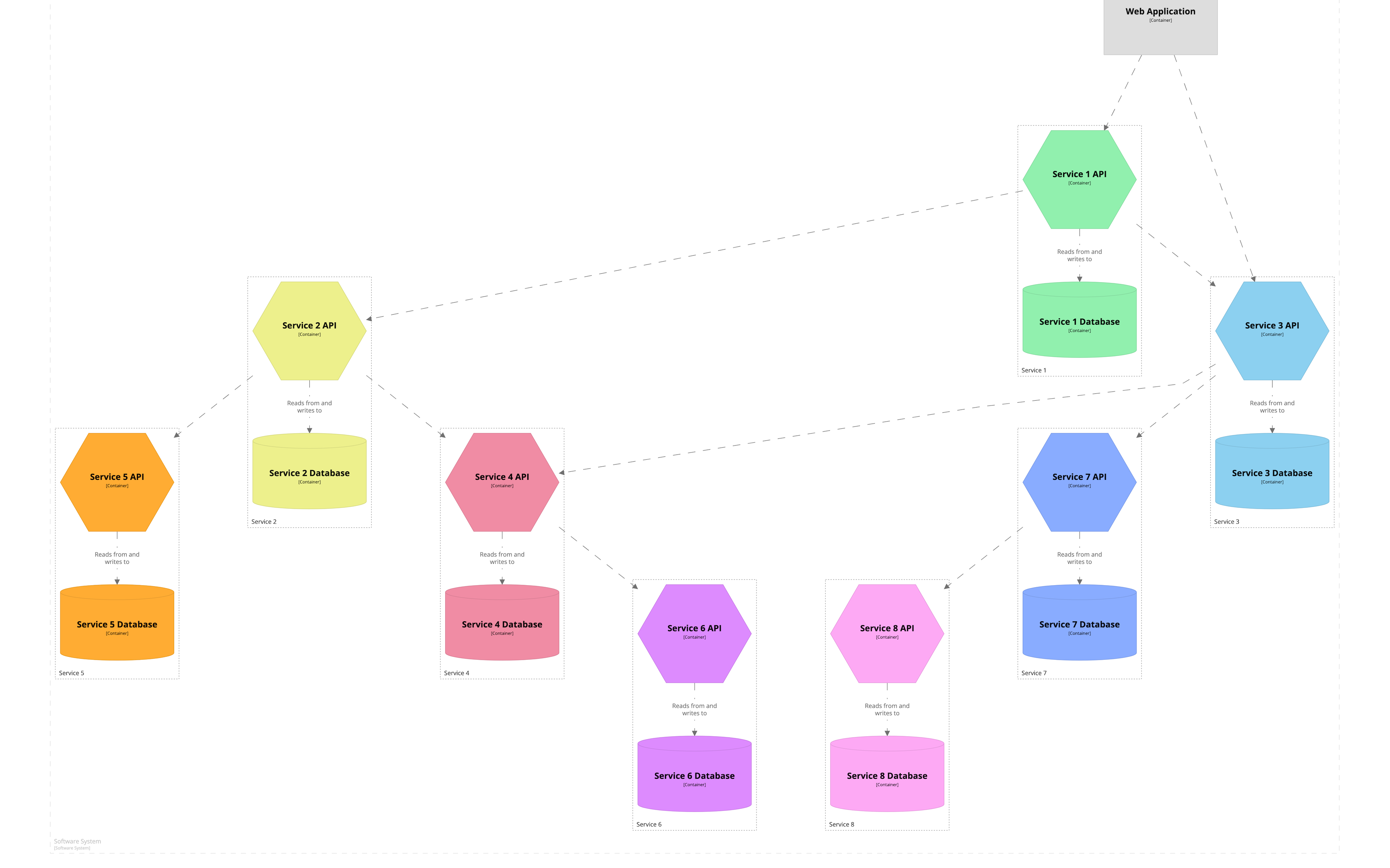
Instead of showing a little green box moving from system A to system B, I could have shown static arrows alongside the link between system A to system B, or something similar.
I chose the moving green box as it represents the data flowing in the system, in a tangible / concrete manner.
It communicates:
- A data is created/produced/etc. at system A.
- The data is transferred/copied/moved/etc. to the system B.
- The data is received/consumed/etc. by the system B.
My favorite tool for creating diagrams so far is still Drakon (try in browser: https://drakonhub.com/start-drakon).
It has the best "move element" behavior of any diagramming tool I've ever encountered (it shifts neighboring elements predictably, minimally and often in the exact way that I actually want).
gg-charts is pretty close in some respects, but still feels a bit more clunky to me, because the "move element" function gives less direct feedback, and in some cases complicates the layout more than I feel necessary.
I was also surprised diagrams are exportable to json. Yet, it does contain (x, y) coordinates, making that json impossible to write by hand.
If drakon had a a more human friendly and git friendly format (at least json is more git friendly), I'd gladly use it much more often!
Thanks for calling attention to this. You are right. Drakon does that incredibly well!
There is currently a bug in the app that let someone inject a JS snippet to execute (to confirm) in the URL "file" property. The app then save the content of that "file" property in the local storage, so every time you open https://gg-charts.com, it loads this data from local storage and re-execute the JS snippet.
I'll fix that today, sorry for the inconvenience. :-/ The web is the far west!
Feature request - ability to export to Animated PNG!
The animation in the README.md was captured with the MediaRecorder API. It produced a webm that I "cropped -> clipped -> to gif" manually. I am not that far to produce a looping webm that is perfectly cropped & clipped. I may release that first, and then tackle gif / apng / ??? later.
GIFs support only 256 colors while APNG supports millions of colors and does have multi-browser support now. PNGs are also inherently high quality and don't pixelate like lossy image formats - GIF, JPG etc.
IMO the editing/sharing/maintenance experience of Mermaid’s sequence diagrams is nicer. What is your opinion on sequence diagrams in general? I much prefer their static nature and directional flow over animations you have to wait for when you need to review a detail you missed, and the top/down direction is better than trying to track points moving around in arbitrary directions.
Indeed, I do have a YAML / JSON representation under the hood, which is validated by JSON Schema. In the app, you can click on "file > yaml editor" to access it.
I thought about having a mermaid-like syntax on top of my YAML representation but before adding this, I need to have a proper "auto-layout" feature. Currently, the editor is responsible to detect collisions between systems and to "space them out" until no collisions are found. I need to bring that responsibility back to the core library instead of the editor, as right now, the core library only accept systems without collisions to resolve. TL;DR: it's feasible and I'm open to the idea!
> What is your opinion on sequence diagrams in general?
I like them in small bites, i.e. with few participants and presenting one simple flow. They do become daunting (for me) to read and maintain with more participants and complex flows. I like to sprinkle them in my documentations. In mermaid, I find myself bouncing from "flow diagrams" to "sequence diagrams" all the time.
> over animations you have to wait for when you need to review a detail you missed
I'm currently working on a "viewer mode" / "presentation mode" as I don't want this continuous playback loop to become the default way to present a flow in a system. This continuous playback is useful as an overview of a flow but not to present it to an audience or to embed in a technical documentation. I want to be able to present a flow, step by step, as if it was a slideshow.
Heard of death by a thousand cuts ? LabVIEW comes to mind.
I am curious about the motivation behind this project. What experiences triggered you to think that static diagrams are a problem?
Your answer will help me decide whether I'd like to use it for my own documentation or not.
I decided to work on gg because I want my colleagues to grok our complex software architecture, and I don't feel like I am able to achieve that with textual documentation + static diagrams alone.
I have been in a lot of brainstorming sessions drawing boxes and arrows on a whiteboard. I have produced a lot of diagrams with mermaid, draw.io, miro, etc. I produced a lot of documentation to explain how the software is built. Those are all good tools to get everyone on the same page, and yet, I feel like there is a missing piece of the puzzle to explain a software architecture simply and concisely that even the new junior developer recruit will understand.
I'm working on supporting webm first, as I am close to have a working feature using the MediaRecorder API of the browser. Exporting to gif will come after that, as it can be done by third-party tools as a workaround in the meantime (i.e. webm to gif).
There is no plan yet to support importers directly in gg but the graphs produced with gg have a YAML/JSON representation under the hood so producing a "draw.io to gg" importer is feasible.
I intend to fix that bug (eh!) and I'm also thinking about moving this costly algorithm in web workers (+ parallelize it).
https://netflixtechblog.com/vizceral-open-source-acc0c32113f...
I wish ^ were still alive. It was very cool and way ahead of its time.