Come on, it's 2023. It's more than reasonable to expect all your users to have a login-form accelerator in their PC. If you're not keeping up to date, the fault is with you, not the web developer. /s
And it asked me 4 times, before I gave up and just mashed random answers (and got kicked to the start).
It's silly.
Some audio captchas are just impossible tho, like recaptcha where it's simply impossible to hear what they're saying.
I wish google cared about people with reduced eyesight and listening ability, but no, it doesn't make them any money.
Are others getting something else?
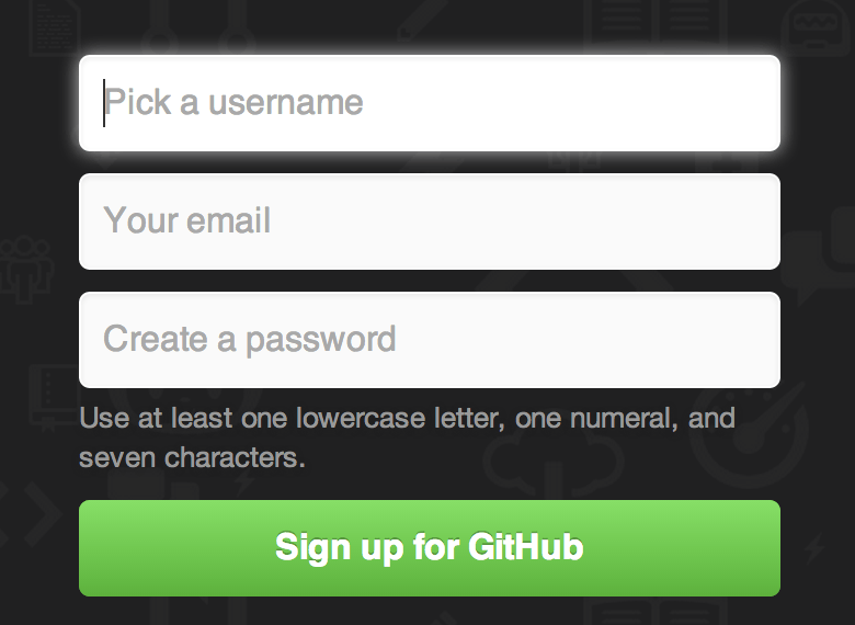
I know interactive "one-step-at-a-time" signup forms may not be popular among the HN crowd, but let me tell you, they sure are wonderful in non-tech enterprise. At least in my experience. I guess you could argue that the target audience for Github isn't exactly non-tech enterprise employees, but I can't speak about people outside of that user group as they are the ones I have experience with.
I must admit that I can't remember how it worked when I signed up many years ago, but I'm personally liking this new version.
The new one doesn't seem all that bad to me, either, although I did try it on a desktop machine. I see that some of the complaints have to do with how it looks on a phone.
If it was some sharp-edged nerd-only thing, then we'd have to spend a lot of time developing documentation to compensate.
asdfkjlhasdfj@asdfkljasdfklh.com just got an 8-digit launch code and is now subscribed to said announcements (sorry if that's a real person), but I'm never going to be able to enter the launch code. Are they still subscribed, even though the launch code will never finish?
I agree that I'd much rather see a single-page form with a half dozen text boxes and a "Submit" button, and I'd hope that nothing gets committed serverside before I click "Submit", at which time all of the \<form> data gets POSTed.
The user cannot press a wrong button, is not distracted by a whole bunch of fields and there is no ambiguity. Cognitive complexity is low throughout the registration proces.
My only two small points were:
- I miss some some kind of "progress" indication. Normally you see the whole form at a glance, now you don't so you're not sure how far you've progressed.
- The outline of the input field touches the button on the right. There should be a padding between the two.
But these are small points, overall I quite like it tbh. It reminds me of a CLI wizard, which seems fitting for Github.
(tested on desktop only)
The user interface of the future!
I think this style of UI might suck a little for browsers that try and autofill email/username/password suggestions, but overall I find it a little more clever and interesting than a generic bootstrap form. As a bonus, this probably introduces a bit of friction to bad actors that try and programmatically mass-produce accounts.
I didn't bother testing other parts but they could probably highlight or border fields with errors in red. Maybe put the response above the field. Just my 2 cents.
I intentionally tested an error path because in my experience that's what separates the joes from the pros in UX.
Give me static forms without heavy JS, please!
The new thing is the "onboarding cards" which I dismissed because I'm already familiar with GitHub and have a set of habits when using the platform (managing my own repos).
Definitely, I do not understand the title. Don't see proof of unusability.
> Email is invalid or already taken
oooh!