In Western Europe, South America and Asia it's mostly just some specific app (WhatsApp for example, or Signal, or WeChat or LINE) and as a fallback SMS. And if SMS turns from one colour bubble to another colour it doesn't really do anything for users on either end. This deep integration with colours and status symbols does remain in specific areas like middle school where it is still seen as important to try to project wealth.
1. In the dating scene, I have heard women remark that it was a red flag (Android users are stereotypically poor... despite a large number of techies using Android)
2. A manager at my old company was advised to get an iphone for communication with VCs. One of our old leaders had heard commentary from a VC at one point about the text message colors.
This is a red flag against the women in question, not the Android user. That attitude/behaviour is a great indicator of a gold digger. You'd be dodging a bullet by avoiding these women.
The only other people that share that attitude are teenagers. So if you go along with this horseshit and buy an iPhone just to feel more comfortable dating, you're courting women with the maturity and intelligence of the average teenager.
I haven't lived in a country where text bubbles used to be a thing, but I noticed this. People, even people who are smart and kind in other aspects, still cling to the easiest social cues. Doesn't matter if you wear a Margiela t-shirt or what you drive; your tinder date or a person who you just met in a bar will look at your phone and take notice. Personally, I was quite happy with Samsung flagship phones, and then not less happy with pretty cheap Xiaomi ones — they literally do anything I want in a phone. But after getting frustrated with how people read social cues, I moved back to iPhones and simply got myself the most expensive one, just for the sake of being easier to read for other people.
Obviously, it would be nice to be so laidback and independent as to not care what other people care about your wealth, but sadly, I'm not on that level yet.
I use an iPhone. Not for any philosophical reason. I tried switching to android 3 times over the years since the first iPhone came out. Same plan, same provider, grandfathered in, same house, same spot. Each android phone did not get the same level of cell service in my house as the iPhone. I have side gigs I do contracting for, I have had cases of missing calls where the androids have literally cost me $100's of dollars, phone didn't ring... just a voicemail notification showing up hours later.
After the 3rd attempt, last being a nexus 5, I gave up. I'm sorry but I draw a line when a device messes with my income regardless of my ideological stance on open source and not having a windows device or even an Apple laptop in the house for the last 13 years.
With that said the Pixel 7 Pro looks nice, and I would love to give it a try but I'll only do that if I have it on a separate dedicated line to try out besides my main one that have had for 20 years. Not sure it's worth the effort at this point.
This doesn’t match my experience. Almost everyone I work with has an iPhone.
Anyway, having a good income isn’t the whole story. It’s probably also about willingness to conform to subtle, arbitrary social norms. Plenty of women are more attracted to a guy who dresses well, despite the fact that plenty of techies wear free hoodies. I think that’s a better analogy.
This doesn't seem very different from a Director of Sales telling the salespeople to upgrade their wardrobe.
Image is important in business. Some people may be uncomfortable with that, but it's a fact. Companies, and people, spend trillions of dollars a year to project an image.
It just happens that blue text bubbles are more in style than green text bubbles.
But Google fell into the same trap that all large companies do: If you can't innovate, litigate.
Are the kids wrong?
When I look at my app’s stats, Android users are worse in every way.
More expensive to develop for, pay less or none at all, and their halo effect is sometimes negative: they might word-of-mouth my app to more Android users instead of more iOS users.
As iOS developer i disagree, You can develop android app on any platform that support JDK you pay a one-time registration fee of €25, Google Play is faster at approving apps (anecdotal evidence from working on team that support both iOS and Android)
iOS apps have to be compiled on recent Mac with latest version of macOS, you pay a yearly fee of €100 and AppStore review process is more in-dept especially for new apps
Maybe because there is always a free alternative that is better than yours.
Whereas iOS users only has the App Store, and if they don’t pay they don’t get app.
> pay less or none at all
Maybe just make the app paid only?
And sms group chats? I only know about sms group chats from US posters.
You can just assume everyone has Whatsapp here, and just message them over that.
Yea but that's a problem too.
Trusting your private conversations to ~Facebook~ Meta is also a signal.
Surely it's not middle school when people try to project wealth the most.. kids care more about who has an iPhone than adults but adults project wealth _a lot_ more than kids overall: fancy cars, homes, holidays etc. More expensive things are also nicer than their cheaper counterparts but I think most people would be lying if they don't say having access to them also gives them some status boost, if only internally. Can't turn off the monkey in the head easily.
Yes, thats exactly whats going on in the US as well
(and yes, we know that Google has recently adopted some other open source messaging standard that now Apple hasn't.)
The debate is that one where I am forced to reconcile whether I am too far removed from popular culture to see how this is a real issue versus accepting that the issue is entirely contrived.
As an adult of course the green/blue bubbles simply don't matter, we grow up and realise that, but it certainly is a significant issue if it's affecting young peoples lives.
So I'd say it's somewhere inbetween what you descibe, perhaps a bit contrived, but also could have a significant impact on some people.
Side note - I have heard of people saying they won't date green or blue bubble people, but of course if someone takes that point of view as an adult then it's a good indicator to show how they think.
> As an adult of course the green/blue bubbles simply don't matter
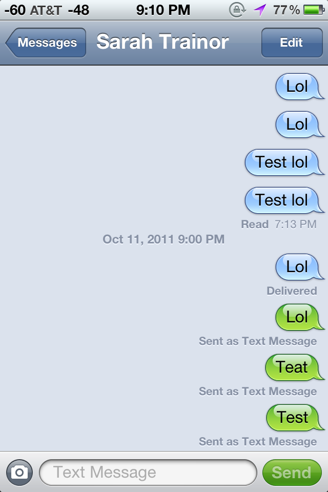
I disagree that the green/blue bubbles simply don't matter as an adult. I've had friend groups not include me in group messages because of it. Some have gotten visibly mad at me for having green bubbles and "breaking their chat". There is certain functionality that iPhones don't support in MMS chats that Android phones do (like adding a new member to the group chat).
It does indicate how people think when they buy into the stigma, but also I think it's a general lack of understanding around why Apple keeps iMessage so tightly coupled to its ecosystem and hardware. And many people aren't interested in gaining that understanding.
Social status is very important to many adults, and blue bubbles have become a way to display that social status.
But how many times, really?
It's like the missing iPhone headphone jack. The press and bloggers hammered away at it for years, making sure it was an ongoing meme in all coverage, but... do people really care? Some people, sure.. but enough for the coverage?
Same with bubbles.
It gets to the point in the second paragraph: the green bubbles have bad contrast. It mentions the design of the green bubbles rank as "very poor" by accessibility standards.
That's why it matters.
As for negative effects on kids. There’s more than just phones. Clothes, cars, vacations, social media posts, tutoring, sports. Maybe we should put everyone in uniforms, don’t allow kids drive to school, ban sports, and forbid them from talking about their vacations. And everyone was equal.
I'm not sure how easy that would be - 'Apple will make you more popular if you use an iPhone instead of Android!'...'No no, that's bad, you don't want that, don't buy an iPhone!'
They have to be very, very subtle, and ride the fine line between effectiveness and outrage, never going too much on a side or the other. The best and most enduring conspiration theories have originated from such deliberate and surgical manipulations. The goal they are after: most people will unknowingly abide and be manipulated, while the minority will go nuts proclaiming they know the truth.
Welcome to propaganda 101, aka destructive marketing.
Or admonishing us for not reading the article, because we've misunderstood it based on the title.
After a two sentence paragraph expressing how the green/blue technical differentiation has become a social one, it then asks the question "Why is green worse than blue?" The next line: "The answer is color contrast."
What could they have realistically done to cut to the chase sooner in a meaningful way? The only real thing is ditching those two context building sentences. But it's two short sentences, providing relevant context.
Doesn't really feel like a valid criticism IMO.
iOS 4, green Aqua-ish bubbles with black text: https://d2bs8hqp6qvsw6.cloudfront.net/article/images/750x750...
iOS 5, introducing blue iMessage bubbles (still good contrast in both colors): https://images.anandtech.com/doci/4956/IMG_0907.PNG
The change in contrast came with Ive's "flat" iOS 7:
https://i.insider.com/5df902c5fd9db27769749a5f?width=1300&fo...
https://www.oreilly.com/api/v2/epubs/9780133016529/files/gra...
They have every reason to make “green bubbles” look toxic and off putting, because unencrypted SMS is genuinely hazardous.
When I text other android users, my messages are encrypted. When I text an iPhone, they are not.
Stop supporting closed protocols and bad-faith actors.
Once 99% of phones and carriers support RCS then maybe you could make this argument, but it won’t be for several years.
If it's the goal to implicate danger, this strikes me as a weird colour choice for dangerous messages, to be honest.
This whole "thing" around "bad" green vs blue message bubbles appears a bit, for the lack of a better word, insane to me as a non-american. The bubbles are fine. IMO, the problem is very obviously that kids can be cruel jerks and "not having an iPhone" is a social stigma for US teenagers, just like "not having a flashy cell phone with Bluetooth and MMS" was 15 years ago. Changing the colour will not fix this stigma, there still isn't an Apple on the back of the Android phones.
This is just like saying the colored HTTPS symbol in the browser toolbar on websites that support SSL was designed to make websites without SSL look uncool.
EDIT: to clarify here, the author does explain his point about the color and the contrast of the text. He may have a point there but IMO, the main issue was that it’s not messages. The thing I should have added is that back when it was implemented people had to pay real money per message to send as a text message. That means everyone in the group had to feel uncomfortable sending frivolous messages when it costs someone money. I think that is the real reason for the bifurcation and not the color choice.
Given their attention to detail in design (see the rabbithole of their Human Interface Guidelines - https://developer.apple.com/design/human-interface-guideline...), I agree with the author in that this was an intentional design choice that Apple made.
I personally am not convinced by the theory that Apple is doing this deliberately (though it doesn't sound impossible to me either!) but either way it's something they should change.
I often get people trying to send me videos or files via SMS (I have an Android, and I guess it normally works for them when sending to other Apple users).
(I say adults, because I often hear kids use it as a status symbol or way to exclude other kids from group messages. I will have to ask the kids I work with what they think about message color bubbles.)
But in this context the thing that's harder on the eyes is the bubble itself. So the lighter one is easier for me. Although I'd rather see no bubbles at all.
I don't think that's true for the reasons you put up.
Our eyes are specialized to distinct more shades of green from each other than with other colors. That's a useful evolutionary feature when you are an animal and have to hunt in the wild.
For humans that leads to the point that we're rather good in picking "unnatural" shades of green (gooish ones and self-emitting shades of green).
https://en.wikipedia.org/wiki/Digital_Markets_Act
https://www.eff.org/deeplinks/2022/04/eu-digital-markets-act...
I know that iPhone-using teens don't care about this in SoCal, the virtue signalling capital of the world. Their group chats with friends are all green, so if anything's "gross" it's the blue bubbles of their parental conversations.
In the meantime, RCS is missing really basic capabilities. For example, RCS encryption only works for 1:1 conversations, so things like family chats are not private. Even Android publications are asking if RCS is too little, too late.
https://www.androidpolice.com/android-iphone-rcs-give-up-mes...
You're misunderstanding the order of events here. "I don't talk to green bubbles" has been a thing for at least five years now, which Google has very recently used in an ad campaign.
Almost always as a joke. And if you search HN, nearly all conversations about this PR-manufactured "green bubbles" outrage have happened since the launch of Google's campaign.
The bubbles for everyone else (the people you are talking to) are always all the same color: dark grey.
As opposed to iMessage, but certainly not as opposed to SMS which is what RCS would actually be replacing on the iPhone. Apple would rather have EVERY conversation with an android user unencrypted rather than work towards a solution.
RCS is not a slam dunk. Juniper Research says RCS-capable subscribers represent less than 13% of global mobile subscribers in 2022. (They project that that will double to 40% by 2026, FWIW.)
End-to-encryption is not part of the RCS standard, but is instead a Google-proprietary layer on top of that. I assume that Apple can't seriously consider adopting RCS until that omission is fixed. It would be crazy for Apple to create a Google dependency for something as critical as messaging, especially given Google's long history of failures in this area.
This isn’t some great conspiracy.
I wonder if the contrast has changed over the years. It could be a worse green today than originally.
The original iPhone had a resolution of 320x480 with much worse color reproduction.
- Contrast of your iPhone: 2.21:1 (#35c759)
- Contrast that's "poor": 2.17:1 (#65c466)
- Contrast that's "good": 2.93:1 (#3bac3c)
- Contrast of the blue: 3.95:1 (#367bf5)
Based on this I would say that the Contrast of your green and the "gross" one from the article are actually pretty close, both being very far from the contrast that blue provides.
Not even the good green from the article does match the contrast of the blue. They are being lenient I'd say, not misleading.
“Gross”: #7EC170
Real from the bottom of the message reel: #65C466
Real from the top: #73E173
No issues with contrast in either case. Also keep in mind that those color hexes will slightly vary depending on where exactly you decide to pick since bubbles are filled with gradients.
Not sure where author gets his bubble from but in real life they look as “good” bubbles at the bottom of the screen that makes me think the article itself is gross.
It's kids being kids and seems like an exclusively US thing.
iMessage shades the bubbles depending on position, and shows both the blue and green bubbles as darker at the bottom of the screen, and lighter at the top.
A side-by-side screenshot of iOS 7, when this design was introduced:
https://i.insider.com/5df902c5fd9db27769749a5f?width=1300&fo...
(I think the current one is perfect for 1:1 conversations .. Multiple people is more of an issue visually)
Edit: Haha thx for the downvotes but the article is still lying with phony made-up images.
See a few posts above where someone did the hard work of taking real screenshots instead of the totally bullshit fictional ones the author has in the article.
Any photo, video, or reaction gif that people send will be compressed down a couple of pixels and replies will often be out of chronological order.
But on the other hand, it assumes an unsubstantiated motive for why it is as it is. I’ve worked with designers a bunch, and they have all kinds of reasons for why they choose as they do. I would not put this past apple at all. But given there’s no quotes from the original designers, I’d go with “Do no attribute to malice that which you can attribute to incompetence.”
IMO this is only good advice there's no obvious motive for malice.
When big corporations are involved, cynicism is absolutely warranted.
The colors of both blue and green messages fade as they scroll up. Looking at my phone right now, the lighter contrast the author seems to be calling out is only shown on a message that is scrolled up. This is the same with blue imessage bubbles, they also fade and have lower contrast when scrolled up.
(US currency is typically associated with the color green in a way that probably doesn't apply elsewhere in the world. Also, the actual color of green on US paper currency is quite different from the green bubbles... but I digress.)
About 99% of the SMS I get is bots. The vast majority was spam (making me wish I could disable SMS altogether), then some alerts (e.g from my bank) and 2SV codes.
The other 1% were delivery people.
Exactly 0.0% were people in my contacts.
From Itune and podcast that always try to sell me something instead of just letting me use my library to mail or safari to iCloud.
Seems to me they are good at pushing the boundaries in hardware and integration, but the software make me run in the other direction.
Is there value in their software?
If you wanted to know about events and didn't have an iPhone, you needed to check your email or hear about it second hand. No one wanted to deal with broken MMS, formatting, etc, so that's how things were handled.
Some folks with Android phones were annoyed, but the official stance is that your email should be the place you check for this stuff anyways.
The lighter greyish green gives off a lower standard, almost as if the Android user was a guest user or in free trial mode.
Some product owner probably wanted the iMessage enabled texter to "pop" and the designers usually take that and roll with it usually through some combination of boldening one, and deemphasizing the other to give the overall desired effect. It's a good call out for them to improve the color contrast, but you can adjust the contrast yourself through the accessibility options.
I've never ever heard anyone care about, discuss, or even mention chat bubble color. All of this sounds like something that only US American teens and kids would react to, like they judge people by their skin color or what kind of clothes they're wearing.
The footnote is a link to a WSJ article that doesn’t back up that sentence at all, i.e. makes no claim that the issue is most prevalent in the US.
Why is this even an issue?!?
Low contrast is now "gross." Yikes!
Subliminal messaging work better than poor contrast.
I think this is a case of learned significance, for which you know that a green bubble means a message sent via SMS rather than the "smarter" message. Added to the fact the blue is often used by tech companies due to its fresh and modern connotation, you have the full picture on why your brain prefers the blue to the green message.
That being said, I think Apple should have been more careful about making their message bubble pass contrast tests. But I doubt there was an "evil designer" carefully planning to make that bubble with lower contrast on purpose to make you dislike it.
Low contrast UI elements are the calling card of Alan Dye’s design team. The iMessage and SMS contrast ratio doesn’t rank because there are so many other UI issues that have crept in from this team over the years. If the blue provides a slightly better contrast ratio, it is bound to be incidental and if I were a betting man, I would bet that someone actually likes the green used for SMS.
This entire message style by the way is a direct descendant of iChat AV where you could actually choose your message color. When Apple developed SMS and then iMessageS for iPhones, they chose basically iChat’s design, and picked their favorite bubble colors and what we have today evolved from that.
E.g.: [1] https://osxdaily.com/2011/02/14/prevent-annoying-im-text-sty...
(note the drop-down menu with “Lime” selected, you can Google around for other colors).