We just rolled out this little MVP for a new user interface for our knowledge base software.
I would love to hear what you think about it!
Cheers, Daniel
Maybe I've missed the point, but there are people who use they keyboard exclusively when navigating a web page already, and I would think accessibility for those people would be a big consideration in what you are doing.
Have you researched which applications have the highest penetration of keyboard usage and why? Afaik most users even on desktop apps (e.g MS office suite) can only retain a handful of shortcuts. What's your strategy to train users to have a fully keyboard based navigation?
Btw did you use any open source library to manage keyboard shortcuts?
Compared to normal shortcuts the commands are easier to remember, because they mostly represent the verb for the action you want to accomplish. Instead of memorizing Ctrl + E or similar for a new article, you type /write or an alias like /new. This way you only have to know what actions are possible, without connecting them to an inconclusive key combination. Most commands will auto-complete after the first two letters, so you are not losing that much time either.
Our frontend is build on Vue.js and the shortcuts are handled by global JS events.
You don't want to force your users into keyboard driven interaction there.
But as decent mobile support is almost a requirement nowadays (even if just inside the browser), you end up with two completely different interaction designs and would require users learning everything twice.
As a German native speaker, I find the German translation quite difficult to read.
The newer windows version still kept every single keyboard shortcut, because it turns out once you know the shortcuts, it's so much faster than pointing and clicking.
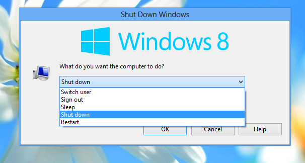
Windows itself did a great job of keyboard shortcut consistency through Windows 7. Windows 8 and beyond, however, have been less so.
Pressing ALT-F4 while Windows Explorer has focus on Windows Server 2019 and finding that you're rudely logged-off with not warning (which has something to do with UAC settings, and can be replicated on Windows Server 2012 R2 w/ the "Desktop Experience" feature enabled) gave me a very "Gee, these guys really don't care about me" kind of feeling. There are others, but they're not coming to me right now.
While they didn't stick too well to the old paradigm in detail, they introduced ribbons in Windows 8 Explorer, which are keyboard-friendly and very "vimperator-alike", using modal hints for commands (press Alt in Explorer to see how it's different), and support the quick toolbar. That's a massive improvement on itself, compared to the old accelerators. There were also many other keyboard-friendly improvements like the basic window tiling and separate desktops, ability to cycle tray icons, almost every OS setting being accessible from the console instead of GUI, etc. I'd say Windows 8 was the first Windows version somewhat usable without a mouse, in Windows 10 they improved on it (and made a huge step back with WPF applications).
Havent seen nearly as much stuff in OS X these days that makes me think the same.
https://winaero.com/blog/wp-content/uploads/2012/08/shutdown...
https://www.tenforums.com/attachments/general-support/241264...
It only happens on Server 2012 R2 when "Desktop Experience" is enabled and you're logged-on with an account that would have groups stripped from its token by User Account Control.
I've no doubt it's related to UAC, ultimately, but I've nearly reached the breaking point w/ my disgust with being unpaid outsourced QA for Microsoft. Deploying and supporting their products have been my livelihood for 20 years, but the "new Microsoft" in the Windows as a Service era is straining my ability to recommend them.
Win+Shift+S to take screenshots, Win+Tab for the expose-style view of all windows, Ctrl+Win+L/R to change desktops, etc.
I haven't used Windows Server since 2012R2 was the new hotness (the product that ran on it has since been ported to dotnet core and containerized) so maybe that explains my differing experience.
Meanwhile, I believe macOS’s equivalent transitions smoothly and quickly. Not that I’ve used it myself for fifteen years or so.
"User friendliness" is paternalistic and limiting. You want a learning curve that amplifies the user's power as they progress along it.
I want to believe. Source?
If you want a keyboard-first interface for your web browser I can recommend Vimium (which I'm sure a lot of you have already heard of). I'm not actually a Vim user (at least not yet), but I rely pretty heavily on Vimium's shortcuts in Firefox nowadays. I started using it when I had a school-provided laptop which had an awful trackpad which was way too slow and annoying to use for my taste.
Vimium: https://vimium.github.io/
Screenshot of shortcuts in Vimium: https://i.imgur.com/x1Y7OvQ.png
EDIT: I almost forgot to mention my favorite feature (which is not limited to Vimium).
Custom search engines are great! If I want to go to the Wikipedia page on aviation then I can just press Shift+o and type w aviation and it will immediately open that Wikpedia page in a new tab.
The other search engines I frequently use are: google translate, thesaurus (synonyms), and justwatch (to see if/where a show/movie is available in my country).
I'm a pretty staunch advocate of it since it doesn't feel at all like a "hack" of vim in the browser, and because it's chromium basically all websites work. (However, I am contributing to the monopoly of chrome based browsers, which is a bad thing in my personal opinion).
It's also easy to extend, I think it's the ultimate hacking browser.
PS: it takes a little tinkering to get really nice looking on MacOS.
Firefox has had this feature for many many years.
I press ctrl+L (keyboard focus to location bar) type "w aviation" and press enter.
It's built in already as a default feature. To add a custom search to Firefox, right click on the search field and click "Add keyword for this search". I chose "w" for Wikipedia like you have.
Yup. I'd also like to see companies put some effort into publishing a complete list of their keyboard shortcuts. How hard can this be? grrrr
I often find highly useful undocumented shortcuts by hitting the key combination by accident.
Designing user interfaces for some hypothetical "average person" that's using it for the first time might make sense for consumer software that's sold to everyone for occasional tasks, but there's plenty of software that benefits heavily from having a bit of a higher learning curve in exchange for faster/more efficient interaction.
I think the main hindrance for most people is not lack of touch typing skills, but more lack of ability or desire to memorize key bindings or the names of commands.
(On later reflection, I have actually thought of three that I know or used to know that can type at a decent speed. But I can think of quite a few more that can’t.)
I work in metal fabrication, and I can tell you the overwhelming majority of building and fabrication tradespeople can’t touch type, regardless of age.
I guess it's time to reexamine the reach of assumption, but I'm sure it will stand correct more often than wrong.
I feel like it would lead to a significant increase in sales, due to the decreased cognitive load of figuring out yet another shitty interface. Mix in seamless payments and account management, and the idea of an online store starts to disappear entirely, to be replaced with the ability to just... buy stuff.
The app could have customer centric functionality, since it would be a "user agent". So you'd have stuff like price tracking, availability tracking, feature comparison, independent reviews, saveable shopping cart, global wishlist, consistent user interface that never changes unless you want it to, and is configurable by you, etc.
Seller would implement the protocol for their side and buyers would choose UI app to discover and order stuff, be it CLI or GUI, or scripted.
If you eliminate differentiation you are eliminating friction, but also innovation.
Maybe it can better be phrased as,
"what if online marketplaces published their data in an open format allowing the end client to display them however the user prefers"?
BTW even in VS Code there is in fact single unified input: "Go to File input" (Ctrl+P) that changes behavior according prefixes; "Show all Commands"(Ctrl+Shift+P) just opens the same input with ">" prefilled; "Go to Symbol in Workspace" (Ctrl+T) prefills "#", "Go to Line" (Ctrl+G) prefills ":" and so on. It even shows you placeholder when empty that reads "Type '?' here to get help [...]" what lists all those prefixes.
There's also Alfred, Quicksilver and Enso
It's a fantastic marriage of traditional search box feature discovery and keyboard shortcuts.
https://help.vivaldi.com/article/quick-commands/
Also, classic Opera had single key page navigation (and loads and loads of shortcuts).
https://web.archive.org/web/20111014104313/http://help.opera...
I'm using Tridactyl now, and am extremely happy with it. There are some problems, notably on the lack of Tridactyl support before the page loads, but with TreeStyleTabs it is the best browsing experience I ever rememeber having.
https://en.m.wikipedia.org/wiki/Menu_key
I have a hard time living without it.
https://www.youtube.com/watch?v=LE8HiHZcgEE https://www.youtube.com/watch?v=ODgs0eWAIKc
> The name "ratpoison" reflects its major design goal: it lets the user manage application windows without using a mouse. Unlike other tiling window managers like Ion, ratpoison completely ignores the mouse (or "rat"), and avoids window decorations as much as possible. The default keybindings are specifically designed to not conflict with Emacs.