The same applies for the Durex packaging. I assume that Durex Select condoms are fruit flavoured or scented, because there's fruit on the box. I can't make that assumption with the "minimalist" packaging.
I think they do look good, but design isn't a synonym for modernist aesthetics; it has a goal and I don't think the goal is being met by these.
Despite what some have said, I think in general these are done fairly well. Some are great, some are worse, but overall it's decent.
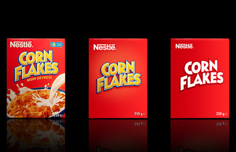
Yes, across the board we still know what the product is but the feelings and the senses of the brand are gone. The Corn Flakes doesn't look like a yummy breakfast anymore. It might as well be the cover of a super hero mag. As already mentioned, the product is no longer unique. It might as well be the store brand.
This isn't effective brand minimalism (in my naive opinion). It's packaging minimalism (minimizing printing costs).
As muji [1] is to a department store, the appropriate store for these would be to a supermarket.
I'm also reminded of the quote "Simplicity is the ultimate sophistication" (da vinci?)
[1] http://muji.us
This sentiment is also expressed by the first commenter on the page :
"dutch supermarkets did it with their low budget labels and that was the reason i came home with two pakages of strawberry yogurt instead of buttermilk this week. it looks nice, but it's confusing when shopping "
I must admit that a few looks better than the original tough : Red Bull, Lindt and Schweppes.