http://dejavu-fonts.org/wiki/index.php?title=Main_Page
Which is a variant of Bitstream Vera Sans Mono:
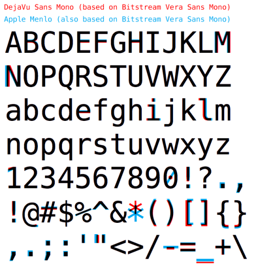
However, right now, my new favorite font is Menlo that came with Snow Leopard. It's another variant of Bitstream Vera and it seems to work much better at smaller font sizes. Which is great for limited screen sizes (such as 1280x800 on a smaller laptop).
Consolas actually can be downloaded for free, legally. If you're on Windows, you can download an installer for the font directly from Microsoft at:
http://www.microsoft.com/downloads/details.aspx?familyid=22e...
If you're on a Mac, slightly more effort is required. Instructions can be found at:
http://www.wezm.net/2009/03/install-consolas-mac-osx/
Though, actually, you don't have to use the Terminal. You can just right-click the XML File Format Converter installer, "Show Package Contents," and navigate to the font installer package.
- Easy to distinguish 1, l, and |
- Zero with a slash
- Lowercase g open on bottom (two circles is too cluttered)
Surprisingly, with those simple rules the only font on the list that gets all 3 is Monaco. (My personal choice, Menlo, also gets all 3.)
Debatable. Zero is typically narrower than uppercase O, so it is trivial to distinguish them even without the slash that merely adds to the visual noise.
I have a pet project of reproducing the IBM 3270 terminal font. I love those 6's and 9's.
http://damieng.com/blog/2008/05/26/envy-code-r-preview-7-cod...
Takes a little bit to get used to using a serif monospace font though.
(It's posted in the comments to that article, but it may not jump out at people.)
I recently had one of those "time to tweak my environment" days where I spent the entire day trying out monospaced fonts (DejaVu Sans Mono, Bitstream Vera Sans Mono, Envy, Terminus... everything I could find) in various color schemes in multiple editors (Win). I've now pretty much set any program where I need a monospace font to Liberation Mono 10pt.
However, I think Consolas looks better if I'm trying to fit more onto the screen. It looks better at smaller sizes than Liberation.
So I've settled on using 2 editors most the time with pretty similar features (Notepad++ & Programmer's Notepad), one loaded with Liberation Mono, the other with Consolas for files where I'd like to squeeze more lines in and keep decent readability.
Maybe there's a better way of doing things, but I like having two sorta different workspaces that I can quickly open.
http://damieng.com/blog/2008/05/26/envy-code-r-preview-7-cod...
http://code.frostglow.com/fonts/programming-font-comparison....